
Ever clicked a button on your iPhone and just *knew* what it would do? That’s not magic. It’s the result of decades of refined Apple Human Interface Guidelines, often called the HIG, which serve as the blueprint for every pixel on Apple devices. If you’re designing for iOS or macOS, ignoring these rules is like building a house without a foundation. The core pillars-hierarchy, harmony, and consistency-aren’t just aesthetic preferences; they are functional requirements that determine whether users trust your app or delete it within seconds.
The Power of Visual Hierarchy
Visual hierarchy is the arrangement of elements in order of importance, guiding the user’s eye through the interface. In Apple’s ecosystem, this isn’t about shouting the loudest. It’s about quiet authority. When you open the Settings app, you notice the large headers before the smaller text. You see the bright blue accent color on actionable items before the gray background. This is hierarchy at work.
Apple uses three primary tools to establish this order:
- Size: Larger elements imply higher priority. A headline is always bigger than body text. A primary action button is larger than a secondary link.
- Color: The system accent color (often blue) signals interactivity. Neutral grays recede into the background. Using too many colors flattens the hierarchy, making everything look equally important-which means nothing stands out.
- Spacing: Whitespace is not empty space; it’s a structural element. Grouping related items with tight spacing and separating unrelated sections with wide gaps helps the brain categorize information instantly.
If your interface feels cluttered, check your hierarchy first. Are you using five different font weights? Do you have three shades of blue competing for attention? Simplify. Let the most critical action breathe.
Harmony Through System Design
Harmony refers to how well different parts of an interface work together visually and functionally. Apple achieves this through its use of SF Pro, the system font designed specifically for screen readability across all device sizes. Because SF Pro scales dynamically, text remains legible whether viewed on an iPhone SE or an iPad Pro.
But harmony extends beyond typography. It’s about rhythm. Apple’s design language relies on consistent corner radii, shadow depths, and animation curves. For instance, when a card expands, it doesn’t just grow; it eases in with a specific cubic-bezier curve that feels natural to the human eye. If you introduce a custom animation that snaps abruptly while the rest of the system glides smoothly, you break the harmonic balance. Users may not be able to articulate why the app feels “off,” but their hands will know.
Consider the relationship between Dark Mode and light interfaces. True harmony means adapting contrast ratios, not just inverting colors. Shadows become less visible in dark mode, so designers must rely on elevation changes via subtle brightness shifts rather than drop shadows. Getting this wrong creates a disjointed experience where one part of the app looks premium and another looks broken.

Consistency as a Trust Signal
Consistency is the backbone of usability. If a trash icon deletes files in one app but archives them in another, users lose trust. Apple enforces strict patterns for common interactions: swiping left reveals destructive actions, pulling down refreshes content, and tapping the top-left arrow goes back.
This standardization reduces cognitive load. Users don’t need to relearn how to navigate every new app. They apply muscle memory. However, consistency doesn’t mean monotony. Apple allows for brand differentiation within the bounds of the system. You can choose your own accent color, but you should stick to it. You can customize icons, but they should follow the same stroke weight and grid alignment as system icons.
A key aspect of consistency is state management. Every interactive element needs clear states: normal, highlighted, pressed, and disabled. Missing even one state confuses users. Does this button work? Is it loading? Without visual feedback, ambiguity reigns, and frustration follows.

Practical Application: Building with the HIG
Implementing these principles requires discipline. Here’s how to apply them in practice:
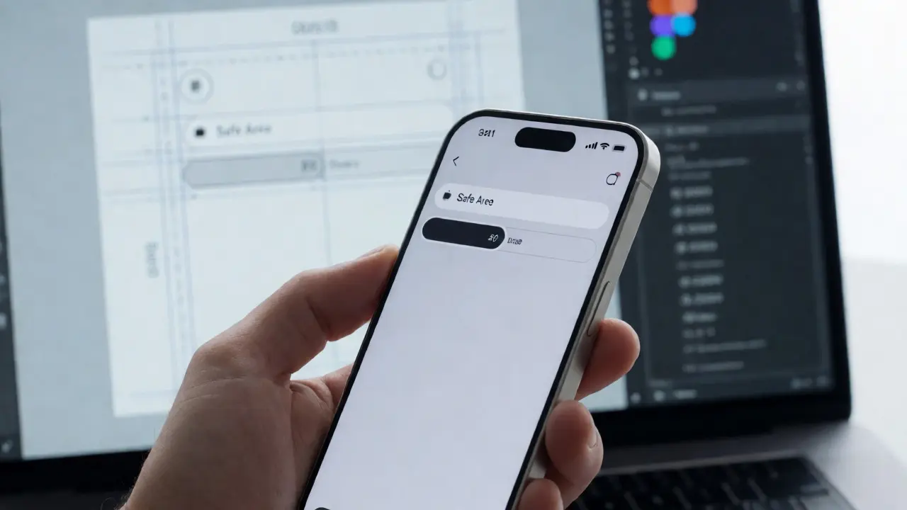
- Start with the Grid: Use Apple’s 8-point grid system. Aligning elements to multiples of 8 ensures optical balance and makes layouts responsive across different screen densities.
- Limit Your Palette: Stick to the system colors unless branding demands otherwise. Use semantic colors (success, warning, error) consistently across all screens.
- Test on Real Devices: Simulators lie. Touch targets vary in feel, and lighting conditions affect contrast perception. Test your hierarchy on a physical iPhone in both daylight and dim environments.
- Audit for Redundancy: If two elements compete for attention, remove one or demote it. Ask yourself: what is the single most important thing a user should do on this screen?
| Principle | Common Mistake | HIG-Compliant Approach |
|---|---|---|
| Hierarchy | Using bold text for everything | Reserving bold for headings and primary actions only |
| Harmony | Mixing custom fonts with system fonts | Using SF Pro throughout for uniform readability |
| Consistency | Changing button styles per screen | Maintaining identical component behavior across the app |
Why These Principles Matter in 2026
As interfaces become more immersive with spatial computing and mixed reality, the need for clarity increases. In AR/VR environments, poor hierarchy can cause motion sickness or disorientation. Apple’s HIG has evolved to include guidelines for depth cues and spatial anchoring, but the core tenets remain unchanged. Clarity beats complexity. Familiarity beats novelty. If a user can figure out your interface without reading a manual, you’ve succeeded.
Designers who master these three pillars create products that feel intuitive, reliable, and premium. They don’t just follow rules; they understand the psychology behind them. And that understanding is what separates good apps from great ones.
What is the main purpose of Apple's Human Interface Guidelines?
The HIG provides a set of best practices and standards for designing software on Apple platforms to ensure usability, accessibility, and a cohesive user experience across devices.
How does visual hierarchy improve user experience?
It guides the user’s attention to the most important elements first, reducing decision fatigue and helping users complete tasks faster by clearly indicating priority through size, color, and spacing.
Can I use custom fonts in my iOS app?
Yes, but it is recommended to use SF Pro for system-level consistency. If using custom fonts, ensure they match the weight and spacing characteristics of the system font to maintain harmony.
Why is consistency important in mobile design?
Consistency leverages user familiarity and muscle memory, allowing users to predict outcomes of their actions. This builds trust and reduces the learning curve for new features.
What role does whitespace play in the HIG?
Whitespace acts as a separator for grouping related items and isolating unrelated ones. It improves readability and prevents visual clutter, supporting effective visual hierarchy.