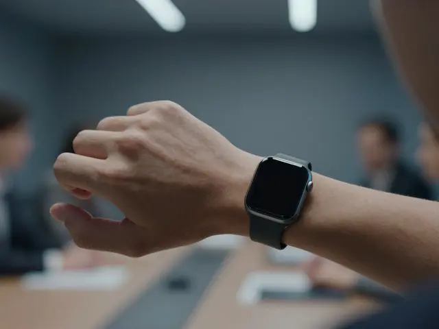

Ever tried to swipe left on your iPhone and accidentally triggered a notification instead of dismissing it? Or maybe you’ve struggled to pinch-zoom a photo without the screen jumping around. These aren’t just annoyances; they are friction points where Apple is a technology company that designs consumer electronics and software with a focus on intuitive user experience. Apple’s approach to gesture design is the practice of creating input methods based on physical movements like swipes, taps, and pinches isn’t accidental. It’s built on decades of research into how our hands naturally move. By aligning digital actions with our biological instincts, Apple reduces cognitive load and makes technology feel less like a machine and more like an extension of your body.
The Biological Basis of Digital Gestures
To understand why a swipe feels "right" or a tap feels "wrong," we have to look at ergonomics. The human hand is not designed for typing on glass; it’s designed for grasping, pulling, and pushing objects in the physical world. When Steve Jobs introduced the first iPhone in 2007, he didn’t just remove buttons; he removed the barrier between intent and action. The key here is motor memory, which is the brain's ability to store and recall muscle movements without conscious thought.
Apple leverages this by mapping high-frequency actions to low-effort movements. A simple tap requires minimal finger movement, making it ideal for selecting items. A swipe involves a linear trajectory, which mirrors how we physically push things aside. If you think about it, when you want to get rid of a piece of paper, you don’t press a button labeled "Delete." You toss it away. On an iPhone, swiping a notification to dismiss it mimics that exact physical motion. This alignment means your brain doesn’t need to translate a command; it just executes a habit.
Anatomy of Core Apple Gestures
Not all gestures are created equal. Some are primary drivers of interaction, while others are secondary refinements. Let’s break down the core set that defines the iOS and macOS experience.
- Tap: The most basic unit of interaction. It corresponds to pointing. In iOS, tapping opens apps or selects text. It’s fast, precise, and requires the least amount of hand stability.
- Swipe: Used for navigation (moving between pages) and dismissal (closing notifications). The direction matters. Swiping up usually reveals hidden content or brings up the home screen, mirroring the idea of lifting something up to see what’s underneath or behind it.
- Pinch-to-Zoom: Perhaps the most iconic gesture. Instead of using two thumbs to drag a slider, you use two fingers to mimic holding a physical object and spreading your hands apart to make it bigger. This spatial metaphor is incredibly powerful because it preserves context. You know exactly where you are in the image as you zoom.
- Long Press: Holding an item down triggers a context menu or allows dragging. Physically, holding something implies you intend to do more than just glance at it. It signals commitment to an action.
Cognitive Load and Muscle Memory
Why does consistency matter so much? Because every time a gesture behaves differently, your brain has to reset its prediction model. This increases cognitive load, which is the total amount of mental effort being used in working memory. Apple maintains strict consistency across its ecosystem. Swipe right to reply in Messages? Do the same in Mail. Swipe down to refresh in Safari? Do the same in Notes. This repetition builds strong neural pathways. After a few weeks of use, these actions become automatic. You stop thinking about "how" to send a message and start focusing on "what" you want to say.
This is where Fitts' Law comes into play. Fitts' Law predicts the time it takes to move to a target area based on the distance to and size of the target. Apple’s UI designers use this principle to place critical elements within easy reach of the thumb zone. On larger iPhones, the bottom corners of the screen are the most accessible areas for one-handed use. That’s why the Home Indicator bar sits at the very bottom-it’s the easiest place to initiate a swipe-up gesture without stretching your arm.
Hardware-Software Symbiosis
Gesture design doesn’t happen in a vacuum. It relies heavily on hardware capabilities. The success of Apple’s touch interfaces is tied directly to the precision of their displays and processors. High refresh rate screens, like those found in ProMotion models, reduce motion blur, making rapid swipes feel smoother and more responsive. If the screen lags even by a few milliseconds, the connection between your finger’s movement and the visual feedback breaks. That disconnect causes frustration and errors.
Additionally, haptic feedback plays a crucial role. When you long-press an icon on an iPhone, you feel a subtle vibration. This tactile cue confirms that the system has registered your intent before you even see the menu appear. It’s a form of sensory grounding, anchoring the digital action in physical reality. Without haptics, long presses can feel ambiguous. With them, the interaction feels solid and reliable.
Comparing Interaction Models
To appreciate Apple’s approach, it helps to compare it with other dominant paradigms. Here’s how different input methods stack up against each other in terms of efficiency and learning curve.
| Input Method | Primary Motion | Cognitive Effort | Learning Curve | Best For |
|---|---|---|---|---|
| Touch Gestures (Apple) | Direct manipulation | Low after habituation | Moderate initially, then steep drop-off | Mobile devices, tablets |
| Mouse/Trackpad | Pointer displacement | Medium (precise targeting) | High for novices, low for experts | Desktop productivity, detailed editing |
| Voice Commands | Articulation | Low (no hand movement) | Low | Hands-free scenarios, accessibility |
| Keyboard Shortcuts | Key combination | High (memorization required) | Steep | Power users, coding, data entry |
Notice how touch gestures sit in a sweet spot. They offer directness without the memorization burden of keyboard shortcuts. They are faster than voice commands for precise tasks but more intuitive than mouse-based pointer control for casual users. This balance is why mobile-first design has dominated recent years. As devices get smaller and more portable, the need for low-cognitive-load interactions grows.
Pitfalls and Common Missteps
Even with a strong foundation, gesture design can fail if developers ignore context. One common mistake is overloading a single gesture with too many functions. For example, if a double-tap could mean "like," "share," or "edit" depending on the app state, users will hesitate. Hesitation leads to missed inputs. The rule of thumb is: one gesture, one primary outcome per context.
Another pitfall is ignoring device size. A gesture that works perfectly on a small smartphone might be awkward on a large tablet. On an iPad, for instance, using a single-finger swipe for complex navigation can lead to accidental triggers. Apple addresses this by encouraging multi-touch gestures for less frequent actions on larger screens. Understanding the physical space available to the user is just as important as understanding the digital logic.
Future Directions in Natural Interaction
Where does this go next? The trend is moving toward even less explicit input. Eye tracking, already present in some Apple products for accessibility, hints at a future where gaze becomes a selection tool. Imagine looking at an email to open it, no tap required. While this raises privacy questions, it represents the ultimate reduction in motor effort. Similarly, advancements in LiDAR and spatial computing suggest that gestures in three-dimensional space will become more nuanced. We might soon be able to "grab" virtual objects with hand-tracking cameras, further blurring the line between physical and digital manipulation.
However, the core principle remains unchanged: match the input to the instinct. Whether it’s a finger on glass or a gaze in mid-air, the goal is to make the technology disappear, leaving only the task at hand.
Frequently Asked Questions
Why does swiping up on an iPhone bring up the home screen?
This gesture mimics the physical action of lifting a cover or revealing what is underneath. Since the home screen is the base layer of the OS, swiping up from the bottom edge acts as a universal "return to start" command. It places the action in the most accessible part of the device for one-handed use, aligning with ergonomic best practices for thumb reachability.
Is pinch-to-zoom better than using zoom buttons?
For most users, yes. Pinch-to-zoom provides continuous, proportional control. Buttons typically offer fixed increments (e.g., +10%, -10%), which can be imprecise. Pinching allows for micro-adjustments and maintains spatial context, meaning you always know where the center of your view is relative to the original image. This reduces the need for re-centering, saving time and cognitive effort.
How does haptic feedback improve gesture accuracy?
Haptics provide immediate confirmation that a gesture has been recognized. Without this feedback, users often doubt whether their input was registered, leading to repeated attempts or hesitation. A subtle vibration acts as a checkpoint, confirming success before the visual result appears. This creates a tighter loop between action and perception, making interactions feel snappier and more reliable.
What is the role of Fitts' Law in mobile UI design?
Fitts' Law states that the time to acquire a target is a function of its distance and size. In mobile design, this means placing frequently used controls closer to the thumb's natural resting position and making them larger. Apple uses this to ensure that essential gestures like swiping or tapping are initiated from zones that require minimal arm movement, reducing fatigue during prolonged use.
Can gesture design be applied to desktop computers?
Yes, particularly with trackpads. Apple’s Magic Trackpad supports multi-touch gestures like four-finger swipes for Mission Control or three-finger clicks for context menus. These gestures mirror touch-screen logic but adapt to the precision required for desktop work. The key is maintaining consistency so that users can transfer skills between mobile and desktop environments seamlessly.