
Imagine tapping a button on your iPhone that does nothing. No sound, no haptic feedback, just silence. For the 285 million people worldwide who have some form of visual impairment, this isn't a glitch-it's daily life unless the interface is built to speak back. VoiceOver is Apple’s built-in screen reader that converts visual information into audio descriptions for users with low vision or blindness. It doesn't just read text; it navigates the entire logical structure of an app. If you are designing for iOS or macOS, understanding how VoiceOver interprets your layout is the difference between an accessible product and one that excludes a massive demographic.
How VoiceOver Actually Works
Most designers assume screen readers simply scan pixels from top-left to bottom-right. That’s a dangerous misconception. VoiceOver uses a hierarchical tree of elements defined by the operating system. When a user swipes right, they aren’t moving across the screen spatially; they are moving through the logical order of content. This means if you place a "Buy" button visually above a price tag but code it after the description in the DOM, VoiceOver will read the description first, then the button. The user might tap the wrong element because their mental map doesn't match the visual map.
The engine behind this is UIKit and AppKit, which expose accessibility traits to the system. These traits tell VoiceOver what kind of element it is: is it a button? A static text label? An image? A slider? Without these explicit tags, VoiceOver guesses, and guesses are often wrong. For example, an interactive image without a trait might be treated as static text, meaning the user can hear its name but won’t know they can tap it to open a detail view.
The Hierarchy Trap: Why Visual Order Fails Audio Users
In visual design, we use grid systems, absolute positioning, and z-indexes to create complex layouts. In audio, there is only one dimension: time. You cannot see where the next item is; you can only hear it when it arrives. This creates a specific challenge known as the reading order trap.
Consider a typical e-commerce card. Visually, it has an image on the left, a title in the center, and a price on the right. If coded naively, VoiceOver might read: "Image, Title, Price." But what if the image is decorative? Now the user hears noise before the actual content. Or worse, if the price is dynamically injected via JavaScript *after* the initial render, VoiceOver might not announce the change unless you explicitly trigger an accessibility update. Users don't wait for updates; they swipe past. If the data isn't there when they arrive, it’s lost.
To fix this, you must flatten the hierarchy for the assistive technology. Combine related elements into single accessibility elements. Instead of three separate nodes (image, title, price), create one node that reads: "Product Name, $19.99, Add to Cart." This reduces cognitive load and ensures the user gets the complete context in one swipe.
Custom Controls vs. Native Components
The golden rule of Apple accessibility is: use native components whenever possible. UIButton, UILabel, and UISwitch come with pre-configured accessibility behaviors. They automatically announce state changes, handle focus, and provide standard gestures. When you build a custom control-say, a star rating widget using five individual images-you lose all that default behavior. You now have to manually implement:
- Accessibility Label: What the element is (e.g., "Star Rating").
- Accessibility Value: The current state (e.g., "4 out of 5 stars").
- Accessibility Traits: Is it adjustable? Is it a button?
- Gestures: How does the user increase or decrease the value? (Usually two-finger up/down swipes).
If you skip any of these, the control becomes invisible or unusable. A common mistake is making a custom progress bar visible to sighted users but completely silent to VoiceOver users. Always test custom controls with VoiceOver enabled. If you can’t describe the interaction in one sentence, it’s probably too complex for an audio-only interface.

Dynamic Type and Text Scaling
Accessibility isn't just about hearing; it's about seeing. Many VoiceOver users also have low vision and rely on large text. Apple’s Dynamic Type allows users to scale text size independently of the device’s base font size. If your design hard-codes font sizes in points (e.g., 14pt), you break this feature. Instead, use semantic text styles like `.body`, `.headline`, or `.caption`. These styles adjust automatically based on the user’s preference. If you ignore Dynamic Type, a user who sets their text to "Largest" will find your app unreadable, forcing them to zoom in manually-a frustrating workaround that defeats the purpose of accessibility.
Testing Beyond the Simulator
Xcode’s Accessibility Inspector is great for catching missing labels, but it doesn’t replace real-world testing. Here is a practical workflow:
- Enable VoiceOver: Triple-click the Home button (or side button) on a physical device. Do not rely on the simulator; latency and gesture handling differ significantly.
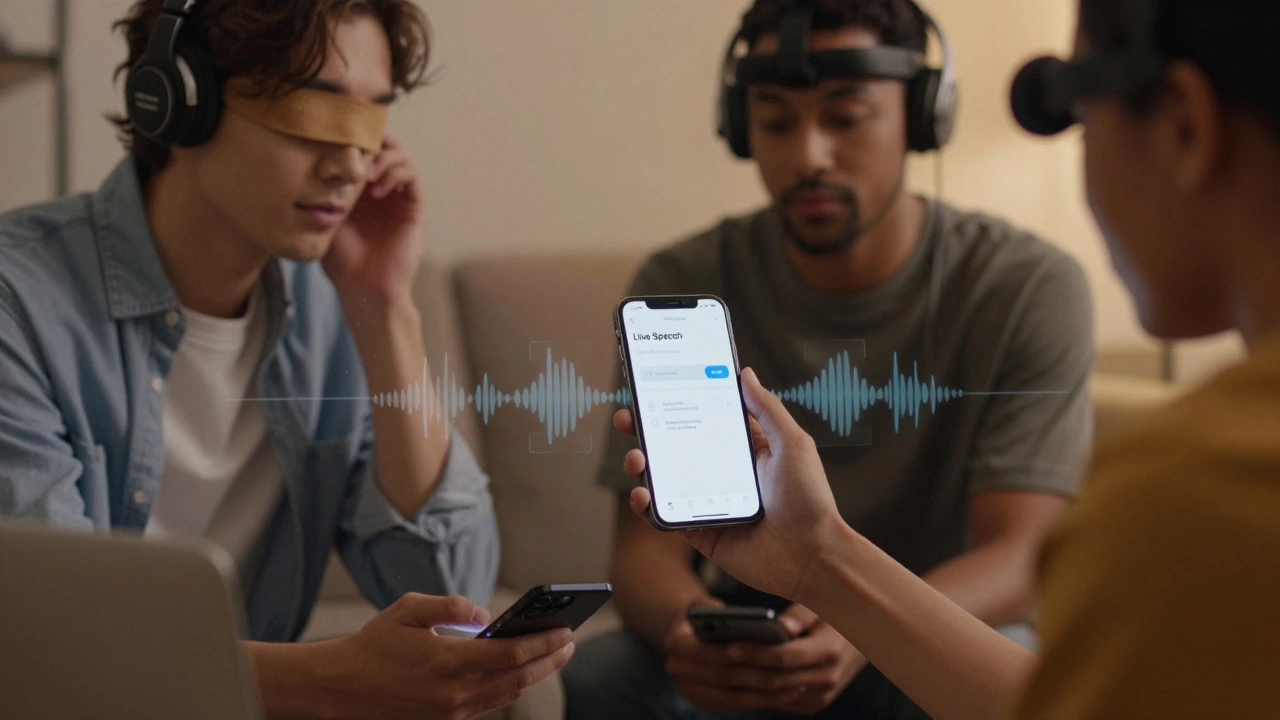
- Navigate Blindfolded: Put your phone face down. Can you still complete a core task, like adding an item to a cart? If you get stuck, your reading order or labels are broken.
- Check Announcements: Listen for clarity. Does "Button, Search" make sense? Or should it be "Search Button"? Context matters.

Common Pitfalls and Fixes
Even experienced teams stumble over these recurring issues:
| Issue | Why It Happens | Solution |
|---|---|---|
| Elements skipped during navigation | Decorative images or non-interactive views not marked as hidden | Set isAccessibilityElement = false or use accessibilityHidden(true) |
| Buttons read as generic "Button" | Missing accessibility label | Add descriptive label: accessibilityLabel = "Add to Cart" |
| State changes not announced | UI updates happen silently in background | Use UIAccessibility.post(notification: .screenChanged, ...) |
| Touch targets too small | Visual design prioritizes density over usability | Ensure minimum 44x44 point touch target area |
Designing for the Future: Spatial Audio and AR
As Apple pushes into augmented reality with ARKit, accessibility is evolving. Spatial audio can help orient blind users in 3D spaces. However, this requires new design patterns. Traditional 2D UI metaphors don’t translate directly to 3D. Designers must think about how objects are described in space relative to the user’s head position. While this is still emerging, the principle remains the same: provide clear, concise, and logically ordered information. Whether it’s a flat screen or a virtual room, the user needs to know what is there, what it does, and how to interact with it without visual cues.
Frequently Asked Questions
Does VoiceOver work with third-party apps?
Yes, but only if the developers have implemented accessibility support. Apps built with standard UIKit/AppKit components usually work well out of the box. Custom-built interfaces, especially those using game engines or web views, require additional effort to ensure full compatibility.
What is the difference between accessibilityLabel and accessibilityValue?
The label describes what the element is (e.g., "Volume Slider"). The value describes its current state (e.g., "75 percent"). Together, they provide full context. Using only one often leaves the user confused about either the function or the status of the control.
Can I test VoiceOver on the Xcode simulator?
Yes, via the Accessibility Inspector or by enabling VoiceOver in the simulator settings. However, always verify on a physical device. Gesture recognition, timing, and audio latency behave differently on real hardware, which can reveal bugs missed in simulation.
Do I need to hide decorative images from VoiceOver?
Yes. Decorative images add noise to the audio stream without providing useful information. Marking them as hidden prevents VoiceOver from stopping to read them, allowing users to navigate faster and more efficiently through meaningful content.
How do I handle dynamic content updates for VoiceOver users?
When content changes programmatically (like a loading spinner turning into a result), you must post an accessibility notification. Use UIAccessibility.post to alert the system that the UI has changed, ensuring the user hears the new state rather than stale information.