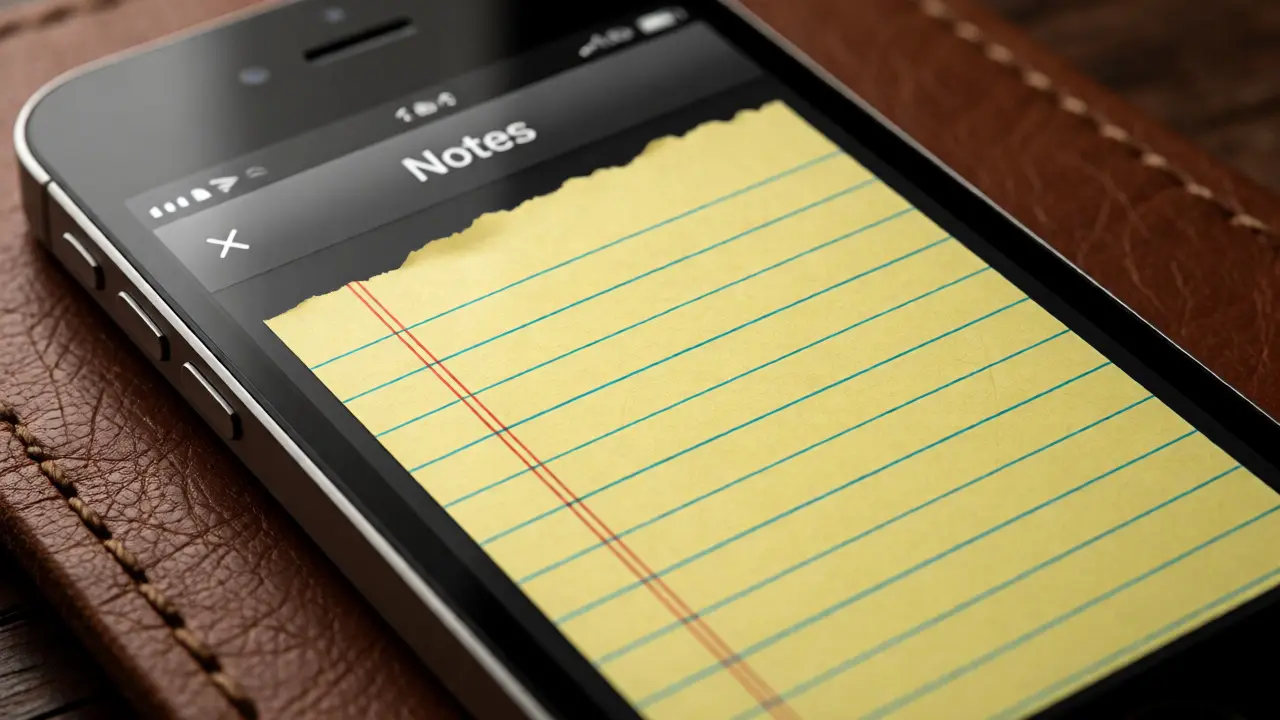

Remember the fake leather stitching on your Notes app? Or the green felt background of Game Center? If you used an iPhone before 2013, you definitely did. For years, Apple's interface was obsessed with making digital buttons look like physical objects. This style is called skeuomorphism, and it dominated early mobile design. Then, overnight, everything changed. The shadows vanished. The textures disappeared. The colors became bright, bold, and flat. This wasn't just a cosmetic update; it was a philosophical shift in how we interact with software.
The transition from iOS 6 to iOS 7 remains one of the most controversial and significant pivots in tech history. It sparked debates among designers, confused users, and ultimately set the standard for modern user interfaces. But why did Apple make such a drastic change? And what does it tell us about the maturity of digital design?
What Is Skeuomorphic Design?
To understand the revolution, you have to appreciate the regime it replaced. Skeuomorphism is a design concept where digital elements mimic their real-world counterparts. Think of a calculator app that looks exactly like a plastic Casio, or a calendar app that resembles a tear-off paper desk calendar. In the early days of smartphones, this approach served a critical purpose: familiarity.
When the first iPhone launched in 2007, touchscreens were new territory. Users didn't know how to swipe, pinch, or tap effectively. Skeuomorphic cues helped bridge the gap between the unknown digital world and the known physical one. A button looked pressable because it had a gradient and a shadow, just like a physical switch. A bookshelf icon made sense because books actually sit on shelves. It reduced cognitive load by leveraging existing mental models.
- Visual Cues: Gradients, drop shadows, bevels, and textures (wood, metal, paper).
- Functional Metaphors: Trash cans, folders, notebooks, and binders.
- User Trust: Realistic visuals reassured users that the interface behaved predictably.
However, as users grew more comfortable with touch gestures, these visual crutches started feeling cluttered. They took up screen space and distracted from the content itself. The medium no longer needed to pretend to be something else.
The Catalyst for Change: Jony Ive’s Influence
You can’t talk about this shift without mentioning Jony Ive. As Apple’s Chief Design Officer, Ive championed minimalism and clarity. He famously criticized skeuomorphism as "lazy" design that relied on nostalgia rather than innovation. His vision aligned with a broader industry trend toward Flat Design, which emphasized simplicity, readability, and hierarchy through typography and color rather than decoration.
By 2013, Android had already moved away from heavy textures. Windows Phone introduced its "Metro" design language, which was starkly geometric and clean. Apple risked looking outdated if it stuck with its textured roots. The decision to strip down iOS wasn't just aesthetic; it was competitive necessity. Ive wanted the software to feel lighter, faster, and more integrated with the hardware's capabilities.
iOS 7: The Big Reveal
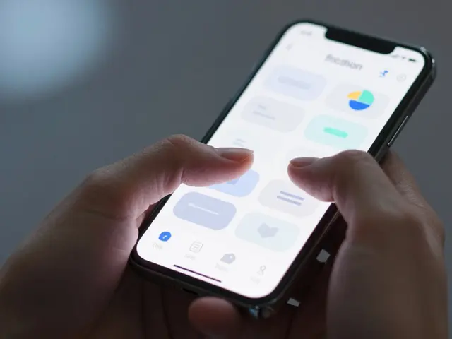
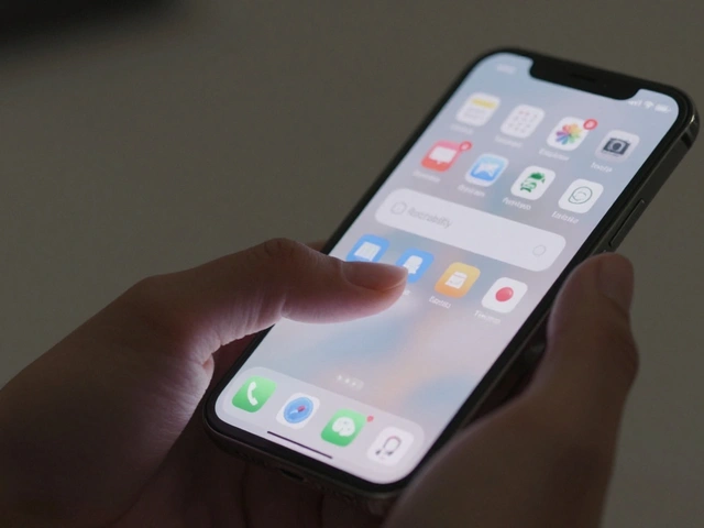
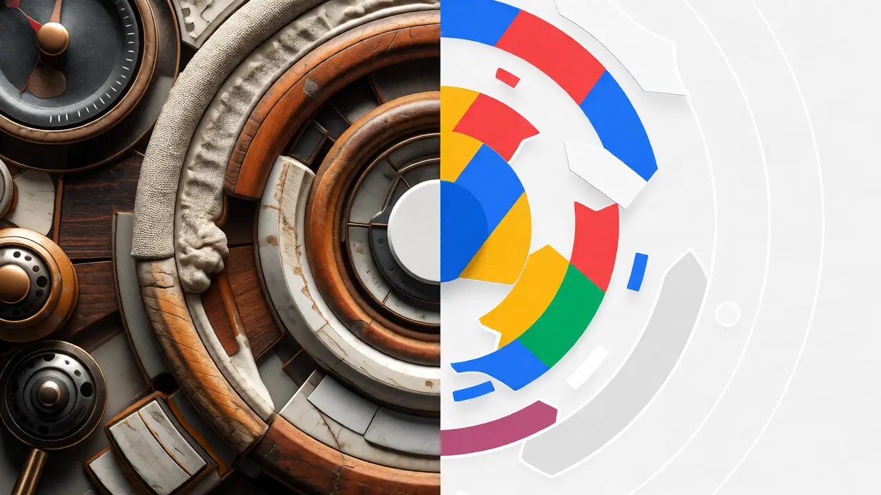
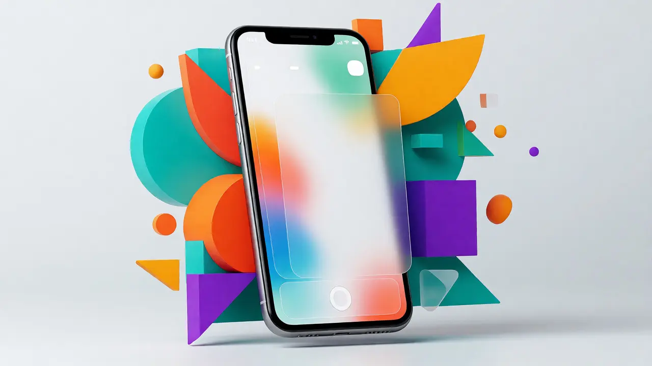
When iOS 7 debuted at WWDC 2013, the reaction was mixed. Some users loved the freshness; others felt lost. The interface removed almost every realistic texture. Buttons became simple circles or rounded rectangles with thin borders. Icons shifted from detailed illustrations to simplified glyphs using solid colors. Translucency became a key feature, allowing layers of the interface to blur together, creating depth without heavy shadows.
This move required a complete rethinking of information architecture. Without visual borders to separate sections, designers had to rely on whitespace and font weight to guide the eye. It was a risky bet. Could users still distinguish between interactive elements and static text? The answer, surprisingly, was yes. Once people adjusted, the cleaner interface allowed content to shine. Photos in the Photos app filled the entire screen. Text in Newsstand apps became easier to read against plain backgrounds.
| Element | iOS 6 (Skeuomorphic) | iOS 7 (Flat) |
|---|---|---|
| Backgrounds | Textured (linen, wood, paper) | Solid colors or subtle gradients |
| Buttons | Glossy, raised, 3D effect | Flat, bordered, minimal depth |
| Icons | Detailed, realistic illustrations | Geometric, simplified shapes |
| Typography | Helvetica Neue (standard) | Helvetica Neue Ultra Light (thin) |
| Navigation | Tab bars with icons and labels | Hidden navigation, edge swipes |
Why Flat Design Won
Flat design isn't just about removing shadows; it's about optimizing for performance and scalability. On smaller screens, high-resolution textures consume memory and processing power. By using vector-based shapes and solid colors, iOS 7 ran smoother on older devices. It also made localization easier. English words often fit better into simple boxes than complex graphical frames.
Moreover, flat design scales better across different devices. An icon designed for an iPhone 5 looks crisp on an iPad Pro or an Apple Watch. Skeuomorphic details often become muddy or illegible when resized. Simplicity ensures consistency. This principle has held true for over a decade, influencing not just Apple but Microsoft, Google, and countless web platforms.
The Legacy of the Shift
Today, we live in a hybrid era. Pure flat design evolved into "Material Design" on Android and "Neumorphism" experiments elsewhere. Apple itself reintroduced some depth in recent versions, like iOS 18, using subtle blurs and dynamic lighting effects. But they never returned to full skeuomorphism. The lesson learned is clear: form should follow function. Decorative elements are fine only if they enhance usability, not distract from it.
The journey from iOS 6 to iOS 7 teaches designers that trends cycle, but core principles endure. Clarity, speed, and focus on content remain paramount. While nostalgia might pull us back toward realistic textures occasionally, the efficiency of flat design keeps us moving forward.
What is the difference between skeuomorphism and flat design?
Skeuomorphism uses realistic textures and 3D effects to mimic physical objects, helping new users understand digital functions. Flat design removes decorative elements like shadows and gradients, focusing on simplicity, typography, and color to create a cleaner, more efficient interface.
Why did Apple remove skeuomorphism in iOS 7?
Apple removed skeuomorphism because users had become familiar with touchscreen gestures, making visual metaphors unnecessary. Additionally, flat design improved performance on older hardware, enhanced readability, and aligned with modern minimalist aesthetics promoted by designer Jony Ive.
Is skeuomorphism completely dead in modern design?
Not entirely. While dominant flat styles prevail, elements of skeuomorphism appear in gaming interfaces, music production software, and specific branding contexts where realism adds emotional value or intuitive affordance. However, mainstream OS interfaces rarely use heavy textures today.
How did users react to the iOS 7 redesign?
Initial reactions were polarized. Many long-time users found the new interface confusing and too sparse, missing the tactile feedback of previous versions. Over time, however, most adapted to the cleaner look, appreciating the increased focus on content and improved system responsiveness.
Did other companies follow Apple’s move to flat design?
Yes, the industry largely followed suit. Microsoft adopted Metro design earlier, and Google introduced Material Design in 2014, which combined flat aesthetics with subtle depth cues. Today, flat or semi-flat designs dominate web and mobile applications globally.