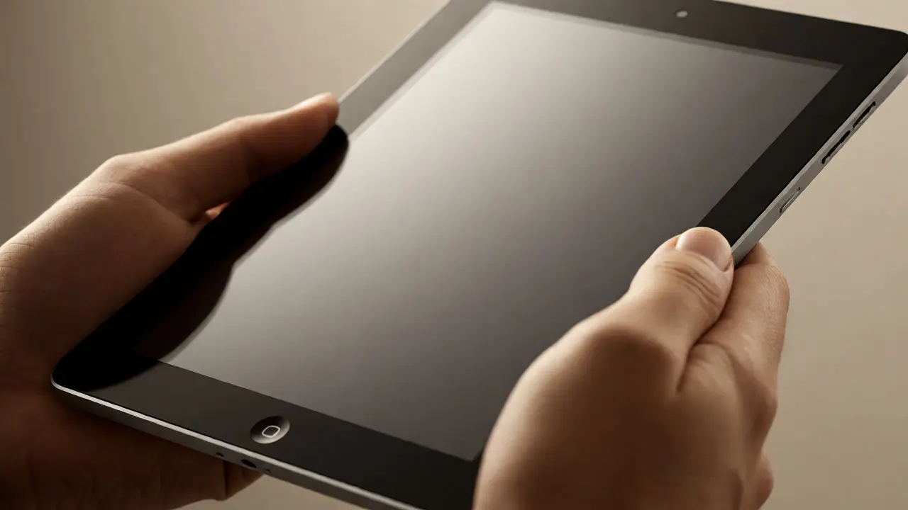

Remember the first time you held an iPad? It wasn't just a gadget; it was a revelation in how we interact with screens. But have you ever stopped to think about why that specific size felt so right? The original iPad launched in 2010 with a 9.7-inch display, and while Apple has since released everything from the tiny iPad mini to the massive iPad Pro, that initial dimension remains the ghost in the machine for tablet design today.
We often treat screen sizes as arbitrary marketing choices, but they are actually deeply rooted in human ergonomics and cognitive psychology. The 9.7-inch form factor wasn't picked out of a hat by Steve Jobs or his team at Apple. It was the result of rigorous testing on how humans hold devices, scan text, and manipulate objects. This article breaks down why that decade-old decision still dictates how we swipe, tap, and read on tablets everywhere, even if your current device is technically larger or smaller.
The Ergonomic Sweet Spot
Think about how you hold your phone versus a book. A phone is one-handed; a book usually requires two hands or a lap. The 9.7-inch tablet sits awkwardly between these two worlds, yet it solves a specific problem: it is large enough to be comfortable for two-handed use but light enough to be held up without arm fatigue for short periods. This balance is what designers call the "ergonomic sweet spot."
Human hands have fixed limitations. The average adult hand span-the distance from the tip of the thumb to the tip of the pinky when fully extended-is roughly 8 to 9 inches. When Apple designed the original iPad, they had to ensure the device could be gripped securely without obscuring too much of the screen. If the tablet were significantly wider, users would struggle to reach the center of the display with their thumbs while holding the edges. If it were narrower, it would lose the utility advantage over phones.
- Grip Stability: The width allows for a secure grip with both hands, reducing accidental touches.
- Thumb Reach: While not perfect for one-handed use, the dimensions allow for reachable zones in the lower corners.
- Weight Distribution: At approximately 1.5 pounds, the 9.7-inch model feels substantial but manageable.
This isn't just theory. Studies on human-computer interaction show that error rates increase significantly when touch targets move beyond natural thumb arcs. The 9.7-inch canvas provides just enough real estate to place key navigation elements within those arcs, making the interface feel intuitive rather than forced.
Cognitive Load and Content Consumption
Size affects how our brains process information. On a smartphone, you scroll vertically because the horizontal space is limited. You focus on one item at a time. On a desktop monitor, you might view multiple windows side-by-side, requiring high cognitive load to manage attention. The 9.7-inch tablet occupies a middle ground that reduces this cognitive friction.
Consider reading a PDF or an ebook. On a phone, you are constantly scrolling. On a laptop, you might have the document open alongside email and browser tabs, creating visual clutter. The 9.7-inch screen offers a full page view-roughly equivalent to a standard paperback or magazine spread-without the distraction of multitasking chrome. This encourages deep focus. It turns the device into a dedicated consumption tool rather than a productivity hub, which aligns with the original intent behind the tablet category.
Moreover, the aspect ratio associated with these early iPads (4:3) plays a crucial role. Unlike widescreen monitors optimized for video, the 4:3 ratio is better suited for documents and web pages. It minimizes wasted vertical space when browsing websites designed for traditional computer monitors. Even today, many apps default to layouts that look best on this ratio, proving that software development still lags behind hardware diversity in adapting to new shapes.

The Legacy of Multi-Touch Gestures
You probably take pinch-to-zoom for granted now. But before the iPad, multi-touch gestures were largely experimental or confined to niche devices like the Microsoft Surface table. The 9.7-inch screen was the first mainstream platform where these gestures made practical sense for everyday users.
Why? Because gesture recognition requires physical space. To perform a pinch, you need enough room for two fingers to move independently without hitting the edge of the screen. On a 4-inch phone, pinching is possible but cramped. On a 9.7-inch tablet, there is ample room for complex gestures like three-finger swipes to switch apps or four-finger swipes to go home. These interactions defined the modern mobile experience.
| Feature | Smartphone (approx. 6") | Classic Tablet (9.7") | Laptop/Desktop (13"+) |
|---|---|---|---|
| Primary Input | One-hand thumb | Two-hand / Lap | Keyboard / Mouse |
| Gesture Space | Limited | Optimal for Multi-touch | Mouse Cursor |
| Content View | Single Column | Full Page / Split View | Multiple Windows |
| Cognitive Load | Low (Sequential) | Moderate (Focused) | High (Multitasking) |
The iPad didn't invent the touchscreen, but it standardized the vocabulary of touch. Every Android tablet, every Windows hybrid, and even some smart TVs now mimic the swipe, tap, and pinch patterns established on that 9.7-inch glass. We are still using the mental model created in 2010.
Software Design Constraints
Hardware dictates software. Developers build apps based on the most common screen sizes. For years, the 9.7-inch iPad was the benchmark for tablet app design. This created a feedback loop: apps were designed to fit the 9.7-inch grid, which reinforced the popularity of that size, which kept developers targeting it.
Even though Apple introduced the 12.9-inch iPad Pro in 2015, many core iOS interfaces haven't fundamentally changed. The icons, buttons, and menus are still sized for a hand interacting with a 9-10 inch surface. If you use an iPad Pro, you might notice that the UI elements don't scale up proportionally. They stay the same size, leaving more white space. Why? Because increasing button size would break muscle memory and make the interface feel clumsy. The underlying logic remains tethered to the original ergonomic constraints.
This is evident in how split-screen multitasking works. On a 9.7-inch screen, splitting the view gives you two narrow columns, each roughly the width of a phone. It works because the content reflows gracefully. On larger screens, developers have struggled to create equally elegant solutions for three-column layouts, suggesting that the 9.7-inch paradigm is still the safest bet for consistent user experience.

Market Impact and Competitor Imitation
When the iPad launched, competitors rushed to copy it. Samsung, Amazon, and Microsoft all released tablets in the 7-inch to 10-inch range. Why didn't they push for 15-inch tablets immediately? Because they understood that the magic lay in portability combined with readability. The 9.7-inch size became the de facto standard for "tablet" classification.
Amazon's Kindle Fire series started at 7 inches to compete on price, but their flagship tablets eventually moved toward 10 inches to match the iPad's usability. Microsoft's Surface line tried to bridge the gap between laptop and tablet, but the pure tablet experience remained anchored around the 10-inch mark. This industry-wide convergence proves that the 9.7-inch origin wasn't just an Apple quirk; it was a discovery of a universal human preference.
Today, when you buy a generic Android tablet, it likely measures close to 10 inches. The bezels may be thinner, and the resolution higher, but the fundamental interaction model-holding it with two hands, tapping with thumbs, scrolling with fingers-remains unchanged. We are still living in the house that the 9.7-inch iPad built.
The Future: Will Bigger Screens Change Everything?
With the rise of foldable phones and ultra-large tablets, are we moving away from this model? Foldables try to solve the size issue by offering a phone-sized device that unfolds into a small tablet. However, early adopters report that the crease and the thickness disrupt the seamless touch experience that flat glass provided.
Meanwhile, Apple continues to refine the 12.9-inch iPad Pro, adding features like Stage Manager to enable true multitasking. Yet, sales data consistently shows that the base-model iPads, which hover around the 10-11 inch range, remain the volume sellers. People want the simplicity of the original vision. They want a device that doesn't require a keyboard to be useful.
The 9.7-inch legacy persists because it solved a fundamental problem: how to make computing personal and portable without sacrificing comfort. Until we find a new way to interact with digital information-perhaps through voice, eye-tracking, or augmented reality-that ergonomic baseline will continue to influence design. The next big shift won't just be about pixels per inch; it will be about whether we can decouple interaction from physical screen size entirely.
Why did Apple choose 9.7 inches specifically?
Apple chose 9.7 inches because it offered the best balance between portability and readability. It was large enough to display full-page documents and support comfortable two-handed usage, but small and light enough to be held easily. This size aligned with human ergonomic limits for thumb reach and grip stability.
Do larger iPads change how we use them?
Larger iPads like the iPad Pro encourage more multitasking and professional workflows, such as drawing or video editing. However, the basic touch gestures and interface elements often remain sized for the original ergonomic standards, meaning the core interaction model hasn't drastically changed despite the increased screen real estate.
Is the 9.7-inch size still relevant today?
Yes, indirectly. Most modern "standard" tablets range from 10 to 11 inches, which is very close to the original 9.7-inch form factor. The design principles established then-such as optimal thumb reach and readable font sizes-are still applied to these devices, ensuring they remain comfortable for general consumers.
How does screen size affect battery life?
Larger screens generally consume more power because they have more pixels to illuminate. However, manufacturers compensate by including larger batteries in bigger devices. The 9.7-inch iPad set a precedent for balancing screen brightness and resolution against battery efficiency, a trade-off that continues to define tablet engineering.
Did other companies copy the iPad's size?
Yes, many competitors adopted similar dimensions. Companies like Samsung and Amazon released tablets in the 7 to 10-inch range to compete directly with the iPad. This widespread adoption cemented the ~10-inch tablet as the industry standard for consumer media consumption.

Categories
Popular Articles