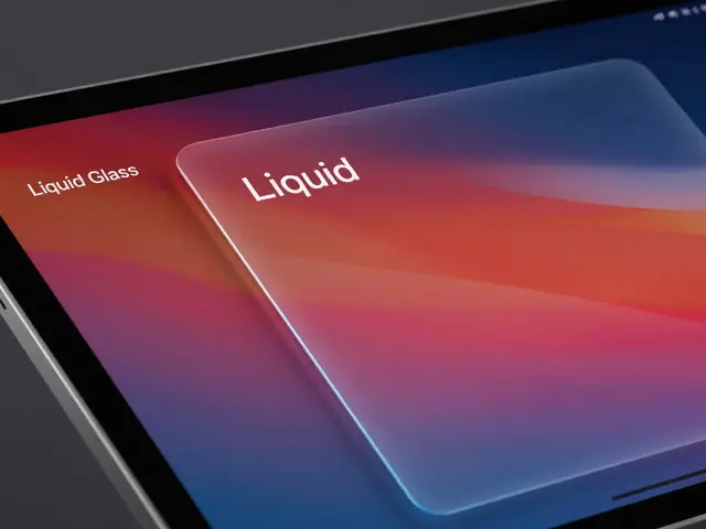

You know that feeling when you’re deep in a workflow on your iPad, and suddenly the background disappears? It’s disorienting. You lose track of where you came from because the context just... vanished. That’s exactly what Apple’s "Liquid Glass" design language aims to fix. This isn’t just about making things look pretty or shiny. It’s a functional shift in how we handle depth and hierarchy on tablets. By using refractive sidebars that mimic physical glass, designers are creating interfaces that keep users anchored, even as they navigate complex layers of content.
If you’ve been following the evolution of iOS and iPadOS, you might remember the heavy skeuomorphism of the early days, followed by the flat minimalism of the last decade. Now, we’re seeing a hybrid approach. Liquid Glass is the term often used to describe this new aesthetic-a blend of transparency, blur, and subtle refraction that suggests materiality without cluttering the screen with fake textures. But why does this matter for usability? Because human brains are wired to understand physical space. When an element looks like it has thickness and optical properties, our minds instantly grasp its relationship to other elements. It’s not magic; it’s cognitive ease.
The Psychology Behind Refractive Interfaces
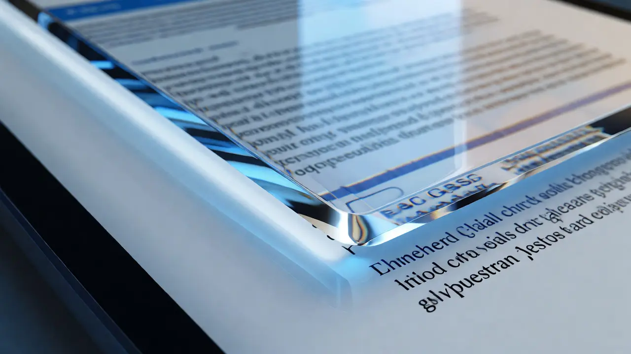
Let’s talk about why this works. In traditional flat design, everything sits on the same plane. To show hierarchy, designers use shadows or color changes. These are abstract metaphors. You have to learn them. With Refractive Sidebars that distort the content behind them based on distance and angle, the metaphor is direct. If something is closer to your eye, it should look different than something far away. That’s physics. When you scroll through a document and the sidebar floats above it, bending the light of the text underneath, your brain doesn’t need to interpret a shadow. It just knows: "This is on top."
This reduces cognitive load significantly. Think about trying to find a specific paragraph in a long PDF while a navigation menu overlays it. If the menu is opaque, you block information. If it’s fully transparent, it’s hard to read the menu text against the busy background. A refractive layer solves both. It blurs the background enough to make the foreground legible but keeps enough visual noise to remind you that the content is still there. It’s a balance between visibility and awareness.
Anatomy of a Liquid Glass Sidebar
So, what actually goes into building one of these interfaces? It’s not just setting opacity to 50%. There are three critical components that make a sidebar feel "liquid" rather than just "faded." First, there’s the Blur Radius. This determines how much detail from the background bleeds through. Too little blur, and the sidebar looks messy. Too much, and you lose context entirely. The sweet spot usually involves a dynamic blur that increases slightly as the user interacts with the sidebar, suggesting focus.
Second, consider the Specular Highlights. These are the bright edges along the border of the glass element. They simulate light hitting the edge of a physical object. Without them, the sidebar can look like a floating sticker. With them, it feels solid. Finally, there’s the Refraction Index, which controls how much the background image appears to bend or warp near the edges of the sidebar. This is subtle-often less than 1% distortion-but it’s what gives the illusion of real glass thickness.
| Feature | Flat/Opaque | Standard Transparent | Liquid Glass (Refractive) |
|---|---|---|---|
| Cognitive Load | High (blocks context) | Medium (hard to read) | Low (natural depth cues) |
| Visual Clutter | Low | High | Medium |
| Orientational Awareness | Poor | Moderate | Excellent |
| Performance Cost | Negligible | Low | Moderate (GPU intensive) |
Implementation Tips for Designers
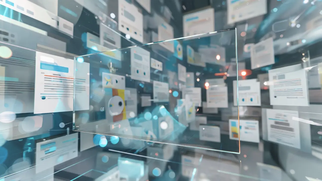
If you’re designing for iPad, you need to respect the hardware. iPads have powerful GPUs, but they also have high-resolution screens. Rendering real-time refraction can be expensive if you aren’t careful. Here’s a rule of thumb: don’t apply liquid effects to every single element. Use them strategically for persistent navigation elements, like the sidebar or tab bars. Let the main content area remain crisp and clear. Mixing too many glass effects creates a "muddy" look where nothing stands out.
Also, pay attention to contrast ratios. Even with a blurred background, your text needs to meet accessibility standards. WCAG guidelines suggest a 4.5:1 contrast ratio for normal text. With a dynamic background, this can fluctuate. One trick is to add a very subtle dark overlay (around 10-15% opacity) beneath the glass effect. This stabilizes the contrast without killing the transparency. Test this in both Light Mode and Dark Mode. In Dark Mode, liquid glass can sometimes disappear against black backgrounds unless you boost the specular highlights.
Common Pitfalls to Avoid
I’ve seen a lot of prototypes fail because designers treat liquid glass as a decorative afterthought. Here are the most common mistakes:
- Ignoring Motion Physics: If the sidebar slides in, the refraction shouldn’t just appear. It should animate smoothly. If the background jumps abruptly while the sidebar glides, it breaks the immersion. Sync the easing curves.
- Over-Burring: Remember, the goal is orientation, not obscurity. If you can’t tell what app you’re looking at through the sidebar, you’ve gone too far. The background should be recognizable, just not readable.
- Static Lighting: Real glass reacts to light. If your app supports multiple themes or orientations, adjust the highlight position accordingly. A static highlight on a rotating device looks fake.
Another trap is ignoring performance on older iPads. While newer models handle these effects effortlessly, older devices might stutter. Always profile your animations. If the frame rate drops below 60fps during transitions, simplify the shader complexity. Sometimes, dropping the refraction index to zero and relying solely on blur is a better trade-off for smoothness.
Why Orientation Matters More Than Ever
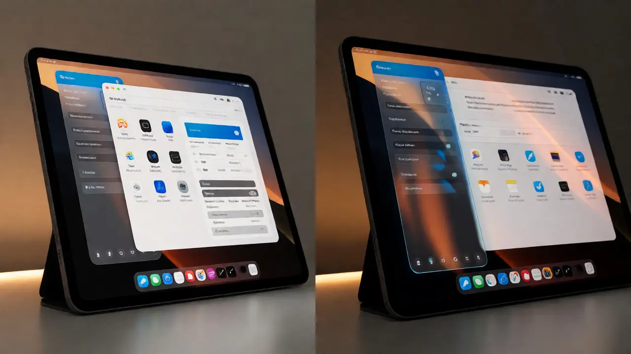
In desktop environments, we have window borders and taskbars to keep us grounded. On mobile, we rely on gestures. But on iPad, especially with Stage Manager or multitasking features enabled, the concept of "where am I?" becomes tricky. Are you in the Notes app or the browser? Is this window active or inactive?
Refractive sidebars act as a constant anchor. Because they subtly reflect the state of the underlying content, they provide continuous feedback. If you switch apps, the sidebar’s appearance might change slightly to indicate focus loss. This micro-feedback loop helps prevent errors, like typing into the wrong field or closing the wrong window. It’s about maintaining a mental map of your digital workspace.
This approach aligns with broader trends in spatial computing. As we move toward more immersive interfaces, understanding depth will become essential. Practicing with liquid glass on 2D screens now prepares users-and designers-for the 3D interfaces of tomorrow. It trains the eye to interpret transparency and depth as functional signals, not just artistic choices.
Frequently Asked Questions
Does liquid glass drain battery life on iPad?
It can, but minimally. The GPU handles the blur and refraction calculations, which are efficient on modern Apple Silicon chips. However, constantly animating large areas of the screen with complex shaders does consume more power than static opaque elements. For most users, the impact is negligible, but developers should optimize animation durations to conserve energy.
Is liquid glass accessible for visually impaired users?
Yes, if implemented correctly. Screen readers ignore visual styles, so VoiceOver functionality remains intact. Visually, ensuring sufficient contrast between the sidebar text and the blurred background is key. Designers should also respect the "Reduce Transparency" accessibility setting in iOS, which swaps the glass effect for a solid color to improve readability for those who struggle with low contrast.
Can I use liquid glass in web apps running on iPad Safari?
Absolutely. CSS backdrop-filter allows you to create similar effects in web browsers. Properties like 'backdrop-filter: blur(10px)' combined with semi-transparent backgrounds can mimic the look. However, performance may vary compared to native SwiftUI implementations, so test thoroughly on different iPad generations.
How do I decide between a sidebar and a bottom bar?
Use sidebars for hierarchical navigation where context matters, like file browsers or settings. Use bottom bars for primary actions like posting or saving. Liquid glass works best on sidebars because they often overlap content temporarily, requiring that contextual hint. Bottom bars usually sit outside the main content flow, so they benefit less from refractive effects.
What tools are best for prototyping liquid glass effects?
Figma and Sketch have plugins that simulate blur and transparency well for static mockups. For interactive prototypes that truly show motion and refraction changes, use Protopie or Framer. These tools allow you to link variables to background images, letting you see how the glass reacts to scrolling in real time.