
You’ve probably heard the phrase "less is more" a thousand times. But for Steve Jobs, it wasn’t just a catchy slogan-it was a ruthless filter that killed half the features on every product he touched. He didn’t just want things to look good; he wanted them to disappear into the user’s life. This article breaks down how Jobs turned aesthetic minimalism into a billion-dollar business strategy, showing you exactly how elegance became his most powerful competitive weapon.
The Core Philosophy: Simplicity as a Business Constraint
Most people think simplicity means removing clutter. Jobs knew better. For him, simplicity was about conquering complexity. It required more effort than adding features because you had to understand the essence of the problem so deeply that you could strip away everything else. When Jobs returned to Apple in 1997, the company was drowning in dozens of confusing product lines. He famously drew a simple 2x2 grid on a whiteboard: Consumer vs. Pro, Desktop vs. Portable. That was it. Four products. Everything else got cut. This wasn’t just editing; it was strategic focus. By reducing choices, Apple reduced cognitive load for customers and streamlined its own supply chain. The lesson? If you can’t explain your product’s value in one sentence, you’re not done designing it yet.
Industrial Design Meets Software Harmony
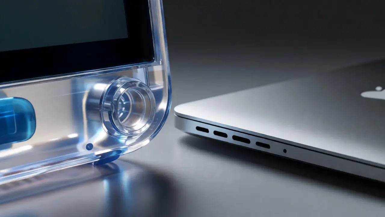
Before Jobs, hardware and software were often treated as separate silos. Engineers built the box; designers made it pretty. Jobs smashed that wall. He insisted that the physical form and the digital interface speak the same language. Take the iMac G3. Its translucent Bondi Blue plastic wasn’t just a fun color choice; it signaled transparency and approachability, breaking the beige monotony of 1990s PCs. But the real magic happened when this hardware philosophy met the Aqua interface on Mac OS X. The glossy buttons, shadows, and rounded corners mirrored the physical curves of the iMac and later the iPod. This consistency created a seamless experience where the device felt like an extension of your hand rather than a tool you had to operate. When hardware and software align, users don’t notice the technology-they notice the result.
| Feature | Pre-1997 Apple | Jobs Era (Post-1997) |
|---|---|---|
| Product Line | Dozens of SKUs with overlapping functions | Four core products (Consumer/Pro x Desktop/Portable) |
| Design Focus | Engineering-led, feature-heavy | Design-led, experience-focused |
| User Interface | Inconsistent across models | Unified ecosystem (Hardware + Software harmony) |
| Packaging | Functional, cardboard boxes | Ritualistic, unboxing experience as part of design |
The Power of Saying No
Here’s the hard truth: Innovation isn’t about saying yes to new ideas. It’s about saying no to a thousand good ones. Jobs spent hours in meetings doing nothing but rejecting proposals. Why? Because every feature added creates maintenance debt, visual noise, and potential points of failure. Remember the original iPhone? Critics laughed at the lack of a physical keyboard and stylus. They called it a toy. But by removing the keyboard, Jobs freed up the entire screen for context-aware interfaces. He bet that multi-touch would be more intuitive than any button layout. This gamble paid off because the simplicity allowed the software to evolve without being shackled by fixed hardware keys. Every time you swipe instead of click, you’re benefiting from that initial "no."
Materiality and the Tactile Experience
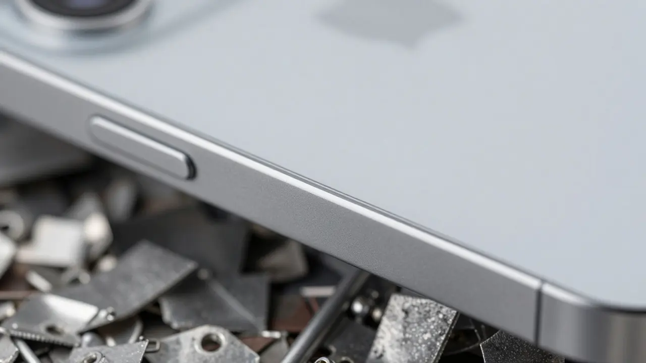
Jobs understood that humans are tactile creatures. We judge quality by touch before we even turn a device on. Under his leadership, Apple shifted from cheap plastics to premium materials like brushed aluminum, glass, and ceramic. The MacBook Air launch is a perfect example. Jobs pulled it out of a manila envelope to prove how thin it was. The cold weight of the aluminum chassis communicated durability and precision instantly. This focus on materiality wasn’t vanity; it was trust-building. When a product feels solid, users assume the software inside is equally robust. Designers today often forget this. They obsess over pixels but ignore the haptic feedback or the sound a laptop hinge makes. Jobs knew that these sensory details create emotional connections that specs alone cannot.

Applying Jobs’ Strategy to Modern Teams
You don’t need to be a tech giant to use this playbook. Start by auditing your current projects against three questions. First, does every element serve a clear purpose? If a button doesn’t help the user achieve their primary goal, delete it. Second, is there friction between your interface and your brand voice? Your UI should feel like your brand, whether that’s playful, serious, or luxurious. Third, have you defined what you are *not* going to do? Write down your exclusions. A team that knows its boundaries moves faster because they stop debating irrelevant features. In Portland, many small studios I know have adopted a "one-feature-per-release" rule inspired by this mindset. It forces them to prioritize impact over volume.
Common Pitfalls in Pursuing Simplicity
Simplicity can go wrong if you mistake emptiness for clarity. Just because a page has lots of whitespace doesn’t mean it’s easy to use. If users can’t find the call-to-action, you’ve designed a maze, not a path. Another trap is oversimplifying complex tasks. Not every process can be reduced to two clicks. Sometimes, hiding advanced options behind a "More Settings" toggle is better than forcing beginners to navigate a simplified menu that lacks necessary depth. Jobs solved this by offering tiered complexity-simple defaults for novices, deep customization for pros-but always within a unified visual framework. Don’t dumb down your product; streamline its presentation.
Did Steve Jobs actually design the products himself?
No, Jobs did not draw sketches or code software. His role was that of a curator and strategist. He worked closely with lead designer Jony Ive and other engineers, providing high-level direction and brutal feedback. He identified problems and demanded solutions, acting as the ultimate gatekeeper for user experience rather than the hands-on creator.
How did simplicity affect Apple's marketing costs?
It significantly lowered them. Simple products are easier to explain. Marketing campaigns could focus on a single benefit or emotion rather than listing technical specifications. This clarity led to higher conversion rates and stronger brand recall, allowing Apple to spend less per customer acquisition compared to competitors who had to educate consumers on complex feature sets.
Is minimalist design always better for usability?
Not always. Minimalism works best when it reduces cognitive load without hiding essential functionality. For data-dense applications like financial dashboards or professional video editors, too much minimalism can hinder efficiency by requiring extra clicks to access tools. The key is progressive disclosure: show only what is needed now, but keep power accessible for those who need it.
What was Jobs' biggest design failure?
Many cite the Apple Pippin console or the early Newton MessagePad handwriting recognition issues. However, his biggest strategic misstep might have been resisting larger screens for years due to a belief in one-handed usability. The market eventually demanded phablets, forcing Apple to adapt its rigid design philosophy to meet consumer preferences.
How can startups apply Jobs' design vision today?
Startups should focus on solving one problem exceptionally well rather than building a platform that does ten things poorly. Invest in packaging and first impressions, as these signal quality. Establish a strong design culture early where engineers and designers collaborate daily, not just at project handoffs. Finally, be willing to kill features that don't align with your core value proposition, even if they seem useful.