
Imagine you are using your favorite app, and suddenly the buttons look different. The icons change shape. The way you navigate feels slightly off. For a split second, you hesitate. That hesitation is friction. It breaks the flow. In Ecosystem Design is the strategic practice of creating a unified visual and functional identity across multiple products and platforms to ensure seamless user experiences. When this cohesion slips, users don't just notice; they lose trust. But here is the catch: static design is dead. If you never change, you stagnate. The real challenge isn't avoiding change-it's managing it so that evolution feels like progress, not confusion.
We often treat design systems as rigid rulebooks. "Don't touch the primary color." "Only use these five font sizes." While structure is good, rigidity kills innovation. The goal is long-term cohesion. This means building a design language that can breathe, adapt, and grow without losing its core identity. Think of it like a family resemblance. Your children might have different hairstyles or clothes than you, but you still know who they are at a glance. That is the standard we aim for in digital products.
The Core Principles of Visual Consistency
Before you can evolve, you need a baseline. What makes your design recognizable? It’s not just the logo. It’s the underlying grammar of your interface. This includes spacing, typography hierarchy, and interaction patterns. When we talk about Visual Consistency is the uniform application of design elements such as colors, shapes, and layouts across all touchpoints to create a predictable user environment, we are talking about reducing cognitive load. Users shouldn't have to relearn how to use your product every time there is an update.
To achieve this, you need to define non-negotiables versus flexible zones. Non-negotiables are the DNA of your brand. Perhaps your primary action button is always blue and rounded. Flexible zones are where you can experiment. Maybe you can try new icon styles or adjust card shadows. By clearly marking these boundaries in your design system, teams can innovate without breaking the pattern. This distinction prevents the "chaos of creativity" where every designer does their own thing, leading to a fragmented experience.
- Typography: Keep the font family constant. Change weights or sizes sparingly.
- Color Palette: Maintain core brand colors. Introduce accent colors for specific contexts only.
- Spacing Grid: Stick to a consistent modular scale (e.g., 4px or 8px increments).
- Iconography: Use a single style guide (line weight, corner radius) for all icons.
Strategies for Gradual Evolution
So, how do you actually make changes without scaring users away? The answer lies in gradualism. Sudden overhauls, often called "rebrands," carry high risk. Instead, adopt a strategy of iterative refinement. You introduce small changes over several release cycles. Each change should be justified by a clear user benefit or technical necessity. For example, if you move from flat design to subtle depth, do it component by component. Start with cards, then buttons, then modals. Users will adapt naturally because each individual change is minor, but the cumulative effect is a modernized feel.
This approach relies heavily on Iterative Design is a process of prototyping, testing, analyzing, and refining a design based on user feedback to improve usability and satisfaction. You aren't guessing what works; you are validating it. If you change the navigation menu, watch how users interact with it. Do they get lost? Do they click the wrong place? Data tells you if the evolution is working. If metrics drop, you tweak the change before rolling it out further. This keeps the risk low and the learning curve shallow for your audience.
- Audit Current State: Document every existing pattern and identify inconsistencies.
- Define Evolution Goals: What specific problem are you solving? (e.g., improving accessibility, updating mobile responsiveness).
- Pilot Changes: Test new elements with a small segment of users (A/B testing).
- Roll Out Gradually: Deploy successful changes to the full user base in phases.
- Monitor Feedback: Track support tickets and usage analytics for signs of confusion.
The Role of Component Libraries
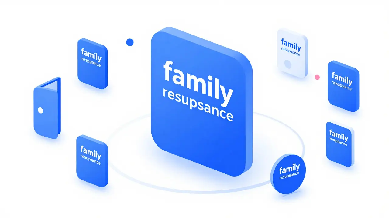
You cannot manage cohesion manually across dozens of screens. You need infrastructure. A robust Component Library is a collection of reusable UI elements such as buttons, inputs, and modals that serve as the building blocks for digital interfaces acts as the single source of truth. When you update a button style in the library, it propagates to every instance of that button across your entire product suite. This ensures that even as you evolve the design, the implementation remains consistent.
However, a component library is more than just code snippets. It needs documentation. Developers and designers must understand *why* a component exists and *how* it should be used. If a developer bypasses the library to build a custom button because they didn't like the default one, you break cohesion. Therefore, governance matters. Establish clear rules for when to use standard components versus when to create new ones. New components should only be added if no existing one fits the need, and they must follow the established design language strictly. This discipline is what allows large teams to work independently while producing a unified result.

Managing Cognitive Load During Transitions
Even with gradual changes, users face a period of transition. This is where Cognitive Load is the total amount of mental effort being used in the working memory, which affects how easily users can learn and use an interface becomes critical. When an interface changes, users must unlearn old habits and learn new ones. To minimize this burden, maintain familiar landmarks. If your search bar was top-left, keep it there. If your profile icon was top-right, keep it there. Move secondary elements first. Let users master the core navigation before you touch the advanced features.
Also, communicate the changes. Don't let users discover the evolution on their own. Use in-app tours, tooltips, or release notes to explain *why* something changed. "We moved settings to the bottom tab to make them easier to reach with one thumb." This context turns confusion into understanding. Users appreciate when changes solve a problem they had. If the change feels arbitrary, they will resist it. If it feels helpful, they will welcome it. Transparency builds goodwill during the transition period.
Measuring Success in Long-Term Cohesion
How do you know if your evolving design language is working? You can't just rely on gut feeling. You need metrics. Look at task completion rates. Are users finishing key actions faster after the update? Check error rates. Are they clicking fewer wrong buttons? Monitor support ticket volume. If confusion spikes, you'll see it in the questions asked. Additionally, conduct periodic surveys asking users about their comfort level with the interface. Do they feel it looks professional? Do they find it easy to use? These qualitative insights complement the quantitative data.
Success in ecosystem design isn't about perfecting a single version. It's about maintaining a healthy trajectory. The design should feel alive, responsive to user needs, and technically sound. It should reflect the current state of technology and user expectations without alienating the existing user base. By balancing stability with innovation, you create a product that feels both familiar and fresh. That balance is hard to achieve, but it is the hallmark of mature, well-designed ecosystems.
How often should a design language be updated?
There is no fixed schedule, but most successful ecosystems update minor elements quarterly and major structural elements annually. The frequency should align with your product release cycle and user feedback loops rather than a calendar date.
What is the biggest risk of evolving a design system too quickly?
The primary risk is increased cognitive load, leading to user frustration and decreased task efficiency. If changes outpace user adaptation, trust erodes, and churn may increase due to perceived instability.
Can small teams afford complex ecosystem design strategies?
Yes, but they must simplify the scope. Focus on core components and strict guidelines for those few elements. Small teams benefit even more from consistency because they lack the resources to fix fragmentation caused by ad-hoc design decisions.
How do you handle legacy components that don't fit the new design?
Create a deprecation timeline. Mark legacy components as 'deprecated' in your library, encourage migration to new equivalents, and remove them only after confirming no active usage. This prevents immediate breakage while pushing toward cohesion.
Does brand identity change affect design language evolution?
Yes, significantly. If the brand voice shifts from playful to professional, the design language must mirror that. Typography, color saturation, and illustration styles should all align with the new brand direction to maintain semantic coherence.