
Ever stared at a checkout form on your iPhone, squinting at tiny gray letters that seem to vibrate out of focus? Or maybe you’ve typed an email address only to realize the keyboard popped up in the wrong mode, forcing you to hunt for the "@" symbol while one hand holds your coffee. These aren't just minor annoyances; they are friction points that directly impact user trust and conversion rates. When designing for Apple platforms, the choice of text input type isn't just about functionality-it’s a critical decision that dictates how readable your interface is and how likely users are to make mistakes.
The core problem here is simple: text inputs on mobile devices operate under strict constraints. Screen real estate is limited, attention spans are short, and physical typing is inherently slower than desktop input. If you ignore the specific behaviors of iOS and macOS input fields, you risk creating forms that feel clunky, hard to read, or prone to data entry errors. This guide breaks down how to choose the right input types to maximize clarity and minimize user frustration.
Understanding the Hierarchy of Input Types
Before diving into specific settings, it helps to understand how Apple Human Interface Guidelines categorize these elements. They don't just see "input boxes." They see distinct interaction models. The primary distinction lies between standard text fields and specialized numeric or secure fields. Each carries different expectations regarding font rendering, cursor behavior, and keyboard layout.
When you define an input as a plain text field, you signal to the system that any character is valid. However, when you specify a number pad or phone number format, the system adapts the keyboard and often adjusts the visual presentation of the field itself. Ignoring this adaptation leads to two common pitfalls: poor readability due to misaligned baselines and increased cognitive load because the user has to mentally switch contexts to find specific characters.
| Input Type | Default Keyboard | Readability Impact | Error Risk Factor |
|---|---|---|---|
| Standard Text | Full QWERTY | Neutral; relies on font size | High (any character accepted) |
| Number Pad | Numeric Only | High; larger digits improve legibility | Low (restricted character set) |
| Email Address | QWERTY with @/. shortcuts | Moderate; requires careful spacing | Medium (syntax errors common) |
| Phone Number | Keypad with + symbol | High; clear separation of digits | Low (formatting assistance) |
| Password | QWERTY (masked) | Low; masking reduces feedback | High (no visual verification) |
Font Choice and Dynamic Type Integration
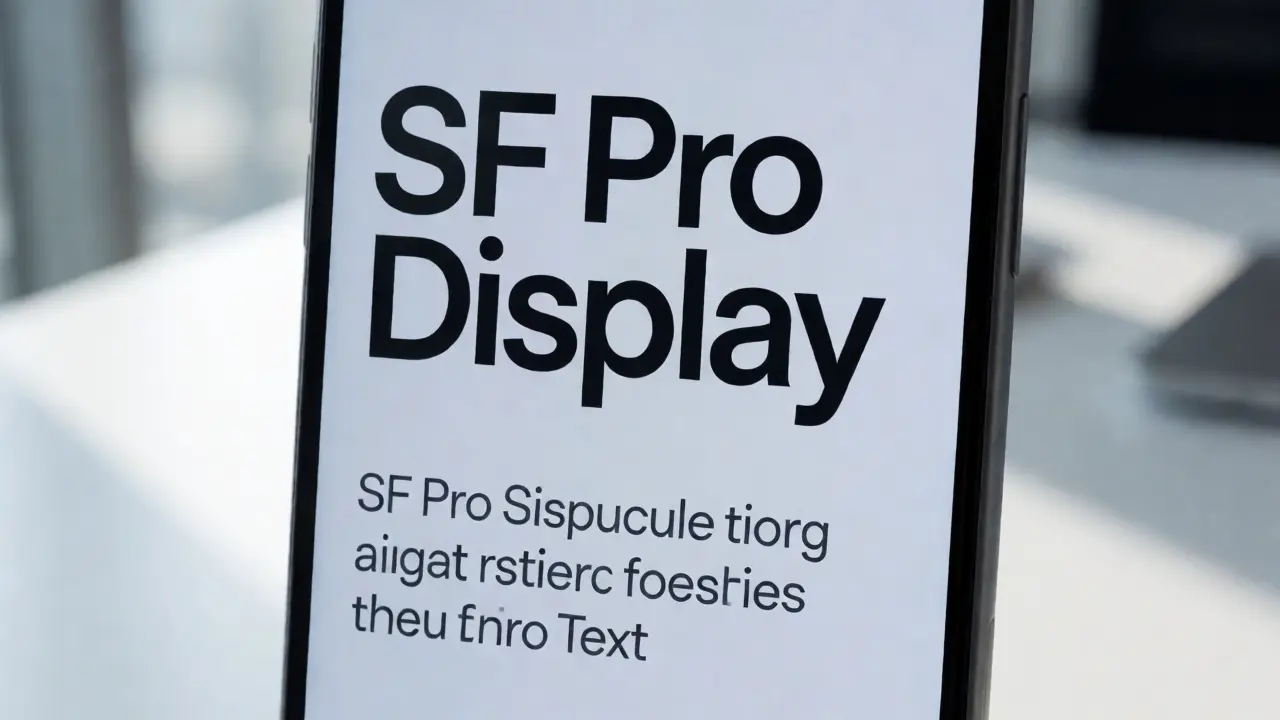
Readability starts long before the user taps the screen. It begins with the font you assign to the placeholder and the entered text. On Apple devices, using the system font, San Francisco, is non-negotiable for native-feeling apps. Why? Because San Francisco is optimized for small screens and high-resolution displays. Its letterforms are designed to remain distinct even at 14pt or smaller sizes, which is common for auxiliary labels but less so for primary input content.
However, the real power comes from enabling Dynamic Type. Many designers treat font size as a fixed value, but Apple’s ecosystem encourages scalable text. If your input field uses a hardcoded 16pt font, users who have adjusted their system text size to "Larger" will find your form inconsistent. The body text might be huge, but the input field remains tiny. This mismatch creates a visual hierarchy that confuses users. By binding your input text to Dynamic Type scales, you ensure that the input area grows proportionally with the rest of the interface, maintaining readability for users with visual impairments or those simply preferring larger text.
A practical rule of thumb: Never go below 17pt for primary input text. While 13pt or 14pt works fine for captions or secondary labels, the actual content the user types needs breathing room. At 17pt, the x-height of the San Francisco font becomes large enough to distinguish similar characters like 'l', '1', and 'I' without strain.
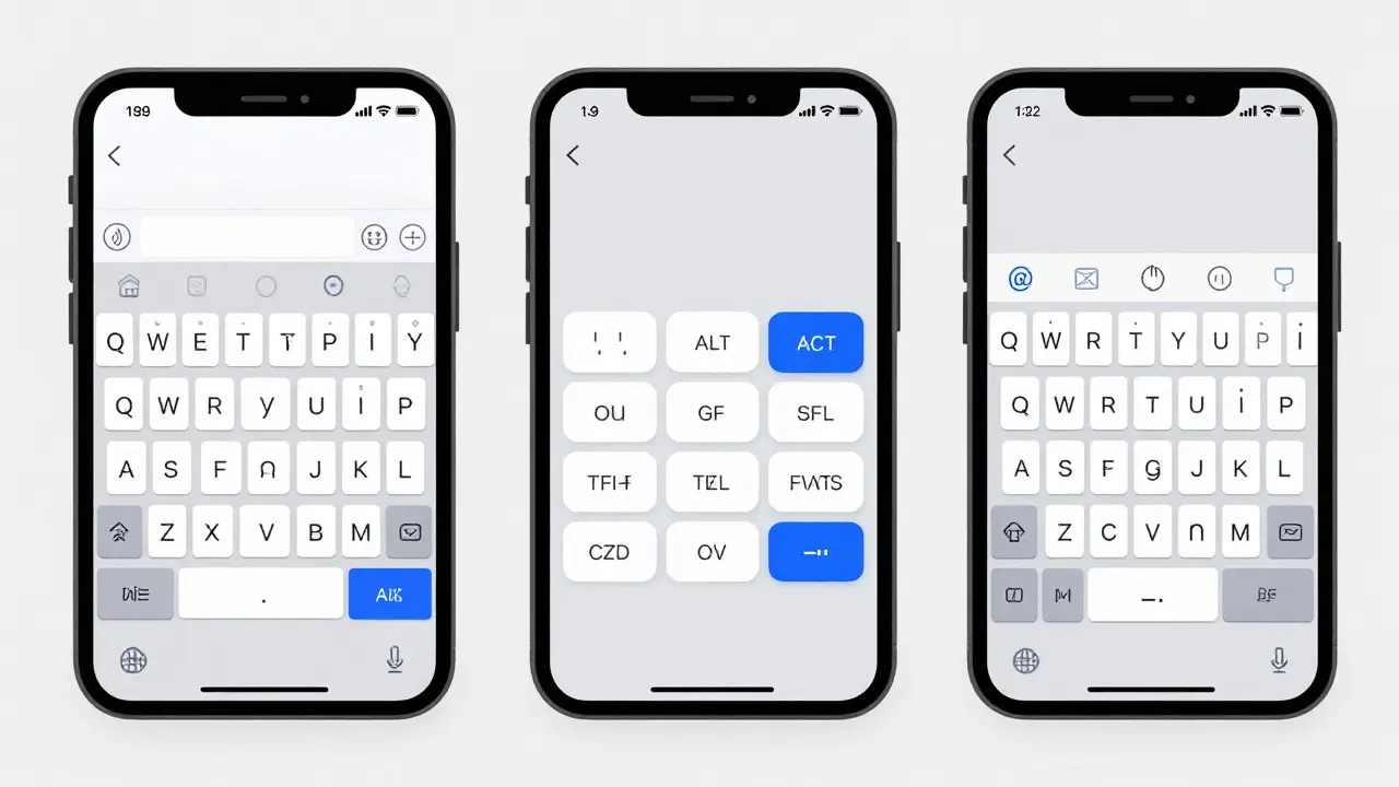
Preventing Errors Through Keyboard Optimization
Let’s talk about the most frequent source of user error: the wrong keyboard. You ask for a zip code, but the full QWERTY keyboard appears. The user has to scroll through rows of letters to find the numbers. This adds seconds to the process and increases the chance of typos. In web development, this is controlled by the `inputmode` attribute; in native iOS development, it’s handled via the `keyboardType` property. Both serve the same purpose: reducing the search space for the user.
Consider the difference between a standard text field and a URL field. A standard field accepts spaces, special characters, and symbols. A URL field should ideally restrict input to alphanumeric characters, dots, hyphens, and slashes. By setting the appropriate input type, you implicitly validate the data as it’s being entered. This is known as inline validation. It’s far more effective than waiting for the user to submit the form and then showing a red error message saying "Invalid URL."
- Use Specific Keyboards: Map every field to its most restrictive valid keyboard. If it’s a date, use the date picker. If it’s a currency, use the decimal pad.
- Leverage Auto-Capitalization Settings: Turn off auto-capitalization for email addresses and URLs. There is no reason for the first letter of "[email protected]" to be capitalized. For names, turn it on. This small detail prevents a surprising number of login failures.
- Enable Return Key Labels: Change the return key label to match the action. Instead of "Return," use "Next" or "Go." This guides the user’s eye and confirms the flow of the form.
Visual Clarity and Placeholder Best Practices
Placeholders are tricky. They help guide the user but can hurt readability if not styled correctly. A common mistake is using light gray text for placeholders that is too close in contrast to the background color. Apple’s guidelines suggest a minimum contrast ratio of 4.5:1 for normal text. For placeholder text, which is technically auxiliary, you still want it to be visible. If the placeholder disappears too quickly or is too faint, users may forget what they were supposed to type, leading to hesitation and errors.
Another aspect of visual clarity is the border style. On iOS, rounded corners are standard. Sharp, square borders can feel jarring and outdated. More importantly, the state of the input field must be visually distinct. When a user focuses on a field, it should change appearance-perhaps by highlighting the border or adding a subtle shadow. This feedback loop tells the user, "You are typing here now." Without this visual cue, users often tap multiple times to ensure the keyboard is active, wasting time and increasing anxiety.
Spacing matters too. Cramped input fields force users to zoom in or tilt their device to see where the text ends. Ensure there is adequate padding inside the input box. At least 8-10 points of internal padding around the text helps prevent the cursor from feeling cramped against the edge, improving both the aesthetic and the functional experience.

Handling Edge Cases: Long Content and Multilingual Support
What happens when the user types more than expected? Does the text wrap? Does it truncate? Does the field expand? These decisions impact readability significantly. For single-line fields like usernames or emails, truncation with an ellipsis (...) is acceptable, provided the full value is accessible elsewhere (like in a preview). But for multi-line fields like comments or bios, automatic expansion is crucial. If the field stays fixed at two lines and cuts off the third, the user feels trapped. Allowing the field to grow vertically maintains the reading flow and prevents horizontal scrolling, which is disorienting on mobile.
Multilingual support adds another layer of complexity. Languages like German or Russian require wider character widths. A field sized perfectly for English might overflow for a German phrase. Testing with longer strings and different scripts is essential. Also, consider right-to-left (RTL) languages like Arabic or Hebrew. The alignment of text within the input field must mirror the direction of the language. If you hard-code left alignment, RTL users will see their text starting from the wrong side, causing confusion and potential errors in copying and pasting data.
Practical Checklist for Implementation
To ensure your text inputs meet the standards for readability and error prevention, run through this checklist before shipping your design or code:
- Verify Font Size: Is the primary input text at least 17pt? Is it linked to Dynamic Type?
- Check Keyboard Type: Does the keyboard match the data type (numeric, email, phone)?
- Test Contrast: Is the placeholder text visible against the background? Is the entered text dark enough?
- Review Padding: Is there sufficient internal space so text doesn't touch the borders?
- Validate Alignment: Does the text align correctly for LTR and RTL languages?
- Confirm Feedback: Does the field visually change when focused?
By treating text inputs as more than just containers for data, you transform them into intuitive interfaces that respect the user’s time and vision. The goal isn't just to capture information; it's to do so smoothly, clearly, and without friction. When you get these details right, the technology disappears, and the user simply gets things done.
What is the minimum recommended font size for text inputs on iOS?
The minimum recommended font size for primary text inputs on iOS is 17 points. This size ensures that characters remain distinct and readable on modern smartphone screens, especially when using the San Francisco system font. Smaller sizes, such as 14 or 13 points, are better reserved for secondary labels or captions rather than the main content the user types.
How does Dynamic Type affect input field design?
Dynamic Type allows users to adjust the global text size of their device. If your input fields use fixed font sizes, they may become disproportionately small or large compared to other UI elements when a user changes their settings. Linking input text to Dynamic Type scales ensures that the entire interface scales together, maintaining consistent readability and hierarchy for all users, including those with visual impairments.
Why should I disable auto-capitalization for email fields?
Email addresses are case-insensitive in most systems, but auto-capitalization forces the first letter to be uppercase. While this rarely causes technical issues, it can lead to user confusion if they expect to type in lowercase. More importantly, disabling it reduces cognitive load and prevents accidental capitalization of domain names, which looks unprofessional and may cause copy-paste errors in stricter systems.
What is the best way to handle long text in single-line inputs?
For single-line inputs like usernames or emails, use truncation with an ellipsis (...) when the text exceeds the field width. However, ensure the full value is accessible via a preview or tooltip if possible. Avoid wrapping text in single-line fields, as it breaks the visual expectation of a single line and can confuse the user about the total length of the input.
How important is padding inside input fields?
Padding is critical for both aesthetics and usability. Insufficient padding makes text feel cramped against the borders, which can be visually stressful and make it harder to select specific words. A minimum of 8-10 points of internal padding provides enough breathing room for the text and cursor, enhancing the overall comfort of the typing experience.