
Your iPad has a massive screen. It is bigger than your phone and smaller than your laptop. But if you treat it like just a giant iPhone, you are leaving value on the table. The secret to unlocking that extra space isn't just installing more apps; it is about how you arrange them. This brings us to two critical concepts: widget density and information hierarchy. These determine whether your home screen feels like a cluttered desk or a streamlined command center.
We have all seen those screenshots of perfectly organized iPads with matching icons and clean layouts. They look great, but do they work? Often, aesthetic choices fight against usability. You might want a minimalist look, but you also need quick access to your calendar, tasks, and notes. Balancing these needs requires understanding how the operating system structures information and how your brain processes visual data.
The Evolution from Grid to Dashboard
To understand where we are, we have to look at where we started. When Apple launched the original iPad in 2010, the home screen was simple: a grid of app icons. That’s it. If you wanted to see your weather or upcoming events, you had to open specific apps. There was no glanceable information on the main interface.
This changed slowly. In 2014, iOS 8 added widgets, but they were hidden in a pull-down Notification Center. You had to swipe down to see them. Then came iPadOS 13 in 2019, which pinned a "Today View" to the left side of the home screen. It was a step forward, but it still felt separate from the rest of the interface. The real game-changer arrived with iPadOS 14 and 15 (2020-2021). Apple introduced WidgetKit, allowing widgets to live anywhere on the home screen alongside app icons.
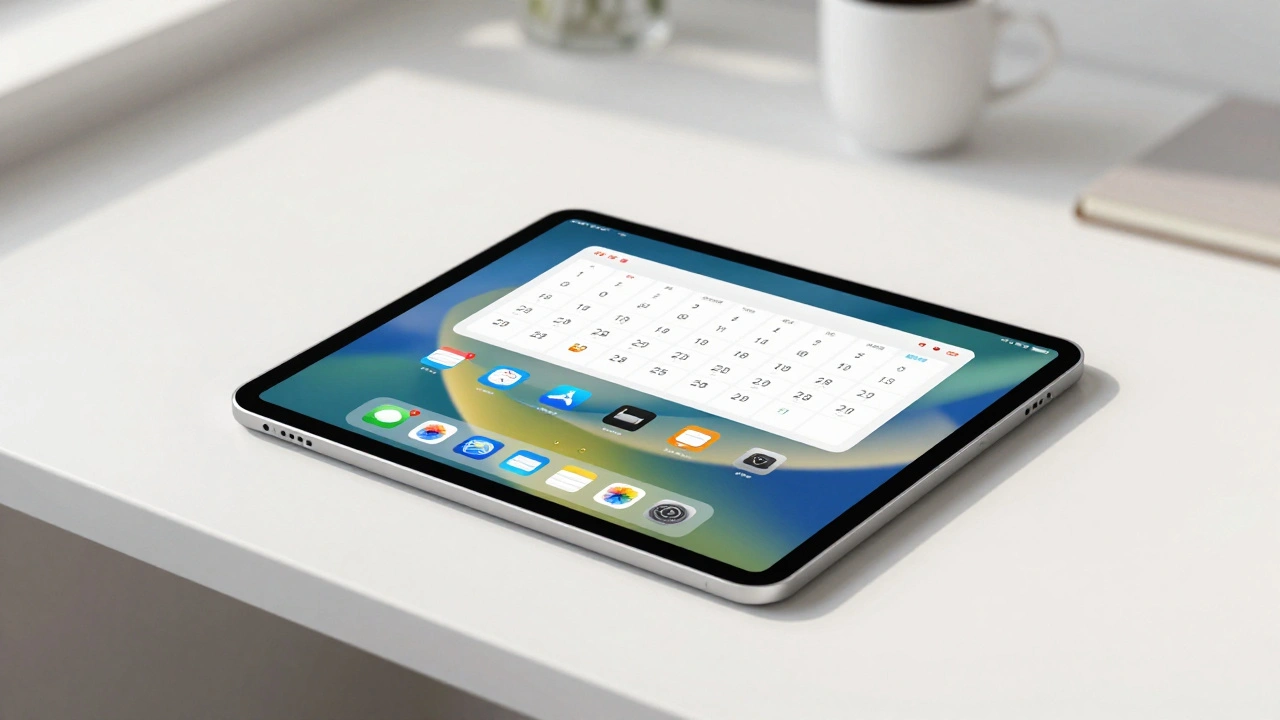
With iPadOS 15, Apple added an "extra-large" widget size exclusive to the iPad. This was huge for density. A single extra-large widget can occupy the space of roughly 12 to 15 standard app icons. Suddenly, you could display a full week’s calendar view or a list of ten reminders without opening an app. Later updates, like iPadOS 17 (2023) and iPadOS 18 (2024), added interactivity and visual styling options, letting users tint icons and change sizes. This evolution shifted the iPad from a passive menu of apps to an active dashboard of information.
Understanding Widget Density and Grid Constraints
Density refers to how much information fits on one screen. High density means lots of data visible at once; low density means plenty of whitespace and fewer elements. On the iPad, this is controlled by a strict grid system. Unlike Android, which allows free-form resizing and overlapping widgets, iPad widgets snap into predefined slots based on four families defined by WidgetKit:
- Small: Occupies a 1x1 grid unit. Good for simple toggles or single numbers.
- Medium: Occupies a 2x2 grid unit. Ideal for lists or detailed views.
- Large: Occupies a 3x2 grid unit. Great for calendars or maps.
- Extra-Large: Occupies a 3x4 or 3x5 grid unit (iPad only). Best for complex dashboards.
Because the grid is rigid, every widget you add displaces app icons. An extra-large widget might take up the space of three columns and five rows. If you fill your screen with large widgets, you lose direct access to many apps. This creates a trade-off. Do you want immediate visibility of data (high widget density), or do you want quick access to applications (high icon density)?
Apple’s Human Interface Guidelines suggest focusing on one primary piece of information per widget. For small widgets, that might be a temperature reading. For extra-large widgets, it could be a multi-day agenda. If you cram too much secondary data into a widget, it becomes hard to read. Text shrinks, spacing tightens, and legibility drops. Remember, most people hold their iPad at a distance of 30 to 50 centimeters. If you can’t read the text without squinting, your density is too high.
Building an Effective Information Hierarchy
Hierarchy is about guiding the user’s eye. Not all information is equally important. Your morning coffee order is less urgent than your 9:00 AM meeting. A good hierarchy prioritizes what matters most right now.
Cognitive psychology offers some helpful rules here. Hick’s Law states that the time it takes to make a decision increases logarithmically with the number of choices. If your home screen has 40 visible icons and widgets, your brain has to process all of them before deciding where to tap. Miller’s Law suggests humans can only hold about 5 to 9 "chunks" of information in working memory at once. This implies that a home screen with dozens of equally prominent items is cognitively expensive.
To build a strong hierarchy, use visual weight. Place your most critical widget-usually a Calendar or Reminders widget-at the top center or top left, where eyes naturally start scanning. Make it large. Use contrasting colors for primary data points. Secondary information should be smaller, lower contrast, or placed further down the screen.
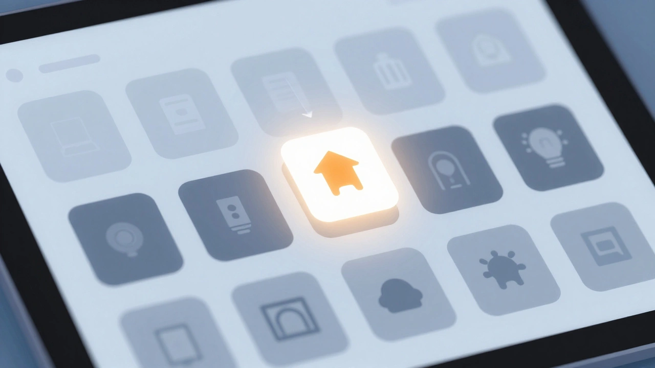
iPadOS 18 gives you new tools for this. You can now tint icons to match your wallpaper or theme. You can make icons larger, which hides their names and reduces text clutter. You can even duplicate app icons across different pages. This means you can have a large, bright Calendar icon on your "Work" page and a small, dimmed version on your "General" page. Visual consistency reinforces hierarchy. Apps related to the same task should look similar; unrelated apps should stand apart.
Leveraging Focus Modes for Contextual Clarity
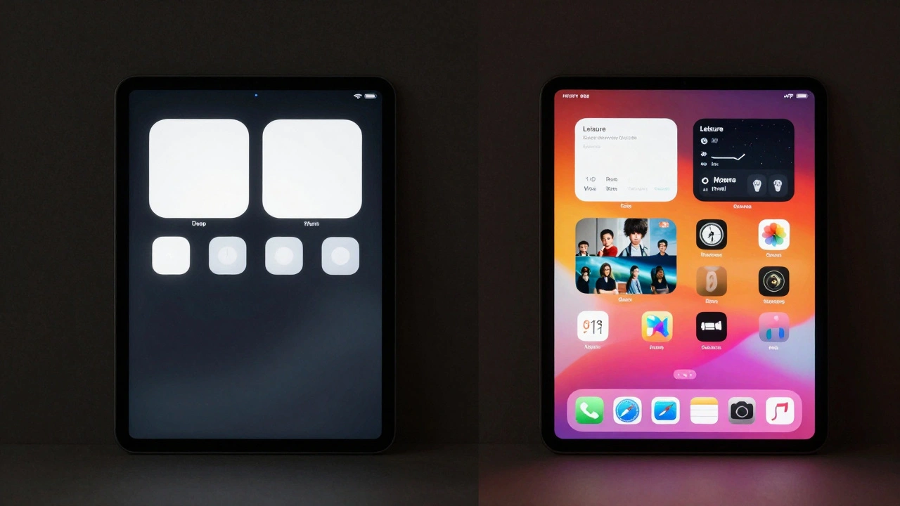
No single home screen layout works for every moment of your day. What you need while studying is different from what you need while relaxing. This is where Focus modes become essential. Introduced in iPadOS 15, Focus modes allow you to create distinct home screens for different activities.
Imagine setting up a "Deep Work" focus. You configure it to show only one home screen page. On that page, you place one extra-large widget showing your current task list and four icons for your essential tools (Notes, Browser, PDF Reader, Calculator). All other pages, including entertainment apps and social media, are hidden. When you activate this focus, your cognitive load drops significantly because distractions are literally invisible.
Conversely, a "Leisure" focus might hide your productivity widgets entirely. Instead, it displays a large photo widget from your camera roll and icons for streaming services and games. By using multiple home screens linked to specific Focus profiles, you avoid the clutter of trying to satisfy every need on one page. You aren’t choosing between density and minimalism; you are switching contexts.
| Strategy | Widget Density | Icon Visibility | Best For | Cognitive Load |
|---|---|---|---|---|
| Productivity Dashboard | High | Low-Medium | Office work, project management | Moderate (requires scanning) |
| Minimalist Focus | Low | Very Low | Studying, writing, deep work | Low (reduced choices) |
| Aesthetic Gallery | Medium | Low | Casual browsing, media consumption | Low (visually pleasing) |
| Hybrid Grid | Medium-High | High | General daily use | High (many options visible) |
Practical Patterns for Different Users
There is no one-size-fits-all solution, but certain patterns emerge as highly effective based on user feedback and expert reviews. Here are three common approaches:
- The Productivity Powerhouse: Top half of the screen features one extra-large Calendar widget and one large Reminders widget. The bottom half holds a row of 6-8 frequently used productivity apps (Mail, Files, Notes). The dock contains your most-used utilities. This layout surfaces three primary chunks of info (schedule, tasks, tools) while keeping total actionable items under 25. It is dense but structured.
- The Minimal Study Station: One medium widget centered on the screen, displaying a study timer or a motivational quote. Four essential icons (Note-taking app, Browser, PDF viewer, Dictionary) are placed near the edges. All other apps are pushed to the App Library or a second page hidden by a Focus mode. Total active elements are under 10. This maximizes focus by minimizing visual noise.
- The Media Hub: Two or three medium widgets for Music, Podcasts, and TV shows. Below them, folders group media apps by type (e.g., "Video," "Audio"). This uses chunking to organize content. Instead of seeing 20 individual video apps, you see one folder labeled "Video." It reduces perceived density while maintaining access.
If you prefer a cleaner look, you can use third-party apps like Widgetsmith to create custom photo or text widgets. Many users combine these with custom icons created in apps like Procreate or Canva. Using the Shortcuts app, you can replace default colorful icons with uniform, monochrome ones. This visual uniformity reduces distraction and makes the functional widgets pop more. However, be aware of the effort involved. Creating custom icons for 20 apps takes time. Only do this if the reduction in visual clutter is worth the setup cost.
Common Pitfalls to Avoid
Even experienced users make mistakes when designing their home screens. Here are the most common issues:
- Ignoring Readability: Packing too much text into a small widget makes it unreadable. If you have to zoom in to see your to-do list, the widget is failing its purpose. Stick to one key metric per small widget.
- Visual Noise: Using brightly colored icons for every app creates a rainbow effect that distracts from the hierarchy. Group similar apps by color or use the tinting feature in iPadOS 18 to mute non-essential apps.
- Static Layouts: Setting up your home screen once and never changing it. Your needs change. A layout that worked during your busy work period might feel overwhelming during vacation. Revisit your setup every few months.
- Overusing Folders: While folders help reduce icon count, burying essential apps inside multiple layers of folders increases friction. Keep your top 5-8 apps accessible on the main screen or dock.
Remember, the goal of your iPad home screen is not to look pretty on Instagram. It is to help you accomplish tasks efficiently. Every element on that screen should earn its place by providing immediate value. If a widget doesn’t save you a click or provide crucial context, remove it. If an icon hasn’t been tapped in a month, move it to the App Library. Simplicity is not about having less; it is about removing the unnecessary so the essential may speak.
What is the best widget size for productivity on iPad?
For productivity, the Extra-Large widget size is often the most effective. It provides enough space to display multiple days of a calendar or a long list of reminders without requiring you to open the app. This reduces the number of taps needed to check your schedule, keeping you in your flow state.
How do I reduce clutter on my iPad home screen?
Start by moving rarely used apps to the App Library. Use folders to group similar apps. Replace colorful default icons with uniform custom icons using the Shortcuts app. Finally, use Focus modes to hide entire pages of apps when you are working or studying, ensuring only relevant tools are visible.
Can I put widgets in the iPad dock?
As of iPadOS 18, you cannot place widgets directly in the dock. The dock is reserved for app icons. However, you can place large widgets immediately above the dock on the main home screen to achieve a similar visual prominence.
Does adding more widgets slow down my iPad?
Generally, no. WidgetKit is designed to be efficient, updating widgets in the background at controlled intervals. However, having dozens of interactive widgets that refresh constantly might impact battery life slightly. Stick to 3-5 major widgets for optimal performance and battery health.
What is the difference between iPadOS and iOS widgets?
The main difference is size and placement flexibility. iPadOS supports an "Extra-Large" widget size that does not exist on iPhone. Additionally, iPadOS allows widgets to be placed anywhere on any home screen page, whereas earlier versions of iOS restricted widgets to the Today View. iPadOS also offers more granular control over icon sizing and tinting.