
You open an app, and something feels off. The text looks cramped, or maybe it’s too airy. You can’t quite put your finger on it, but the reading experience is just... clunky. This usually happens when designers treat SF Pro as a single static asset rather than a dynamic system designed to adapt. If you’re building for iPhone, iPad, Mac, or Watch, using the right variant of this typeface isn’t just about aesthetics-it’s about legibility at different sizes and distances.
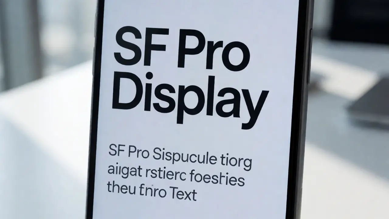
Apple didn’t create one font; they created a family with distinct members. The two heavy hitters you need to know are SF Pro Text and SF Pro Display. Confusing them is a common mistake that hurts user experience. Let’s break down exactly how to pair them so your interface feels native, crisp, and easy to read.
The Anatomy of SF Pro: Why One Size Doesn’t Fit All
Before we talk about pairing, you have to understand why these two fonts exist separately. It comes down to optical adjustments. When you shrink a font down to 11 points for a caption, the letters get closer together. If you use the same spacing as a headline, the text turns into a gray mush. To fix this, designers increase tracking (letter-spacing) and adjust stroke weights for smaller sizes. That’s what SF Pro Text does. It’s optimized for small sizes where clarity is king.
SF Pro Display goes the other way. At large sizes, like a 40-point title, normal letter-spacing creates awkward gaps between characters. The eye sees islands of ink instead of words. SF Pro Display tightens those gaps and refines the curves to look cohesive from a distance. Using Display for body text makes lines feel loose and disconnected. Using Text for headlines makes them look bloated and unpolished.
Here’s the simple rule of thumb Apple engineers use: if the font size is below 20 points, use Text. If it’s 20 points or larger, use Display. But wait-there’s a catch. On macOS, the threshold shifts slightly depending on the screen resolution and context. However, sticking to the 20pt line is a safe bet for most cross-platform consistency unless you have specific accessibility needs.
Dynamic Type and Automatic Switching
If you’re coding in Swift for iOS or macOS, you might wonder if you need to manually swap fonts every time the user changes their text size settings. Good news: you don’t. The system handles this via Dynamic Type. When you set a label’s font using standard APIs like UIFont.preferredFont(forTextStyle:), iOS automatically swaps between SF Pro Text and SF Pro Display based on the point size.
But here’s where many developers trip up. If you hardcode a font name like "SF-Pro-Display-Regular," you lose that automatic adaptation. Your text won’t scale properly when a user enables Larger Accessibility Sizes. Always prefer semantic text styles over hardcoded font names. This ensures your app respects the user’s visual preferences without extra work.
For web developers using CSS, you don’t have Dynamic Type built-in. You need media queries or JavaScript to detect viewport width and font size. If you’re mimicking the Apple look on the web, you’ll need to write custom logic to switch font families when the computed font-size crosses that 20px threshold. It’s tedious, but necessary for true fidelity.
Pairing Strategies for Visual Hierarchy
Typography is the backbone of hierarchy. You guide the user’s eye through weight, size, and color. With SF Pro, you have nine weights ranging from Ultralight to Black. How do you mix Text and Display within a single component?
Consider a card layout. You might have a title, a subtitle, and body text. The title is likely 28 points. Use SF Pro Display Semibold. The subtitle is 17 points. Here’s the trap: 17 is below 20, so technically it should be SF Pro Text. But visually, it acts as a header. Should you stick to the rule? Yes. Consistency beats intuition here. Use SF Pro Text Medium for the subtitle. Then, for the body copy at 15 points, use SF Pro Text Regular.
This strict adherence prevents visual noise. If you used Display for the subtitle, the letter spacing would be too tight compared to the body text below it. The transition between elements would feel jarring. By respecting the Text/Display boundary, you maintain a consistent rhythm of spacing throughout the vertical stack.
| Point Size Range | Recommended Variant | Primary Use Case | Optical Adjustment |
|---|---|---|---|
| 11pt - 19pt | SF Pro Text | Captions, Footnotes, Body Copy | Increased tracking, wider apertures |
| 20pt - 26pt | SF Pro Display | Subheaders, List Titles | Tighter tracking, refined curves |
| 27pt+ | SF Pro Display | Headlines, Hero Text | Maximum tightening, high contrast |

Weight Pairing: Creating Contrast Without Clutter
Once you’ve picked the right variant, you need to pick the right weight. Beginners often rely solely on bold vs. regular. That’s lazy design. SF Pro offers nuanced weights that convey tone better than binary choices.
Try this combination for a modern, clean interface:
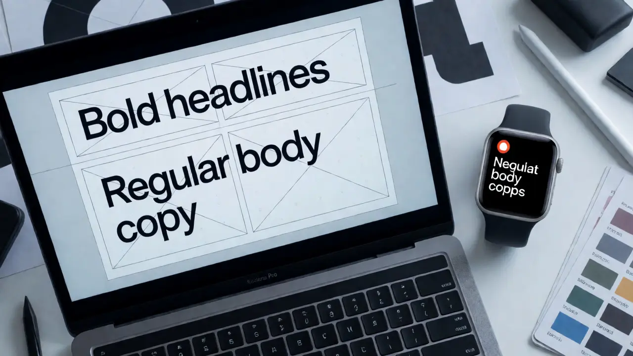
- Headline: SF Pro Display Bold. Strong, authoritative, grabs attention.
- Subtitle: SF Pro Text Medium. Not too loud, but distinct from body text.
- Body: SF Pro Text Regular. Neutral, easy to scan.
- Metadata/Timestamps: SF Pro Text Light or Thin. Recedes into the background, doesn’t compete for focus.
Avoid using Light weights for long paragraphs. At small sizes, thin strokes can disappear against light backgrounds or become illegible on older screens. Reserve Light and Thin for short strings of text, like labels or timestamps. If you must use Light for body text, ensure your background has high contrast-black on white, not dark gray on medium gray.
Also, watch out for "weight creep." This happens when everything starts looking bold because the designer wants emphasis. If your headline is Bold, your subtitle shouldn’t also be Bold. Use Semibold or Medium. Save Black for critical alerts or marketing hero sections where you want maximum impact. Overusing heavy weights flattens the hierarchy, making it hard for users to know where to start reading.
Common Pitfalls and How to Fix Them
Even experienced designers make mistakes with SF Pro. Here are the three most common ones I see in code reviews and design audits.
Pitfall 1: Ignoring Line Height. SF Pro has generous default line heights. If you force a tight line height (like 1.2x) on body text, the ascenders and descenders will clash. For SF Pro Text, aim for a line height of 1.3x to 1.5x. For Display, you can go tighter, around 1.1x to 1.2x, because the glyphs are more compact. Never let lines touch unless you’re going for a very specific artistic effect.
Pitfall 2: Mixing Variants Incorrectly in Buttons. Button text is tricky. A button label might be 17 points. Technically, that’s SF Pro Text. But buttons are interactive elements that need presence. Some designers mistakenly use Display here. Stick to Text for anything under 20pt, even in buttons. The slight extra spacing helps tap targets feel less crowded. If the button is huge (like a primary CTA on a landing page), then yes, switch to Display.
Pitfall 3: Forgetting Monospaced Digits. In tables or financial apps, numbers should align vertically. Standard proportional digits vary in width (a '1' is narrower than an '8'). This causes jagged columns. SF Pro includes monospaced digit variants. Ensure you enable them for any column of numbers. This tiny detail signals professionalism and improves scanning speed significantly.
Beyond iOS: Typography on Web and Android
What if you’re designing for the web or Android? You can’t legally use SF Pro outside of Apple platforms. But you can approximate its feel. For web, use the system font stack: -apple-system, BlinkMacSystemFont, "Segoe UI", Roboto, Helvetica, Arial, sans-serif. This gives Mac/iOS users SF Pro and others their native equivalent.
On Android, the closest relative is Roboto. Roboto was designed by Christian Robertson to complement Material Design. Like SF Pro, it has separate Text and Display variants. The pairing logic is nearly identical: use Roboto Text for small sizes and Roboto Display for large headers. If you’re maintaining a cross-platform brand, keep your hierarchy rules consistent. If a heading is 24pt on iOS, it should be 24pt on Android, using the respective Display font.
For non-Apple web projects where you want the exact SF Pro look, consider licensing alternatives like Inter or San Francisco clones available via web font services. Just remember that loading custom fonts impacts performance. System fonts load instantly. Custom fonts require network requests. Weigh the aesthetic gain against the potential delay in First Contentful Paint.
Quick Checklist for Perfect SF Pro Implementation
Before you ship your next update, run through this list:
- Did I check every font size against the 20pt threshold?
- Am I using semantic text styles instead of hardcoded font names?
- Are my line heights adjusted per variant (tighter for Display, looser for Text)?
- Do I have sufficient contrast between weights (e.g., Bold vs. Regular, not Bold vs. Semi-Bold)?
- Are numbers in tables using monospaced digits?
- Have I tested with Accessibility Sizes enabled to ensure no truncation occurs?
Getting typography right is invisible when done well. Users won’t say, "Wow, great SF Pro pairing." They’ll just say, "This app is easy to use." And that’s the highest compliment a designer can receive.
Can I use SF Pro Display for all my headings regardless of size?
No. While it might seem simpler to use one font, SF Pro Display looks loose and disconnected at smaller sizes (under 20pt). Always switch to SF Pro Text for headings below 20pt to maintain proper letter spacing and legibility.
How do I access SF Pro fonts in Figma or Sketch?
You cannot directly install SF Pro on Windows or Linux systems due to Apple's licensing terms. On macOS, it is installed by default. In design tools like Figma, you can select "SF Pro" from the font dropdown if you are running the desktop app on a Mac. Alternatively, use the system font option which maps to SF Pro on Apple devices.
Is there a difference between SF Pro and New York?
Yes. SF Pro is a sans-serif font designed for digital interfaces. New York is a serif font introduced by Apple, also with Text and Display variants, intended for editorial content and longer-form reading where serifs aid flow. Do not mix them arbitrarily; choose one personality for your entire app.
Why does my text look blurry on Retina displays?
Blurriness often results from sub-pixel positioning errors or incorrect anti-aliasing settings. Ensure your text layers are aligned to pixel grids in design tools. In code, avoid fractional font sizes (e.g., 15.5pt) which can cause rendering artifacts. Stick to integer point sizes where possible.
Does Dynamic Type affect both SF Pro Text and Display?
Yes. Dynamic Type scales the base size of the text style. As the size increases past the 20pt threshold, the system automatically swaps the underlying font file from SF Pro Text to SF Pro Display to maintain optimal optical proportions.
Categories
Popular Articles