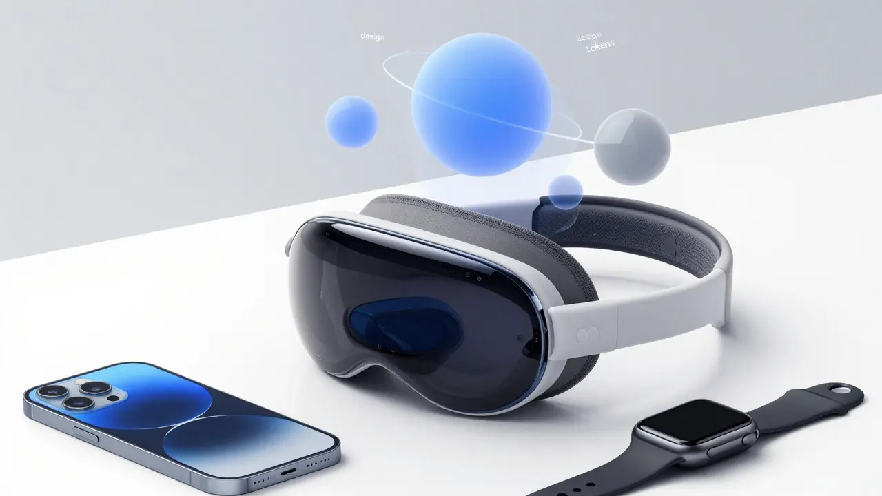

Building for Apple platforms often feels like solving a puzzle with missing pieces. You know the rules-use SF Pro, stick to system colors, respect safe areas-but translating those guidelines into code that scales across iOS, macOS, watchOS, and visionOS is where things get messy. Enter design tokens. These are the bridge between the Human Interface Guidelines (HIG) and your actual production code, ensuring that a button on an iPhone looks and feels exactly right on an Apple Watch.
Most teams treat tokens as just a color palette file. That’s a mistake. In the Apple ecosystem, tokens are the structural DNA of your interface. They encode not just *what* a color is, but *when* it should change based on context, accessibility needs, or device capabilities. If you’re building a multi-platform app in 2026, ignoring this layer means you’ll spend more time debugging visual inconsistencies than designing features.
Why Semantic Naming Beats Raw Values
The first rule of thumb: never hardcode hex values in your UI components. Instead, map raw design assets to semantic token names. For example, instead of using `#0A84FF` directly, you define a token called `color-accent-primary`. This might resolve to `#0A84FF` in light mode and `#0A84FF` (or a slightly adjusted variant) in dark mode automatically.
This separation allows designers to update the brand palette without touching code logic, and developers to swap themes dynamically. It also future-proofs your app. When Apple introduced new display technologies or updated their contrast ratios in recent OS releases, teams using semantic tokens only had to update the underlying value maps, not hundreds of component files.
Color Standards: Beyond Light and Dark Mode
Apple’s color system is more complex than simple day/night switching. The HIG emphasizes vibrancy and materiality, especially on devices like the Apple Vision Pro. Your token structure must account for three distinct states:
- Base Colors: The raw brand hues defined by the design team.
- Semantic Roles: How those hues apply to specific UI elements (e.g., background, foreground, destructive).
- Contextual Variants: Adjustments for high-contrast mode, increased legibility, or translucency layers.
A common pitfall is assuming white text always works on colored backgrounds. On OLED screens, pure white can cause blooming. Apple recommends using off-white shades for text on vibrant backgrounds. Your tokens should reflect this nuance. For instance, a token named `text-on-accent` should resolve to a softer white in high-brightness scenarios, ensuring readability without eye strain.
Typography: Scaling SF Pro Across Devices
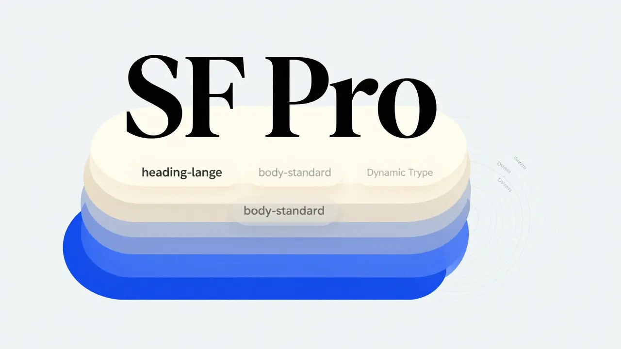
Type is where most cross-platform apps fall apart. The San Francisco font family, known as SF Pro, is designed to be dynamic. It adjusts its weight and width based on screen size and text length. However, relying solely on system defaults can lead to inconsistent hierarchy if you don’t define explicit type scale tokens.
Define your type tokens by role, not size. Create tokens like `heading-large`, `body-standard`, and `caption-small`. Each token should specify not just the font size, but the line height, letter spacing, and recommended weight. For example, `heading-large` might use a 34pt size with -0.41pt tracking on iPhone, but scale up to 40pt on iPad with tighter leading. This ensures visual rhythm remains consistent even when physical dimensions change.
Don’t forget Dynamic Type. Apple’s accessibility feature allows users to adjust text size globally. Your tokens must support these scaling factors. If you lock a font size in pixels, you break accessibility compliance. Use relative units or percentage-based scaling within your token definitions so that user preferences propagate correctly through the entire interface.
Motion Standards: Timing and Curves
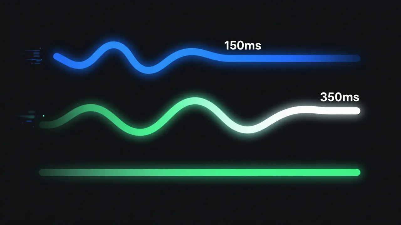
Motion isn’t just decoration; it’s communication. Apple’s HIG defines specific timing curves for different interactions. A quick tap feedback should feel snappy (around 150ms), while a page transition should feel smooth and deliberate (around 350ms). Hardcoding these durations in every animation function leads to drift over time.
Create motion tokens for both duration and easing curves. Standardize on a few core curves:
- Standard Ease: For general state changes.
- Spring: For interactive elements that need a natural bounce.
- Linear: For progress indicators where constant speed matters.
Implementing Tokens in Modern Workflows
In 2026, the tooling landscape has matured significantly. Most teams use a centralized token repository (often in JSON or YAML format) that syncs with design tools like Figma via plugins. This ensures that what the designer sees matches what the developer ships.
For Swift-based development, libraries like SwiftUI allow you to bind these tokens directly to view modifiers. You can create custom environment values that read from your token source at runtime. This means changing a single token definition in your config file updates the entire app instantly. No recompiling individual views, no hunting for hardcoded values.
Consider this workflow:
- Designer updates the accent color in Figma.
- Token plugin exports the change to your Git repository.
- CI pipeline validates the JSON schema and generates Swift constants.
- App pulls the new values on next build or hot-reload.
| Strategy | Pros | Cons | Best For |
|---|---|---|---|
| Hardcoded Values | Fast initial setup | No scalability, high maintenance cost | Prototypes only |
| Basic CSS Variables | Simpler than full systems | Lacks semantic context, limited cross-platform support | Web-only Apple apps |
| Full Design Token System | High consistency, automated sync, accessible | Higher initial setup effort | Production multi-platform apps |
Common Pitfalls to Avoid
Even experienced teams stumble here. One frequent error is creating too many tokens. If you have a token for every possible shade of gray, you’ve lost the point. Stick to a disciplined set of roles. Another mistake is ignoring reduced motion settings. Apple provides an API to detect if a user prefers less animation. Your motion tokens should include a fallback state (like instant fade) for these users. Failing to do so creates an inaccessible experience for people with vestibular disorders.
Also, watch out for platform-specific quirks. WatchOS has smaller screens, so your `padding-medium` token might need to resolve to a smaller value there than on iPhone. Use conditional logic in your token generation process to handle these overrides cleanly, rather than duplicating entire token sets for each device.
Frequently Asked Questions
What is the difference between a design token and a style guide?
A style guide is documentation describing how to use design elements. A design token is the actual data value (like a hex code or millisecond count) that represents that element in code. Tokens are machine-readable; style guides are human-readable. They work together, but tokens are the executable part of the standard.
Do I need separate tokens for iOS and macOS?
Not necessarily. Ideally, you define one semantic token (e.g., `spacing-card`) and let the platform determine the final value based on device context. However, if the visual language differs significantly between platforms, you may need platform-specific overrides within your token configuration file. The key is keeping the semantic name consistent while allowing the resolved value to vary.
How do design tokens handle Dynamic Type in iOS?
Tokens should define base sizes and scaling factors rather than fixed pixel values. When implementing in SwiftUI, bind your type tokens to the system's Dynamic Type environment. This ensures that when a user increases their text size setting, your `body-standard` token scales proportionally, maintaining layout integrity without breaking the grid.
Is it worth using design tokens for small apps?
If you plan to maintain the app beyond six months, yes. Even small apps accumulate technical debt quickly if colors and fonts are scattered across files. Setting up a basic token structure takes a few hours and pays off immediately in consistency and ease of theming. For one-off prototypes, hardcoded values might be acceptable, but for anything user-facing, tokens are essential.
How do I keep design tokens in sync with Figma?
Use a dedicated plugin that supports two-way syncing. Tools like Tokens Studio or Style Dictionary integrations allow designers to edit variables in Figma, which then export to your code repository. Ensure your CI pipeline includes a validation step to catch syntax errors before they reach production. This automation prevents manual copy-paste errors and keeps both sides aligned.
Categories
Popular Articles