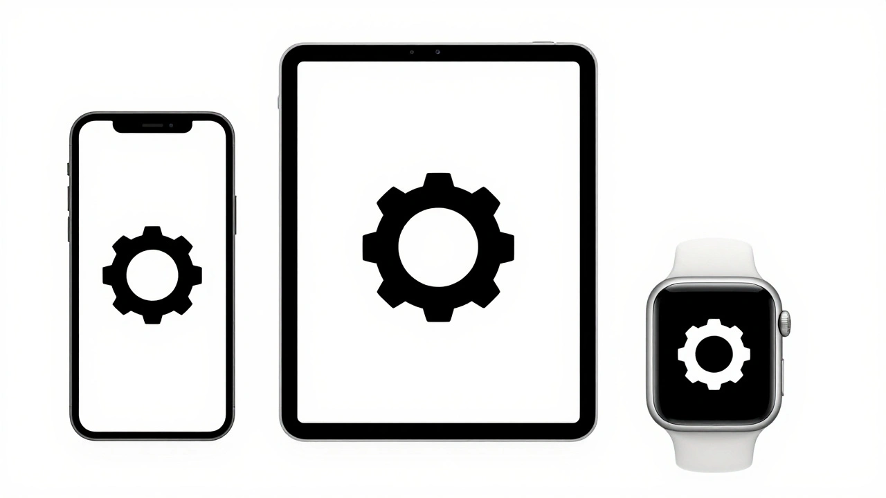

You’ve spent hours tweaking a custom app icon. It looks perfect on your retina display at 100% zoom. Then you shrink it down to the size of an app badge or a notification thumbnail, and suddenly it looks blurry, heavy on one side, or just plain wrong. This isn’t bad luck; it’s a failure of pixel fitting and optical balance. Apple’s design ecosystem doesn’t just ask for pretty shapes; it demands mathematical precision wrapped in visual intuition.
If you’re designing for iOS, macOS, or watchOS, understanding how icons sit within their grids is the difference between an app that feels native and one that feels like a cheap clone. Let’s break down exactly how Apple’s grid systems work, why they look “off” when you ignore them, and how to fix your assets so they shine on every device.
The Myth of Mathematical Centering
Here is the first trap most designers fall into: mathematical centering. If you draw a square inside another square and align their geometric centers, they are mathematically centered. But do they look centered? Often, no. The human eye doesn’t measure pixels; it measures weight and volume. A circle with a thick stroke on the bottom looks heavier than a circle with a thin stroke on top, even if both are perfectly aligned to the grid.
This is where optical balance comes in. Apple’s Human Interface Guidelines (HIG) explicitly state that icons should be optically centered, not mathematically centered. This means you might need to shift a glyph up by half a pixel or adjust its stroke width slightly to make it feel stable to the viewer. It’s a subtle adjustment, but it’s what makes Apple products feel so polished. When you ignore this, your icons feel like they’re sliding off the screen or sinking into the background.
Think about the Mail envelope icon. If you look closely at the flap, it’s not just a triangle sitting on a rectangle. The lines converge in a way that guides the eye inward. If you were to draw a strict geometric box around it, the visual mass would feel top-heavy. Designers compensate by adjusting the internal spacing, ensuring the icon feels grounded.
Understanding the SF Symbols Grid System
In recent years, Apple standardized its approach through SF Symbols, a library of thousands of scalable symbols that integrate seamlessly with the San Francisco font system. While you can create custom icons, they must adhere to the same underlying grid logic as SF Symbols to maintain consistency.
The core concept here is the grid system. For most standard UI elements, Apple uses a 24x24 point grid for small icons and larger grids for prominent actions. However, the magic isn’t just in the outer bounds; it’s in the internal alignment guides. Every symbol has specific anchor points that ensure different shapes-like a heart versus a gear-align correctly when placed next to each other in a toolbar.
When you design a custom icon, you aren’t just drawing a shape; you’re defining how that shape interacts with text baselines and neighboring icons. If your custom “Settings” gear sits higher than the adjacent “User” profile icon, the whole row looks messy. To fix this, you need to understand the x-height and cap-height metrics of the accompanying text. Your icon’s visual center should align with the text’s visual center, which often differs from the text’s baseline.
Pixel Fitting: Why Blurriness Happens
Pixel fitting is the process of aligning vector edges to physical pixel boundaries on a display. On older non-retina screens, this was easy: if you drew a line at position 10.5px, it fell between two pixels and looked fuzzy. You had to snap it to 10px or 11px.
Modern displays are complex. An iPhone 15 Pro Max has a Super Retina XDR display with a high pixel density. But here’s the catch: the operating system scales interfaces based on logical points, not physical pixels. A 1pt line might render as 3 physical pixels wide on a 3x scale device. If your vector path lands on a fractional point value (e.g., 10.333pt), the rendering engine has to anti-alias the edge, blending colors across multiple pixels. This creates that dreaded “blurry” look.
To achieve crisp results, follow these rules:
- Use integer values for coordinates: Keep your main structural lines on whole numbers (1, 2, 3...) whenever possible.
- Avoid fractional strokes: If your stroke width is 1.5pt, ensure the center of the stroke falls on a half-pixel boundary relative to the grid.
- Check against multiple scales: Test your icon at @1x, @2x, and @3x. An icon that looks sharp at 3x might still have soft edges at 1x if the geometry is too complex.
Tools like Sketch, Figma, and Adobe Illustrator have “snap to pixel” features, but they aren’t foolproof. You still need to manually inspect the export previews. Sometimes, a curve that looks smooth in vector space becomes jagged when rasterized because the control points don’t align well with the pixel grid.
Optical Adjustments for Common Shapes
Different shapes require different optical corrections. Here is a breakdown of common pitfalls and how to fix them using real-world examples.
| Shape Type | Common Issue | Optical Fix |
|---|---|---|
| Circles | Look smaller than squares of equal diameter | Scale circles up by ~5-8% compared to bounding boxes |
| Triangles | Visual center appears lower than geometric center | Shift upward by 1-2px to balance the base weight |
| Horizontal Lines | Can appear thinner than vertical lines | Increase horizontal stroke width slightly (e.g., 1.2pt vs 1.0pt) |
| Complex Glyphs | Details disappear at small sizes | Simplify paths; remove internal details below 24pt |
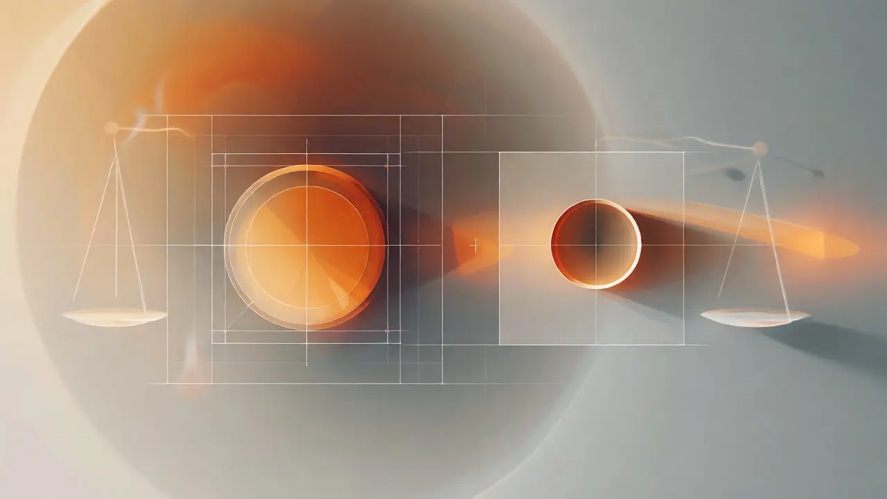
Notice the circle example. If you put a circle and a square in the same 24x24 box, the circle will look significantly smaller because it touches the box only at four points. To make them look equal in weight, you need to expand the circle’s diameter until its visual mass matches the square’s. This is a classic optical illusion trick used in typography and logo design alike.
Implementing Grids in Modern Design Tools
You don’t need to draw everything from scratch. Most modern design tools support grid templates that mimic Apple’s specifications. In Figma, for instance, you can set up a layout grid with columns and rows that match the SF Symbols metrics. But here’s a pro tip: don’t just rely on the default settings.
Create a dedicated component library for your icons. Inside each icon component, include hidden layers that represent the optical center and the keyline shapes (the invisible boxes that define the icon’s footprint). When you swap out an icon, these guides help you verify that the new asset aligns with the existing ones. This saves hours of manual tweaking during handoff.
For developers, this structure translates directly into code. When you export SVGs, ensure they use consistent viewBox dimensions. If one icon uses a 24x24 viewBox and another uses 20x20, your developer has to write extra CSS to normalize them. Standardize early, and the integration phase becomes boring-in the best way possible.
Testing Across Devices and Contexts
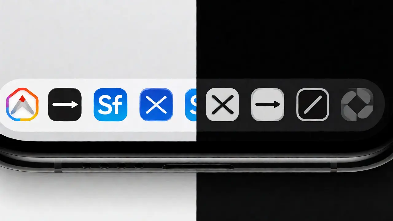
An icon that works in a light-mode navigation bar might fail in a dark-mode tab bar. Or worse, it might look great on an iPhone but terrible on an iPad due to scaling differences. Always test your icons in context.
Place your custom icons alongside native SF Symbols. Do they feel like siblings or strangers? If yours looks heavier, lighter, or differently styled, adjust the stroke weight and corner radius. Apple tends to favor rounded corners (often matching the superellipse shape of the OS itself). Sharp, right-angle corners can feel jarring unless you’re going for a very specific retro aesthetic.
Also, consider accessibility. Ensure there is enough contrast between the icon and its background. Don’t rely solely on color to convey meaning; the shape must be distinct. If you’re using icons for critical actions (like delete or save), test them with users who have low vision. If they can’t identify the icon without reading the label, your optical balance or simplicity is failing.
Next Steps for Polishing Your Icons
Ready to refine your current set? Start with an audit. Pick ten of your most-used icons. Place them in a mockup of your app’s interface. Squint at the screen. Does anything jump out as misaligned or blurry? Zoom in to 400% and check the pixel alignment. Are any lines falling between pixels?
Adjust the problematic assets using the optical corrections outlined above. Re-test. Iterate. It’s tedious work, but it’s the kind of detail that separates professional apps from hobby projects. Once you’ve mastered the grid and pixel fitting, you’ll find yourself spending less time fixing bugs and more time creating delightful interactions.
What is the standard grid size for iOS icons?
The standard grid size varies by context, but for most UI elements in SF Symbols, the base grid is 24x24 points. Larger action buttons may use 44x44 points or more. Always refer to the specific HIG section for the component you are designing.
Why does my icon look blurry even though I'm using vectors?
Vectors look blurry when their edges don't align with physical pixel boundaries. This happens when coordinate values are fractional (e.g., 10.333px). Snapping your main structural lines to integer values helps prevent anti-aliasing blur.
Do I need to design separate icons for Light and Dark mode?
Not necessarily. Most icons use monochrome fills that adapt automatically via template rendering. However, if your icons have complex gradients or shadows, you may need variants to ensure visibility against different backgrounds.
How do I check if my icon is optically balanced?
Place your icon next to a known good reference, like an SF Symbol of similar complexity. Squint at them together. If one feels heavier or tilted, adjust its internal spacing or stroke weight. Visual comparison is often more accurate than measuring pixels.
Can I use custom fonts for icon glyphs?
Yes, many icon sets are built as icon fonts. However, SVG is generally preferred now for better scalability and styling flexibility in web and mobile contexts. Fonts can sometimes suffer from hinting issues at small sizes.