
Walk into an Apple Store in SoHo or look at the sleek lines of a MacBook Pro, and you aren't just seeing technology. You are seeing decades of cross-disciplinary borrowing. The reason Apple's products feel so cohesive isn't magic; it is a deliberate fusion of architectural principles and fine art history. For years, the company has treated its devices not as gadgets, but as objects that belong in a curated space, much like a sculpture in a gallery.
This approach didn't happen by accident. It started when Steve Jobs realized that consumers don't just buy specs; they buy feelings. By hiring designers who understood form and function equally, Apple shifted the industry from "what does it do?" to "how does it feel?" This shift required looking beyond engineering manuals and into the worlds of modernist architecture and mid-century art.
The Architectural Foundation: Form Follows Function
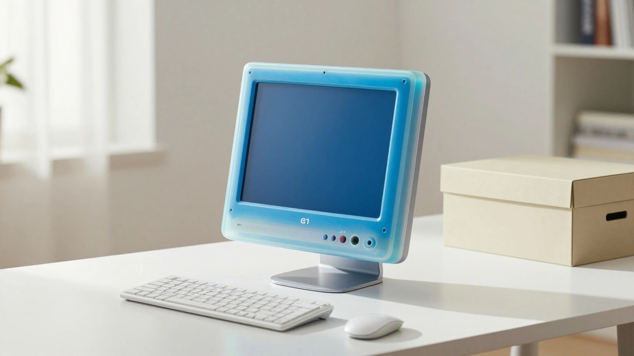
At the core of Apple’s aesthetic is the principle that beauty comes from utility. This idea traces back to Louis Sullivan and was later popularized by the Bauhaus school, which argued that art should serve society through practical design. Apple adopted this mindset rigorously. When designing the original iMac G3, engineers wanted a bulky CRT monitor, but the design team insisted on a compact, translucent shell. The result wasn't just smaller; it was more honest about what the machine actually was.
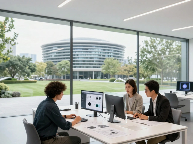
Consider the Apple Park campus in Cupertino. Designed by Norman Foster, the building is a perfect circle, echoing the unity of the product ecosystem inside. The glass walls allow natural light to flood the workspace, reducing the need for artificial lighting and creating a connection between the indoor work environment and the outdoors. This isn't just vanity architecture; it reflects the internal software logic where every app talks to every other device seamlessly. The physical space mirrors the digital experience.
- Simplicity: Removing unnecessary elements to highlight the core purpose.
- Material Honesty: Showing the true nature of materials (aluminum, glass) without heavy ornamentation.
- Integration: Ensuring parts fit together so tightly that seams disappear.
The Role of Jony Ive and Industrial Minimalism
You can't discuss Apple’s design leadership without mentioning Jony Ive. As the Chief Design Officer for nearly two decades, Ive brought a specific sensibility to the table: industrial minimalism. Unlike pure art, which can be abstract, industrial design must solve problems. Ive’s genius lay in finding the simplest solution that still felt premium. He viewed constraints not as limitations, but as creative fuel.
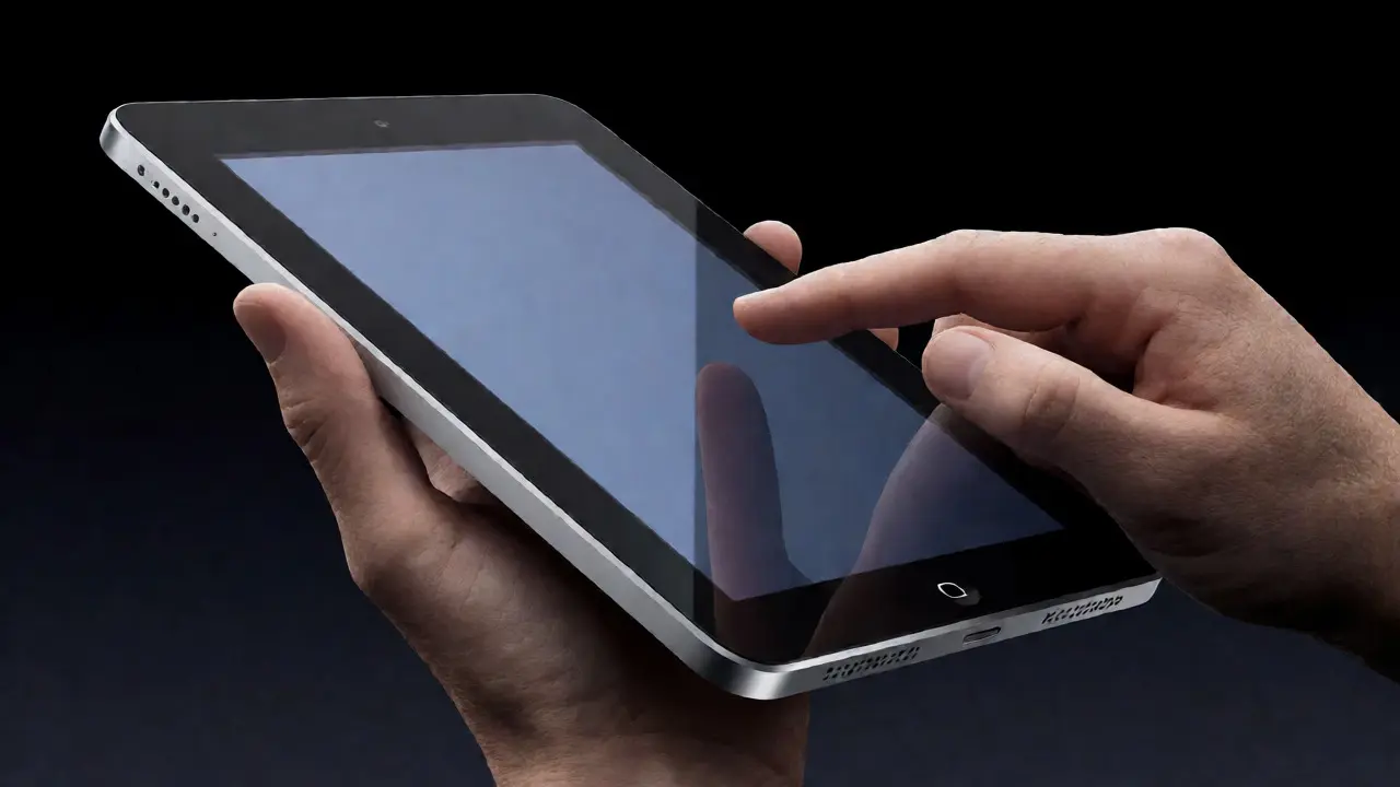
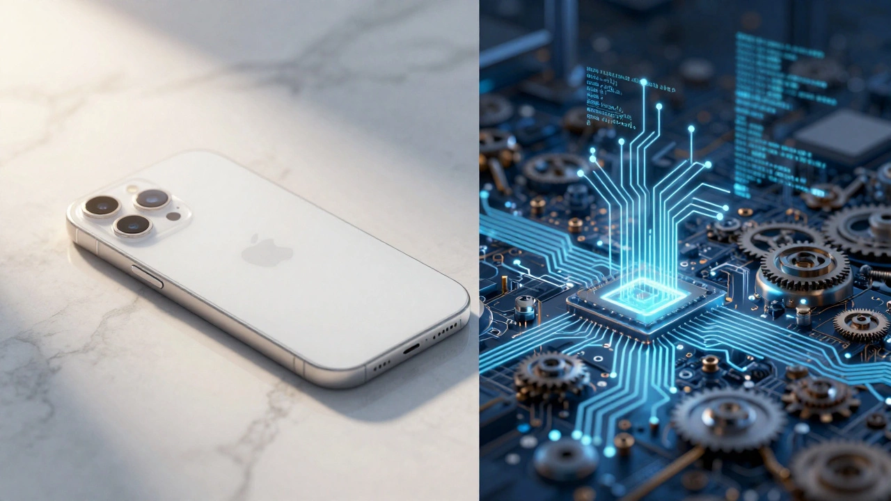
Ive often cited his love for furniture design, particularly the works of Charles Eames and Dieter Rams. Rams, the legendary designer behind the Braun calculator, believed that good design is as little design as possible. This philosophy permeates Apple’s hardware. Look at the iPhone: no buttons on the front, no visible screws, no complex menus. The interface is hidden until you touch it. This invisibility of complexity is a direct nod to high-end architectural interiors where the technology is embedded in the walls, not plastered on them.
Art History Lessons: Color and Perception
While architecture provided the structure, art history provided the soul. Early Apple products were famously colorful, breaking away from the beige plastic boxes of the 1980s PC market. The iMac Bondi Blue was a bold move, influenced by pop art and the vibrant palettes of artists like Roy Lichtenstein. It signaled that computers could be fun and personal, not just cold corporate tools.
However, as the brand matured, the palette shifted toward neutrality. This change aligns with the concept of "negative space" in visual arts. In painting, negative space defines the subject by leaving areas empty. In product design, negative space is the absence of clutter. By stripping away color and decoration, Apple allows the user to focus on the content on the screen. The device becomes a window, not a frame. This subtle shift from expressive color to neutral surfaces shows how Apple evolved its artistic language to match its expanding global audience.
| Influence Source | Key Principle | Apple Application Example |
|---|---|---|
| Bauhaus Movement | Form follows function | iMac G3 compact enclosure |
| Modernist Architecture | Openness and light | Apple Park circular layout |
| Dieter Rams Philosophy | Less but better | iPhone buttonless front face |
| Pop Art | Vibrant, accessible color | Original iMac Bondi Blue |
Retail Spaces as Galleries
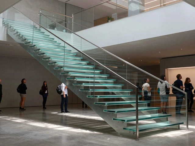
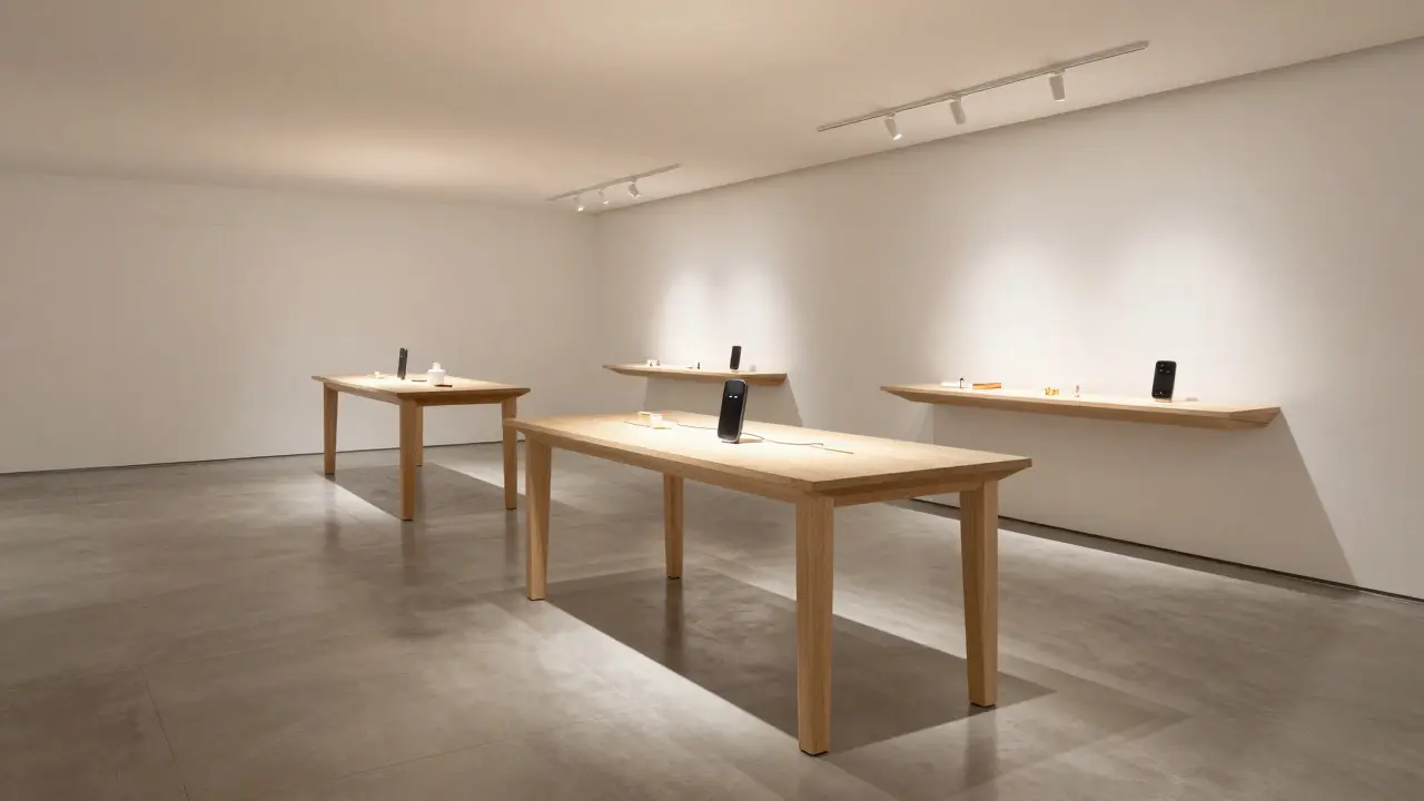
When Apple opened its first retail stores, critics said they would fail because people preferred buying tech online or at big-box retailers. They were wrong. The stores succeeded because they weren't stores; they were experiences. The design of these spaces borrows heavily from museum curation. Products are displayed on simple tables, often floating above the surface, allowing customers to view them from all angles without obstruction.
The lighting is controlled to eliminate glare and highlight material textures. The floor plans are open, encouraging movement and discovery rather than pushing products down aisles. This spatial arrangement reduces decision fatigue. When you walk into an Apple Store, you aren't overwhelmed by choices; you are guided toward a few key options. This psychological trick, rooted in environmental psychology and art installation design, makes the purchase feel inevitable rather than forced.
Materials as Medium
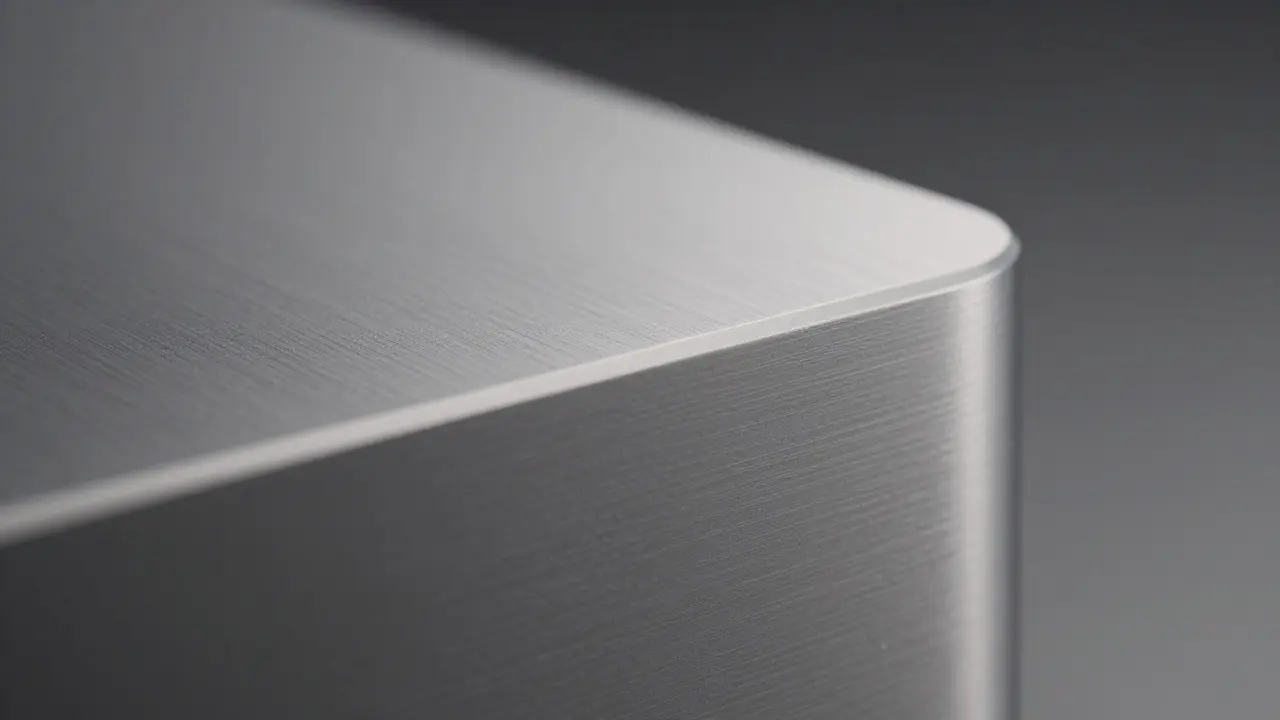
In art, the medium matters. An oil painting feels different from a watercolor. In design, the material is the medium. Apple invests heavily in sourcing unique materials to create tactile differentiation. The unibody aluminum construction of the MacBook Air, for example, was a technical breakthrough that allowed for a seamless, single-piece casing. There are no joints, no gaps, just one continuous surface. This mimics the monolithic stone structures of ancient architecture, providing a sense of permanence and strength.
Similarly, the use of sapphire crystal on the Apple Watch crown or the ceramic shield on iPhones references the durability and clarity of gemstones. These choices signal quality without saying a word. The user doesn't need to read a spec sheet to know the product is premium; they can feel it. This sensory engagement is a hallmark of fine craftsmanship, linking industrial manufacturing to artisanal traditions.
The Legacy and Future Directions
Today, as Apple expands into new categories like wearables and home automation, the same design DNA persists. The Apple TV remote is essentially a pebble of polished metal and glass. The HomePod looks like a woven fabric cylinder, blending into domestic decor rather than standing out as a tech gadget. This ability to adapt architectural and artistic principles to new forms ensures that the brand remains consistent, even as the products change.
The lesson for other companies is clear: design leadership isn't just about making things look pretty. It is about understanding the deeper cultural and historical currents that shape how humans interact with objects. By studying architecture, we learn how to organize space and flow. By studying art, we learn how to evoke emotion and meaning. Apple mastered this combination, turning consumer electronics into cultural artifacts.
Frequently Asked Questions
Did Steve Jobs personally study architecture?
While Steve Jobs had a deep appreciation for aesthetics and typography, he did not formally study architecture. However, he hired experts like Jonathan Ive and collaborated with architects like Norman Foster to bring those principles into the company culture. His role was curatorial, selecting the right talent to execute the vision.
What is the main difference between Apple's design and typical tech competitors?
Most competitors focus on feature density, adding more ports, buttons, and indicators to maximize functionality. Apple focuses on integration and simplicity, hiding complexity behind intuitive interfaces and seamless materials. This results in products that feel less like machines and more like refined objects.
How does the Bauhaus movement specifically influence modern smartphones?
The Bauhaus emphasis on geometric purity and functional honesty leads to clean lines and the removal of decorative elements. In smartphones, this manifests as edge-to-edge screens, minimal bezels, and the elimination of physical buttons where touch gestures can replace them. The goal is to let the function define the form.
Why does Apple use so much glass and aluminum?
These materials offer a balance of durability, weight, and aesthetic appeal. Aluminum provides structural integrity and heat dissipation, while glass offers a smooth, reflective surface that enhances the visual depth of the device. Together, they create a premium tactile experience that distinguishes Apple products from cheaper plastic alternatives.
Can small companies replicate Apple's design strategy?
Yes, but it requires discipline. Small companies don't need massive budgets; they need a clear design philosophy. By focusing on one or two core principles, such as simplicity or material honesty, and sticking to them across all products, even small brands can create a cohesive and recognizable identity that resonates with users.