
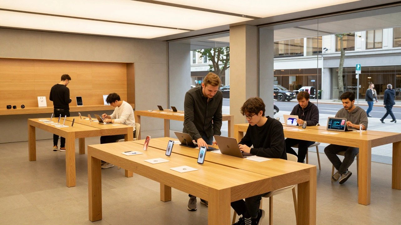
Walk into an Apple Store is a retail environment designed to prioritize product discovery and hands-on interaction over traditional sales pressure. It feels less like a shop and more like a modern library or a tech workshop. You don’t see rows of products locked behind glass counters. Instead, you find open tables with devices out in the open, inviting you to pick them up, tap the screen, and figure things out on your own. This specific layout is not an accident; it is the result of decades of intentional Retail Design strategies that shifted the focus from transactional buying to experiential learning.
The core idea here is simple but powerful: if you understand a product deeply, you are far more likely to buy it. Apple realized early on that their technology was complex enough that customers needed time to explore it without a salesperson hovering over their shoulder. By creating spaces that encourage curiosity, they turned potential buyers into engaged users. This approach has become a benchmark for other brands trying to move beyond the "browse and buy" model.
The Shift from Sales Floor to Learning Hub
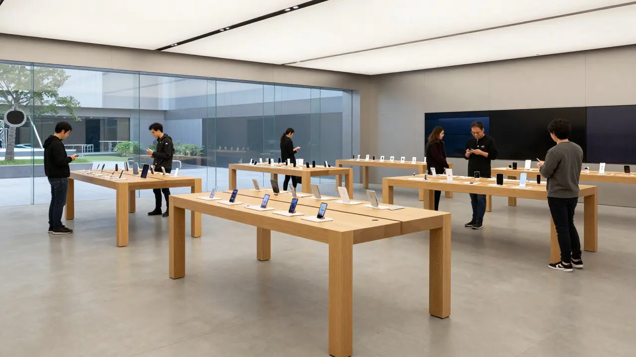
Traditional retail design often relies on high-density shelving and clear sightlines to cash registers. The goal is to maximize the number of items visible at once and guide the customer quickly to a point of sale. Apple flipped this script. In their stores, the primary unit of space is the table, not the shelf. These tables are arranged to create small, semi-private zones where customers can sit down with a device and spend ten, twenty, or thirty minutes interacting with it.
This setup supports what designers call "dwell time." Dwell time is the amount of time a customer spends engaging with a product before deciding whether to purchase. Higher dwell time usually correlates with higher conversion rates because the customer has had the chance to form an emotional connection with the item. For a company selling premium hardware, this connection is critical. You aren't just buying a phone; you're adopting an ecosystem. The store design facilitates that adoption by removing friction.
Spatial Layout and Flow
The physical layout of an Apple Store is carefully engineered to control foot traffic while maintaining an open feel. When you enter, you typically encounter a wide, unobstructed path that leads directly to the center of the room. There are no narrow aisles forcing you into a specific direction. Instead, the flow is organic. You can wander, stop at any table, and then move on.
Key elements of this spatial strategy include:
- Open Sightlines: Every part of the store is visible from almost every other point. This reduces the feeling of being lost and increases comfort. It also allows staff to monitor the floor easily without appearing intrusive.
- Zoning by Category: While the space is open, products are grouped logically. Macs are near the back, iPads and iPhones are in the middle, and accessories are near the front. This creates a natural journey from high-consideration items to lower-consideration add-ons.
- Lighting Hierarchy: Lighting is used to draw attention. Products on tables are spotlit, making them glow against the neutral background. The rest of the store uses softer, ambient lighting to keep the atmosphere calm and focused.
This zoning ensures that you don't get overwhelmed. If you come in for a laptop, you know exactly where to go. But the open layout encourages you to stumble upon other categories you might have forgotten about. It’s a subtle nudge, not a push.
The Role of Staff and Interaction
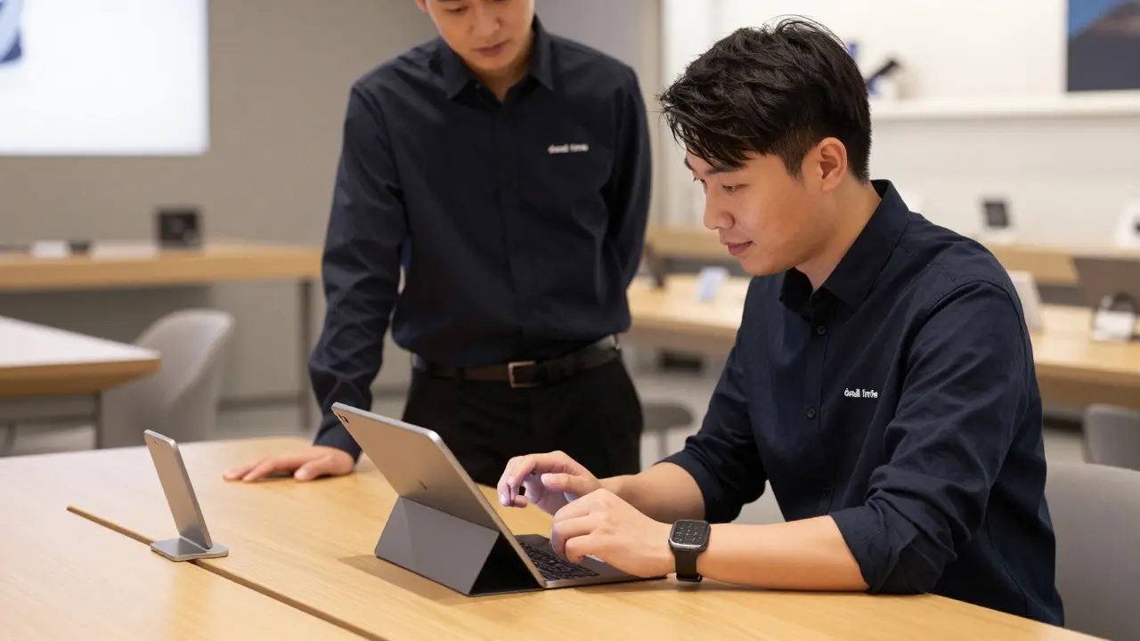
In many retail environments, employees are trained to approach customers within seconds of entry. At Apple Stores, the rule is different. Employees, known as Specialists, are trained to observe first. They watch how you interact with the product. Do you look confused? Do you seem interested in a specific feature? Only when they detect a need do they step in.
This approach respects the customer's autonomy. It turns the employee from a seller into a helper. The Specialist’s job isn't to close a deal; it's to answer questions and demonstrate features. This dynamic builds trust. When you feel like you’re getting advice rather than a pitch, you’re more likely to listen. And because the products are already out and accessible, the Specialist doesn’t need to fetch anything from a stockroom. Everything is right there on the table, ready for demonstration.
Technology Integration in Physical Space
Apple is a technology company, so it makes sense that their stores use technology to enhance the shopping experience. But they do it subtly. The most prominent example is the Genius Bar, a dedicated area for technical support. It’s not hidden in the back; it’s a visible, welcoming space where you can sit down and talk to an engineer. This visibility reinforces the brand promise: if something goes wrong, help is available and accessible.
Beyond the Genius Bar, digital touchpoints are integrated throughout the store. Screens on walls display tutorials and tips. QR codes on tables lead to detailed specs or videos. These digital layers complement the physical products without replacing them. The goal is to provide information on demand, so you don’t have to memorize details or hunt for brochures.
Design Materials and Aesthetics
The aesthetic of an Apple Store is defined by minimalism. The color palette is strictly limited to white, gray, black, and wood tones. There are no bright colors, no cluttered signage, and no loud graphics. This neutrality serves a purpose: it lets the products stand out. Since Apple’s devices are often white, silver, or black, a colorful background would clash. A neutral background acts as a canvas.
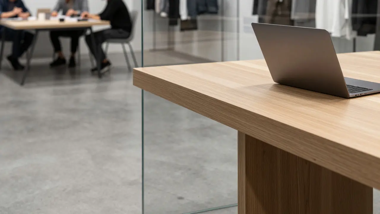
Materials play a huge role in this aesthetic. You’ll notice the use of polished concrete floors, glass walls, and solid wood tables. These materials feel durable and high-quality. They also age well. Unlike plastic or cheap laminate, these surfaces maintain their appearance over time. This durability signals longevity, which aligns with the brand image of building products that last.
| Feature | Traditional Retail | Apple Store Approach |
|---|---|---|
| Primary Goal | Maximize sales volume per square foot | Maximize customer understanding and engagement |
| Product Display | Shelves, bins, locked cases | Open tables, hands-on access |
| Staff Role | Aggressive upselling, quick service | Observational assistance, educational support |
| Space Usage | Dense packing, narrow aisles | Open zones, generous spacing |
| Customer Journey | Linear, directed toward checkout | Non-linear, exploratory, self-paced |
Impact on Customer Behavior
So, does this design actually work? The numbers suggest it does. Apple Stores consistently rank among the highest revenue-per-square-foot retailers in the world. But revenue isn't the only metric. Customer satisfaction scores are also remarkably high. Why? Because the design reduces anxiety. Buying expensive technology can be stressful. You worry about compatibility, usability, and long-term value. An environment that lets you test-drive the product at your own pace alleviates those fears.
Furthermore, the design fosters community. Many Apple Stores host workshops, such as photography classes or coding sessions for kids. These events transform the store from a place of commerce into a place of education. Customers return not just to buy, but to learn. This loyalty is harder to break than price-based loyalty. Once you feel like you belong to a community, you’re less likely to switch to a competitor, even if they offer a slightly cheaper alternative.
Challenges and Criticisms
No design philosophy is without its critics. Some argue that the minimalist aesthetic is too sterile. The lack of personality in the decor can make the stores feel impersonal, especially compared to local shops with unique character. Others point out that the open tables, while convenient, can lead to wear and tear. Devices are handled hundreds of times a day, which requires constant maintenance and restocking.
There’s also the issue of scalability. Replicating the exact same high-quality experience in every location around the world is difficult. Labor costs vary, and local regulations can affect store layouts. Despite these challenges, the core principles remain intact. The focus on learning and interaction hasn’t wavered, even as new technologies emerge.
Lessons for Other Brands
What can other retailers learn from this? First, think about what your customer needs to *do* with your product. If it’s a tool, let them use it. If it’s food, let them taste it. If it’s software, let them click through it. Second, reduce friction. Remove barriers between the customer and the product. Third, train your staff to be educators, not just sellers. Finally, use space to tell a story. Your store should reflect the values of your brand. If you value simplicity, keep the space simple. If you value innovation, showcase the latest tech prominently.
The Apple Store model proves that retail isn't just about moving inventory. It's about creating an experience that resonates with the customer. By focusing on learning, they’ve built a brand that people trust and love. And in a crowded market, that kind of loyalty is worth more than any discount code.
Why are Apple Store tables open instead of locked?
Open tables allow customers to interact with devices freely, increasing dwell time and building confidence in the product. This hands-on approach reduces purchase anxiety and helps customers understand the full capabilities of the hardware before committing to a buy.
How does the layout of an Apple Store differ from a typical electronics store?
Typical electronics stores use dense shelving and narrow aisles to maximize product visibility. Apple Stores use open floor plans with wide walkways and isolated product zones. This layout encourages exploration and provides a calmer, less overwhelming shopping environment.
What is the role of 'Specialists' in an Apple Store?
Specialists act as educators rather than aggressive salespeople. They observe customer behavior and step in only when assistance is needed. Their goal is to answer questions and demonstrate features, helping customers make informed decisions without feeling pressured.
Does the minimalist design of Apple Stores serve a functional purpose?
Yes, the neutral color palette and clean lines ensure that the products themselves are the focal point. Since Apple devices often have sleek, monochromatic designs, a busy background would distract from them. The minimalism creates a visual hierarchy that guides the eye to the merchandise.
Can other retail brands successfully adopt the Apple Store model?
Yes, but it requires a shift in mindset. Brands must prioritize customer education over immediate sales. This involves retraining staff, redesigning floor plans to allow for interaction, and investing in high-quality displays. It works best for products that benefit from hands-on testing or complex explanation.

Categories
Popular Articles