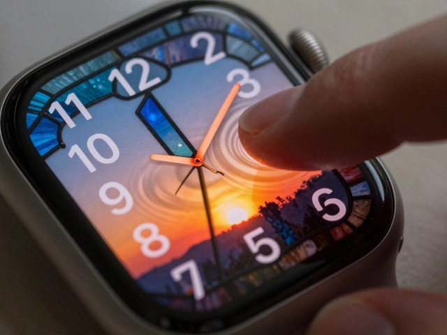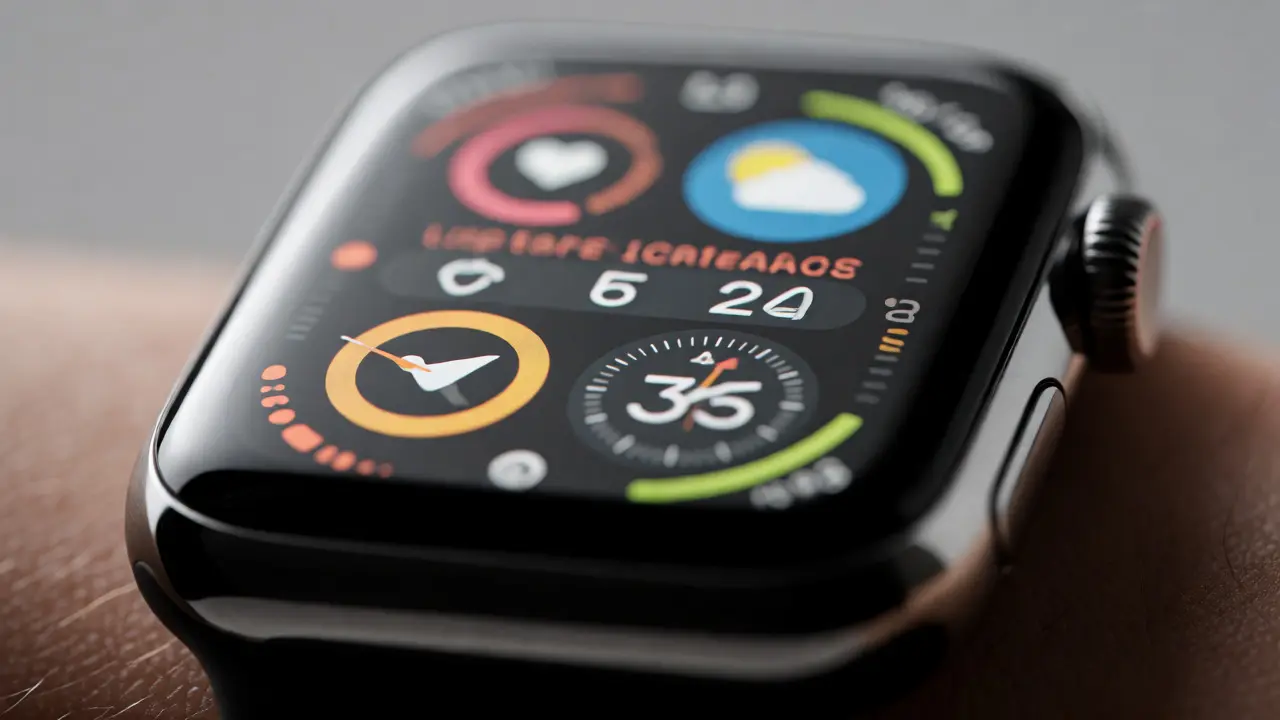

You stare at your wrist. It’s a tiny screen, barely two inches wide, yet it demands to show you the time, your heart rate, the next meeting, and maybe a stock ticker-all at once. If you’ve ever tried to cram too much data into a Apple Watch smartwatch interface, you know the struggle. The result is usually cluttered, unreadable, and frankly, annoying. But what if you could treat each piece of data as an independent building block? What if you could layer them without fighting for space?
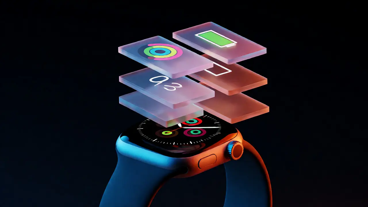
This is where information modularity comes in. It’s not just a buzzword from software architecture; it’s the secret sauce behind those clean, highly functional watch faces that actually make sense. By breaking down the interface into discrete, swappable units-what we call custom layers overlaid visual components on a watch face-designers can create experiences that adapt to the user’s context rather than forcing the user to squint at a static image.
The Core Problem: Space vs. Signal
Here’s the hard truth: screen real estate on a wearable is expensive. Unlike a laptop or even a smartphone, you don’t have room for scroll bars or complex menus. You have one glance. Maybe two. If your watch face requires cognitive effort to decode, you won’t look at it. You’ll ignore it.
Traditional watch face design often fails because it treats data points as fixed elements. The time is always here. The battery is always there. This rigidity breaks when a user wants to prioritize health metrics over calendar events. Information modularity a design principle where content is separated into distinct, interchangeable modules solves this by decoupling the data source from its visual presentation. Instead of drawing a single flat image, you build a system of layers.
Think of it like a sandwich. The bread is the background (maybe a photo, maybe a solid color). The fillings are your widgets-time, weather, activity rings. In a modular system, you can swap the turkey for ham without rebuilding the whole sandwich. On watchOS the operating system for Apple Watch, this means designing components that can be dragged, dropped, resized, and repositioned independently.
What Is Information Modularity in Wearables?
Modularity isn’t new. We see it in LEGO bricks, in web development with React components, and in desktop dashboards. But applying it to a circular or square 1.7-inch display changes the rules entirely.
In a modular watch face, every element must satisfy three conditions:
- Independence: Changing the size of the time widget shouldn’t break the alignment of the weather icon.
- Reusability: The same "Heart Rate" module should look consistent whether it’s placed in the top-left corner or the bottom-center.
- Context Awareness: The module should know when to shrink itself. If the user raises their wrist while walking, maybe the text gets larger for readability. If they’re sitting still, it can be more compact.
When you adhere to these principles, you stop designing screens and start designing systems. This is crucial for Apple Human Interface Guidelines Apple's official recommendations for creating intuitive interfaces, which emphasize clarity and deference to the content. A modular approach ensures that no single element dominates the others unless intentionally prioritized.
Building Custom Layers: The Anatomy of a Widget
So, how do you actually build these layers? Let’s break down a typical "Activity Rings" layer. It’s not just three colored circles. It’s a composite object with specific attributes.
| Component | Function | Design Consideration |
|---|---|---|
| Data Source | Fetches live info (e.g., steps, BPM) | Must handle null states gracefully. What does it look like before sync? |
| Visual Container | Holds the graphic elements | Needs padding to avoid clipping against other layers. |
| Typography | Displays labels or values | Use SF Pro Display. Minimum 10pt font size for legibility. |
| Interaction Zone | Tappable area | Must be at least 44x44 pixels for accurate touch targets. |
Notice the emphasis on constraints. In SwiftUI Apple's declarative framework for building UIs, which powers most modern watch apps, you define these layers using views that automatically adjust to available space. If you hardcode pixel positions, you’ll fail when Apple releases a larger Series model. Always use relative positioning.
Layering Strategies: Z-Index and Occlusion
Once you have your modules, you need to stack them. This is where many designers get tripped up. They assume higher visibility equals better design. Wrong. Overlapping layers can destroy readability.
Consider a scenario: You want a large analog clock hand to sweep across a digital weather forecast. If the hand passes directly over the temperature number, the text becomes illegible for a split second. That flicker is jarring. To fix this, you have two options:
- Occlusion Masks: Add a subtle drop shadow or a semi-transparent background to the text layer so it remains readable even when something moves behind it.
- Dynamic Visibility: Program the layer to fade out slightly when another element intersects its bounding box. This is harder to code but looks magical.
Another common pitfall is ignoring the bezel. On older Apple Watch SE entry-level Apple Watch model models, the screen edges curve away. Text placed too close to the edge disappears. Your modular layers must include "safe zones"-invisible margins around the perimeter where critical information never goes.
Practical Example: The 'Commute' Face
Let’s apply this to a real-world use case. Imagine a commuter who needs to check transit times, battery life, and incoming messages quickly.
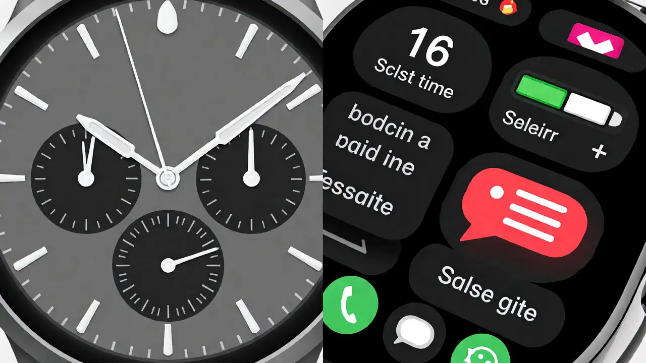
Instead of a generic face, you design a modular layout with three distinct layers:
- Top Layer (Priority): Next Train Arrival. Large, bold text. High contrast.
- Middle Layer (Secondary): Battery Percentage. Small icon, tucked into the corner.
- Bottom Layer (Ambient): Message Preview. Fades in only when a notification arrives, otherwise hidden to save visual noise.
Because these are separate modules, the user can drag the "Next Train" layer to the center if they’re running late. They can delete the message layer entirely if they prefer silence. The system doesn’t break; it just rearranges. This flexibility is the hallmark of good user experience design process of enhancing satisfaction through usability and accessibility.
Pitfalls to Avoid
Even with modularity, things go wrong. Here are the mistakes I see most often in portfolio reviews:
1. Ignoring Dark Mode: Most users wear their watches at night. If your custom layer uses pure black (#000000) for text on a dark background, it vanishes. Always test against OLED blacks. Use white or light gray for text on dark themes.
2. Overloading Animation: Smooth transitions between layers are nice. Constant spinning icons are distracting. If a module updates every second, keep the animation subtle. Save big movements for state changes, like completing a workout ring.
3. Neglecting Accessibility: About 15% of users have some form of vision impairment. If your modular layers rely solely on color coding (red for danger, green for good), you’re excluding people with color blindness. Add icons or patterns to your layers to convey meaning redundantly.
Tools and Workflow
You don’t need Xcode to prototype this. Start in Figma collaborative interface design tool. Create component sets for your layers. Use auto-layout features to simulate resizing. Once the logic holds up in the prototype, move to SwiftUI.
In code, structure your project by feature, not by file type. Don’t put all buttons in one folder. Put the "WeatherButton", "WeatherText", and "WeatherIcon" together. This mirrors the modular nature of the design itself, making maintenance easier when you inevitably need to tweak the spacing.
Final Thoughts
Designing for the wrist is about restraint. You have less space, less time, and less attention than any other platform. Information modularity gives you the power to respect those limits while offering depth. By treating every piece of data as a custom layer, you empower users to curate their own reality. And honestly? That’s the best kind of technology-tech that gets out of the way and lets you live your life.
Can I create completely custom watch faces without coding?
Yes, to an extent. Apple allows users to customize existing faces by swapping complications and changing backgrounds. However, true structural modularity-changing the shape or interaction model of the face itself-requires developing a third-party app using Swift and SwiftUI.
How many layers can I add before performance drops?
There is no hard limit, but practicality suggests keeping active animated layers under five. Each layer consumes GPU resources. Too many overlapping transparent layers can cause frame rate drops, especially on older Series models like the Series 6 or earlier.
Do custom layers work on all Apple Watch models?
Generally, yes, provided the watch runs watchOS 9 or later. However, screen resolution varies between Series 8, Ultra, and SE. Designers must use adaptive layouts (like GeometryReader in SwiftUI) to ensure layers scale correctly across different physical sizes.
What is the biggest mistake beginners make with watch face design?
Trying to replicate smartphone density. Beginners often pack too much text onto the screen. Remember, the goal is glanceability. If you can't read it in under two seconds while walking, simplify the layer.
How does battery life affect layer design?
Complex animations and frequent data refreshes drain the battery faster. Static layers or those updating every minute are more efficient. Always optimize your update cycles; don't refresh a weather widget every second if the data only changes hourly.
Categories
Popular Articles