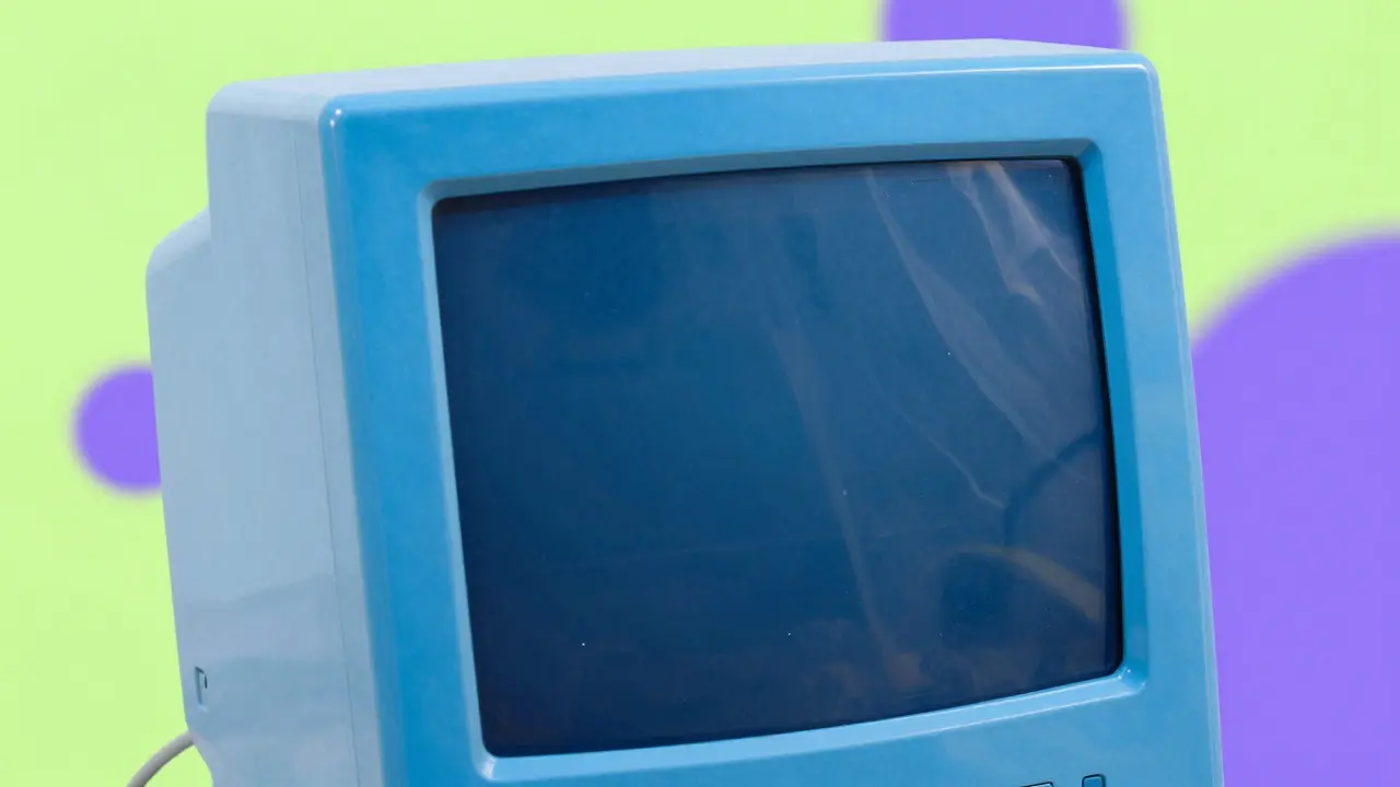

Remember when your desk was a rainbow? In the late 90s and early 2000s, an iMac was a consumer desktop computer known for its translucent, candy-colored plastic shell. It wasn't just a tool; it was a statement. The shift from those vibrant hues to the sleek, matte silvers and deep space grays of today marks one of the most significant visual pivots in tech history. This isn't just about paint jobs. It’s a reflection of how Apple views its user, what values it prioritizes, and how design communicates function versus emotion.
We often look at product design as purely aesthetic, but color is a functional language. It tells you where to plug things in. It signals status. It defines the mood of your workspace. Understanding this evolution helps us see why your new MacBook feels so different from the computer that started it all, even if the core mission remains the same.
The G3 Era: Design as Disruption
When Jony Ive took over industrial design at Apple in the late 90s, the PC market was dull. Beige boxes were everywhere. They looked like filing cabinets. Apple needed to wake people up. The original iMac G3, released in 1998, did exactly that with its Bondi Blue casing. It was bold, almost aggressive, and impossible to ignore.
This period was defined by translucency. You could see the internal components through the plastic. It demystified technology. Instead of a black box, the computer felt organic, like a toy or a piece of modern art. The color palette expanded rapidly:
- Bondi Blue: The iconic launch color, bright and energetic.
- Graphite: A darker, more professional option that still kept the translucency.
- Lime Green: A jarring, high-energy choice that appealed to younger users.
- Indigo: A deep purple-blue that offered a slightly more mature vibe.
The strategy here was clear: make technology approachable. If computers were scary or complicated, colorful plastics made them friendly. It was a direct challenge to the corporate sterility of Windows PCs. You weren't buying a machine; you were buying a personality.
The White Box Transition: Simplicity Takes Over
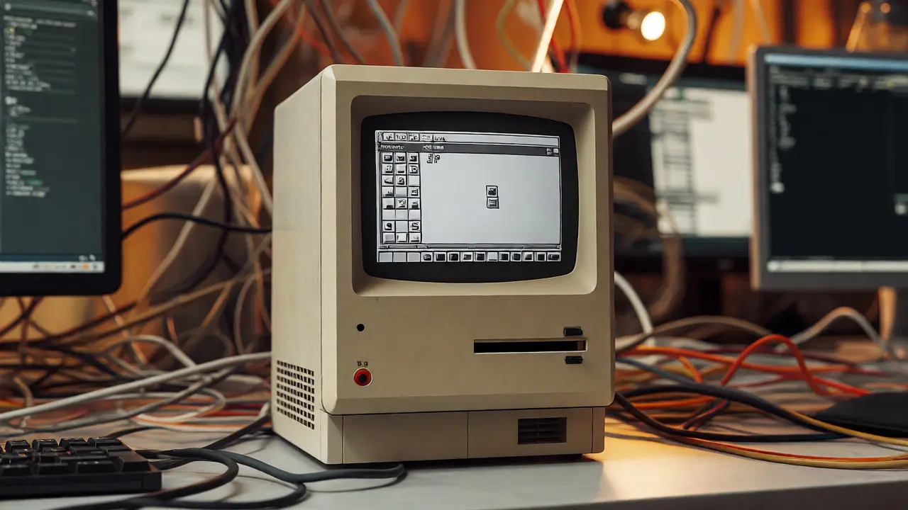
By 2004, the landscape shifted. The iMac G5 dropped the translucent plastic for opaque white aluminum. Why? Because the technology inside was getting more powerful, and the design language was maturing. The focus moved from "look at me" to "look at the screen."
White became the dominant color for several years. It symbolized cleanliness, purity, and minimalism. Think of the first iPhone, the iPod nano, and the Mac Pro. White allowed the product to blend into any environment. It didn't compete with your wallpaper or your office decor. It receded into the background, letting the content on the display take center stage.
This era introduced a subtle but crucial change: monochromatic harmony. Your keyboard, mouse, and laptop all matched. There was no mismatched beige tower and black monitor. Everything was unified. This reduced cognitive load. You didn't have to think about whether your peripherals matched; they just did. It was design working silently in the background.
| Decade | Dominant Colors | Material | Design Philosophy |
|---|---|---|---|
| 1990s-2000s | Bondi Blue, Lime, Indigo | Translucent Plastic | Approachability, Fun, Disruption |
| 2000s-2010s | White, Silver | Opaque Aluminum | Cleanliness, Minimalism, Uniformity |
| 2010s-Present | Space Gray, Midnight, Starlight | Brushed Aluminum | Sophistication, Versatility, Premium Feel |
The Rise of Space Gray: Sophistication and Versatility
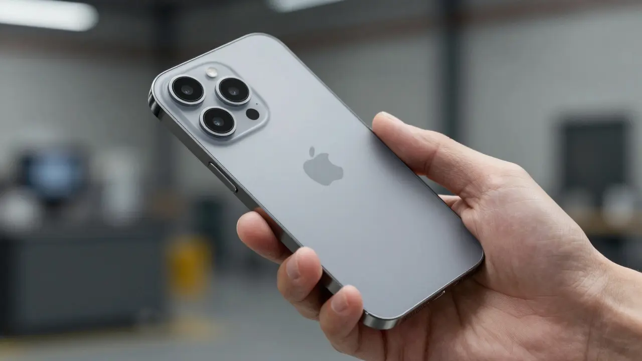
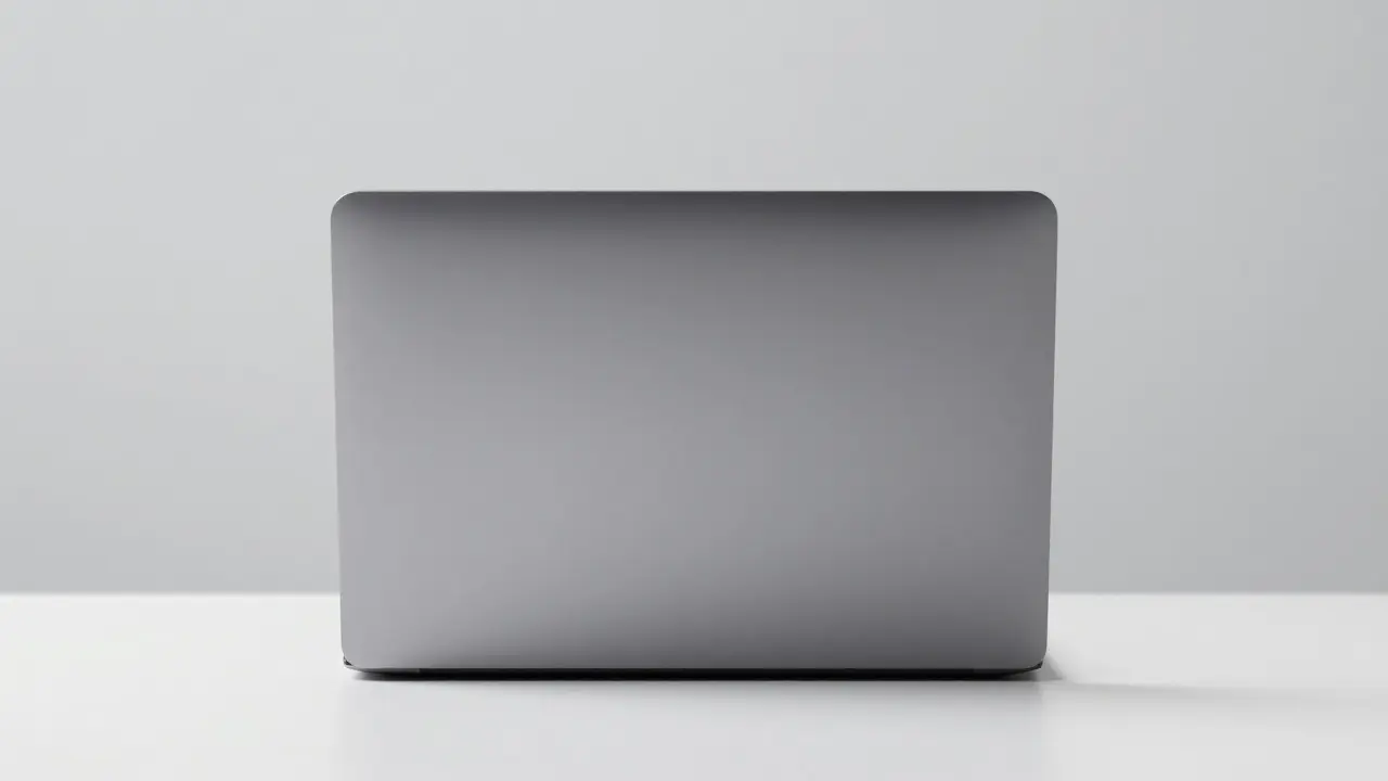
Around 2012, Apple introduced Space Gray. At first, it was seen as a minor variant. But it quickly became the preferred choice for many professionals. Why? Because gray is neutral. It doesn't clash. Whether you're in a creative studio with colorful posters or a law firm with wood paneling, Space Gray fits. It feels serious without being boring. It suggests precision engineering rather than playful experimentation.
This shift mirrored a broader trend in tech: the move toward premium neutrality. As devices became thinner and lighter, their physical presence diminished. Color had to carry more weight. Bright colors can feel cheap if the build quality isn't perfect. Neutral tones hide minor imperfections and emphasize the craftsmanship of the materials. Brushed aluminum in gray looks expensive. It feels durable. It ages well.
For businesses, this was a game-changer. IT departments could standardize on one color. Employees wouldn't complain about matching accessories. The device became a tool, not a fashion accessory. This aligns with Apple's growing B2B (Business-to-Business) push, where reliability and uniformity matter more than individual expression.
Current Trends: Subtlety and Personalization
Today, we see a nuanced approach. While neutrals dominate, Apple has reintroduced color in a more restrained way. The latest iPads and MacBooks offer options like Midnight, Starlight, and Sienna. These aren't the loud, saturated hues of the G3 era. They are muted, earthy tones that add a touch of personality without overwhelming the senses.
This reflects a change in consumer behavior. People want personalization, but they don't want it to be distracting. They want a hint of self-expression that still feels sophisticated. It's the difference between wearing a neon shirt and wearing a high-quality charcoal blazer with a subtle pattern. Both express style, but one is louder than the other.
Furthermore, the rise of Apple Silicon chips has influenced design. With heat dissipation becoming less of a constraint due to efficient chip architecture, designers have more freedom in material choices. However, they've chosen restraint. The focus remains on thermal efficiency and structural integrity, which often favors metal over plastic. Metal allows for better heat transfer, keeping devices cool during intensive tasks like video editing or gaming.
Why Does Color Matter So Much?
It’s easy to dismiss color as superficial, but in design, every detail serves a purpose. Here’s why Apple’s color strategy is so effective:
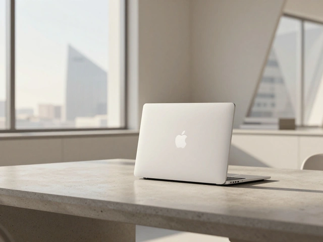
- Brand Recognition: Even without a logo, the shape and color combination of an Apple product are instantly recognizable. The silhouette of a MacBook in Space Gray is distinct from a Dell or HP laptop.
- User Psychology: Color affects mood. Bright colors can increase energy and creativity. Neutral colors promote focus and calm. Apple offers both, catering to different use cases.
- Perceived Value: Studies in consumer psychology suggest that neutral, premium-looking products are perceived as higher quality. The lack of flashy colors signals confidence in the product's performance.
- Longevity: Trendy colors go out of style quickly. Neutrals remain relevant for years. A Space Gray iPhone from five years ago still looks modern. A lime green iMac from 2000 might look dated today.

The Future: What’s Next?
Looking ahead, we might see even more integration of color into functionality. Imagine devices that subtly change hue based on ambient lighting or time of day, using advanced OLED displays that extend beyond the screen to the chassis. Or perhaps a return to bolder colors, but with sustainable materials that appeal to eco-conscious consumers.
One thing is certain: the era of random, loud colors is over. Apple has mastered the art of understated elegance. They understand that true luxury is quiet. It’s not about shouting for attention; it’s about being noticed because everything is perfectly in place. As we move further into the future of computing, expect Apple to continue refining this balance between personal expression and universal appeal. The next big shift might not be about color at all, but about how color interacts with light, texture, and touch.
Frequently Asked Questions
Why did Apple stop making colorful iMacs?
Apple shifted away from translucent colorful plastics to opaque metals to signal a move toward professional-grade hardware. The transition reflected a maturing brand image, focusing on durability, heat management, and a minimalist aesthetic that blends into various environments rather than standing out as a novelty.
Is Space Gray better than Silver for productivity?
While subjective, many users find Space Gray less distracting than Silver. Silver can reflect light and show fingerprints more easily, potentially breaking concentration. Space Gray absorbs light and hides smudges, creating a calmer visual experience that supports longer work sessions.
Do Apple colors affect resale value?
Generally, neutral colors like Space Gray and Silver hold their value better than limited-edition or highly specific colors. Buyers in the secondary market prefer versatility and condition. A clean, neutral device appeals to a wider audience, whereas a unique color might limit potential buyers to a niche group.
What role does Jony Ive play in current color decisions?
Although Jony Ive left Apple in 2019, his design philosophy heavily influences the company's current direction. The emphasis on simplicity, material honesty, and seamless integration continues under new leadership. Current color palettes reflect the long-term strategic vision established during his tenure, prioritizing timeless design over fleeting trends.
Are there any upcoming changes to Apple's color lineup?
Apple typically updates color options with each major product cycle. Recent trends suggest a continued focus on muted, natural tones like Starlight and Midnight. However, rumors occasionally point to special editions or sustainability-focused colors made from recycled materials, which may introduce new shades in future releases.