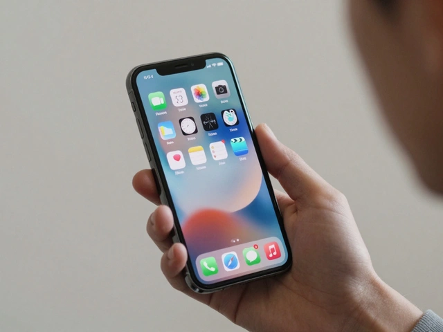

Think about the last time you picked up an iPhone. Did you read a manual? Did you struggle to find the power button? Probably not. You just used it. That feeling of effortless interaction isn't magic; it's the result of ruthless editing. Apple doesn't just make products; they curate experiences by removing everything that doesn't serve the core function. This approach, often called simplicity-first product design, is harder than it looks because it requires saying "no" more often than "yes."
Most companies add features to solve problems. Apple solves problems by taking things away. When Steve Jobs returned to Apple in 1997, the company was drowning in complex, confusing products. The fix wasn't better marketing; it was cutting the product line from dozens of models down to four. This article breaks down how that philosophy works in practice, why it’s so difficult to copy, and what you can steal from their playbook for your own projects.
The Myth of Easy Simplicity
People assume simple means basic. It’s not. Simple means clear. There is a massive difference between a feature-less product and a focused one. A calculator is simple because it does one thing well. A smartphone is complex under the hood but feels simple on the surface. Apple achieves this through abstraction. They hide the complexity behind intuitive interfaces and seamless hardware integration.
Consider the original iPod. In 2001, MP3 players were cluttered with buttons, menus, and confusing file management systems. Apple introduced the Click Wheel. It replaced a dozen physical buttons with a single touch-sensitive interface. Users didn't need to understand how the hard drive worked or how to manage playlists via USB mass storage. They just scrolled and clicked. The complexity didn't disappear; it moved into the software where it could be managed invisibly.
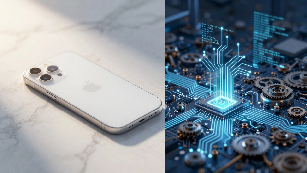
This shift requires deep technical control. You can’t hide complexity if you’re building on top of someone else’s messy foundation. Apple designs its own silicon, operating system, and hardware chassis. This vertical integration allows them to optimize every pixel and millimeter. If you try to copy Apple’s look without controlling the underlying tech stack, you’ll end up with a pretty shell that falls apart when users push it.
Designing for the First Five Seconds
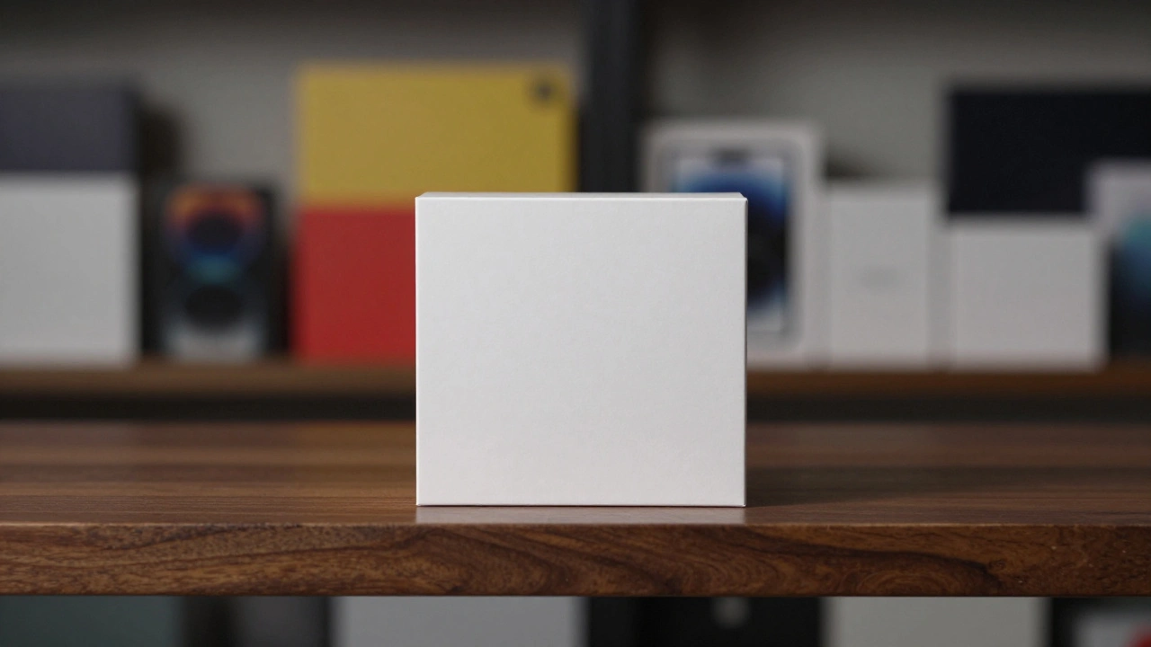
Attention spans are short. If a user can’t figure out how to use your product within five seconds, you’ve failed. Apple designers obsess over this initial moment of contact. They call it the "out-of-the-box experience," but it starts before the box is even opened. The packaging itself is designed to slow you down, creating anticipation while guiding you through setup with minimal friction.
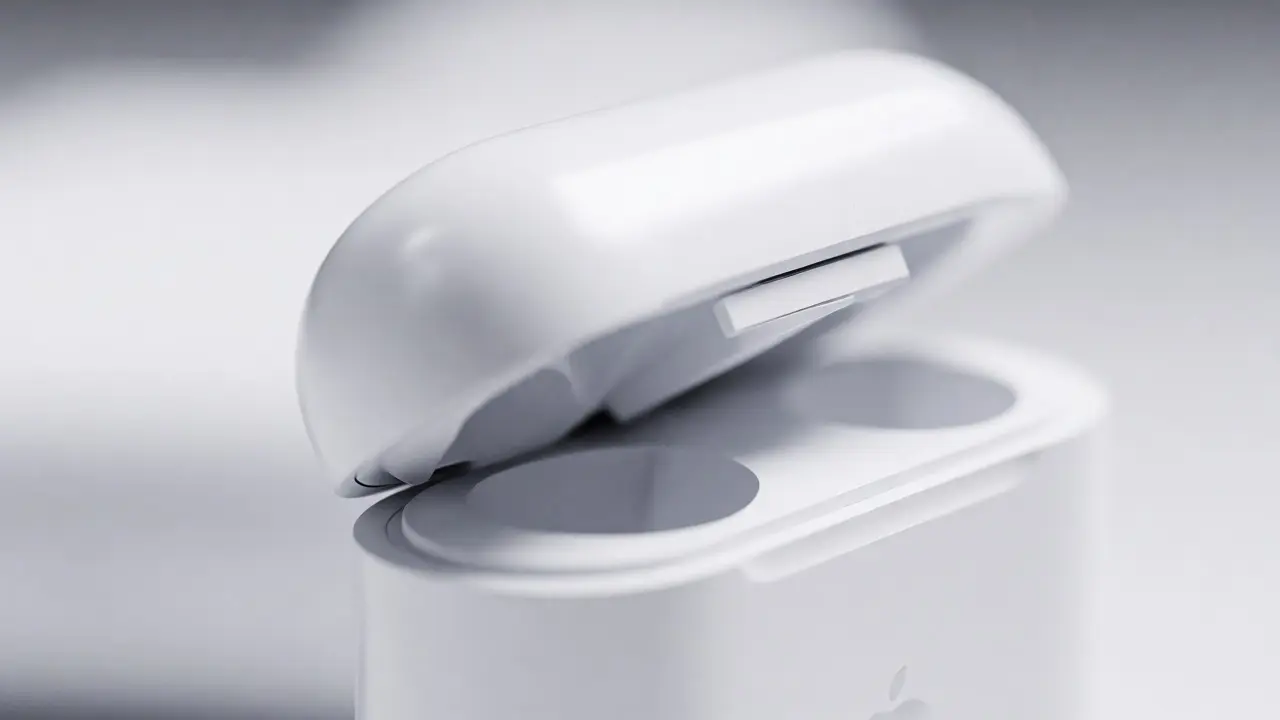
Take the unboxing of an AirPods case. The lid opens with a specific tactile resistance-a soft click that feels satisfying but not cheap. The earbuds sit perfectly aligned. There are no tangled wires, no extra plastic wrappers, and no quick-start guide telling you to download an app first. The device pairs automatically when brought near an iPhone. This isn't luck; it's engineered serendipity.
To achieve this, Apple uses a principle called "progressive disclosure." Don’t show all options at once. Show only what’s needed right now. When you open the Settings app on iOS, you see broad categories like Wi-Fi, Bluetooth, and General. You don’t see advanced network protocols or developer options unless you dig deeper. This reduces cognitive load. Users feel smart because they aren’t overwhelmed by choices they don’t care about yet.
The Cost of Saying No
Simplicity is expensive. Not in dollars, necessarily, but in opportunity cost. Every feature you cut is a potential sales point you lose. Competitors will scream that they have more ports, more customization, or more settings. Apple bets that most users value clarity over configurability. And they’re usually right.
Look at the removal of the headphone jack in 2016. Critics called it anti-user. But it forced the industry toward wireless audio, which eventually became standard. It also freed up internal space for a larger battery and haptic engine. Apple prioritized the long-term ecosystem vision over immediate backward compatibility. This kind of decision requires confidence. Most product managers are afraid to remove features because they fear backlash. Apple accepts the noise as part of the strategy.
Here is how different companies handle feature bloat:
| Approach | User Experience | Maintenance Burden | Brand Perception |
|---|---|---|---|
| Feature-First (e.g., Android OEMs) | High customization, high learning curve | Heavy; many edge cases to test | Versatile but fragmented |
| Apple-Centric | Low customization, low learning curve | Lighter; fewer permutations | Premium, cohesive, exclusive |
The trade-off is clear. If you want to appeal to power users who want to tweak every setting, Apple’s model might frustrate them. But if you want to capture the mainstream market, reducing friction wins every time. The key is knowing who your user actually is, not who you wish they were.
Material Honesty and Physical Design
Digital simplicity needs physical support. If the software is clean but the hardware feels flimsy, the illusion breaks. Apple invests heavily in material science. They use recycled aluminum, surgical-grade stainless steel, and ceramic shield glass. These materials aren't just durable; they communicate quality. When you hold an iPhone, the weight distribution tells you it’s premium before you even turn it on.
Jony Ive, Apple’s former Chief Design Officer, famously said that good design is obvious. Great design is transparent. Transparency means the material matches its function. Aluminum is light and strong, so it’s used for laptop bodies. Glass is smooth and scratch-resistant, so it’s used for screens. Leather is warm and tactile, so it’s used for accessories. Nothing is fake. No plastic pretending to be metal. No stickers covering seams.
This attention to detail extends to tolerances. Gaps between parts are measured in fractions of a millimeter. Buttons have consistent travel distance. Hinges snap shut with precise force. These micro-interactions build trust. Users subconsciously associate physical precision with digital reliability. If the hinge feels loose, you assume the software is buggy too. If the fit is perfect, you assume the code is clean.
Ecosystem Lock-In Through Frictionless Handoff
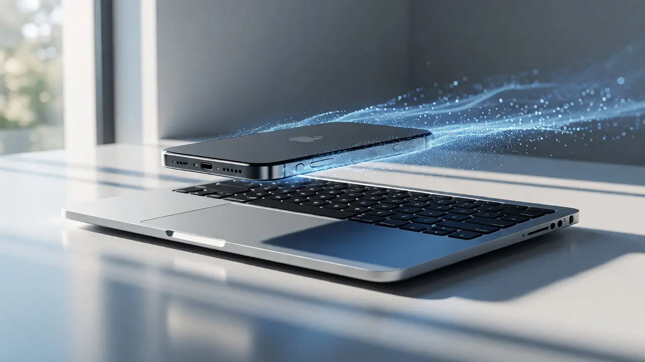
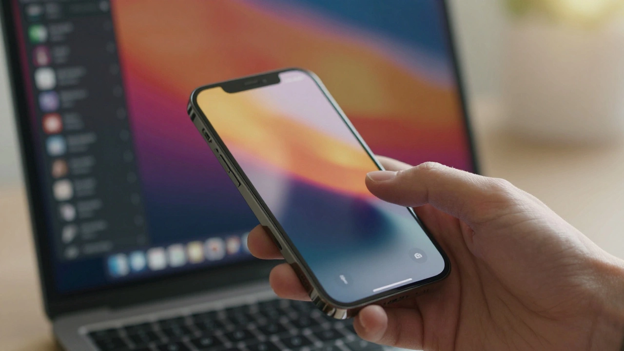
One reason Apple’s simplicity sticks is the ecosystem. Devices talk to each other seamlessly. Copy text on your iPhone, paste it on your Mac. Start an email on your phone, finish it on your iPad. This continuity removes friction between tasks. It’s not just convenient; it’s addictive. Once you’re inside the loop, leaving feels painful.
This relies on proprietary technologies like Continuity and Handoff. These features work because Apple controls both ends of the connection. They don’t have to negotiate standards with third-party manufacturers. They can iterate quickly. If a feature doesn’t work smoothly, they can kill it or rewrite it overnight. Competitors trying to replicate this often fail because they rely on open standards that lag behind or lack polish.
For designers outside Apple, the lesson is to reduce friction between steps. If your app requires users to manually sync data, export files, or re-enter passwords, you’re adding complexity. Automate the transitions. Make the next step obvious. Let the system do the heavy lifting so the user can focus on the outcome, not the process.
How to Apply Simplicity Without Being Apple
You don’t need a billion-dollar R&D budget to apply these principles. Start by auditing your current product. List every feature. Ask yourself: "Does this help the user achieve their primary goal faster?" If the answer is no, consider removing it. If you’re scared to delete it, move it to a secondary menu instead of deleting it outright. Test if anyone misses it.
- Define the Core Job: What is the one thing your product must do perfectly? Everything else is secondary.
- Reduce Choices: Limit visible options. Use defaults wisely. Most users prefer a good default over endless configuration.
- Polish Transitions: Smooth animations and instant feedback make interactions feel natural. Lag kills perceived simplicity.
- Consistency Over Novelty: Reuse patterns. If a gesture works in one place, it should work everywhere. Surprise is bad in UI design.
Remember, simplicity is not a destination. It’s a continuous process of refinement. As technology advances, new capabilities emerge. The challenge is integrating them without breaking the mental model users already have. Apple succeeds because they prioritize the user’s mental model over technical possibility. Just because you *can* add a feature doesn’t mean you *should*.
Why is Apple’s design considered simpler than competitors?
Apple focuses on vertical integration, meaning they control hardware, software, and services. This allows them to hide technical complexity behind unified interfaces. Competitors often rely on third-party components, leading to inconsistent experiences and more exposed settings.
Does simplicity mean fewer features?
Not necessarily. It means features are contextual and hidden until needed. Apple devices often have powerful capabilities buried in simple gestures or automatic processes, rather than exposing every option in a menu.
Is Apple’s design philosophy sustainable for all businesses?
It depends on the target audience. Niche markets often require high customization. However, for mass-market consumer products, reducing cognitive load usually drives higher adoption and satisfaction, regardless of company size.
What is progressive disclosure in UI design?
Progressive disclosure is a technique where only essential information is shown initially. Advanced options appear only when the user requests them. This prevents overwhelming beginners while still providing depth for experts.
How does packaging contribute to Apple’s design philosophy?
Packaging sets expectations. Apple boxes are designed to create a ritualistic unboxing experience that reinforces brand values of precision and care. Slow opening mechanisms build anticipation and signal quality before the product is even seen.
Categories
Popular Articles