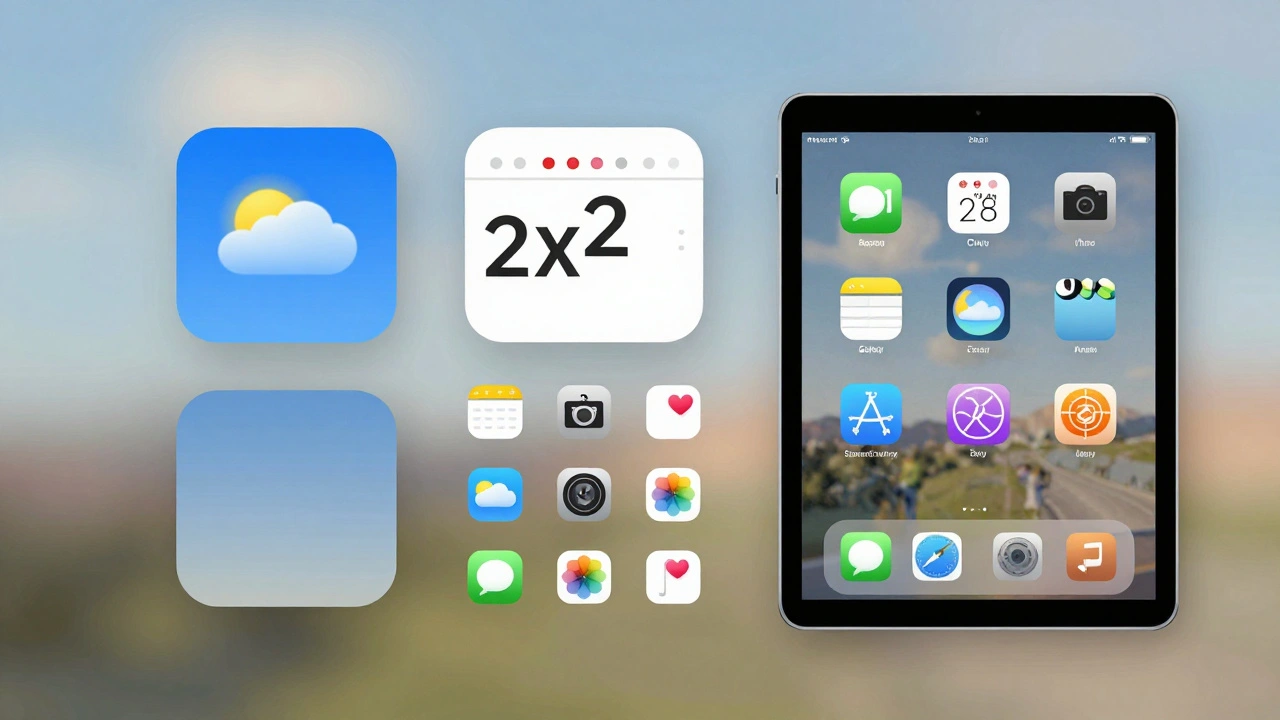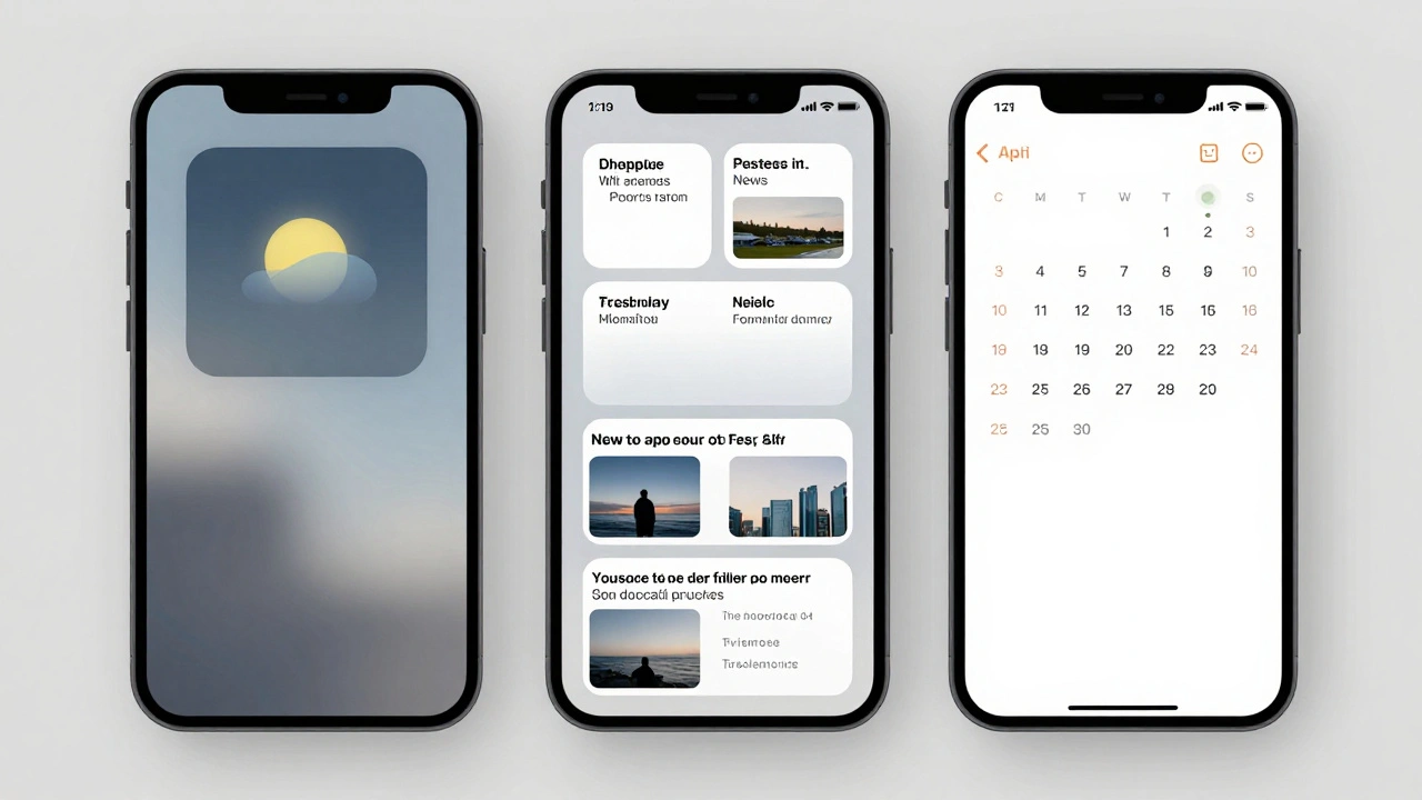

Imagine building a single interface component that looks native on an iPhone Lock Screen, scales perfectly to a Mac menu bar, and remains legible on a massive iPad display-all without writing separate code for each device. That is the promise of the modern Apple Widget ecosystem. It’s not just about adding a shortcut; it’s about creating a persistent, glanceable presence in your user’s daily routine. But here is the catch: designing for this multi-surface reality is tricky. If you treat every screen like a blank canvas, you end up with maintenance nightmares. The secret lies in "design once, adapt everywhere," leveraging the shared DNA of SwiftUI.
This approach isn’t just a technical convenience; it’s a strategic shift in how we think about user interfaces. We are moving away from app-centric silos toward a distributed experience model. Your content lives where the user looks, not just where they tap. To pull this off, you need to understand the constraints of each surface and the capabilities of the underlying framework. Let’s break down how to build a resilient widget strategy that saves time and boosts engagement.
The Core Philosophy of Adaptive Widgets
At its heart, the WidgetKit framework (now largely integrated into SwiftUI) relies on a declarative syntax. This means you describe what the UI should look like, and the system handles the rendering across different contexts. The central entity here is the Widget Extension, which acts as a lightweight process that shares resources with your main app. Because these extensions run in a sandboxed environment with strict memory limits, efficiency is non-negotiable.
When you design for the ecosystem, you must accept that context changes drastically between devices. An iPhone home screen widget competes with icons for attention. A Mac desktop widget might sit behind windows. An iPad Stage Manager view offers more real estate but demands higher information density. Trying to force one static design onto all these surfaces results in poor usability. Instead, you adopt a modular mindset. You create reusable views that can stretch, shrink, or rearrange based on available space.
Think of it like packing for a trip. You don’t pack three different outfits for three different days if you can pack one versatile layering system. Similarly, you build a base view structure that adapts to size classes. This reduces code duplication and ensures visual consistency. When a user sees your brand color on their watch face, then again on their phone lock screen, and finally on their Mac dock, the experience feels cohesive. That cohesion builds trust.
Leveraging SwiftUI for Cross-Platform Consistency
SwiftUI is the engine driving this adaptability. Its layout system uses concepts like GeometryReader and ViewThatFits to dynamically adjust content. For developers, this means less conditional logic checking for device types. You write one view hierarchy, and SwiftUI resolves the layout based on the container’s size.
Consider a weather app. On a small iOS widget, you show only the current temperature and condition icon. On a medium widget, you add high/low temperatures. On a large widget or a Mac desktop widget, you include a five-day forecast. In SwiftUI, you don’t write three separate structs. You use modifiers that hide or reveal elements based on width thresholds. This keeps your codebase clean and your design intent clear.
However, performance matters. Widgets refresh periodically, often triggered by background tasks or push notifications. Heavy animations or complex image processing can drain battery life. Stick to simple vector graphics and system fonts. Avoid custom drawing operations unless absolutely necessary. Remember, the goal is glanceability. If a user has to squint or wait two seconds for data to load, you’ve failed.
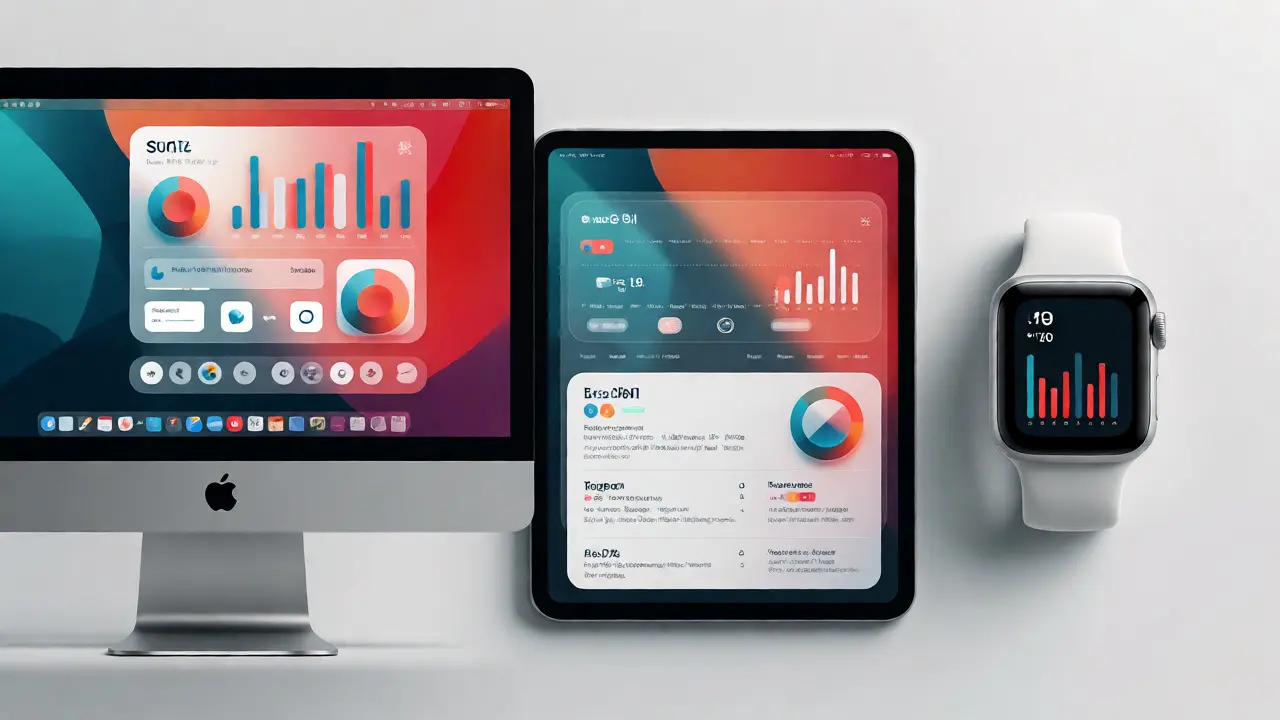
Designing for Specific Surfaces: iPhone, iPad, and Mac
Each platform in the Apple ecosystem imposes unique constraints. Ignoring them leads to broken layouts. Here is how you handle the major players:
- iPhone Home Screen & Lock Screen: These are high-frequency touchpoints. The Lock Screen widget is tiny and monochromatic (mostly). It needs high contrast and minimal text. The Home Screen widget allows for full color but still demands brevity. Users scan these quickly while unlocking their phones.
- iPad Widgets: iPads offer larger canvases. With Stage Manager, widgets can appear alongside apps. This is an opportunity for richer data visualization, like charts or lists, but you must ensure readability at varying zoom levels.
- macOS Widgets: Since macOS Sonoma, widgets live in Notification Center and on the desktop. They interact with mouse hover states, which iOS does not support. You can add subtle interactivity here, like expanding details on hover, but keep it lightweight.
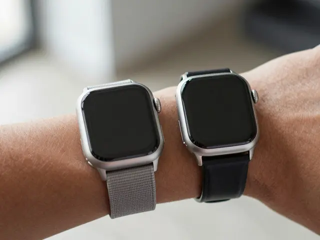
- Apple Watch: While technically part of the ecosystem, watch widgets (Complications) have extreme size constraints. Often, the best strategy is to exclude complex widgets from Watch or provide a simplified version specifically designed for circular or rectangular complications.
The key takeaway? Do not assume parity. Just because you can render a chart on a Mac doesn’t mean it fits on a Phone. Use conditional compilation or runtime checks to serve optimized versions. This prevents your beautiful Mac widget from looking cramped on a smaller screen.
Data Flow and Interactivity Challenges
Widgets are read-mostly interfaces. Unlike full apps, they cannot perform heavy network requests on demand without draining resources. The standard pattern involves using TimelineProvider to schedule updates. You tell the system when to fetch new data, and it batches these requests to save battery.
Interactivity is limited but growing. You can add buttons to widgets now, allowing users to toggle settings or mark items as done directly from the home screen. However, these actions trigger deep links back into the app or execute specific intents via App Intents. This is crucial for productivity apps. Imagine marking a task complete from your Lock Screen without opening the ToDo list app. That friction reduction is where engagement spikes.
State management across devices requires careful synchronization. If a user updates a setting on their Mac, it should reflect on their iPhone widget within the next timeline update. Using CloudKit or shared UserDefaults groups helps maintain this sync. Test edge cases: what happens when the user is offline? What if the data source fails? Always provide a graceful fallback state so the widget never appears empty or broken.

Testing and Optimization Strategies
You cannot rely solely on Xcode previews. Previews are helpful for quick iterations, but they don’t simulate real-world conditions like low power mode or background refresh restrictions. Use the actual devices. Install your app on an iPhone, iPad, and Mac. Observe how the widget behaves after reboot, after switching networks, and during long periods of inactivity.
Monitor metrics closely. Check energy impact logs. If your widget causes excessive wake-ups, optimize your timeline intervals. Maybe updating every hour is enough instead of every fifteen minutes. Also, consider accessibility. Ensure dynamic type sizes work correctly. VoiceOver users should hear meaningful descriptions of the widget content, not just raw numbers.
| Platform | Primary Context | Key Constraint | Best Practice |
|---|---|---|---|
| iPhone Lock Screen | Glanceable status | Monochrome, tiny size | High contrast, minimal text |
| iPhone Home Screen | Quick action/info | Competes with icons | Clear hierarchy, fast load |
| iPad | Detailed overview | Variable window sizes | Responsive layout, rich data |
| macOS | Desktop utility | Hover interactions | Subtle animations, mouse support |
Future-Proofing Your Widget Strategy
The Apple ecosystem continues to evolve. Recent updates have introduced interactive widgets and expanded customization options. Staying ahead means keeping your architecture flexible. Abstract your data sources so you can swap providers easily. Keep your UI components decoupled from business logic. This makes it easier to adapt when Apple introduces new APIs or deprecates old ones.
Also, think about personalization. Users want control. Allow them to choose which data points appear in their widgets. This increases perceived value. A generic widget is forgettable; a personalized one becomes a habit. As spatial computing grows with visionOS, remember that depth and positioning will become new design variables. Start thinking in terms of volumetric space now, even if you’re only shipping for flat screens today.
Can I use the same code for iOS and macOS widgets?
Yes, largely. Since both platforms share the SwiftUI foundation, you can share most of your view code. However, you may need to handle platform-specific behaviors like hover effects on macOS or distinct sizing constraints on iOS. Using `#if os(macOS)` blocks allows you to tweak these specifics without duplicating the entire view hierarchy.
How do widgets update their data?
Widgets use a TimelineProvider to schedule updates. You define entries for future times, and the system refreshes the widget at those intervals. Additionally, you can trigger immediate updates using `WidgetCenter.shared.reloadTimelines(ofKind:)` when significant events occur, such as receiving a push notification or completing a background task.
Are widgets supported on all Apple devices?
Widgets are supported on iOS 14+, iPadOS 14+, macOS 11+ (Big Sur), and tvOS 17+. Apple Watch supports Complications, which function similarly but have stricter size and interaction limitations. VisionOS also supports widgets, though their placement and interaction models differ significantly due to the spatial nature of the OS.
What is the memory limit for widget extensions?
Widget extensions operate under tight memory constraints, typically around 30MB for the extension itself, though this can vary by device and OS version. Exceeding this limit causes the widget to crash and revert to a placeholder. Always profile your widget’s memory usage, especially if loading images or complex data structures.
How do I test widget interactions?
Use the simulator for basic testing, but always verify on physical devices. For interactive widgets, ensure that App Intents are properly configured and that the target app launches correctly. You can debug intent execution by checking the console logs in Xcode when interacting with the widget on a connected device.