
Widgets on Apple devices aren’t just small app previews-they’re essential interface elements that shape how users interact with their phones, tablets, and Macs every day. If you’ve ever glanced at your home screen to check the weather, see your next meeting, or spot a new podcast episode without opening an app, you’ve experienced the power of a well-designed widget. This isn’t about convenience. It’s about reducing friction. Making information feel immediate, not hidden.
Apple’s approach to widgets is built on two core ideas: at-a-glance value and system harmony. These aren’t optional design preferences. They’re rules that separate functional widgets from clutter. A widget that doesn’t deliver value in one glance gets ignored. One that clashes visually with its neighbors feels broken. Let’s break down what actually works-and what doesn’t.
What At-a-Glance Value Really Means
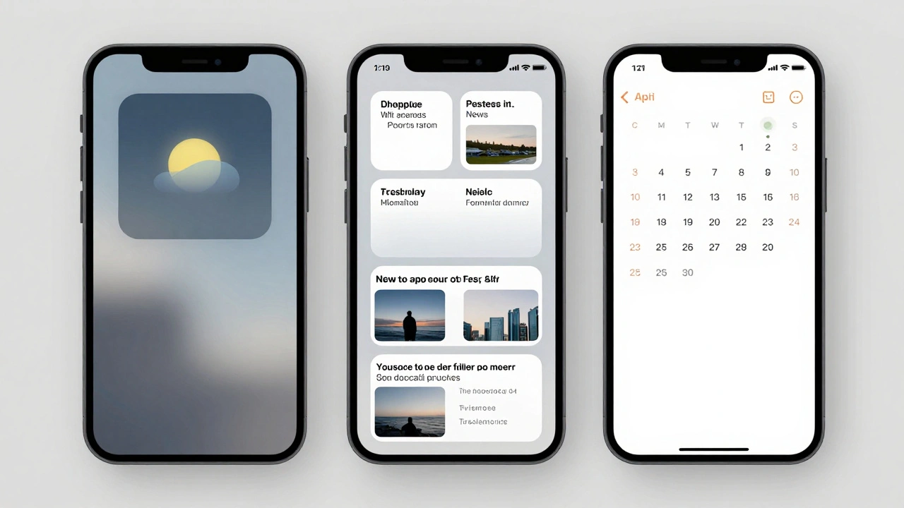
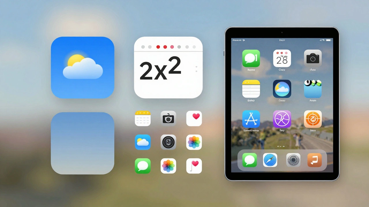
At-a-glance doesn’t mean "show something small." It means communicate the most important thing instantly. Think of a weather widget. The small version shows today’s high, low, and current conditions in one clean line. No icons, no labels, no "Today:" text. Just data. The medium version adds a five-day forecast. The large version adds precipitation charts and hourly trends. Each size expands the detail, but never forces the user to hunt for the core info.
Compare that to a poorly designed widget that shows "Last updated: 3 minutes ago" or "Tap to see more." That’s not at-a-glance. That’s an instruction. Apple’s rule is simple: the widget should answer the question before you even tap it. The tap is for deeper action-not for revealing what should’ve been visible already.
News widgets follow the same logic. A small news widget fills its entire space with one headline and a single image. No preview text. No byline. No date. Just enough to make you decide if you want to tap. A medium version shows three headlines. A large version shows five, with thumbnails and category tags. Each size is built from scratch for its context-not stretched from the small version.
System Harmony: The Invisible Rules
System harmony is what makes widgets feel like part of the OS, not third-party add-ons. It’s why a weather widget from a third-party app looks like it belongs beside Apple’s own Calendar widget. There are strict, consistent rules behind this.
First, margins. Every widget uses 16-point spacing by default. If you’re placing a circle or inset shape inside the widget, you drop to 11 points. But here’s the trick: corners on those shapes must match the widget’s corner radius. Apple’s SwiftUI container does this automatically. You don’t calculate it. You just use the tool. Why? Because if one widget has slightly sharper corners than its neighbor, your brain notices. It feels off. That’s system harmony.
Fonts matter too. Only SF Pro, SF Mono, or SF Pro Rounded are allowed. No custom fonts unless you absolutely need brand recognition-and even then, you must make sure it doesn’t clash. A widget using a bold serif font next to Apple’s clean sans-serif looks like it’s from a different device.
Dark mode isn’t optional. It’s mandatory. A calendar widget doesn’t just invert colors-it transforms. In light mode, it shows white text on pastel backgrounds. In dark mode, it flips to dark text on light backgrounds, mirroring how the full Calendar app behaves. Podcasts use gradient backgrounds that adapt to both modes. Notes widgets copy their in-app appearance exactly. If your widget looks wrong in dark mode, users will notice-and they’ll disable it.
Visual Presentation in iOS 26: Accented Rendering
iOS 26 introduced accented rendering, a new way widgets appear on the home screen. Instead of solid backgrounds, widgets now sit on translucent glass-like surfaces that tint based on your wallpaper. The system automatically desaturates colors and applies subtle highlights. Developers don’t fight this-they adapt.
Apple gives you four image rendering options:
- Desaturated: Removes color, keeps shape. Best for icons and general content.
- AccentedDesaturated: Desaturated + a hint of your system accent color. Perfect for buttons and interactive areas.
- FullColor: Preserves original colors. Only use for media-album art, book covers, movie posters.
- Accented: Applies accent color directly. Use sparingly, only for key UI elements.
Most widgets default to AccentedDesaturated. A fitness tracker showing steps? Desaturated graph lines with a touch of your accent color on the progress bar. A stock widget? Desaturated chart with a single colored line for the trend. FullColor? Reserved for album art in the Music widget. If you use FullColor for a text-heavy widget, it’ll look jarring.
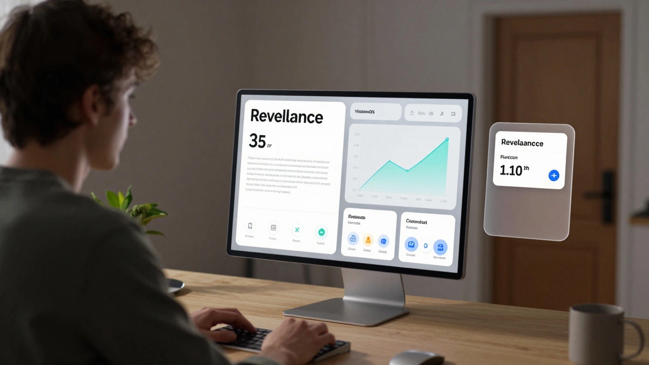
Cross-Platform Consistency: VisionOS and WatchOS
Widgets aren’t just for iPhone anymore. VisionOS 26 brings spatial widgets that float above surfaces or sink into them. You can choose between glass or paper textures. The Level of Detail API adjusts content based on distance. If you’re 3 feet away, the widget simplifies-fewer details, larger text. Lean in, and it fills with full data. This isn’t zooming. It’s intelligent adaptation.
WatchOS 26 went even further with Relevance Widgets. Instead of static tiles on your watch face, widgets now appear only when they matter. Need to know your next bus time? The widget shows up when you’re near a stop. Checking your daily step goal? It pops up at 9 a.m. and disappears after you hit 10,000. No more clutter. No more scrolling. Just context-driven info.
This changes how you build widgets. You don’t just schedule updates. You define contexts: time, location, activity, device state. A calendar widget might trigger only when you’re at your office or when your next meeting is within 15 minutes. It’s not about what’s in the app-it’s about what’s relevant right now.
What Not to Do: The Forbidden Rules
Apple has clear lines you can’t cross. Break them, and your widget feels alien.
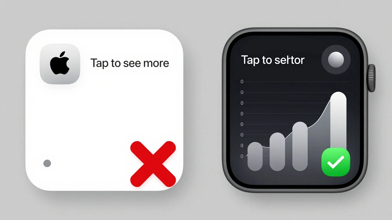
- No app icon. The icon already sits below the widget on the home screen. Adding it inside is redundant.
- No app name. Same reason. The label is already there.
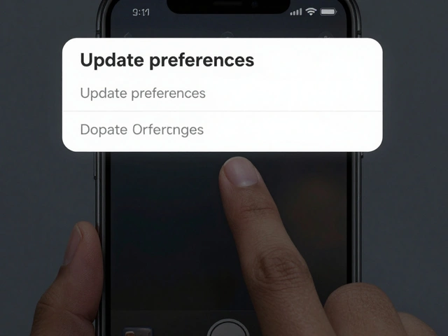
- No "Tap to..." or "Last updated." These are instructions, not information. Replace them with visuals. Show a progress bar instead of "50% complete." Show a clock icon instead of "Next meeting in 10 minutes."
- No logo in the center. If you must show branding, put it in the top-right corner. Always.
And here’s something most developers miss: placeholders. When data is loading or unavailable, your widget shouldn’t go blank. It should show a skeleton-gray blocks where text will go, empty circles where images belong. This tells users: "I’m still here. Just waiting for info." A blank widget feels broken. A placeholder feels intentional.
Layout Strategies by Widget Type
Not all widgets grow the same way. You can’t treat them like responsive web pages.
Weather uses the expansion pattern. The same data scales up. Small: temperature. Medium: temperature + condition icon. Large: temperature + 5-day forecast + hourly graph. Everything builds logically.
News uses the unique layout pattern. Small: one full-screen story. Medium: three headlines with thumbnails. Large: five headlines + category tags. The small version isn’t just a cropped medium version. It’s a different experience.
Screen Time uses advanced layout optimization. Small: total usage time. Medium: usage by app category. Large: detailed breakdown per app, with charts and time comparisons. The larger the widget, the more granular the data.
If you’re building a widget, ask: "What’s the core message at each size?" Don’t copy-paste. Redesign.
Performance and Privacy
Widgets drain battery if they update too often. WidgetKit handles this automatically with system-managed refresh cycles. But you can help. Use push updates only for urgent changes-like a new message or a flight delay. For routine data (stock prices, weather), let the system decide when to refresh.
Privacy is baked in. Widgets can’t access personal data unless the user explicitly allows it. No background tracking. No hidden connections. If your widget needs location, the user must grant permission. If it needs health data, it must use Apple’s HealthKit API. No workarounds. No exceptions.
Customization and User Control
Users don’t just want widgets-they want their widgets. Weather widgets let users pick cities. Reminders widgets let them choose lists. Calendar widgets let them pick which calendars to show. This isn’t optional. It’s expected.
Some users go further. Tools like Widgetopia let people build custom widgets from scratch: combine stock data, battery levels, weather, and text-all in one tile, with custom fonts and transparency. Apple doesn’t build these, but they support them. Why? Because control increases trust. When users shape their interface, they use it more.
Placement Matters
The most powerful widget is the one you see first. Put your most-used widgets on the primary home screen. Weather. Calendar. News. Reminders. These should be top row, easy to glance at without swiping.
Less critical ones-like your podcast player or Spotify widget-go on later pages. The goal isn’t to show everything. It’s to show what matters now. Clutter kills engagement. A clean home screen with 3-5 essential widgets gets used more than a packed one with 15.
Final Thoughts: Widgets Are the New Home Screen
Five years ago, widgets were a nice-to-have. Today, they’re the primary way users interact with apps. On iPhone, iPad, Mac, and even VisionOS, the home screen isn’t just a launcher-it’s a dashboard. And widgets are its language.
Designing one isn’t about coding. It’s about thinking: What does the user need before they even think to tap? If you answer that, your widget doesn’t just work. It feels inevitable.
Can I use custom fonts in Apple widgets?
Yes, but only if absolutely necessary for brand identity. Apple strongly recommends using SF Pro or SF Pro Rounded because they’re optimized for readability at small sizes and match the system’s visual language. If you use a custom font, test it against Apple’s widgets in both light and dark modes. If it feels out of place, it will be ignored by users-even if it looks "cool."
Why does my widget look different on iPhone vs. iPad?
Because Apple adjusts corner radius and spacing automatically based on device size. A widget on iPhone might have a 12-point corner radius, while on iPad it’s 16. Your layout must adapt. Use SwiftUI’s widget environment variables to detect size and adjust spacing or content density. Never hardcode dimensions. Let the system handle it.
How do I test widget performance before release?
Enable WidgetKit Developer Mode in Xcode. This bypasses the system’s update budget, letting you see how your widget behaves under heavy refresh cycles. Also, monitor battery usage in Settings > Battery. If your widget is using more than 1% of battery over 24 hours, you’re updating too often. Use push notifications for urgent updates and let the system handle routine ones.
Should I make a large widget even if most users have small ones?
Yes. Users can choose their widget size. If your widget only supports small, you’re limiting its usefulness. A large version gives users more value-more data, more context. Even if only 20% of users pick it, those users will love it. And they’ll recommend your app.
What’s the difference between Relevance Widgets and traditional ones?
Traditional widgets show up all the time, whether you need them or not. Relevance Widgets appear only when context triggers them-like when you’re near a location, at a certain time, or doing a specific activity. They’re dynamic, not static. This reduces clutter and increases usefulness. If your widget has time- or location-based data, consider switching to RelevanceConfiguration.
For developers, the future of widgets isn’t bigger or flashier. It’s smarter. More context-aware. Less about showing everything-and more about showing what matters right now. That’s the real win.
Categories
Popular Articles