
Most modern product teams treat design as a layer of paint applied after engineering finishes its work. They get it backwards. If you look closely at Apple, specifically during its formative years in the 1980s and 1990s, you’ll find that their most successful products weren’t just well-designed; they were designed first, then engineered to fit that vision. This isn’t just nostalgia. The constraints and creative philosophies from that era offer concrete, actionable lessons for today’s digital-first teams who often feel lost in feature bloat and endless A/B testing.
The Philosophy of Constraints
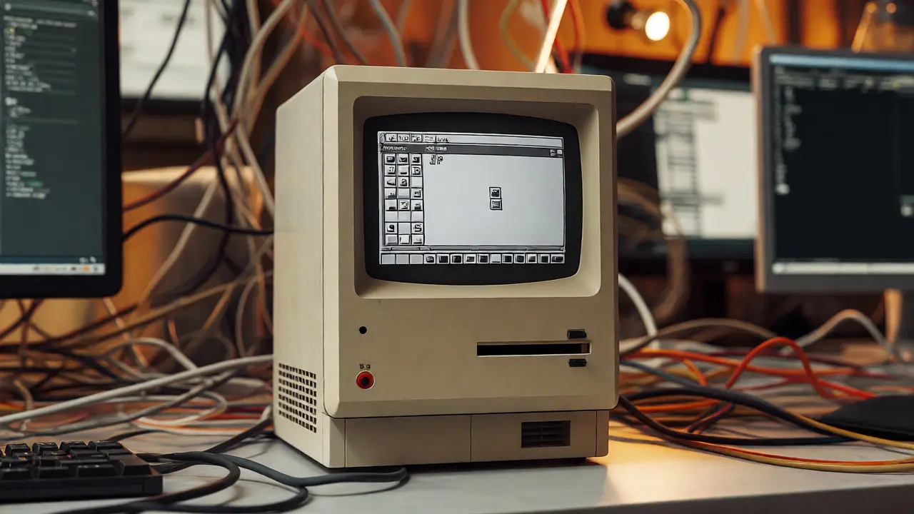
Today, we have infinite screen real estate and cloud storage. In the early 1980s, Steve Jobs and his team had none of that luxury. When designing the original Macintosh, the goal wasn’t to add features. It was to remove them. The constraint of a small, low-resolution screen forced designers to prioritize clarity over complexity. Every pixel had to earn its place.
This approach contrasts sharply with modern development cycles where "more" is often mistaken for "better." By embracing strict limitations-whether it’s hardware capabilities or cognitive load limits-teams can focus on what truly matters. The lesson here is simple: don’t let technology dictate the design. Let the design dictate the technology requirements. If your current project feels cluttered, try imposing artificial constraints. What if you could only use three colors? What if the primary action had to be completed in two clicks? These restrictions spark creativity rather than stifling it.
Human-Centered Hardware Design
Before the iPhone dominated our pockets, Apple revolutionized how humans interacted with machines through physical design. Consider the iMac G3, launched in 1998. It wasn’t just colorful; it was friendly. It hid screws, eliminated messy cables, and used translucent plastic to demystify the machine inside. This was a direct response to the beige, intimidating boxes of the PC industry.
Modern UX teams can learn from this by focusing on emotional resonance. We often obsess over conversion rates and bounce rates, but we forget that users are humans seeking comfort and confidence. The iMac taught us that making technology accessible means removing friction, both physical and psychological. Today, this translates to reducing cognitive friction in apps. Are your onboarding flows welcoming or interrogating? Does your interface feel cold and corporate, or does it have personality? Apple’s 90s hardware proved that aesthetics are functional-they build trust before a single button is pressed.

Consistency Through Systematic Thinking
In the 1980s, Apple didn’t just design individual products; they designed a system. The Snow White Proportion rule, developed by designer Hartmut Esslinger, dictated that all Apple devices should share specific curvature ratios. This created a visual language that spanned computers, mice, and keyboards. Users knew they were using an Apple product not because of a logo, but because of the shape.
For today’s software teams, this highlights the power of design systems. But it goes deeper than reusable components in Figma. It’s about consistent behavioral patterns. If your mobile app behaves differently than your web platform, you break the user’s mental model. Apple’s consistency meant that muscle memory transferred across devices. Your team should audit their product suite. Do your micro-interactions follow a unified logic? Is your tone of voice consistent from error messages to marketing copy? Consistency reduces learning time and builds brand loyalty.
Iterative Prototyping Over Perfectionism
A common myth is that Apple got everything right the first time. The reality is messier. The Apple Lisa, released in 1983, was a commercial failure despite its groundbreaking GUI. Why? It was too expensive and too complex. The team learned from these mistakes rapidly, applying those lessons to the Macintosh just a year later.
Modern teams often suffer from paralysis by analysis. We wait for perfect data before launching. Apple’s 80s and 90s strategy was faster iteration. They shipped, observed failures, and pivoted. The Newton PDA, though flawed, paved the way for the iPad decades later. Don’t fear failure; fear stagnation. Build prototypes quickly, test them with real users, and be willing to kill features that don’t serve the core vision. Speed and honesty are more valuable than premature polish.

Bridging Past Wisdom with Future Tech
How do we apply these historical lessons to AI-driven interfaces and spatial computing? Start by asking what the technology enables, not just what it requires. Apple’s success came from hiding complexity. As we integrate large language models into apps, avoid showing off the tech. Hide the prompt engineering behind intuitive workflows. Keep the interface human-centric, even when the backend is robotic.
| Aspect | Apple 1980s/90s Approach | Common Modern Pitfall | Recommended Action |
|---|---|---|---|
| Feature Set | Minimalist, curated | Feature bloat, "shovelware" | Ruthlessly cut non-essential features |
| Hardware/Software | Tightly integrated | Fragmented experiences | Align UI behavior with device capabilities |
| Visual Language | Systematic (Snow White) | Inconsistent branding | Enforce strict design tokens |
| User Interaction | Direct manipulation | Deep nesting/menus | Prioritize one-click actions |
Practical Steps for Your Team
You don’t need to buy a vintage Macintosh to apply these insights. Here is a checklist to bring that old-school discipline into your sprint planning:
- Audit for Friction: Identify every step in your user journey that doesn’t provide immediate value. Remove it.
- Define Your "Snow White": Create a set of visual and behavioral rules that all new features must adhere to. No exceptions.
- Prototype Physically: Even for software, sketch interactions on paper or use cardboard mockups. It forces simplicity.
- Embrace Constraints: Limit your color palette and font choices. See if the design still holds up.
- Listen to Failure: Analyze past failed launches not as embarrassments, but as data points for future refinement.
The magic of Apple’s early design language wasn’t magic at all. It was rigorous attention to detail, respect for the user’s time, and courage to say no. In a world overflowing with options, these traits are rare commodities. Your team has the tools to recreate that impact. You just need to stop adding noise and start curating signal.
Why is Apple's 1980s design philosophy relevant today?
It emphasizes minimalism, user-centricity, and integration, which counteract modern issues like feature bloat and fragmented user experiences. The focus on quality over quantity remains a competitive advantage.
What was the Snow White Proportion rule?
Developed by Hartmut Esslinger, it was a design guideline ensuring all Apple products shared specific curvature ratios, creating a cohesive visual identity across devices.
How did the iMac G3 change consumer electronics?
It made computers friendly and accessible by using colorful, translucent designs and hiding technical complexities, shifting the market away from utilitarian beige boxes.
Can these principles apply to software-only products?
Yes. The core principles of reducing cognitive load, maintaining consistency, and prioritizing essential functions apply directly to UI/UX design, regardless of hardware.
What is the biggest mistake modern teams make regarding design?
Treating design as an afterthought rather than a foundational element. This leads to disjointed user experiences and inefficient development processes.