
Imagine opening your iPhone and finding a new button that does something you didn't ask for. You tap it, confused, and close the app. That is the fastest way to kill trust in an AI interface is a system of digital interactions where artificial intelligence processes input to provide personalized outputs. Apple knows this better than anyone. With Apple Intelligence is a suite of machine learning features integrated into iOS, iPadOS, and macOS that uses on-device processing to enhance productivity and creativity., the company faces a massive challenge: how do you add powerful tools without making users feel like they are working for their phone instead of the other way around?
The core problem isn't technology; it's cognitive load. When we introduce AI, we often assume users want more options. In reality, they want less friction. The goal of designing for generative AI is an AI model capable of creating new content such as text, images, or code based on prompts. is not to show off what the computer can do, but to disappear when the task is done. If the user has to read a manual to understand why a summary appeared at the top of their email, the design failed.
Understanding the Cognitive Load of AI Features
Human brains have limited bandwidth for decision-making. Every new icon, every new menu item, and every unexpected animation consumes a piece of that bandwidth. This is known as cognitive load is the total amount of mental effort being used in working memory.. When designers add AI features, they must ask: does this reduce the steps required to complete a task, or does it just add another layer of complexity?
Consider the difference between a search bar and a predictive assistant. A search bar requires the user to know what they want. An assistant guesses. If the guess is wrong, the user feels interrupted. If the guess is right, the user feels smart. The line between these two outcomes is razor-thin. To navigate it, designers need to focus on context awareness. The AI should only act when the context is clear. If you are typing a grocery list, suggesting recipes might be helpful. If you are typing a legal contract, suggesting emojis is annoying. Context is king.
- Explicit Intent: The user clearly wants help (e.g., selecting "Summarize" in Mail).
- Implicit Intent: The user is likely to want help (e.g., hovering over a long article for three seconds).
- No Intent: The user is just browsing or reading. Do not interrupt.
On-Device Processing and Trust Signals
One of the biggest hurdles for AI adoption is privacy anxiety. Users worry that their data is being sent to a server, analyzed, and potentially sold. on-device AI is machine learning models running locally on the hardware rather than in the cloud, ensuring faster response times and enhanced privacy. solves this by keeping data local. But technology alone doesn't build trust. The interface must communicate that privacy is happening.
How do you visualize privacy? You don't need a lock icon everywhere. Instead, use subtle cues. When a feature runs locally, the loading state should be instant. If there is a delay, indicate that processing is happening locally. Avoid terms like "Connecting to Cloud." Use terms like "Processing on Device." This language shift reassures users that their data isn't leaving their pocket. It turns a technical specification into a user benefit.
| Attribute | Cloud-Based AI | On-Device AI |
|---|---|---|
| Latency Perception | Requires explicit loading states | Near-instant; minimal UI feedback needed |
| Privacy Signal | Requires trust badges or encryption notes | Inherent trust via speed and local terminology |
| Error Handling | Network errors common; needs retry logic | Hardware limits; needs fallback to simpler tasks |
| User Control | Often opaque; "black box" results | Easier to debug locally; clearer cause-and-effect |

Progressive Disclosure: Hiding Complexity
Not every user wants to tweak parameters. Most users just want the result. This is where progressive disclosure is a UI design technique that reveals information gradually to avoid overwhelming the user with too many options at once. comes in. Start with the simplest possible interaction. Show the result first. Let the user dig deeper if they care.
For example, in a photo editing app, don't present ten sliders for color correction immediately. Apply the best automatic fix first. If the user taps the image, then reveal the sliders. If they don't tap, assume the auto-fix was good enough. This pattern respects the user's time. It assumes competence but offers control without demanding it upfront. It’s a gentle nudge, not a forced tutorial.
This approach also helps with onboarding. New users aren't intimidated by a wall of settings. They see value immediately. Power users find the depth they need later. Both groups win. The key is ensuring the "advanced" options are accessible but not visible by default. Hide the engine under the hood until someone asks to see it.
Consistency Across the Ecosystem
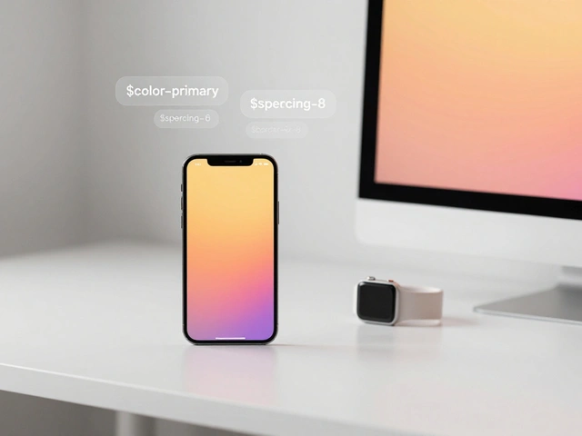
Apple’s strength is its ecosystem. Users move from iPhone to Mac to Watch seamlessly. If the AI behaves differently on each device, confusion sets in. cross-platform consistency is the practice of maintaining uniform user experiences across different devices and operating systems. is non-negotiable for AI features. If a summary tool works one way in Mail on iPhone and another way in Outlook on Mac, users will lose confidence in the entire system.
Design teams must establish a shared vocabulary for AI actions. What does "Smart Reply" look like? Is it a bubble? A card? Where does it appear? Standardize these patterns. Create a design system component library specifically for AI interactions. Define the animations, the timing, and the haptic feedback. When the AI suggests a next step, it should feel like the same entity regardless of the screen size. Consistency reduces the learning curve. Users learn the pattern once and apply it everywhere.

Handling Uncertainty and Errors Gracefully
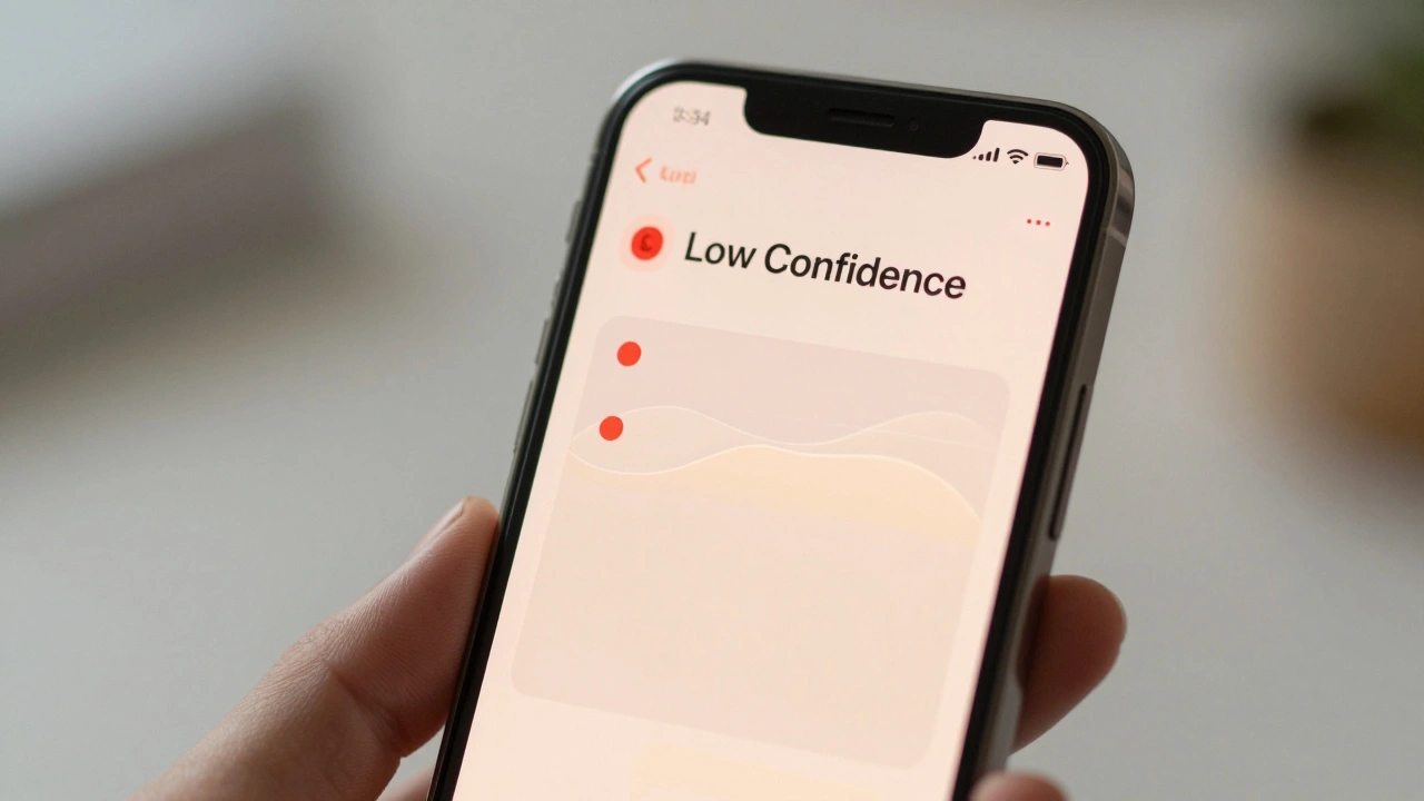
AI is probabilistic. It makes mistakes. Traditional software either works or crashes. AI might give you a slightly wrong answer. How do you design for that? You need to make uncertainty visible. Don't pretend the AI is perfect. Use language that implies suggestion rather than fact. Instead of "Here is your invoice," try "Did you mean this invoice?"
Error states are particularly tricky. If the AI fails to generate a summary, don't just show a blank space. Offer a fallback. "Summary unavailable. Tap to read full text." Give the user a path forward. Also, allow for easy correction. If the AI mislabels a contact, let the user fix it with one tap. That correction should train the local model. Make the user feel like they are teaching the device, not fighting it. This builds a sense of partnership rather than dependency.
Measuring Success Beyond Clicks
How do you know if your AI design is working? Don't just look at click-through rates. Look at completion time. Did the user finish the task faster with AI enabled than disabled? Measure abandonment rates. If users turn off the AI feature after using it twice, the design is probably too noisy or too inaccurate.
Qualitative feedback is crucial. Watch users interact with the feature. Do they hesitate before tapping? Do they look confused? These micro-expressions tell you more than any analytics dashboard. Iterate quickly. Ship small updates that refine the timing and placement of AI suggestions. The goal is to reach a point where the AI feels invisible. It just works. And when it works, nobody notices. That is the highest compliment a designer can receive.
What is the biggest risk in integrating AI into consumer apps?
The biggest risk is increasing cognitive load without providing proportional value. If the AI adds steps or confusion, users will disable it. The feature must save time or reduce effort to justify its presence.
How can designers explain on-device AI to users simply?
Focus on speed and privacy. Tell users that processing happens instantly on their phone and their data stays local. Avoid technical jargon about neural networks or GPU cores. Use benefits-based language like "Private and Fast."
Should AI features be turned on by default?
It depends on the intrusiveness. For passive features like background indexing, yes. For active features that change content or send messages, consider starting them off or requiring a single opt-in. This builds trust before asking for more autonomy.
How do you handle AI hallucinations in UI design?
Use tentative language and provide easy correction paths. Label AI-generated content clearly so users know it's a suggestion. Allow one-tap fixes for errors. This turns potential frustration into a collaborative improvement loop.
What metrics matter most for evaluating AI UX?
Task completion time, error correction rate, and feature retention are key. If users keep the feature enabled after a week, it's likely adding value. If they turn it off, the design needs work. Combine quantitative data with qualitative observation for the full picture.