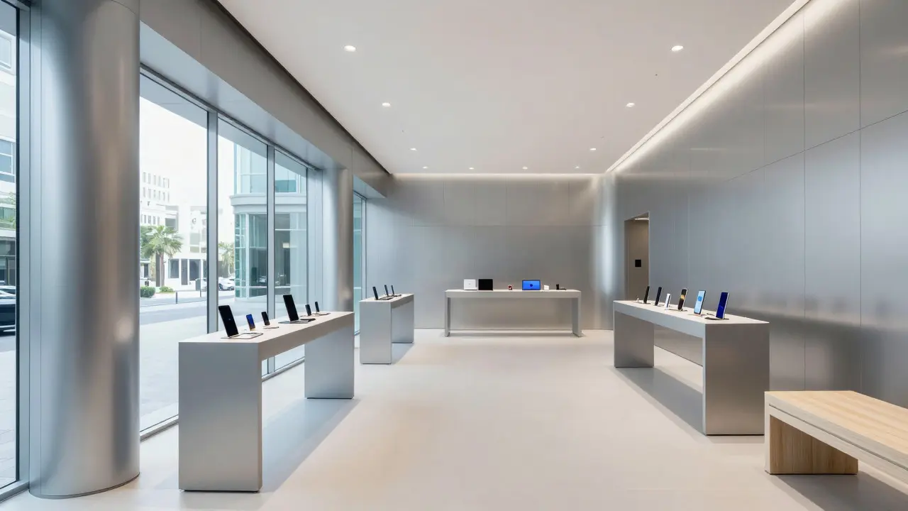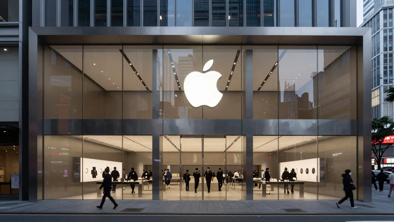

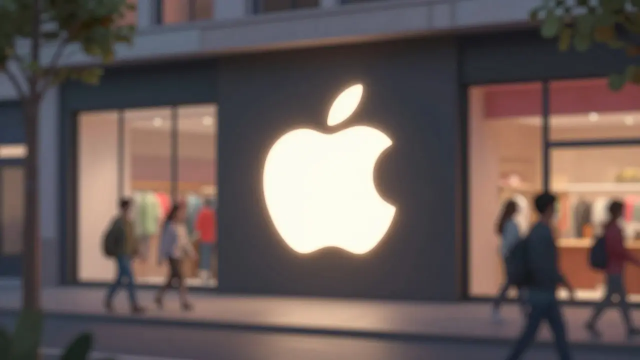
Walk past an Apple Store on Fifth Avenue or in Tokyo’s Shibuya district, and you likely won’t read a single word before recognizing the brand. You see the silhouette of a fruit with a bite taken out of it, glowing softly against dark glass or brushed aluminum. This is not an accident. It is the result of decades of deliberate minimalist branding that turned a simple shape into one of the most recognized symbols in human history.
In retail design, complexity often leads to confusion. Cluttered signs compete for attention, and busy graphics get lost in the noise of a crowded street. Apple took the opposite approach. By stripping away text, color variations, and decorative elements, they created a visual anchor that works across every scale, from a tiny app icon on a smartphone screen to a massive illuminated sign atop a building. The lesson here isn’t just about apples; it’s about how simplicity creates clarity, and clarity drives recognition.
The Anatomy of a Silent Symbol
To understand why the logo works so well in physical spaces, we have to look at its structural components. The current iteration, which has remained largely unchanged since 1977, features a specific set of geometric properties that make it ideal for storefront signage physical displays used to identify business locations and attract customer attention.
- Silhouette Integrity: The shape holds together even when viewed as a solid block of light. There are no thin lines that might break under low-resolution LED screens or distant viewing angles.
- Negative Space: The "bite" is not a separate element; it is defined by the absence of material. This makes the logo easy to cut from metal, laser-etch into glass, or project onto walls without needing complex internal detailing.
- Proportional Balance: The curve of the top leaf and the roundness of the body create a stable, centered composition. It doesn’t lean left or right, giving it a sense of calm authority.
These attributes allow the logo to function as both a picture and a symbol. When you see it, your brain processes the shape first, then associates it with the brand. Because there is no text attached, it transcends language barriers. A tourist in Paris recognizes the same symbol as a local in Seattle. In retail terms, this reduces cognitive load. The customer doesn’t need to decode typography or parse colors; they simply recognize the object.
Why Simplicity Wins in Physical Retail
Digital interfaces allow for animation, hover effects, and dynamic changes. Physical storefronts do not. They are static objects exposed to weather, varying lighting conditions, and distracted pedestrians. This environment demands a design strategy that prioritizes legibility over decoration.
Consider the difference between a traditional department store sign and an Apple Store facade. Department stores often use serif fonts, gold lettering, and ornate frames. While elegant, these elements require close proximity to read. If you are walking quickly, your eyes skip over small details. The Apple logo, however, acts like a beacon. Its high contrast-usually white or silver against black or gray-creates immediate visual separation from the background. This is a core principle of visual hierarchy the arrangement of elements to show their relative importance. By making the logo the largest and brightest element, it becomes the focal point of the entire entrance.
Furthermore, minimalism aids in consistency. An Apple Store in New York looks almost identical to one in Beijing. The architecture varies slightly to fit local regulations, but the signage remains constant. This uniformity builds trust. Customers know exactly what to expect because the visual cue is universal. In contrast, brands that change their logos or signage styles frequently can confuse consumers, diluting the impact of their marketing efforts.
Materiality and Light: The Physical Execution
A logo on paper is very different from a logo on a building. In retail design, the choice of materials defines the perceived quality of the brand. Apple invests heavily in the tactile and visual experience of their storefronts, and the logo is central to this investment.
| Material Type | Visual Impact | Maintenance Requirement | Brand Association |
|---|---|---|---|
| Brushed Aluminum | Clean, industrial, premium | Low (wipes clean easily) | Tech-forward, durable |
| Illuminated Acrylic | Bright, modern, eye-catching | Medium (LED replacement needed) | Innovative, accessible |
| Etched Glass | Elegant, subtle, transparent | High (fingerprint sensitive) | Luxury, exclusive |
| Vinyl Decals | Flexible, cost-effective | Low (but fades over time) | Temporary, promotional |
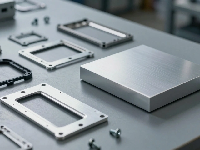
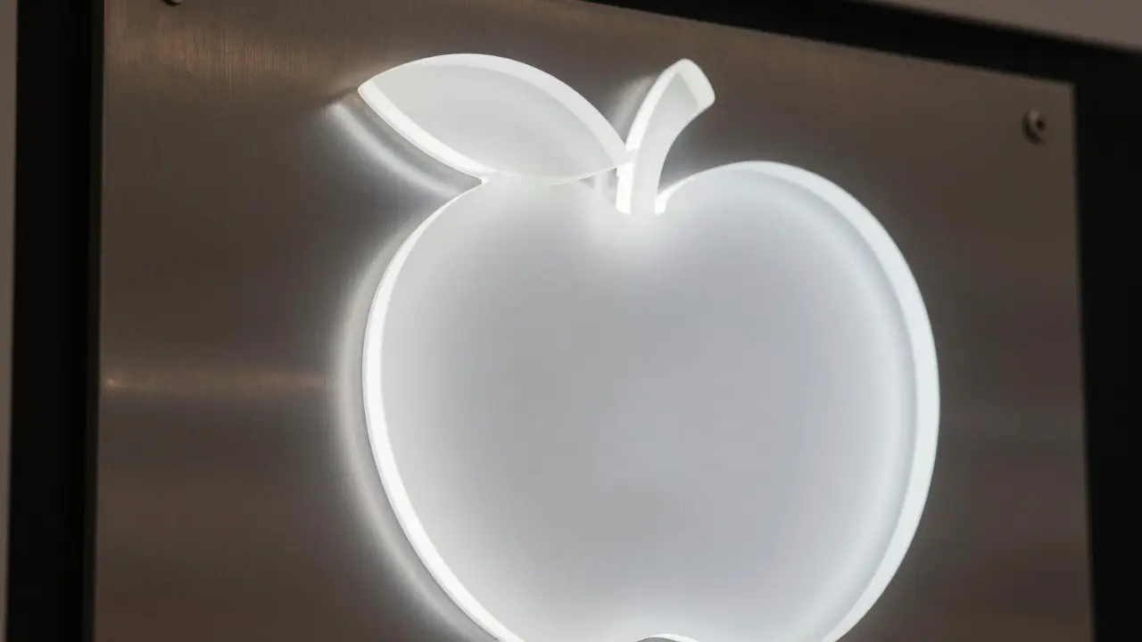
Apple typically uses backlit acrylic or polished aluminum for their primary exterior logos. Backlighting ensures visibility at night, which is crucial for retail hours that extend into the evening. The light source is hidden behind the shape, creating a halo effect that draws the eye without glare. This technique turns the logo into a landmark. People orient themselves using these lit symbols, much like sailors once used lighthouses.
The placement is also strategic. The logo is usually positioned at eye level or slightly above, ensuring it is visible from the sidewalk. It is never buried among other graphics. This isolation reinforces the idea that the product inside is the star, not the packaging around it. The building itself serves as the frame, and the logo is the jewel.
Psychological Impact on Consumer Behavior
When a consumer sees a simple, recognizable symbol, their brain releases a small hit of dopamine associated with familiarity and safety. This is known as the mere exposure effect. We tend to prefer things we have seen before. Because the Apple logo is ubiquitous, it feels safe and trustworthy.
In a competitive retail landscape, trust is currency. Consumers are bombarded with new brands daily. Many of these brands fail because they try too hard to be unique, resulting in confusing or forgettable designs. Apple’s strategy is the opposite: they are intentionally boring in their design execution to maximize their emotional resonance. The logo promises a consistent experience. Whether you are buying a laptop or charging your phone, the interface, the support, and the aesthetic will align with the promise made by that simple shape.
This psychological shortcut saves decision-making time. For a busy shopper, the ability to identify a store instantly means less friction in their journey. They don’t have to stop and think, “Is this where I wanted to go?” They just know. This efficiency is a significant advantage in high-foot-traffic areas where seconds matter.
Lessons for Other Brands
You don’t need to sell electronics to benefit from these principles. Any brand operating in physical retail can apply the logic of iconic design distinctive visual marks that serve as shorthand for brand identity.
- Reduce Elements: Ask yourself if every part of your sign is necessary. Can you remove a color? Can you simplify a font? Every element removed increases the chance of instant recognition.
- Test at Distance: Print your logo small and view it from ten feet away. If it’s blurry or indistinguishable, it’s too complex for effective outdoor signage.
- Control the Environment: Ensure your logo contrasts sharply with its background. If your building is white, avoid white logos. Use dark tones or bright illumination to create separation.
- Consistency is Key: Use the exact same proportions and colors across all locations. Deviations create doubt. Uniformity creates confidence.
It is tempting to add trends to your signage. Gradients, shadows, and 3D effects may look impressive in a mockup, but they often age poorly and distract from the core message. Stick to flat, bold shapes. Let the location and the product do the talking, and let the logo simply say, “You are in the right place.”
Frequently Asked Questions
Does a minimalist logo work for every type of retail store?
Not necessarily. Luxury boutiques sometimes benefit from more detailed typography to convey exclusivity. However, for mass-market or tech-oriented retail, minimalism tends to perform better because it signals efficiency and modernity. The key is matching the visual complexity to the target audience's expectations.
How important is lighting for storefront logos?
Lighting is critical. A logo that is invisible at night loses half its potential impact. Backlit or internally illuminated signs ensure visibility during extended hours. Even in daytime, high-contrast lighting helps the logo stand out against changing natural light conditions.
Can small businesses afford Apple-style signage?
Yes. The cost lies in the production quality, not the complexity. Simple shapes are actually cheaper to produce because they require less cutting and fewer materials. Investing in good lighting and durable materials like aluminum or acrylic is affordable for most small businesses and yields long-term returns.
What is the biggest mistake brands make with their logos?
Over-designing. Adding too many colors, textures, or words makes the logo hard to reproduce consistently and difficult to recognize quickly. The goal is to create a mark that can be identified in under one second, even by someone who has never heard of the brand before.
How does digital presence affect physical logo design?
They must align. If your website uses a sleek, sans-serif font and a clean layout, your physical storefront should reflect that same aesthetic. Discrepancies between online and offline visuals can confuse customers and weaken brand trust. Consistency across channels reinforces the mental model of the brand.