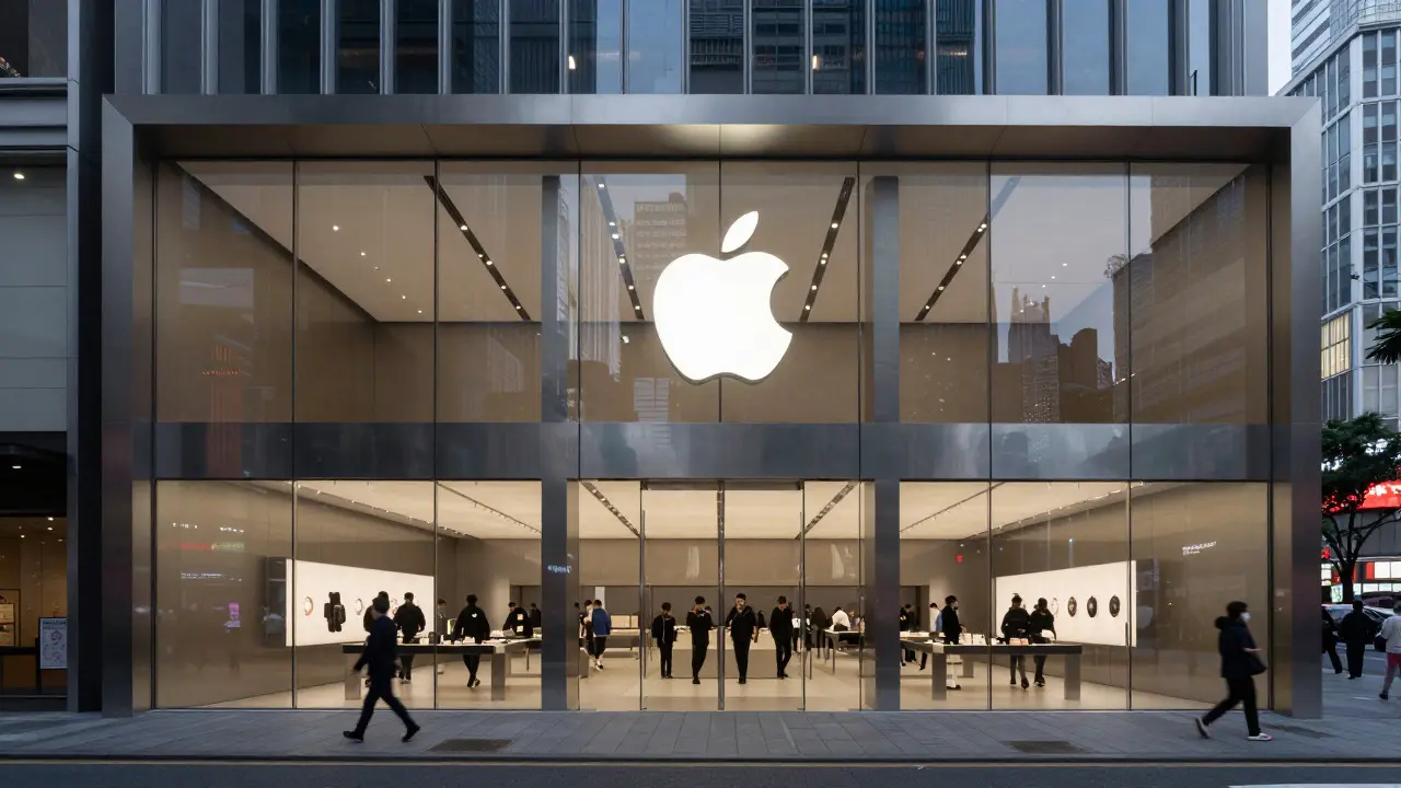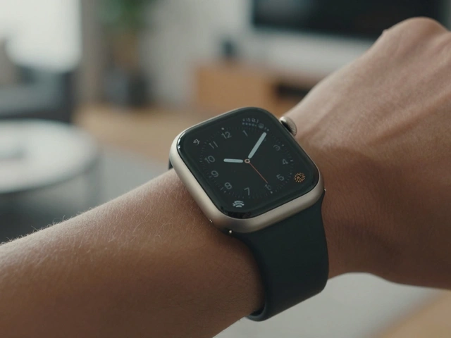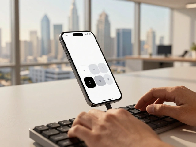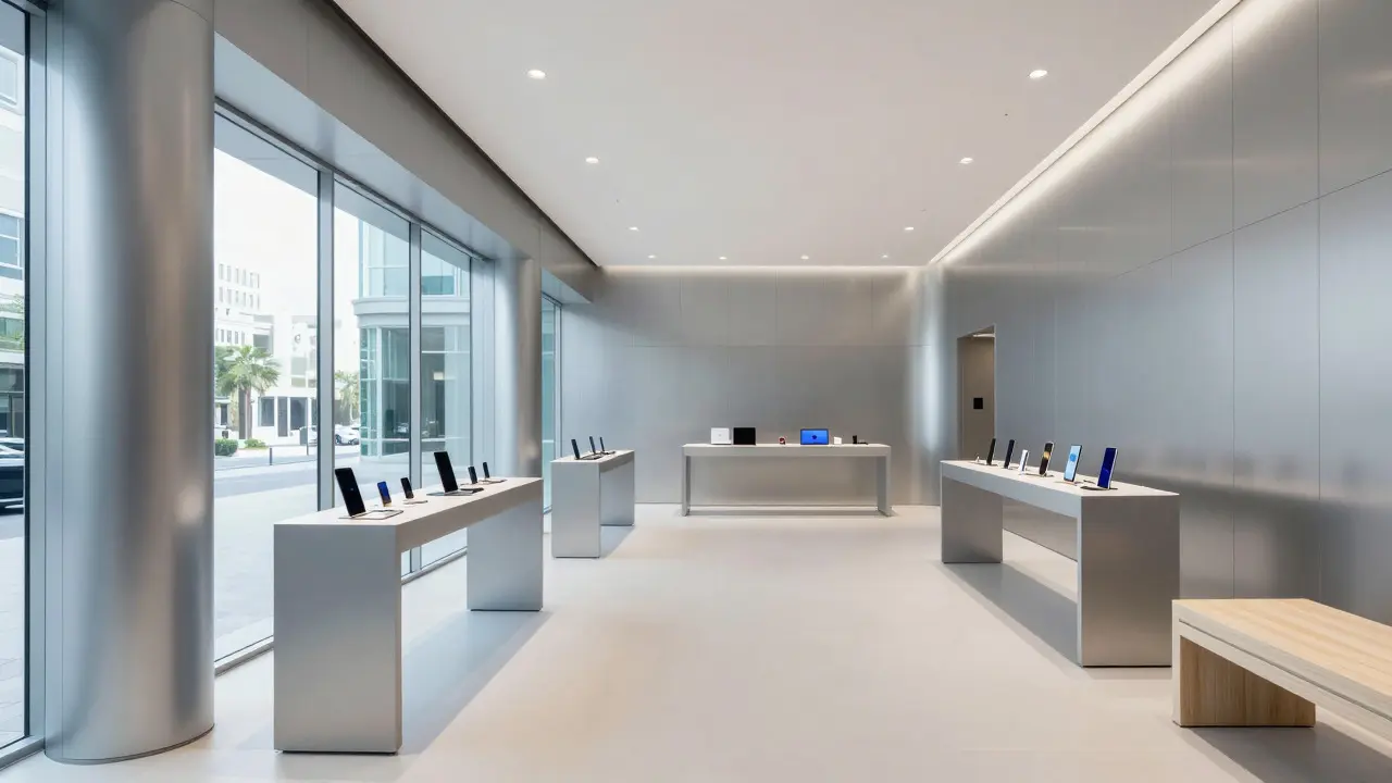

Walk into a modern tech flagship and you likely feel it before you see it. The air is crisp, the surfaces are cool to the touch, and the light reflects off polished edges with a specific kind of clarity. This isn't just about selling gadgets; it is a deliberate architectural strategy known as material continuity. By using the same high-grade aluminum and laminated glass found in smartphones and laptops for walls, counters, and floors, retailers create a seamless bridge between the product and the environment. The result is a space that feels like an extension of the device itself, rather than just a place where the device is stored.
This approach has become the gold standard in premium retail design, largely driven by the influence of major consumer electronics brands. But why does this work so well? It’s because humans process materials intuitively. When the wall matches the phone case, the cognitive load drops. You stop analyzing the space and start focusing on the experience. For designers and business owners looking to elevate their physical presence, understanding how to replicate this effect without copying the logo is the key to creating memorable, high-perception environments.
The Psychology of Seamless Materials
Why do we trust a shiny metal counter more than a painted wood one? It comes down to perceived value and durability. In retail psychology, consistency signals quality. If a brand claims its products are precision-engineered, but the store feels cluttered or made of cheap composite materials, there is a disconnect. Material continuity eliminates this friction.
When you use the same material palette throughout the space, you create what architects call a 'visual rhythm.' Your eye moves smoothly from the display stand to the checkout counter to the window frame. There are no jarring interruptions. This smoothness subconsciously tells the customer that everything in this space is curated and controlled. It mirrors the user interface of modern software: clean, intuitive, and free of unnecessary noise. For a retailer, this means customers spend less time wondering if they are in the right place and more time engaging with the merchandise.
Aluminum: The Backbone of Modern Retail
Anodized Aluminum is a lightweight, corrosion-resistant metal alloy widely used in both consumer electronics and architectural cladding due to its ability to hold color and finish. In the context of retail design, aluminum serves as the structural and visual anchor. Unlike steel, which can rust or require heavy painting, aluminum offers a factory-finished surface that looks consistent from day one to year ten.
There are two main ways retailers utilize aluminum:
- Architectural Cladding: Large panels wrapped around columns or facades. This creates a monolithic look where the building itself feels like a giant version of a laptop enclosure.
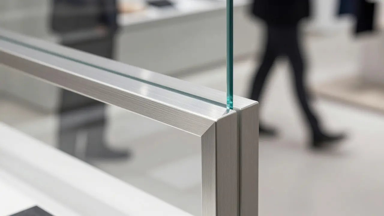
- Fixture Fabrication: Custom-milled stands, shelves, and counter tops. Here, the focus is on edge detailing. A sharp, mitered corner on a display pedestal reinforces the idea of precision engineering.
The choice of finish matters immensely. A matte silver finish reduces glare and makes the space feel calmer, while a brushed texture adds depth and hides minor scratches. Many successful stores use a combination: matte for large surfaces to absorb light, and glossy accents on interactive elements to draw attention. This contrast guides the customer’s journey through the store without using a single sign.
Glass: Transparency as a Branding Tool
If aluminum provides structure, Laminated Glass is a safety glazing material consisting of multiple layers of glass bonded together with interlayers, offering strength and transparency ideal for storefronts and internal partitions. Glass is the primary tool for breaking down barriers between the street and the store, or between the staff and the customer. In high-end retail, clear glass is not just a window; it is a canvas.
The challenge with glass is managing reflections. Too much reflection turns the interior into a dark mirror, hiding the products. To solve this, designers use low-iron glass, which has less green tint and higher clarity. This allows natural light to penetrate deep into the store, making white and metallic surfaces pop. Furthermore, the thickness of the glass plays a role. Thicker glass (12mm or more) feels substantial and secure, reinforcing the premium nature of the goods inside. Thin glass can feel flimsy, undermining the perception of quality.
Internal partitions made of glass allow staff to monitor the floor while maintaining an open feel. This transparency fosters a sense of trust. Customers feel watched over, not hidden from. It also allows lighting designers to layer light sources, using the glass to bounce illumination onto product displays rather than directly blasting them, which reduces eye strain and enhances the aesthetic appeal of the items.
Integrating Lighting with Material Surfaces
Material continuity fails if the lighting doesn’t respect the materials. Aluminum reflects light sharply, while glass transmits and refracts it. A poorly lit aluminum wall becomes a blinding mirror; a poorly lit glass partition becomes invisible. The goal is to create a balanced luminance level where the materials define the space, not the bulbs.
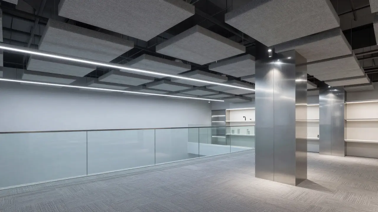
Indirect cove lighting is the standard technique here. By hiding LEDs in recesses above ceilings or behind backlit shelves, designers cast a soft glow onto the aluminum and glass surfaces. This technique, often called 'washing,' highlights the texture of the materials without creating harsh shadows. For example, a linear LED strip mounted above a glass railing will make the glass appear to float, emphasizing its weightlessness. Similarly, grazing light along an aluminum column reveals the grain of the metal, adding tactile interest to a smooth surface.
Color temperature is another critical factor. Cool white light (4000K-5000K) complements the blue-grey tones of aluminum and the neutral clarity of glass, reinforcing a technological, clean vibe. Warm light (3000K) can clash with these materials, introducing yellow tints that make the metal look dirty or aged. Most premium tech-inspired retail spaces stick to the cooler spectrum to maintain the sterile, precise atmosphere associated with advanced technology.
Practical Implementation for Retailers
You don’t need to build a skyscraper to achieve this aesthetic. Even small boutique shops can leverage material continuity by focusing on three key areas:
- The Entryway: Use a full-height glass door with minimal framing. Add a sleek aluminum handle or pull bar. This sets the tone immediately upon entry.
- The Display Fixtures: Replace wooden or plastic shelves with aluminum extrusions. These are cost-effective, modular, and easy to clean. They can be powder-coated to match your brand colors while retaining the metallic sheen.
- The Checkout Counter: This is the final point of contact. Make it a statement piece. A solid block of aluminum or a glass-topped counter with a metal base signals that the transaction is part of the premium experience, not an afterthought.
Maintenance is a significant advantage of these materials. Aluminum wipes clean easily and resists stains. Glass requires regular cleaning to prevent fingerprints, but when kept pristine, it looks better than almost any other surface. Investing in professional cleaning schedules ensures that the 'new' feeling persists, which is crucial for maintaining the illusion of perfection.
Comparing Material Choices
While aluminum and glass are the dominant players, understanding how they compare to alternatives helps in making informed decisions. The table below outlines the key differences in perception, maintenance, and cost implications.
| Material | Perceived Vibe | Maintenance Effort | Cost Impact | Best For |
|---|---|---|---|---|
| Anodized Aluminum | Precision, Tech, Clean | Low | Medium-High | Fixtures, Columns, Facades |
| Laminated Glass | Open, Transparent, Premium | High (Fingerprints) | High | Partitions, Storefronts, Counters |
| Polished Concrete | Industrial, Raw, Durable | Low | Medium | Floors, Walls (Contrast element) |
| White Oak Wood | Warm, Organic, Human | Medium | Medium | Accent pieces, Seating |
Notice that wood is listed as an accent piece. Mixing too much organic material can dilute the technological feel. However, a small amount of warm wood can prevent the space from feeling cold or unwelcoming. The trick is balance: let the metal and glass dominate the vertical planes and fixtures, and use wood sparingly for human-scale interactions like seating or handrails.
Avoiding Common Pitfalls
Many retailers try to mimic the aesthetic but end up with a disjointed look. Here are the most common mistakes to avoid:
- Inconsistent Finishes: Using brushed aluminum on the walls but glossy chrome on the handles. Stick to one finish family per zone.
- Overcrowding: Material continuity works best with negative space. If every square inch is covered in product, the materials disappear. Leave breathing room.
- Ignoring Acoustics: Glass and aluminum are hard surfaces that reflect sound. Without acoustic panels or soft flooring, the store can become echoey and noisy. Integrate fabric-wrapped panels or carpet tiles in high-traffic areas to dampen sound.
- Lighting Mismatch: As mentioned, warm light clashes with cool metals. Ensure your lighting plan is designed specifically for the material palette, not the other way around.
By addressing these issues early in the design phase, you save money on renovations later. It is far cheaper to install acoustic baffles during construction than to retrofit them into a finished, crowded space.
Future Trends in Material Application
Where is this going next? Sustainability is driving new material innovations. Recycled aluminum is becoming more available and visually indistinguishable from virgin stock, allowing brands to claim eco-friendly credentials without sacrificing aesthetics. Additionally, smart glass technology is emerging, where windows can switch from transparent to opaque at the push of a button or based on sunlight intensity. This adds a functional layer to the visual continuity, making the space responsive to its environment.
Bio-based composites are also entering the scene. Some manufacturers are creating panels that look like stone or concrete but are made from recycled plant fibers. These can serve as textured backdrops that complement smooth aluminum, adding depth without breaking the modern aesthetic. The future of retail design lies in these hybrid approaches: keeping the core language of metal and glass while integrating sustainable and adaptive technologies.
Final Thoughts on Spatial Branding
Material continuity is not just a design trend; it is a strategic tool. It aligns the physical environment with the digital promise of the products you sell. When a customer touches a cold, smooth aluminum counter, they are physically interacting with the same material as the device in their hand. That tactile connection builds trust faster than any marketing campaign. Whether you are opening a new flagship or refreshing an existing location, focusing on the harmony between your materials, lighting, and layout will create a space that feels inevitable, not just decorative. It invites customers to stay longer, explore deeper, and leave with a positive impression that lingers long after they’ve paid.
Is aluminum expensive for retail interiors?
It depends on the scale. Architectural cladding is costly, but fixture fabrication using standard aluminum extrusions is quite affordable. The investment pays off in durability and reduced maintenance costs over time compared to painted wood or plastic.
How do I reduce glare from glass in a sunny location?
Use low-iron glass for maximum clarity and consider external shading devices like louvers or awnings. Internally, position product displays away from direct line-of-sight reflections and use indirect lighting to minimize contrast between bright outside and dim inside.
Can I mix wood with aluminum and glass?
Yes, but use wood as an accent. Keep the majority of vertical surfaces and fixtures in metal and glass to maintain the primary aesthetic. Use wood for seating, signage, or small display elements to add warmth without overwhelming the cool, technical vibe.
What lighting color temperature works best with these materials?
Cool white light, typically between 4000K and 5000K, is recommended. It complements the blue-grey tones of aluminum and the neutral clarity of glass, enhancing the clean, technological feel. Avoid warm 3000K light as it can introduce unwanted yellow tints.
How important is acoustic treatment in these spaces?
Very important. Hard surfaces like glass and metal reflect sound, leading to echo and noise buildup. Incorporate acoustic panels, soft flooring, or fabric-wrapped furniture to dampen sound levels, ensuring a comfortable environment for both staff and customers.