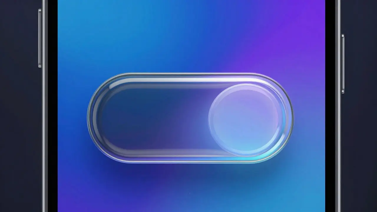

For years, using an iPhone and a Mac felt like switching between two different operating systems. The icons looked slightly different. The shadows behaved differently. Even the way text rendered had subtle variations that power users noticed immediately. That friction is gone now. With the rollout of Liquid Glass across the entire Apple lineup in 2026, the company has finally achieved a visual language that feels identical whether you are tapping a touchscreen or moving a mouse cursor. This isn't just a skin change. It is a fundamental shift in how Apple handles depth, light, and interaction. If you have been waiting for your devices to actually *look* like they belong to the same family, this is the moment it happened. Here is what changed, why it matters, and how it affects your daily workflow.
What Is Liquid Glass?
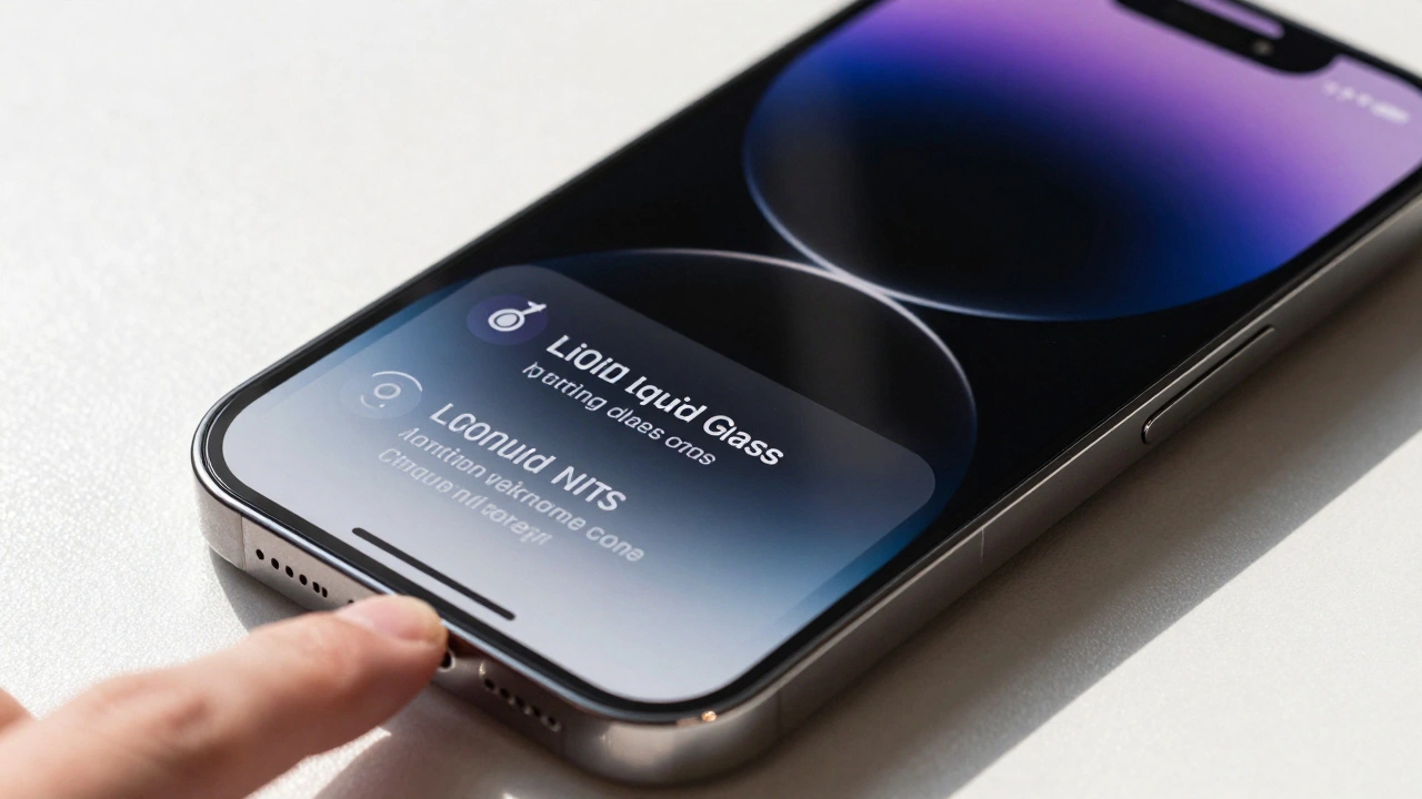
Liquid Glass is a new material-based design system introduced by Apple in 2026 that replaces flat UI elements with dynamic, translucent surfaces that react to touch and movement. Think of it as digital glass that flows. Unlike the previous "Squircle" era which relied on static rounded rectangles and simple drop shadows, Liquid Glass uses real-time rendering to simulate refraction and reflection. The core attribute here is **translucency**. When you open an app on an iPad running iPadOS 26, the background blurs dynamically based on where your finger hovers. On a MacBook Pro running macOS Tahoe, the same window reacts to the mouse position. The physics are consistent. The math behind the blur radius and opacity levels is identical across platforms, which creates that seamless "unified feel" mentioned in the title.The Visual Shift: From Flat to Fluid
To understand the impact, look at the control center. In previous versions, toggling Wi-Fi or Bluetooth involved tapping a static icon that lit up white. Now, the toggle itself appears to be made of thick glass. As you drag it, the highlight moves along the surface, mimicking how light hits a physical object. This applies to buttons, sliders, and even the dock. Here is a quick comparison of the old vs. new aesthetic:| Feature | Previous Design (iOS 18/macOS Sequoia) | Liquid Glass (iOS 26/macOS Tahoe) |
|---|---|---|
| Surface Material | Flat colors with static shadows | Dynamic translucent layers with refraction |
| Interaction Feedback | Instant state change (on/off) | Animated fluid deformation during input |
| Cross-Device Consistency | Similar but distinct styling per OS | Identical rendering engine across all devices |
| Battery Impact | Negligible | Slightly higher GPU load for real-time effects |
How It Works Across Devices
Apple engineers spent two years unifying the rendering pipeline. Previously, SwiftUI handled UI components differently on iOS versus macOS because the underlying graphics stacks were optimized for different hardware constraints. With Liquid Glass, Apple forced a single source of truth for visual effects. On iPhone 17 models, the high refresh rate displays (120Hz) make the liquid motion feel incredibly smooth. There is no stutter when dragging windows or resizing panels. On older devices like the iPhone 15, the effect is still present but slightly simplified to maintain performance. The blur radius is reduced, and some complex refraction calculations are skipped, but the core identity remains intact. For Mac users, the integration with Metal API ensures that these heavy visual effects don't tank your frame rates in games or video editing software. The system intelligently disables complex glass effects in full-screen apps where transparency isn't needed, saving battery life without breaking immersion.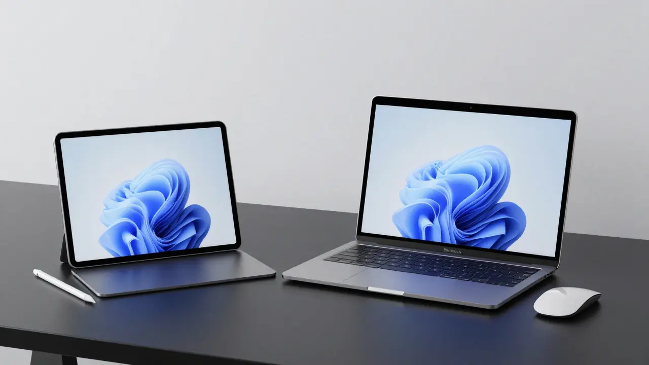
Practical Benefits for Users
You might wonder if this is just cosmetic fluff. For most people, yes. But for developers and power users, the consistency brings real advantages.- Faster App Development: Developers building cross-platform apps using SwiftUI now see identical behavior on iOS and macOS. You build the button once, and it looks and feels exactly the same on both platforms. No more tweaking padding or shadow values separately for each OS.
- Better Accessibility: The high contrast modes have been updated to handle translucent backgrounds better. Text readability over busy wallpapers is improved because the system automatically adjusts the opacity of the glass layer based on the content behind it.
- Seamless Handoffs: When you start a task on your iPad and continue on your Mac, the visual context carries over. The window sizes, the blur states, and the color schemes match perfectly, making the transition feel instant rather than jarring.
Common Pitfalls and Fixes
Even with such a polished update, there are a few things to watch out for.- Third-Party App Lag: Apps that haven't been updated to support the new rendering engine may appear blurry or slow. Check for updates regularly. Native apps like Mail, Photos, and Safari are fully optimized, but niche productivity tools might lag behind.
- Battery Drain on Older Hardware: If you are using an iPhone 14 or earlier, the constant redrawing of glass effects can drain your battery faster. Consider lowering the brightness or disabling animations in Accessibility settings if you notice a significant drop in battery life.
- Text Readability Issues: While the system auto-adjusts opacity, some custom dark mode themes can clash with the translucent backgrounds. Stick to default color schemes for the best experience until third-party theme engines catch up.
Is It Worth Upgrading?
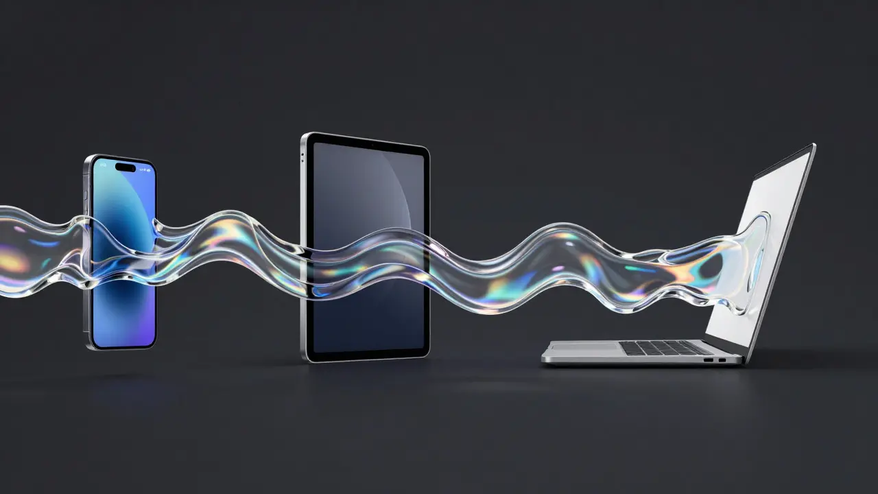
If you already own devices within the last three years, the upgrade is seamless. You don't need to buy new hardware to enjoy the unified look. The software update pushes the new design language to compatible devices automatically. The only reason to rush is if you want the highest fidelity version of the effects, which requires the latest chipsets. However, if you are holding onto a five-year-old device, the experience will be functional but less impressive. The magic of Liquid Glass relies heavily on fast processors and high-resolution displays. Without those, it becomes just another translucent overlay rather than a dynamic material. The bigger picture is that Apple has stopped treating its devices as separate products. They are now parts of one continuous ecosystem. Whether you are sketching on an Apple Pencil on an iPad or coding on a MacBook, the interface speaks the same language. That consistency is the real value proposition here. It removes the mental overhead of switching contexts and lets you focus on the work, not the tool.Frequently Asked Questions
Does Liquid Glass work on all Apple devices?
Yes, but with varying levels of fidelity. All devices capable of running iOS 26, macOS Tahoe, and iPadOS 26 receive the update. However, older devices with slower processors may have simplified effects to maintain performance.
Will Liquid Glass drain my battery faster?
Slightly. The real-time rendering of translucent effects uses more GPU power. On modern chips like M3 or A17 Pro, the impact is minimal (around 3-5%). On older devices, you might notice a faster drain during heavy multitasking.
Can I turn off the Liquid Glass effects?
You cannot completely remove the design language, as it is baked into the OS. However, you can reduce animations in Settings > Accessibility > Motion, which simplifies the transitions and reduces GPU load.
Do I need to buy a new iPhone to get the best experience?
No. Any device supporting the latest OS versions will get the feature. But for the smoothest 120Hz animations and highest quality refraction, newer devices with ProMotion displays and faster chips offer the premium experience.
How does this affect app development?
It simplifies cross-platform development. Developers using SwiftUI no longer need to create separate styles for iOS and macOS. The design system ensures consistency automatically, reducing code duplication and testing time.