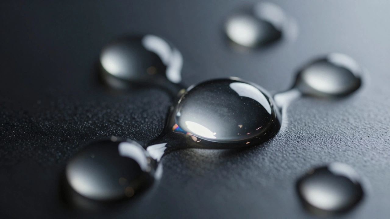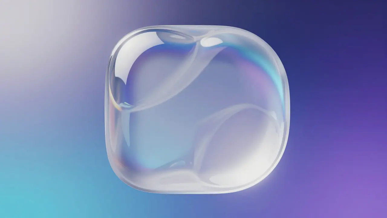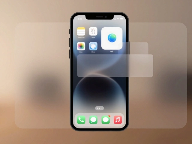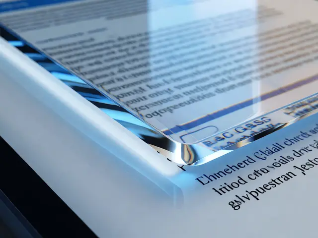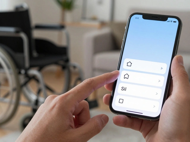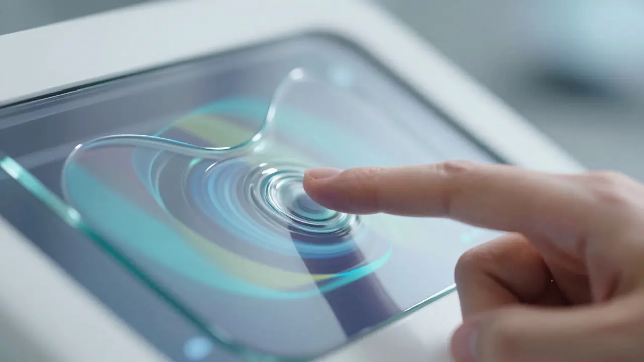

Imagine holding a control panel that isn't made of plastic or metal, but feels like a sheet of wet glass. It bends slightly when you press it. It changes its transparency based on what's behind it. This is the core idea behind Liquid Glass, a visual design language characterized by fluid, transparent surfaces that react to user input and underlying content. First popularized in spatial computing interfaces, this aesthetic has started bleeding into traditional mobile and desktop media applications. The result? Controls that don't just sit on top of your photos or videos; they interact with them.
For designers and developers, this shift represents more than just a pretty skin. It’s a fundamental change in how we think about hierarchy and focus in media-rich environments. When a play button looks like a drop of mercury resting on a video frame, it signals something different than a flat icon. It suggests tangibility. It suggests that the interface is part of the medium, not separate from it.
The Physics of Fluid Interfaces
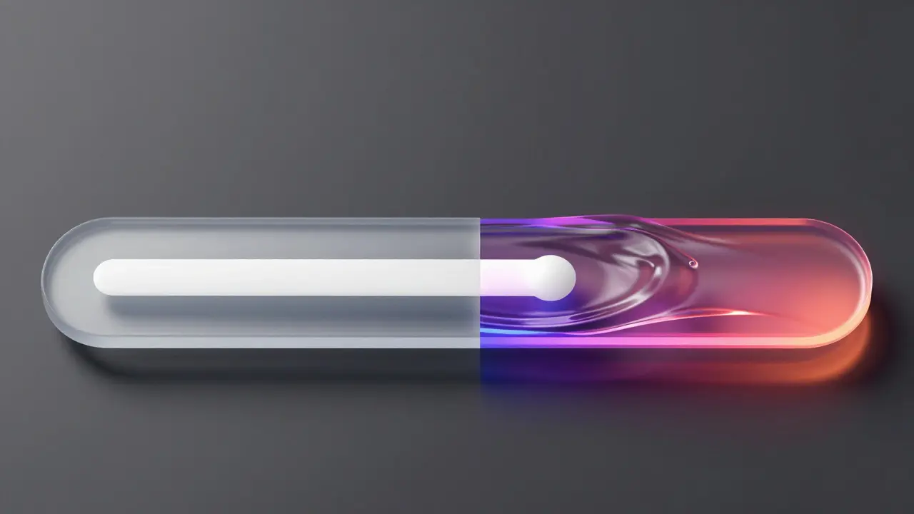
To understand why Liquid Glass works so well in media apps, you have to look at the physics simulation driving it. Unlike static gradients or simple blur effects, liquid glass relies on real-time refraction calculations. Think of it like looking through a curved lens. When the light (or in digital terms, the pixels) passes through the 'glass,' it bends. This bending creates highlights and shadows that give the element depth without using heavy drop shadows.
In a photo app, this means the slider for brightness doesn't just overlay the image. It distorts the image beneath it slightly. If you drag the slider over a bright white area, the glass reflects more light. If you drag it over a dark corner, it absorbs more. This subtle feedback loop keeps the user's eye engaged. It turns a mechanical action into a tactile experience. You aren't just adjusting a number; you're manipulating a physical object that exists within the scene.
- Refraction: The bending of light/pixels as they pass through the control surface.
- Specular Highlights: Bright spots that simulate light hitting the curved surface of the glass.
- Dynamic Transparency: The opacity of the control changes based on the contrast of the background content.
Adapting to Content: The Smart Blur Effect
One of the biggest challenges in media apps is readability. Text and icons often get lost against busy backgrounds. A chaotic photo or a fast-moving video can make a standard white button disappear. Liquid Glass solves this by analyzing the local color and luminance of the pixels directly behind the control.
If the background is dark, the glass becomes lighter and more opaque to ensure contrast. If the background is bright, the glass takes on a darker tint or increases its internal shadowing. This isn't a global setting; it happens pixel-by-pixel in real time. For a music player, this means the album art doesn't need to be dimmed globally to read the song title. Instead, the text container itself adjusts its 'tint' to match the specific colors of the artwork underneath it. The interface feels alive because it responds to the unique content every single time you open an app.
Implementation in Photo Editors
Photo editing apps are natural candidates for this style. Consider a crop tool. In traditional UIs, the crop handles are small squares or circles. With a liquid glass approach, these handles become soft, rounded blobs that seem to float above the image. When you pull one corner, the entire grid seems to ripple slightly, mimicking the tension of a stretched material.
This visual metaphor helps users understand the relationship between their action and the result. The 'stretch' of the glass mirrors the 'stretch' of the canvas. It’s a subtle psychological cue that makes complex adjustments feel intuitive. Developers implementing this often use Gaussian blur combined with alpha channel manipulation. However, the key is performance. To maintain 60 frames per second, the refraction effect must be calculated efficiently, often using GPU shaders rather than CPU-heavy JavaScript loops.
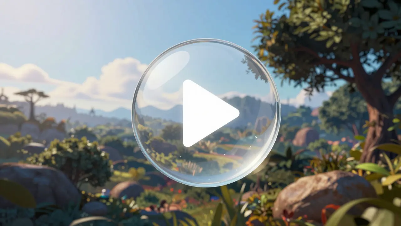
Video Players and Immersive Control
Video presents a different challenge: motion. A static glass effect can look disjointed if the video behind it is moving fast. The solution is temporal smoothing. The glass control shouldn't react instantly to every frame of the video, or it will look jittery. Instead, it averages the background colors over a short window of time (roughly 100-200 milliseconds). This creates a smooth, flowing transition where the glass seems to 'swim' gently over the changing footage.
Take the play/pause button as an example. When paused, the glass is solid and clear, inviting interaction. As the video plays, the glass might become slightly more diffuse, indicating that the system is busy rendering content. When you hover over it, it sharpens again. This state-based transparency reinforces the active/inactive status of the media without needing extra labels or indicators.
Performance Trade-offs and Optimization
Beauty comes at a cost. Rendering dynamic refraction is computationally expensive. On older devices, this can lead to battery drain and frame drops. The secret to successful implementation lies in selective application. You don't need liquid glass on every single element. Reserve it for primary interactive elements: the main play button, the volume slider, the central navigation bar.
Secondary elements, like settings menus or text labels, can use simpler frosted glass effects (static blur) to save processing power. This hybrid approach gives you the premium feel of the hero elements while keeping the rest of the app snappy. Profiling tools should always be used to monitor shader compilation times and memory usage during these animations.
| Feature | Static Frosted Glass | Liquid Glass |
|---|---|---|
| Visual Depth | Low (flat blur) | High (refraction + highlights) |
| Content Awareness | None (fixed opacity) | Dynamic (adapts to background) |
| CPU/GPU Load | Low | Medium-High |
| User Engagement | Standard | Higher (tactile feedback) |
| Best Use Case | Background panels, modals | Primary controls, sliders, buttons |
Accessibility Considerations
Here is where many designers stumble. Transparent interfaces can be hostile to users with low vision or color blindness. If the glass adapts to the background, it might also adapt to a low-contrast scenario, making the button invisible. The fix is a minimum contrast ratio enforcement. Even if the algorithm calculates that a 20% opacity is aesthetically pleasing, the accessibility layer should force a minimum of 4.5:1 contrast ratio for essential controls.
Motion sensitivity is another factor. The rippling effect of liquid glass can trigger vertigo in some users. Provide a 'Reduce Motion' toggle that switches the dynamic refraction to a static, high-contrast version. This ensures the technology serves everyone, not just those with high-end hardware and perfect vision.
The Future of Tangible Digital Surfaces
We are moving away from the flat, sterile screens of the last decade. Users expect their interfaces to have weight, texture, and response. Liquid Glass is one step toward that goal. It bridges the gap between the digital and the physical. As hardware improves, we will see even more complex simulations-glass that shatters when broken, water that ripples when touched, or materials that heat up under pressure. For now, mastering the basics of dynamic transparency and refraction gives you a head start in designing media apps that feel less like software and more like objects you can hold.
Is Liquid Glass only for AR/VR headsets?
No. While it originated in spatial computing, the aesthetic translates well to 2D screens. Many mobile and web media apps are adopting it to add depth and interactivity to flat interfaces.
How do I implement dynamic transparency in CSS?
Pure CSS cannot handle real-time pixel analysis for refraction. You typically need JavaScript libraries that sample background colors and adjust CSS variables, or WebGL shaders for true refraction effects.
Does Liquid Glass hurt battery life?
Yes, continuous shader calculations consume more power than static images. Limit the effect to primary controls and disable it during idle states to mitigate battery drain.
What is the difference between frosted glass and liquid glass?
Frosted glass uses a static blur (backdrop-filter). Liquid glass adds dynamic refraction, specular highlights, and content-aware opacity changes, creating a sense of physical volume and movement.
Can I use Liquid Glass in dark mode?
Absolutely. In dark mode, the glass tends to rely more on specular highlights (white reflections) rather than opacity changes to maintain visibility against dark backgrounds.