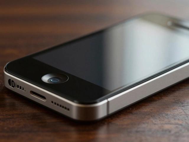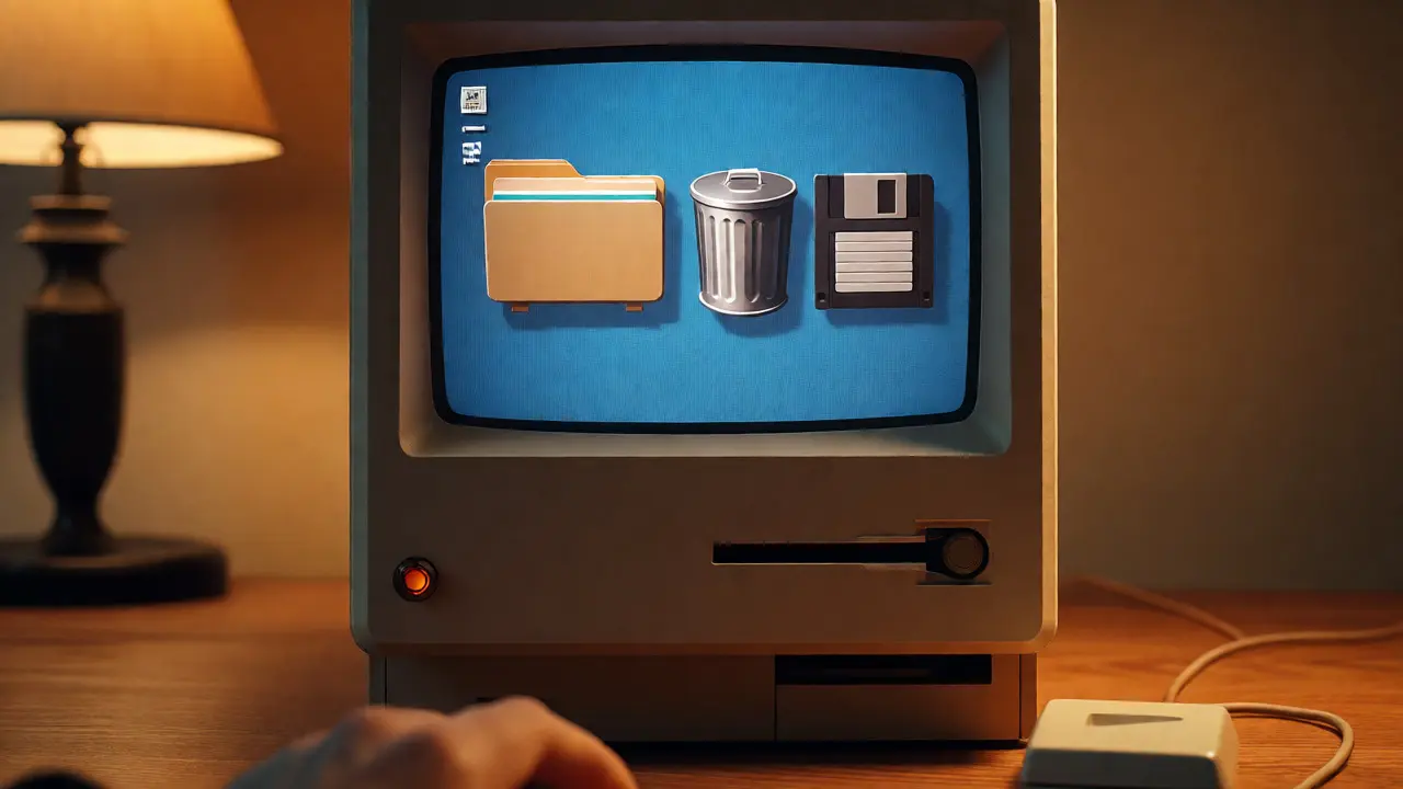

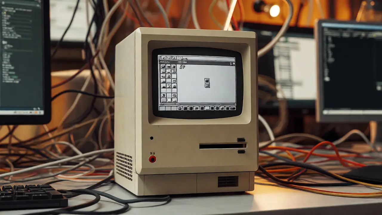
You probably remember the first time you saw a Macintosh desktop. It wasn't just a screen; it was a metaphor for your actual desk. Folders looked like manila folders. The trash can looked like a real bin. That visual language, created in the early 1980s by Susan Kare and her team at Apple, defined personal computing for decades. But look at your wrist right now. Or check your phone. Does that tiny, glowing rectangle feel like a "desk"? Not really. It feels more like an extension of your body.
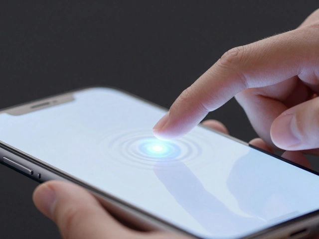
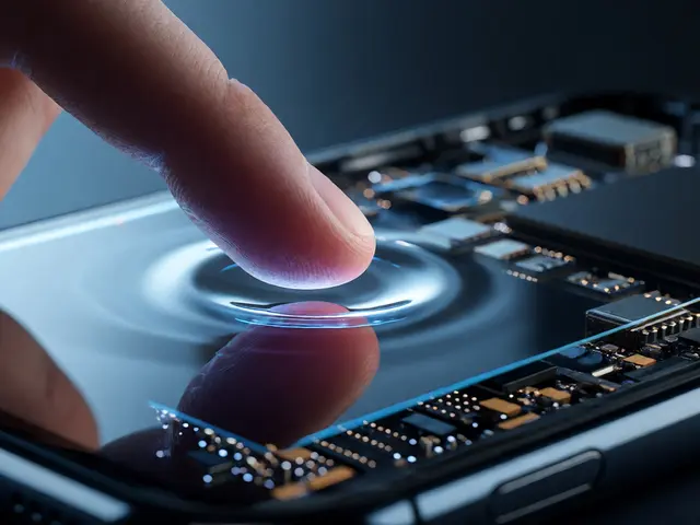
This shift isn't just about smaller screens. It's a fundamental change in how we interact with machines. We moved from clicking on representations of physical objects to swiping through information layers, and finally to tapping on glass or raising a wrist. This journey-from desktop icons to wearables-isn't random. It follows a strict logic driven by context, input methods, and the sheer size of the device in front of you.
The Era of Skeuomorphism: Why We Needed Pictures
In the beginning, computers were scary. They spoke binary, not English. To make them friendly, designers used skeuomorphism. This is a fancy word for making digital things look like their real-world counterparts. If you wanted to delete a file, you dragged it into a picture of a trash can. If you wanted to listen to music, you opened an app that looked like a stereo system with wooden knobs.
This approach worked because users needed anchors. A blank white window meant nothing. A folder icon meant "stuff goes here." Steve Jobs famously insisted on this realism. He wanted the computer to feel familiar, like a tool you already knew how to use. For twenty years, this held true. Even when screens got sharper, the metaphors stayed. The calculator still looked like a Casio. The notes app still had yellow paper lines.
But there was a problem. As devices became ubiquitous, everyone learned the language. You didn't need a picture of a floppy disk to save a file anymore. You knew what the little arrow meant. The training wheels were no longer necessary. In fact, they started getting in the way. Real-world textures added visual noise. Wood grain and leather stitching took up pixels that could have been used for content. The design vocabulary needed to shed its costume.
Flat Design: Stripping Away the Noise
Enter iOS 7 in 2013. Jony Ive led a massive overhaul that stripped away the shadows, gradients, and textures. This move toward flat design wasn't just aesthetic preference. It was functional necessity. Touchscreens changed the game. When you touch a button, you don't want to think about whether it looks pressed down. You want immediate feedback. Flat design focused on clarity, hierarchy, and typography.
Icons became simpler. The settings gear lost its metallic shine. The weather app stopped looking like a realistic cloud and became a vibrant color gradient. This shift reduced cognitive load. Users processed information faster because there were fewer decorative elements competing for attention. It also made interfaces scalable. A flat icon looks good on a giant iMac and decent on a small iPad. Skeuomorphic details often blurred or looked messy when resized.
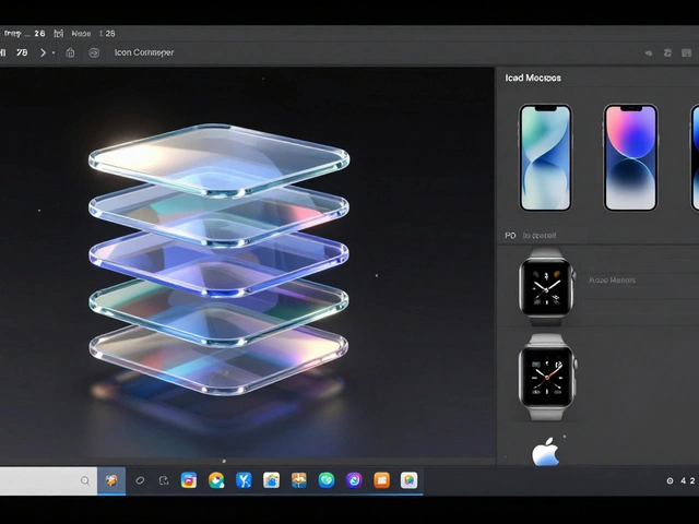
However, flat design hit a wall. Without depth cues, some users struggled to distinguish between interactive buttons and static text. Everything felt like a piece of paper. Apple responded by introducing subtle motion and translucency in later updates. They didn't go back to wood grain, but they added layers. Blurred backgrounds hinted at depth without cluttering the view. This hybrid approach balanced simplicity with usability.
The Watch Constraint: Designing for a Wrist
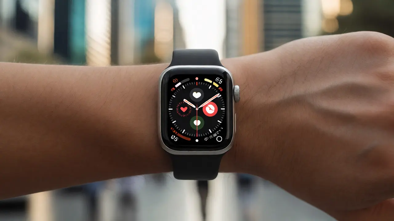
When the Apple Watch launched in 2015, designers faced a nightmare scenario. How do you fit a complex operating system onto a screen barely larger than a coin? You can't show ten icons in a grid. You can't display paragraphs of text. The traditional desktop model collapsed completely.
The solution required a new vocabulary. Apple introduced the concept of glances and complications. Instead of opening apps to see data, you glanced at specific widgets on the watch face. These tiny data points-like heart rate, calendar events, or battery life-became the primary interface. The design shifted from "doing tasks" to "receiving notifications."
Input methods changed too. On a Mac, you use a mouse and keyboard. On an iPhone, you tap and swipe. On a Watch, you tap, turn the digital crown, and speak. Each interaction demands precision. Tapping a target smaller than 40x40 pixels leads to frustration. So, Apple increased hit targets and simplified navigation. Menus became vertical lists. Complex forms were replaced by quick actions. The goal wasn't to replicate the phone experience; it was to deliver only what mattered, right now.
| Feature | Desktop (Mac) | Mobile (iPhone) | Wearable (Watch) |
|---|---|---|---|
| Primary Input | Mouse/Keyboard | Touch/Swipe | Tap/Crown/Voice |
| Visual Style | Skeuomorphic → Flat | Flat → Translucent | Minimalist/High Contrast |
| Data Display | Windows/Panels | Cards/Lists | Glances/Complications |
| User Intent | Creation/Productivity | Consumption/Communication | Awareness/Quick Action |
Vision Pro and Spatial Computing: Breaking the Screen
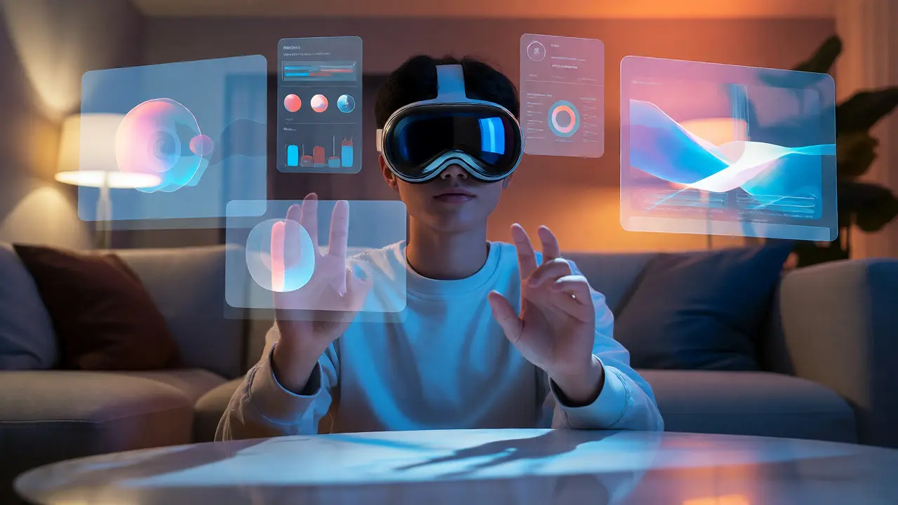
If the Watch pushed boundaries, the Vision Pro shattered them. Released in 2024, this headset moved us beyond 2D planes entirely. Here, there are no desktops. There are no windows pinned to a monitor. Instead, apps float in your room. They respond to eye movement and hand gestures. You look at an app to select it. You pinch your fingers to click.
This spatial environment requires a whole new set of rules. Text must remain legible regardless of distance. Buttons need to provide haptic feedback so you know you've touched something invisible. The design vocabulary now includes concepts like "depth," "lighting," and "presence." An app doesn't just sit on a screen; it casts a shadow on your real-world table. It reacts to ambient light. This level of integration blurs the line between digital and physical.
Why does this matter for everyday users? Because it changes how we multitask. On a Mac, you switch between windows. On a Vision Pro, you arrange virtual screens around your physical space. You might have a browser floating above your kitchen counter while watching a video on the fridge. The design challenge shifts from organizing pixels to organizing space. It’s less about layout and more about placement.
Consistency Across Devices: The Universal Language
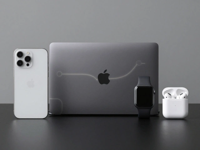
Despite these radical changes, Apple maintains a core consistency. The fonts, colors, and animation curves stay similar across all platforms. This is intentional. It creates a seamless ecosystem. If you start reading an email on your Mac, finish it on your iPhone, and get a notification on your Watch, the experience feels continuous. The underlying logic remains the same, even if the presentation differs.
Developers benefit from this unified Human Interface Guidelines. They write code once and adapt it for different form factors. SwiftUI, Apple's modern framework, makes this easier. It allows components to scale automatically. A button designed for a phone looks appropriate on a tablet and functions correctly on a watch. This reduces fragmentation. Users don't have to relearn basic interactions every time they switch devices.
Yet, each platform retains its unique character. The Mac prioritizes power and precision. The iPhone balances utility and portability. The Watch emphasizes brevity and health. The Vision Pro focuses on immersion. Understanding these distinctions helps developers create better products. Copying a Mac app directly to a Watch fails because the contexts are too different. Successful designs respect the constraints of the hardware.
What Comes Next? Ambient Intelligence
We are moving toward an era of ambient intelligence. Interfaces will become less visible. Think about Siri. You don't open an app to ask the weather; you just speak. Future wearables might eliminate screens altogether. Imagine glasses that project information only when you need it, then fade away. Or earbuds that translate conversations in real-time without any visual interface.
The design vocabulary will expand to include audio cues, haptic patterns, and predictive algorithms. Designers won't just draw buttons; they'll choreograph moments. When should the device interrupt you? How loud should the alert be? Which vibration pattern means "urgent" versus "routine"? These micro-interactions define the user experience as much as visual layouts ever did.
From the pixelated folders of 1984 to the holographic overlays of today, Apple's design evolution reflects our changing relationship with technology. We went from commanding machines to collaborating with them. The icons disappeared, but the intent remained: make complex tools feel simple. Whether you're dragging a file or glancing at your pulse, the goal is always the same-to reduce friction between human intention and digital action.
Why did Apple stop using skeuomorphic designs?
Apple moved away from skeuomorphism because users became comfortable with digital interfaces. Realistic textures added visual clutter and slowed down processing. Flat design offered cleaner aesthetics, better scalability across different screen sizes, and improved performance by reducing graphical overhead.
How does the Apple Watch interface differ from the iPhone?
The Apple Watch uses a glanceable interface focused on quick information retrieval rather than deep interaction. It relies on complications (widgets) on the watch face and simplified menus accessed via the Digital Crown. Input is limited to taps, voice, and crown rotation, requiring larger hit targets and shorter text compared to the iPhone's full touch capabilities.
What is spatial computing in the context of Apple Vision Pro?
Spatial computing refers to interacting with digital content in three-dimensional physical space. Unlike traditional screens, Vision Pro apps float in the user's environment. Interaction occurs through eye tracking and hand gestures, allowing users to place, resize, and organize virtual windows relative to real-world objects.
Are desktop icons obsolete?
Not entirely. While mobile and wearable interfaces rely on cards and lists, desktop environments still use icons for file management and application launching. However, the style has evolved from realistic images to flat, symbolic glyphs. Icons remain useful for quick recognition but are supplemented by search and list views for efficiency.
How does Apple maintain design consistency across devices?
Apple uses unified Human Interface Guidelines and frameworks like SwiftUI. These ensure consistent typography, color palettes, and animation behaviors across Mac, iPhone, iPad, Watch, and Vision Pro. Developers build adaptive components that adjust layout and interaction based on the device's capabilities and screen size.

Categories
Popular Articles