
Imagine walking into a computer store in 1997. The shelves are lined with beige boxes that look like they were designed by an accountant who hates fun. Then, you see it: a translucent blue shell glowing under fluorescent lights. It doesn’t just look different; it feels alive. This was the moment Apple Computer stopped trying to blend in and started leading the visual conversation of the decade.
The story of Apple’s 1990s revival is not just about better processors or faster hard drives. It is fundamentally a story about color. Before 1998, personal computers were utilitarian objects. They were beige because beige was neutral, safe, and unobtrusive. But when Jony Ive took the helm of industrial design, he realized that color could be a functional tool, not just decoration. He turned the PC from a workhorse into a lifestyle accessory, setting the stage for the cultural dominance Apple enjoys today.
The Beige Era: Why Computers Bored Us
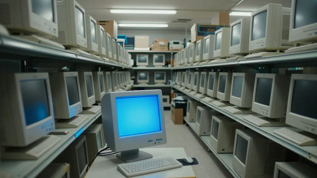
To understand why the shift to vibrant colors was so radical, we have to look at what came before. In the early 1990s, the dominant aesthetic in tech was defined by IBM and its competitors. Their machines were rectangular, matte, and almost always off-white or light gray. This wasn't an accident. It was a deliberate choice to signal professionalism. If your computer looked serious, you felt productive using it.
However, this approach had a downside. By 1996, the market was saturated with identical-looking machines. Consumers couldn't tell a Pentium II apart from a Celeron just by looking at the case. The product identity was lost in a sea of sameness. For Apple, which was already struggling financially and culturally, this lack of distinctiveness was fatal. People bought PCs based on specs, not feelings. Apple needed to change the emotional equation.
The Pivot: From Platinum to Transparency
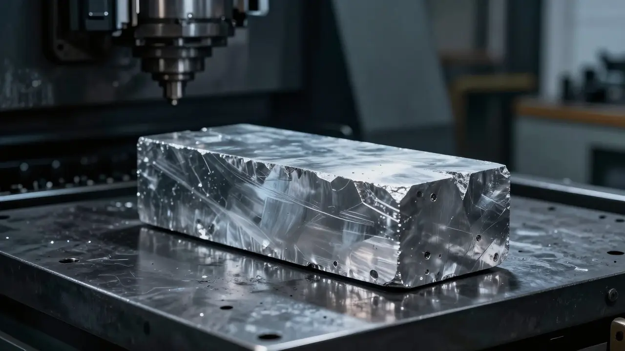
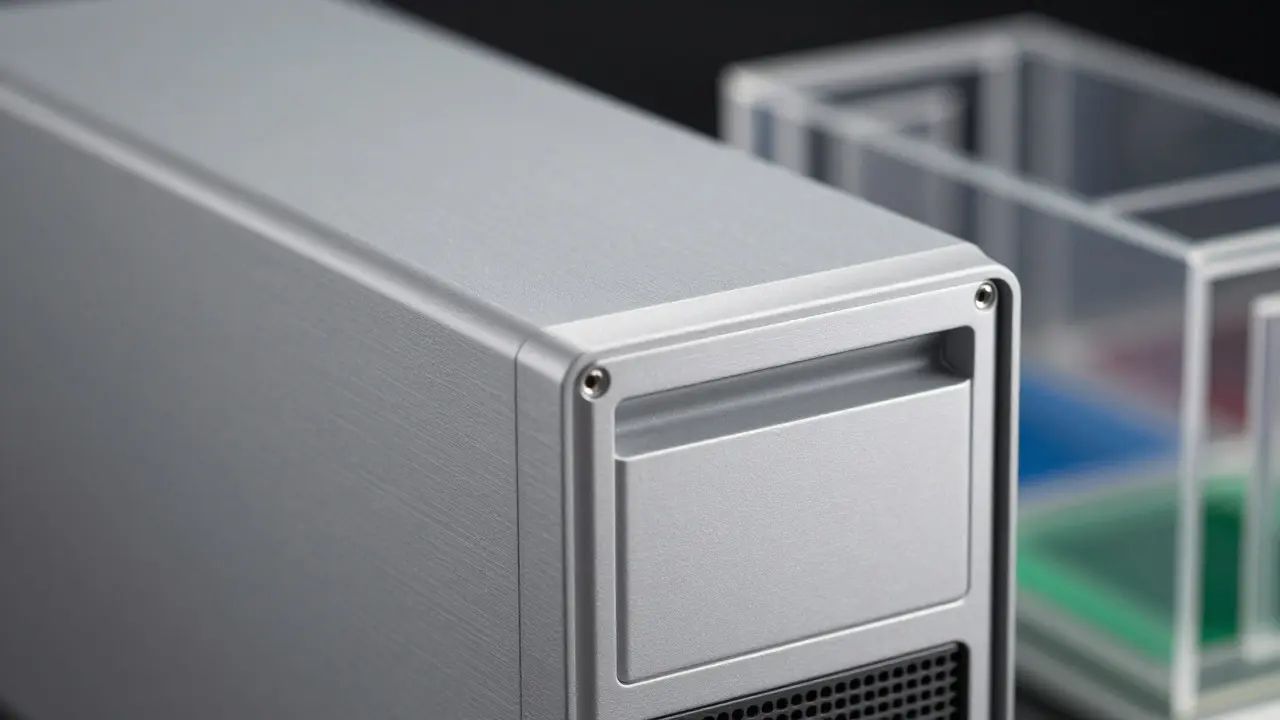
The transition didn't happen overnight. It started with a subtle shift toward metallic finishes. In the mid-90s, Apple introduced the Power Mac G3 line, which featured a sleek, platinum-gray aluminum chassis. This was a significant departure from plastic beige. The metal gave the machine weight and a premium feel. It whispered "quality" without shouting.
But metal was still cold. It was still corporate. The real breakthrough came when design teams began experimenting with transparency. The idea was simple: if you can see inside the computer, you trust it more. You see the components, the cooling fans, the logic boards. It demystified the technology. It made the machine feel less like a black box and more like a piece of engineering art. This philosophy led directly to the creation of the iMac G3, the device that would redefine the industry.
Bondi Blue: The Color That Changed Everything
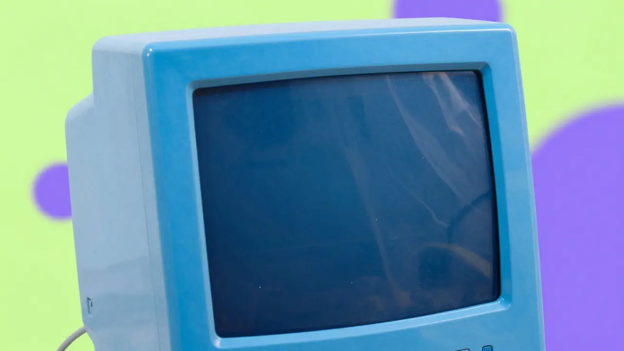
In May 1998, Apple released the iMac G3. Its debut color was Bondi Blue, named after the famous beach in Sydney, Australia. It wasn't just any blue. It was a bright, electric, semi-translucent cyan that seemed to glow from within. At first, critics were skeptical. Some called it a toy. Others said it was too loud for a professional workspace.
But the reaction from consumers was immediate and overwhelming. The iMac G3 sold out in weeks. More importantly, it changed how people perceived personal computing. A computer was no longer something you hid under a desk. It was something you displayed on top of it. The color became a badge of identity. Owning an iMac meant you were part of a creative, forward-thinking tribe.
| Year | Product Line | Primary Material | Signature Color | Design Intent |
|---|---|---|---|---|
| 1995 | Power Mac G3 | Metal (Aluminum) | Platinum Gray | Signal premium quality and move away from beige |
| 1998 | iMac G3 | Translucent Plastic | Bondi Blue | Create emotional connection and visual distinctiveness |
| 1999 | iBook G3 | Translucent Plastic | Lime Green / Grape | Target students with playful, portable aesthetics |
| 2001 | iMac G4 | Glass & Metal | White / Silver | Shift toward minimalist sophistication and home integration |
The Psychology of Translucency
Why did translucency work so well? Psychologists suggest that humans have an innate curiosity about mechanisms. When we can see how something works, we feel a sense of control and understanding. The iMac’s clear shell invited users to look inside. It reduced the fear factor associated with new technology.
Furthermore, the color wasn't static. Depending on the lighting in the room, the Bondi Blue could appear deep navy or bright turquoise. This dynamic quality kept the object visually interesting over time. A beige box looks the same in 1990 as it does in 2020. A translucent blue iMac changes with the sun, making it feel like a living object rather than a dead appliance.
Expanding the Palette: Beyond Blue
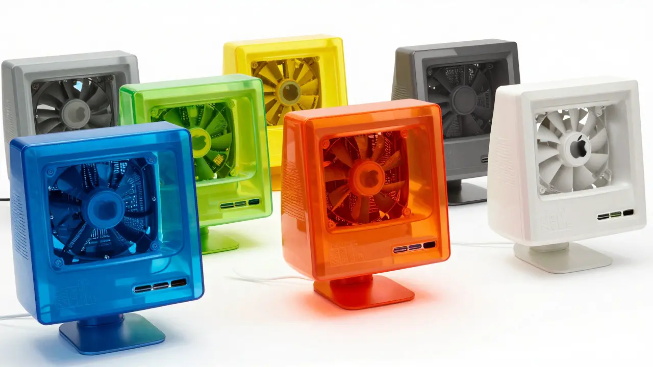
Once Bondi Blue proved successful, Apple expanded its color palette aggressively. The iMac G3 came in Graphite, Lime, Tangerine, Snow, and finally, White. Each color targeted a specific demographic or mood. Lime was energetic and youthful, perfect for the iBook laptop aimed at college students. Tangerine was warm and inviting.
This strategy turned hardware choices into fashion statements. You didn't just buy a computer; you chose a vibe. This was a massive shift from the previous era where all computers looked the same regardless of price or performance. Color became a primary differentiator in a crowded market. It allowed Apple to charge a premium not just for specs, but for the aesthetic experience.
The Legacy: Setting the Stage for the iPhone
The impact of the 1990s color revolution extended far beyond desktop computers. It established a design language that would carry through the iPod, the original iPhone, and the iPad. The focus on material integrity, clean lines, and bold color choices created a brand identity that is instantly recognizable worldwide.
When Steve Jobs returned to Apple in 1997, he partnered closely with Jony Ive to strip away complexity. But they didn't strip away personality. Instead, they amplified it through design. The lesson from the 1990s is clear: in a world of identical products, form is function. Color is not just paint; it is communication. It tells the user what the product feels like before they even turn it on.
Frequently Asked Questions
Why was the iMac G3 initially criticized for its color?
Critics argued that Bondi Blue was too playful and childish for a professional computer. They believed that serious work required serious, neutral colors like beige or gray. However, consumer sales quickly proved that the public preferred the vibrant, distinctive look over the traditional corporate aesthetic.
What material was used for the iMac G3's translucent shell?
The iMac G3 used a polycarbonate plastic shell. This material was chosen because it could be molded into complex curves and tinted with pigments to achieve the desired level of translucency. It was also durable enough to withstand daily use while maintaining its glossy finish.
How did the Power Mac G3 differ from the iMac G3 in terms of design?
The Power Mac G3 featured a solid, opaque platinum-gray metal chassis, focusing on a premium, industrial look. The iMac G3, by contrast, used a translucent, colorful plastic shell to create a friendly, accessible, and emotionally engaging user experience. The former signaled power; the latter signaled creativity.
Did other manufacturers try to copy Apple's colored design?
Yes, several competitors attempted to mimic the trend. Companies like Dell and HP released models with colored accents or translucent panels in the late 1990s and early 2000s. However, most failed to capture the cohesive aesthetic vision that Apple maintained across its entire product line, resulting in designs that often looked inconsistent or cheap by comparison.
What role did marketing play in the success of the iMac's color?
Marketing played a crucial role by positioning the iMac as a lifestyle product rather than just a tool. Advertisements showed the computer in home environments, emphasizing its beauty and simplicity. The launch event itself was a spectacle, highlighting the color and form as the primary selling points, which helped shift consumer expectations for what a computer should look like.