
In 1997, Apple was nine months away from bankruptcy. The company had a bloated product line, confusing branding, and hardware that felt like it belonged in a hospital waiting room rather than a creative studio. Then Steve Jobs returned as interim CEO, bringing with him a singular, ruthless focus on design that would save the company.
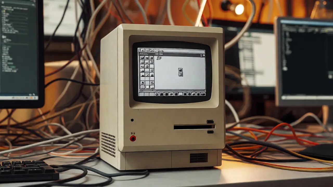
This wasn't just about making things look pretty. It was a fundamental shift in how technology companies approach product development. Before Jobs' second tenure, Apple operated like many tech firms of the 90s: engineering-led, spec-obsessed, and disconnected from the actual human using the device. The return of Steve Jobs didn't just change who sat in the corner office; it rewired the DNA of industrial design in Silicon Valley.
| Attribute | Pre-1997 (Gil Amelio Era) | Post-1997 (Jobs Era) |
|---|---|---|
| Primary Driver | Engineering specs & market share | User experience & aesthetic coherence |
| Product Strategy | Fragmented (35+ models) | Focused Matrix (4 core products) |
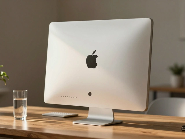
| Materials | Beige plastic, bulky forms | Polycarbonate, aluminum, glass |
| Design Authority | Subordinate to marketing/engineering | Central decision-maker (Jony Ive) |
The Death by a Thousand SKUs
When Jobs walked back into Cupertino, he didn't start with a new logo or a catchy slogan. He started with a spreadsheet. Apple was producing over 35 different Macintosh models, plus printers, scanners, and peripherals that made little sense together. Customers were confused. Retailers were overwhelmed. Engineers were burned out trying to support legacy hardware.
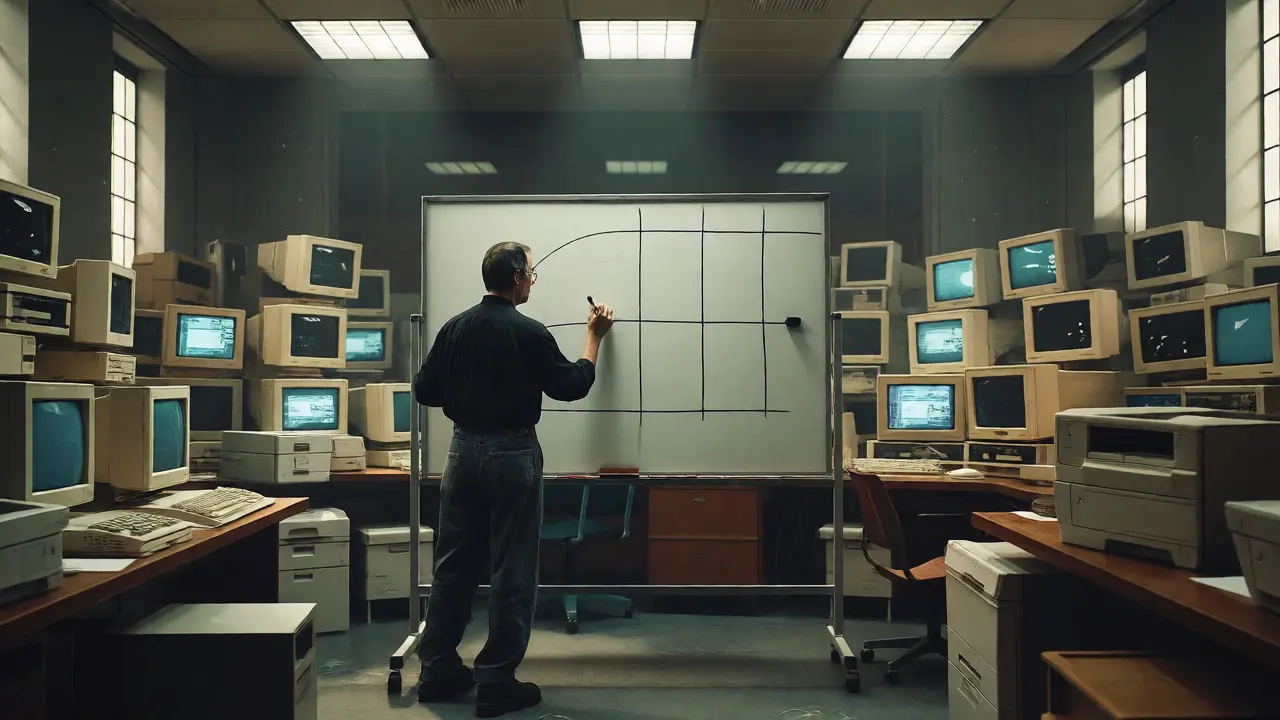
Jobs drew a simple 2x2 grid on a whiteboard. On one axis: Consumer vs. Pro. On the other: Desktop vs. Portable. The rule was brutal but effective: if a product didn't fit into one of those four quadrants, it died. This wasn't just inventory management; it was a design constraint. By forcing the team to pick only four winners, every single pixel, port, and button had to earn its place. You couldn't hide mediocre design behind a crowded portfolio.
This move taught the industry a hard lesson: subtraction is the highest form of creativity. Most companies try to solve problems by adding features. Apple solved them by removing options. When you have fewer choices, each choice must be perfect. That pressure cooker environment forced designers to obsess over details that usually get ignored-like the sound a power button makes or the way a cable drapes across a desk.
Jony Ive and the Rise of Industrial Design
You can't talk about Apple's design reset without talking about Jony Ive. Before Jobs returned, Ive was a mid-level designer at Apple, largely ignored by the previous leadership. Jobs saw something in Ive's work-a commitment to material honesty and seamless integration that matched his own vision.
Ive became the head of industrial design, reporting directly to Jobs. This structural change was critical. In most tech companies, design is an afterthought, brought in once the engineers have already figured out what fits inside the box. At Apple, under Jobs, design led the conversation. If the design demanded a thinner profile, the engineers had to find a way to make the battery smaller. If the design required a specific curve, the manufacturing process had to adapt.
The result was the iMac G3. Released in 1998, it broke every rule of beige-box computing. It used translucent colored plastics, integrated the CRT monitor into the case, and eliminated floppy drives before they were technically obsolete. It wasn't just a computer; it was an object of desire. It proved that consumers cared about how their tools looked and felt, not just how fast they calculated.

Material Honesty and Manufacturing Innovation
Jobs and Ive weren't just sketching cool shapes; they were pushing manufacturing limits. They wanted materials that felt premium but behaved predictably. This led to a partnership with manufacturers that was unusual for the time. Apple bought entire production lines of machines to ensure quality control. They pioneered the use of unibody aluminum construction, where a single block of metal is carved out to create the chassis.
Why does this matter for design priorities? Because when you control the manufacturing, you control the aesthetic integrity. A seam between two pieces of plastic isn't just a visual flaw; it's a structural compromise. By demanding unibody designs, Apple forced the supply chain to innovate. Competitors like Dell and HP relied on off-the-shelf parts because they couldn't afford to buy custom CNC machines. Apple could. And that difference showed up in the hand-feel of every MacBook.
This era also saw the introduction of multi-touch interfaces. While capacitive touch existed before, Apple refined it to feel intuitive. The iPhone didn't invent the smartphone, but it redefined the interaction model. Physical buttons disappeared. The screen became the interface. This required a complete rethink of UI design principles-gestures replaced clicks, and minimalism became the default state.
The Ecosystem as a Design Feature
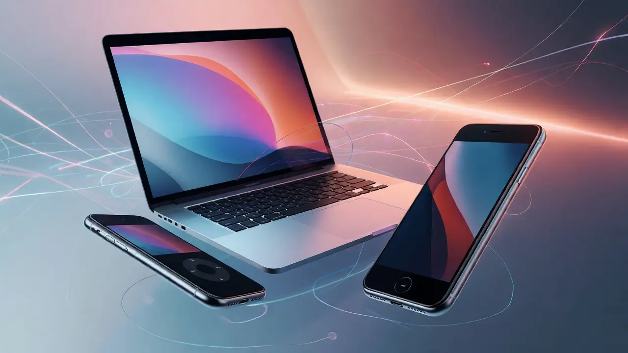
Perhaps the biggest shift Jobs instilled was the idea that the ecosystem itself is a design element. Before Apple's resurgence, devices were islands. Your MP3 player didn't talk to your phone. Your phone didn't sync easily with your computer. Jobs envisioned a seamless flow of data and context between devices.
This required standardization. USB ports became universal connectors. Bluetooth protocols were adopted early and consistently. iCloud later tied it all together digitally. But even before cloud storage, the physical design language signaled connectivity. The same fonts, the same rounded corners, the same clean white packaging-it all told the user that these objects belonged together. It reduced cognitive load. You didn't need to learn three different ways to plug in cables. One shape, one logic, everywhere.
For designers today, this is the key takeaway: don't just design the artifact. Design the relationship between artifacts. How does the watch communicate with the phone? How does the laptop wake up when you open the lid? These micro-interactions are often invisible, but they define the brand's character more than any logo ever could.
Lessons for Modern Leaders
What can current startups and established brands learn from this historical pivot? First, empower your designers. Give them veto power over engineering decisions. If the engineer says "it can't be done," the designer should ask "why not?" and push until the answer changes.
Second, embrace constraints. Don't launch ten products to see what sticks. Launch one, make it exceptional, and iterate. Scarcity creates value. When customers know you only release a few items, they pay attention to every detail.
Third, prioritize tactile feedback. In a world of flat screens and haptic buzzes, physical texture matters. The weight of a mouse, the click of a keyboard, the coldness of metal-these sensory inputs build trust. They signal quality without a word being spoken.
Finally, remember that design is communication. Every curve, color, and material choice tells the user what you think of them. Do you think they want complexity, or clarity? Apple bet on clarity, and it paid off with a trillion-dollar valuation. That bet started with a man returning to a failing company and deciding that no feature was worth shipping if it confused the user.
Did Steve Jobs actually design the products himself?
No, Steve Jobs did not draw the sketches or model the CAD files. His role was curatorial and strategic. He acted as the ultimate editor, approving or rejecting concepts based on whether they met his strict standards for simplicity and usability. He worked closely with Jony Ive, providing direction and critique, but the execution was handled by the design and engineering teams.
How did the 2x2 product matrix help Apple's design?
The 2x2 matrix (Consumer/Pro x Desktop/Laptop) forced extreme focus. By cutting the product line from 35 models to just 4 core offerings, Apple freed up resources to perfect those four items. Designers no longer had to create distinct identities for dozens of minor variants. Instead, they poured all their creative energy into making those four flagship devices iconic, ensuring consistent quality and clear market positioning.
Why was the iMac G3 considered a design revolution?
The iMac G3 broke the monotony of beige PCs by introducing colorful, translucent polycarbonate shells. It integrated the CRT monitor into the main unit, reducing clutter. Crucially, it removed legacy ports like the floppy drive, signaling a forward-looking approach. It proved that computers could be lifestyle products, appealing to emotion and aesthetics rather than just technical specifications.
What is "material honesty" in Apple's design philosophy?
Material honesty means using materials in a way that respects their natural properties. Aluminum looks and feels like metal; glass looks and feels like glass. Apple avoided painting plastic to look like metal or hiding screws unnecessarily. This transparency builds trust with users, who subconsciously associate high-quality materials with durability and precision engineering.
How did Apple's design strategy influence competitors?
Competitors initially dismissed Apple's focus on aesthetics as superficial. However, as Apple captured market share through loyalty and premium pricing, rivals began hiring top industrial designers and investing in unified ecosystems. Today, companies like Samsung, Microsoft, and Dyson emulate Apple's emphasis on minimalist aesthetics, seamless connectivity, and premium materials, validating Jobs' belief that design is a competitive advantage, not just decoration.