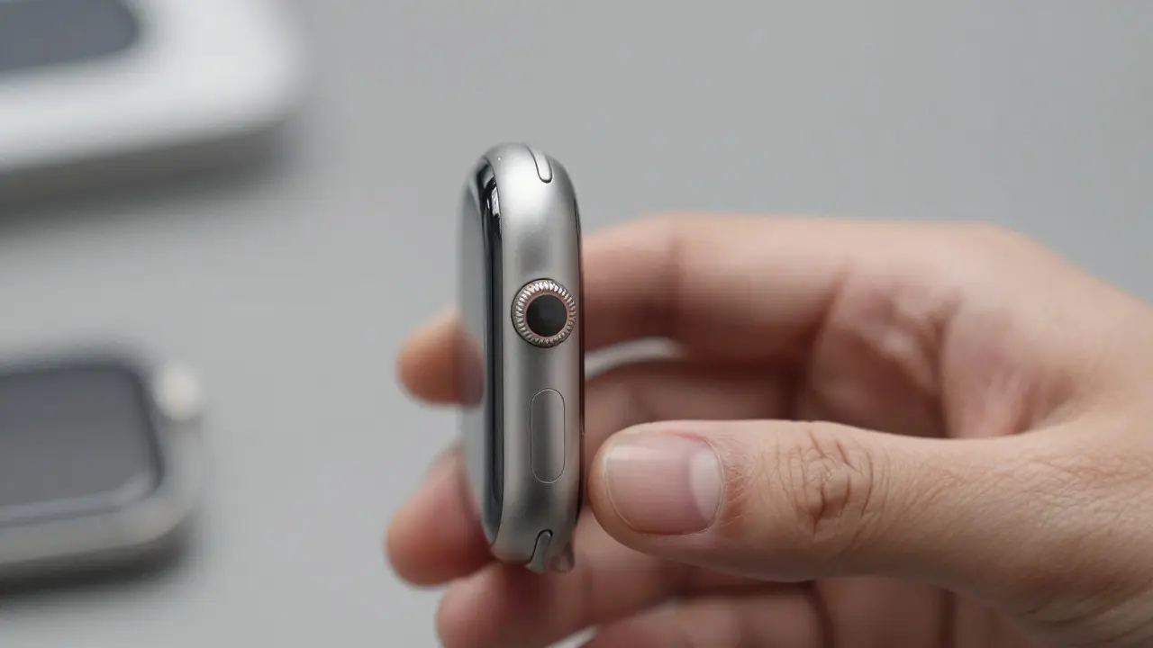

Most people assume that a premium accessory is just a smaller version of a flagship phone or laptop. They are wrong. The real magic happens in the gap between the device and the user’s hand. When you pick up an AirPods Pro case or slide a Magic Trackpad across your desk, you aren’t just using hardware; you are engaging with a specific set of physical cues that tell your brain exactly how to interact. This is the essence of accessory design language: a consistent system of tactile, visual, and haptic feedback that makes third-party or even first-party peripherals feel like they belong in the same family as the core device.
Why does this matter? Because friction kills engagement. If a charger feels clunky, if a keyboard key has too much travel, or if a smartwatch band snaps shut with a violent click, the user notices. In 2026, where devices are increasingly modular and accessories are often bought separately from the main unit, consistency is the new luxury. It’s not about matching colors; it’s about matching expectations.
The Physics of Trust: Tactile Feedback and Material Choice
Before a screen lights up, your fingers do the talking. Tactile feedback is the silent handshake between user and object. Apple’s approach to this has always been obsessive. Take the Apple Watch digital crown. It isn’t just a button; it’s a precision-machined aluminum ring with a knurled edge that provides distinct, high-frequency clicks. Each click corresponds to a specific scroll increment on the interface. This creates a direct mapping between physical action and digital result. You don’t have to look at the screen to know you’ve scrolled one item. Your thumb knows.
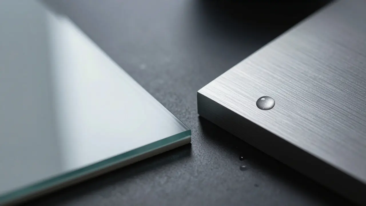
This principle extends to materials. Premium accessories rely on anodized aluminum and ceramic glass not just for durability, but for thermal conductivity. Aluminum dissipates heat quickly, which signals quality because cheap plastic retains warmth from charging coils. Ceramic glass offers a smoother glide for styluses and fingers than standard Gorilla Glass, reducing micro-friction during swipes. These material choices aren’t arbitrary; they are calculated responses to how humans perceive weight, temperature, and texture. A heavy, cold metal object feels more "substantial" than a light, warm plastic one, even if the internal components are identical.
Haptics: The Invisible Interface
If touch is the handshake, haptics are the conversation. Haptic feedback uses vibration motors to simulate textures and confirm actions without sound. In 2026, linear resonant actuators (LRAs) have largely replaced older eccentric rotating mass (ERM) motors in high-end accessories. LRAs produce a sharper, more precise pulse that can be modulated in frequency and amplitude. This allows designers to create complex patterns: a double-tap confirmation, a subtle warning buzz, or a textured surface simulation when scrolling through a list.
Consider the AirPods Max. When you adjust the volume via the Digital Crown, you don’t just hear the audio change; you feel a crisp, mechanical click that mirrors the physical resistance of the crown. This dual-sensory input reduces cognitive load. You trust the input because two senses confirm it. For accessory designers, the lesson is clear: haptics should never be decorative. Every vibration must serve a functional purpose-confirmation, navigation, or alert. If a haptic cue doesn’t help the user understand state or position, remove it.
Visual Consistency: The Unspoken Grammar
Visual design language is about rhythm and restraint. Apple’s accessories follow a strict grid system. Buttons are perfectly aligned. Seams are invisible. Screws are hidden. This minimalism isn’t just aesthetic; it reduces visual noise so the user can focus on the task. But it also establishes a hierarchy. Primary actions (like power buttons) are slightly raised or colored differently. Secondary actions (like pairing modes) are recessed or marked with subtle icons.
In the broader ecosystem, third-party manufacturers struggle to replicate this. Why? Because they often prioritize feature density over clarity. A budget wireless mouse might have six buttons, three DPI switches, and RGB lighting. An Apple Magic Mouse has one flat surface and no visible buttons. The trade-off is obvious: less flexibility, but zero learning curve. For most users, simplicity wins. The visual grammar of an accessory should communicate its function at a glance. If you need a manual to find the mute button, the design has failed.

Sound Design: The Final Polish
We often overlook sound in accessory design, but it plays a crucial role in perceived quality. The click of a USB-C connector seating into a port, the snap of a magnetic case closing, or the soft thud of a keyboard key bottoming out-all these sounds signal precision. Engineers spend hours tuning these acoustic profiles. A cheap plastic case might rattle when closed. A premium aluminum case produces a solid, muted thock. This auditory feedback reinforces the tactile sensation, creating a multi-sensory experience that feels cohesive.
Sound also serves as a status indicator. The subtle chime of a watchband locking into place tells you it’s secure. The absence of sound when a cable disconnects gently indicates a safe removal. In noisy environments, these cues become vital. They allow users to operate devices confidently without constant visual verification. For accessory designers, sound is not an afterthought; it’s part of the interaction loop.
Comparing Core Principles: First-Party vs. Third-Party
To understand the gap between core device quality and accessory interactions, let’s compare typical approaches. First-party accessories benefit from unified control over hardware, software, and firmware. This allows for deep integration features like automatic pairing, battery health monitoring, and seamless handoff. Third-party accessories often lack this depth, relying on generic Bluetooth protocols that introduce latency or connectivity drops.
| Attribute | First-Party (e.g., Apple) | Third-Party (Generic/Premium) |
|---|---|---|
| Tactile Precision | High (custom machined parts) | Variable (injection molded) |
| Haptic Complexity | Custom LRA patterns | Standard ERM pulses |
| Material Quality | Anodized Al, Ceramic | Polycarbonate, ABS Plastic |
| Software Integration | Deep OS-level access | Basic BT profile support |
| Sound Profile | Tuned for silence/clarity | Often rattly or loud |
The table highlights a critical insight: premium feel is rarely about raw specs. It’s about the consistency of small details. A third-party manufacturer can match the battery life of an Apple accessory, but replicating the exact weight distribution, the smoothness of the hinge, and the quietness of the mechanism requires significant R&D investment. Most companies skip this step to cut costs, resulting in products that work well but feel "cheap."
Common Pitfalls in Accessory Interaction Design
Even experienced designers make mistakes that break the immersion. Here are the most common ones:
- Inconsistent Button Travel: If one button sinks 1mm and another sinks 0.5mm, the user perceives inconsistency. Standardize travel distance across all inputs.
- Over-Engineering Haptics: Too many vibration patterns confuse users. Limit haptic cues to three or four core states: success, error, selection, and notification.
- Ignoring Thermal Management: Hot accessories feel defective. Use passive cooling (metal shells, heat pipes) rather than active fans, which add noise and failure points.
- Poor Cable Strain Relief: Cables are the first point of failure. Design strain relief that guides the cable naturally, preventing sharp bends near the connector.
- Lack of Visual Hierarchy: If all buttons look the same, users hesitate. Use size, color, or texture to differentiate primary actions from secondary ones.
Practical Tips for Designers and Buyers
For designers aiming to elevate their accessory line, start with the "blind test." Can a user identify the power button, reset switch, and pairing mode by touch alone? If not, revise the layout. Use prototyping tools to test different button depths and spring tensions. Aim for a force curve that feels responsive but not mushy. Typically, a press force of 250-350 grams per square centimeter provides a satisfying click without fatigue. For buyers evaluating accessories, look beyond marketing claims. Check the build materials. Is it metal or plastic? Does the hinge creak? Do the buttons feel uniform? Listen to the unboxing video for audio cues-a solid, quiet assembly suggests better quality control. Remember, the best accessories disappear into the background. They don’t demand attention; they simply work, every time, with a confidence that comes from meticulous attention to detail.
What makes an accessory feel "premium"?
Premium feel comes from consistent tactile feedback, high-quality materials like anodized aluminum, precise haptics, and silent operation. It’s about the reduction of friction and noise in every interaction, making the device feel reliable and intentional.
Why do Apple accessories feel different from third-party ones?
Apple controls the entire supply chain, from raw materials to firmware. This allows for tighter tolerances, custom-machined components, and deep software integration. Third-party makers often use generic parts to reduce costs, leading to slight inconsistencies in fit, finish, and functionality.
Is haptic feedback necessary for all accessories?
No. Haptics are essential for devices with frequent, repetitive inputs like watches, phones, and controllers. For static accessories like stands or docks, haptics are unnecessary and add cost. Focus on tactile precision instead.
How important is sound in accessory design?
Very important. Sound confirms physical actions. A quiet, solid click signals quality, while rattling or squeaking signals poor assembly. Sound design helps users operate devices confidently, especially in noisy or low-light environments.
Can third-party brands achieve Apple-level design quality?
Yes, but it requires significant investment in R&D and quality control. Brands like Logitech and Sennheiser have achieved similar levels of polish in keyboards and headphones by focusing on consistent manufacturing processes and user-centric testing. It’s harder, but not impossible.