
Think about how different your iPhone feels from your Mac. One has touch, one has a cursor. One has a home screen, one has a desktop. One has a Dock at the bottom, the other has a menu bar at the top. For years, Apple made these differences feel natural - even intentional. But starting with iOS 26, iPadOS 26, and macOS Tahoe 26, that’s no longer true. Apple didn’t just tweak icons or update colors. They rebuilt how every device in the ecosystem looks and behaves - and made them feel like one system.
It’s Not Just a Visual Update - It’s a System-Level Shift
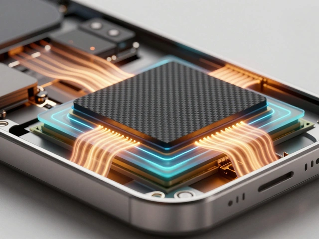
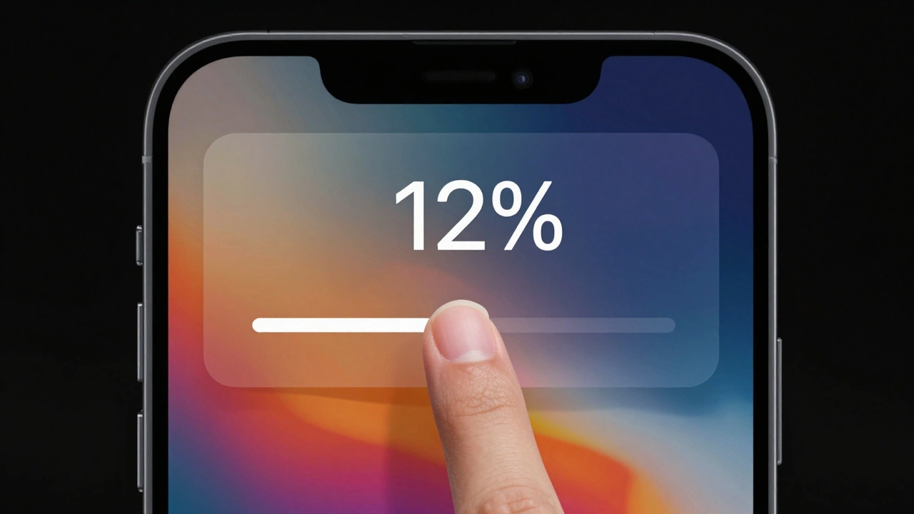
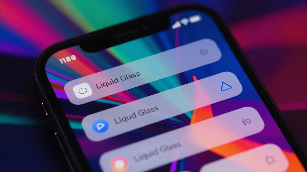
This isn’t another round of "flatter design" or "rounded corners." Apple’s 2025 redesign, built around something called Liquid Glass a system-level visual material that creates layered, translucent UI elements that refract content behind them while reflecting wallpaper and surrounding interface elements, changes how every interface element is constructed. It’s not just about making things look pretty. It’s about making them behave the same way, no matter what device you’re using. Take the Dock. On iPhone, it slides up from the bottom. On Mac, it lives on the side or bottom. Now, both versions use the same Liquid Glass material. They have the same depth, the same shimmer, the same way they respond to movement. The icons? Same grid. Same rounded rectangle shape. Same drop-shadow-free edges. Even the way they animate when you open an app is nearly identical. And it’s not just the Dock. The Lock Screen on iPhone now uses Liquid Glass for the time display - the numbers don’t sit on top of your photo. They blend into it, like a thin layer of frosted glass. On Mac, the menu bar is completely transparent. Your wallpaper shows through. Not just a tint. Not a blur. The actual image, untouched, visible behind every window and toolbar.Icons That Work Everywhere - Even on a Watch
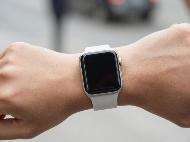
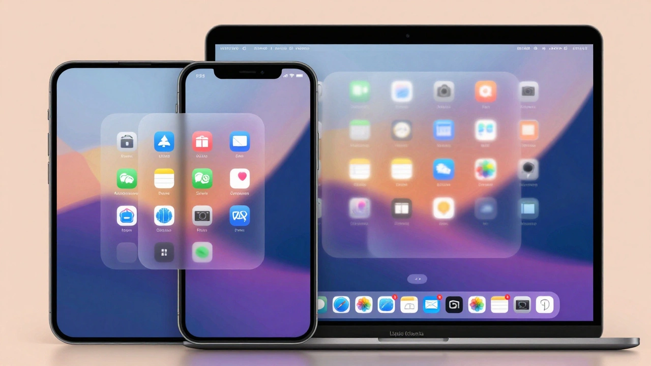
Apple’s icon redesign is one of the most quietly powerful parts of this update. Before, each platform had its own icon style. iOS icons were slightly more detailed. macOS icons had subtle gradients. watchOS icons were tiny and simplified. Now, they’re all built from the same template. The system uses a unified 1088-pixel canvas for watch icons - yes, even on the tiny screen of an Apple Watch. That canvas is larger than needed, so the system can scale and crop intelligently across devices. On iPhone, the icon fits inside a rounded rectangle. On Mac, the same icon is masked to match the system’s rounded corners. On Apple Watch, it’s cropped into a circle - but the shape underneath is identical. No custom designs per platform. No pixel-perfect hand-tuning for each device. One source. One system. This matters because developers no longer have to design five different versions of the same icon. One set works everywhere. That’s why apps like Apple Music, Safari, and Camera now look almost identical across all devices. The button shapes, the spacing, the way you tap or click - it’s consistent. You don’t have to relearn how to use an app when you switch from phone to Mac.Behavior Follows Form - And It’s Smarter Than You Think
Visuals are only half the story. Apple also redesigned how interfaces respond to movement. On iPhone, when you scroll down in Safari, the tab bar shrinks - not just hides. It tucks away smoothly, giving you more screen space. When you scroll back up, it slides back into place. On iPadOS 26, the same behavior appears in split-view mode. On macOS Tahoe 26, the menu bar doesn’t just disappear. It fades out when you’re scrolling, then reappears with a subtle animation when you move your cursor near the top. It’s not random. It’s the same pattern, adapted for each input method. Even window management changed. On iPad, you could drag windows around before. Now, they snap to the same grid as Mac windows. The resize handles? Identical. The minimize, maximize, close buttons? Same shape, same placement. You can drag a window from your iPad to a Mac and it feels like it belongs. That’s not magic. That’s design.Why This Matters More Than You Realize
You might think, "So what? It just looks nicer." But this shift solves real problems. For Apple, it means fewer bugs. One design system means one set of code to maintain. Developers don’t have to guess how to make their app look "Apple-like" on each device. The system does it for them. That’s why third-party apps updated so quickly after the 2025 release - they didn’t have to rebuild from scratch. For users, it means less learning. If you know how to use Messages on your iPhone, you already know how to use it on your Mac. The same gestures, the same layout, the same way notifications pop up. You don’t need to switch mental models when you move from device to device. And for Apple’s future? This system is built to last. Liquid Glass isn’t a one-time effect. It’s a foundation. Future updates - new animations, new interactions - will build on this. No more fragmented design languages. No more "iPhone look" vs. "Mac look." Just one Apple.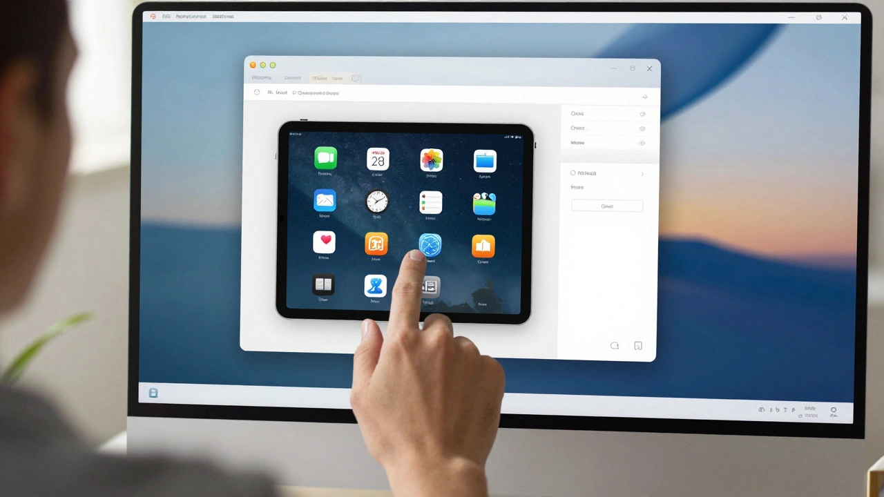
The Criticisms - And Why They Miss the Point
Not everyone loves it. On forums and social media, people complain that the transparency makes text hard to read. That the wallpaper bleeding through on Mac is distracting. That it looks like the failed glass effects from Windows Vista or Linux desktops from the early 2000s. And yes - there are moments when the glass effect clashes with dark text on a bright background. But Apple didn’t design this for perfection in every scenario. They designed it for consistency. The real breakthrough isn’t that everything looks shiny. It’s that everything behaves the same. A button on iPhone, iPad, and Mac doesn’t just look alike - it responds the same way. The same tap pressure. The same animation speed. The same feedback. That’s what users notice over time, even if they can’t explain why. And let’s be honest: people buy Apple products because they feel polished, not because they’re the most functional. Steve Jobs knew this. The return of visual polish isn’t a regression - it’s a strategy. People notice design before they notice usability. And when design feels familiar across devices, trust grows.What This Means for the Future
This isn’t the end. It’s the beginning. With Liquid Glass as the foundation, Apple can now introduce new features without breaking the ecosystem. Imagine a new gesture on iPhone that works the same way on Mac. Or a widget that appears on your watch, phone, and desktop - all with the same behavior. That’s the goal. Apple’s old approach was to let each device evolve independently. That led to confusion. Now, they’ve built a single language - visual, behavioral, and technical - that spans every screen. It’s bold. It’s risky. And it’s working. The iPhone and Mac don’t just look similar anymore. They feel like parts of the same thing. And that’s the most powerful design move Apple has made in years.Does this change require new hardware?
No, Apple designed Liquid Glass to work on hardware as old as the iPhone XS and Mac mini from 2018. Performance optimizations in the system-level implementation mean older devices handle the transparency effects smoothly. However, some advanced animations may be disabled on devices with less than 4GB of RAM to maintain responsiveness.
Can I turn off the Liquid Glass effect?
You can’t remove Liquid Glass entirely - it’s built into the system’s core UI. But you can reduce its intensity. In Settings > Accessibility > Display, there’s an option called "Reduce Transparency" that dims the glass effect and makes backgrounds more opaque. This helps with readability on bright wallpapers or for users sensitive to visual noise.
Why did Apple wait until 2025 to do this?
Apple needed time to build the infrastructure. Before 2025, each operating system had its own UI toolkit. iOS used UIKit, macOS used AppKit, and they didn’t share code. The shift to a unified system required rewriting those toolkits from the ground up. The "Liquid Glass" engine took years to develop and test across all device types. The 2025 release was the first time Apple had the technical foundation to make this happen without breaking apps.
Does this affect third-party apps?
Yes - but in a good way. Third-party apps now inherit the system’s design language automatically. Buttons, menus, sliders, and alerts all adopt Liquid Glass, icon styles, and animations without developers needing to code them. This means apps look more native and feel more consistent. Apple also released updated SDKs that let developers customize colors and shapes within the system’s framework - so apps can still have personality, but not chaos.
Will this change how I use my Apple devices?
You’ll notice it more than you realize. Switching from iPhone to Mac will feel seamless. The way you open apps, navigate menus, and interact with notifications will be nearly identical. You won’t need to relearn how to use your tools. That’s the whole point - Apple wants you to forget you’re using different devices. You’re just using one ecosystem.
Categories
Popular Articles