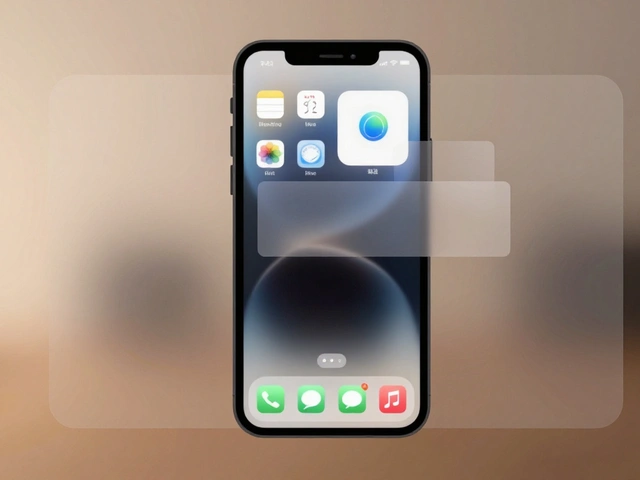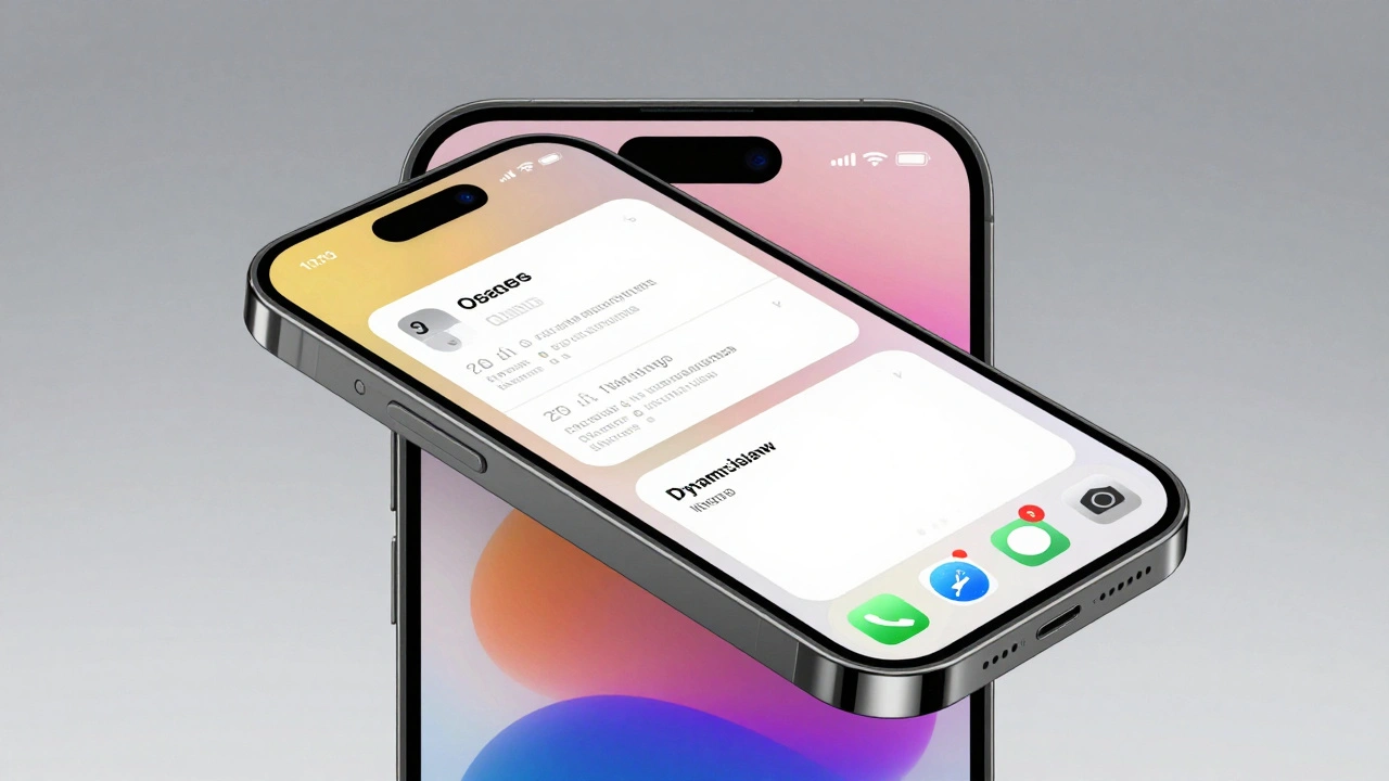

Nothing kills a design presentation faster than a screenshot that looks like it was pasted onto a generic phone frame from 2018. If you are building an app for iOS or macOS, your mockup needs to look exactly like the real thing. That means getting the device shape right and using the exact colors Apple uses in its system. Apple product bezels are official high-fidelity graphic files provided by Apple that depict current devices with precise dimensions, allowing designers to place screenshots into accurate hardware frames for presentations and marketing. When you combine these official frames with Apple’s documented color systems, you stop guessing and start creating pixel-perfect visuals that match the actual user experience.
You might think any old iPhone PSD will do, but Apple is specific about this. Using unofficial frames can lead to visual inaccuracies that make your work look amateurish, or worse, violate their marketing guidelines if you plan to use those images for your App Store listing. The good news? Apple gives you everything you need for free. You just need to know where to find it and how to apply it correctly in tools like Figma or Sketch.
Where to Find Official Apple Design Resources
The first step is sourcing the right assets. For years, designers hunted down third-party mockups or tried to trace device outlines themselves. That era ended when Apple centralized its assets. You need to go to the Apple Design Resources page at developer.apple.com/design/resources. This hub is free, requires no login, and contains the authoritative source for all platform-specific design materials.
On this page, you will find several key sections:
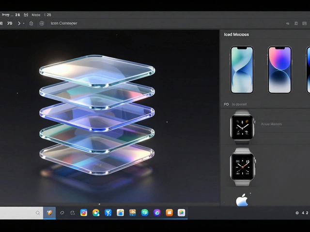
- Product Bezels: Layered Photoshop (.psd) files for iPhones, iPads, MacBooks, and Apple Watches. These include the physical casing, notches, and Dynamic Islands with exact proportions.
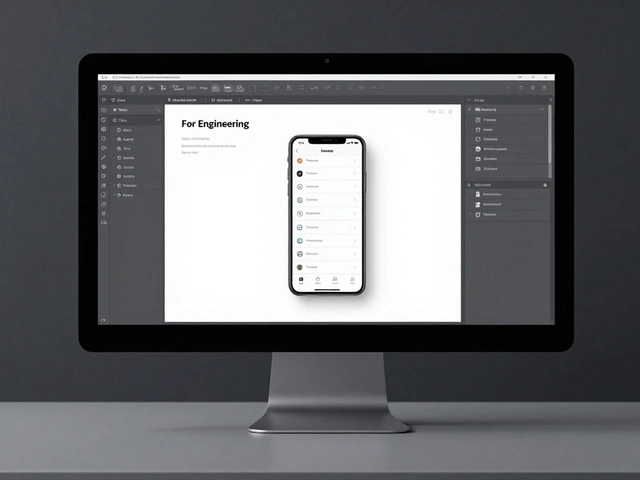
- Platform UI Kits: Libraries for Figma and Sketch containing native components like buttons, switches, and navigation bars for iOS, iPadOS, macOS, watchOS, tvOS, and visionOS.
- Icon Production Templates: Guidelines and templates for creating compliant app icons.
- SF Symbols: Access to Apple’s vector icon library.
As of late 2025, these resources are updated regularly following new hardware announcements. For example, after the release of new iPad Pro models, updated bezels appear here quickly. Always check the "What’s New - Design" section to ensure you are downloading the latest generation of devices. Using an older model, like an iPhone X when your app supports the iPhone 16, makes your product look outdated before anyone even opens it.
Integrating Bezels into Your Workflow
Having the files is one thing; using them efficiently is another. The workflow differs slightly depending on whether you use Photoshop, Figma, or Sketch.
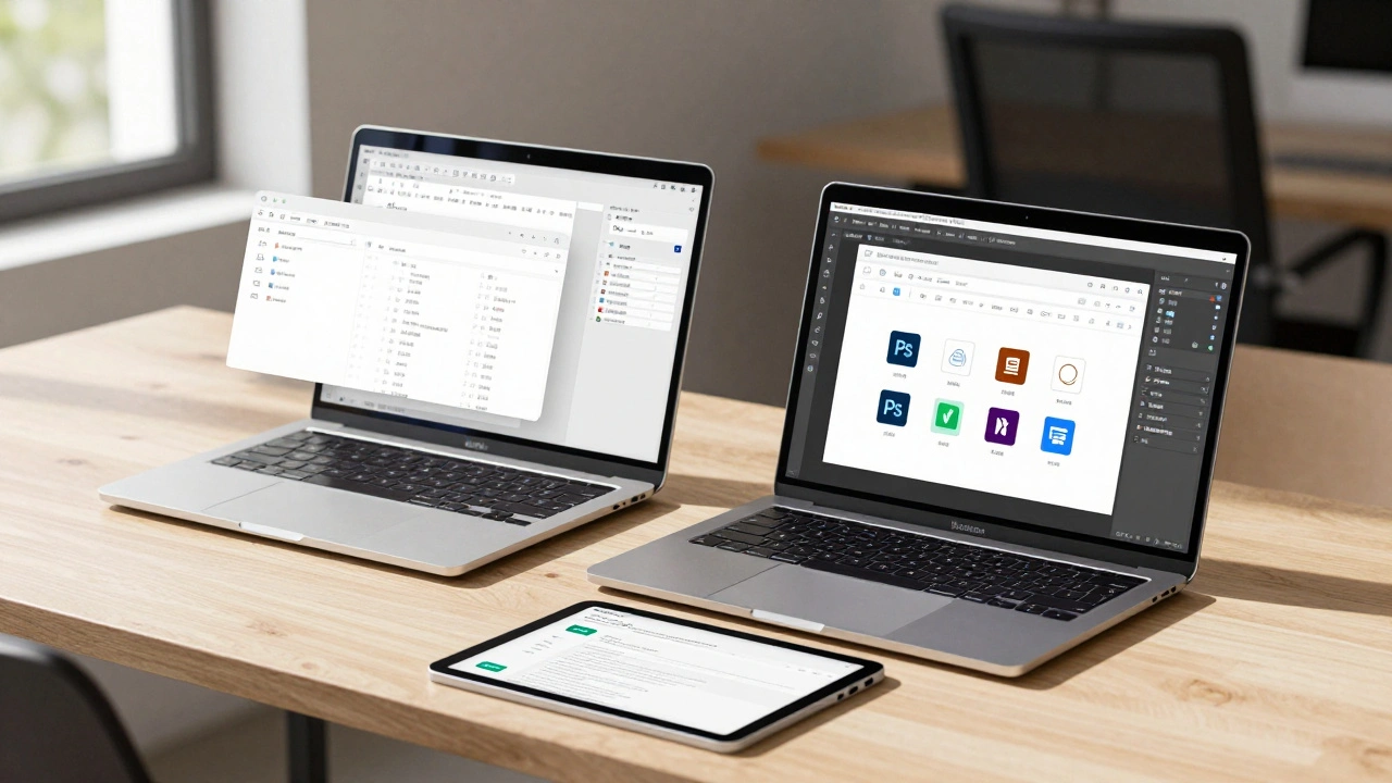
For Photoshop Users: Download the .psd file for your target device. Open it up, and you will see a layered structure. There is usually a dedicated layer named "screen" or similar, masked to the device's display area. Simply drag your app screenshot into this layer. Because the bezel is high-resolution, you can export the final composite at various sizes (1x, 2x, 3x) for web use, print, or video without losing quality. The mask ensures your screenshot fits perfectly within the rounded corners and notch areas.
For Figma Users: Apple has made integration seamless. Open the Asset panel in Figma, navigate to the "Community" tab, and search for "Apple." You will find official libraries published by Apple. Click "Open in Figma" to load the library. Once loaded, you can drag device frames directly onto your canvas. These frames often act as smart components. You drop your screen content into the designated slot, and it snaps into place. This method is faster than manual masking and keeps your file organized.
For Sketch Users: Go to Settings → Libraries. Enable the Apple platform libraries by checking the appropriate boxes. The bezels and components then become available in your Symbols panel. Like in Figma, you can instantiate these symbols and replace the inner contents with your own designs.
A pro tip: Keep a separate folder or page in your design file dedicated to "Marketing Assets." Here, store your finalized composites. This prevents clutter in your active design workspace and makes it easy to hand off high-res images to developers or marketers later.
| Tool | Asset Format | Integration Method | Best For |
|---|---|---|---|
| Figma | Library Component | Community Panel / Auto-link | Collaborative teams, rapid prototyping |
| Sketch | Symbols Library | Settings → Libraries | Mac-native designers, legacy workflows |
| Photoshop | Layered .PSD | Manual File Open | High-end marketing renders, complex compositing |
Mastering Semantic Colors
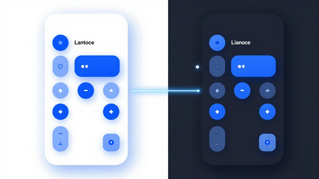
Getting the frame right is only half the battle. The other half is color. Many designers pick hex codes arbitrarily-#FF5733 for red, #4CAF50 for green. On Apple platforms, this breaks immersion. Apple uses a system of Semantic Colors are dynamic color roles defined in the Human Interface Guidelines that adapt automatically to light/dark modes and accessibility settings, rather than static RGB values.
According to the Human Interface Guidelines (HIG), colors like systemBlue, labelColor, and secondarySystemGroupedBackground are not fixed values. They change based on the user's appearance mode (Light vs. Dark) and accessibility preferences (like Increased Contrast). If you hard-code a specific shade of blue in your mockup, it won't reflect how the app actually behaves on a device.
To create accurate mockups, you must mimic this behavior in your design tool. Here is how:
- Create Color Tokens: Instead of naming your styles "Blue" or "Gray," name them by their role: "Primary/Fill," "Label/Primary," "Background/Secondary."
- Define Variants: Create two versions of each token: one for Light Mode and one for Dark Mode. Extract the correct hex values from Apple’s HIG documentation or by inspecting elements in Xcode previews.
- Apply Systematically: Use these tokens throughout your UI. When you switch your frame’s variant to "Dark Mode," all elements should update automatically to use the dark-mode equivalents of those semantic colors.
WWDC25 introduced updates to the design system, emphasizing a refined palette and bolder typography. While the core concept of semantic coloring remains, keep an eye on new shades introduced in recent iOS releases. Aligning your design tokens with Apple’s evolving system ensures your mockups stay relevant and reduce future rework when OS updates roll out.
Compliance and Marketing Guidelines
If your mockup is just for internal review, you have some leeway. But if you plan to use these images for your App Store listing, website, or press kit, you must follow Apple’s App Store Marketing Guidelines are a set of rules governing how developers can represent Apple products and trademarks in promotional materials to maintain brand consistency and legal compliance.
Violating these guidelines can result in your marketing assets being rejected or, in severe cases, legal issues. Key rules include:
- Use Official Bezels: Apple explicitly states, "Use Apple-provided product bezels in all your marketing materials." Do not modify the shape, color, or proportions of the device. No extreme angles, no warping the screen to fit text.
- Latest Generation Only: Always show the newest device your app supports. Don’t show an iPhone 12 if your app works on iPhone 15.
- No Competitors: Never display Apple product images alongside images of competing products (e.g., Android phones) in the same visual frame.
- Trademark Usage: When mentioning product names in copy, use the correct trademark symbol (® or ™) the first time they appear. For example, "iPhone®" and "App Store®" require the registered trademark symbol.
- Badge Requirements: If using the "Download on the App Store" badge, ensure it meets minimum size requirements (10 mm in print, 40 px onscreen) and remains subordinate to the main imagery.
These rules exist to protect the brand identity, but they also help you. Following them ensures your visuals look professional and trustworthy. A distorted phone frame signals carelessness; a clean, official bezel signals polish.
Common Pitfalls and How to Avoid Them
Even experienced designers stumble over a few common issues when working with Apple resources.
Version Drift: Apple releases new hardware every year. A bezel downloaded in 2023 might lack the Dynamic Island or have incorrect button placements for a 2025 device. Solution: Bookmark the Design Resources page and check it annually, especially after September (iPhone launches) and Spring (iPad/Mac launches).
Static Color Approximation: Designers often try to replicate the exact vibrancy effect of a blurred background in Figma. It’s hard to get perfect. Solution: Don’t obsess over pixel-perfect vibrancy in static mockups. Focus on the semantic color roles. As long as the contrast ratios and general hue are correct, the mockup will read accurately. Save the fine-tuning for the actual code implementation in Xcode.
Ignoring Third-Party Risks: You might find a "Super Cool iPhone Bezel Pack" on a marketplace. It might look nice, but does it match Apple’s industrial design specs? Probably not. And is it legally safe for commercial use? Maybe not. Stick to the official sources for anything public-facing. Use third-party community files (like those on GitHub or Figma Community) only for internal brainstorming or if you verify their accuracy against Apple’s official PSDs.
Next Steps for Designers
Start by auditing your current design files. Are you using outdated device frames? Are your colors hardcoded? Make the switch today. Download the latest bezels from developer.apple.com/design/resources. Set up your Figma or Sketch libraries with Apple’s official components. Define your semantic color tokens based on the HIG.
This small investment in setup pays off in credibility. When stakeholders see a mockup that looks indistinguishable from the real app running on a real device, trust increases. You aren’t just showing them a picture; you’re showing them the product.
Are Apple’s product bezels free to use?
Yes, Apple provides product bezels and UI kits for free on their Developer Design Resources page. No login or paid subscription is required. However, you must adhere to their marketing and identity guidelines when using these assets in public-facing materials.
Can I use third-party bezels for my App Store listing?
It is strongly discouraged. Apple’s marketing guidelines explicitly state that you should use Apple-provided product bezels. Third-party bezels may have inaccurate dimensions or proportions, which could lead to rejection or brand inconsistency. Use official assets for any public marketing.
How do I handle Dark Mode in my mockups?
Create separate color styles for Light and Dark modes based on Apple’s semantic color definitions. In Figma or Sketch, use component variants to swap between these color sets. This ensures your mockup accurately reflects how the app adapts to user preferences.
Where can I find the latest Apple UI kits for Figma?
You can find them directly in Figma by opening the Community panel and searching for "Apple." Look for libraries published by Apple Inc. Alternatively, visit developer.apple.com/design/resources to download the latest packages and links.
Do I need to pay for Sketch or Figma to use Apple’s resources?
No, the Apple design resources themselves are free. However, to utilize the integrated libraries in Figma or Sketch, you need access to those respective design tools. Photoshop users can download the standalone PSD files without needing a specific plugin, though a Creative Cloud subscription is required to open them.
Categories
Popular Articles