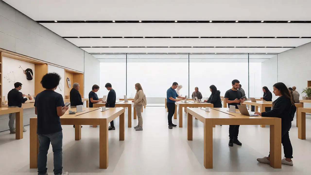

You walk into an Apple Store and you don’t see a cash register. You don’t see a line of people waiting to pay. You see a room full of people touching things. This isn’t an accident. It’s a deliberate design choice that flips the traditional retail model on its head. Most stores are built to extract money from your wallet as quickly as possible. Apple builds spaces designed to extract understanding from your brain first.
The core idea here is simple but radical: teach before you sell. In a typical electronics store, the salesperson’s goal is to close the deal. In an Apple Store, the "Genius" or specialist’s goal is often just to get you comfortable with the device. If you leave without buying anything but feeling smarter about how technology fits your life, they consider that a win. Why? Because trust converts better than pressure ever could.
The Architecture of Confidence
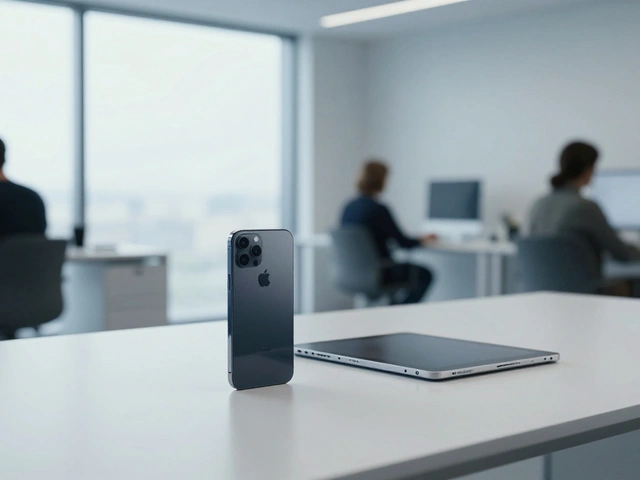
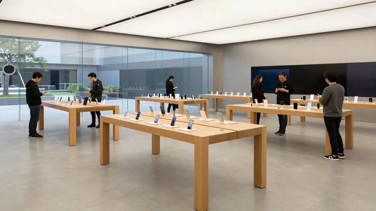
Walk through the layout of any flagship location, like the glass cube in New York or the new circular hub in Austin. The space is open, airy, and intimidatingly clean. There are no hidden corners where pushy associates lurk. Instead, products sit on light-colored wooden tables, spaced far enough apart so you can breathe around them. This spatial arrangement serves a specific psychological function. It lowers your anxiety. When you aren’t crowded, you explore more freely. When you explore freely, you engage deeper.
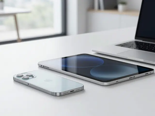
This approach relies heavily on what designers call "affordance." An object should suggest how it’s used. A laptop screen tilted slightly toward you invites interaction. A phone placed face-up with the lock screen glowing asks to be touched. Apple removes the friction between seeing a product and using it. You don’t ask for permission to pick up an iPhone. You just do it. That immediate tactile feedback creates a sense of ownership before a transaction even occurs. Psychologists call this the "endowment effect," where we value things more highly simply because we feel we own them. By letting you hold the device, Apple triggers this bias instantly.
Education Over Transaction
Traditional retail metrics focus on conversion rates per square foot. Apple looks at engagement time. How long did you stay? Did you attend a workshop? Did you ask a question? This shift changes the role of the staff entirely. Employees aren’t trained to memorize spec sheets. They’re trained to listen and demonstrate. If you mention you’re a photographer, the associate won’t recite megapixel counts. They’ll show you how to shoot in RAW format on the iPhone Pro. They’re teaching a skill, not selling a box.
This educational model reduces buyer’s remorse. Electronics are complex. People fear making expensive mistakes. By providing a low-stakes environment to learn, Apple mitigates that fear. You try the camera settings. You test the keyboard responsiveness. You compare the size of the iPad mini against the standard iPad. By the time you reach the checkout counter-often just a handheld device carried by a staff member-you’ve already made the decision. The sale is essentially complete before you pay. The transaction becomes a formality, not a negotiation.
The Genius Bar as Community Hub
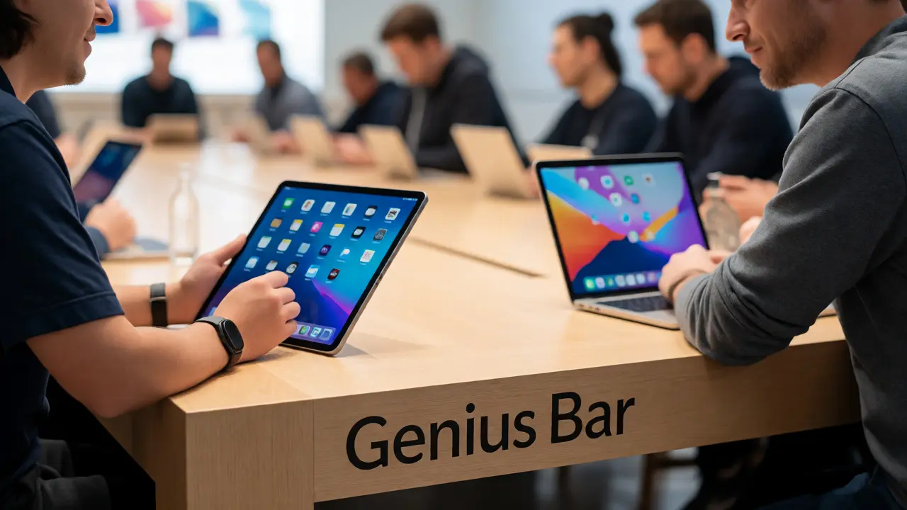
No discussion of Apple’s retail strategy is complete without mentioning the Genius Bar. Originally introduced in 2001, this service desk has evolved from a repair station into a community anchor. Unlike the sterile counters at other tech retailers, the Genius Bar is designed for conversation. Staff members stand beside you, not behind a barrier. This physical positioning signals partnership rather than authority.
The Genius Bar handles more than just broken screens. It hosts "Today at Apple" sessions, which range from photography walks to coding workshops for kids. These events turn the store into a classroom. For many users, especially those who aren’t tech-savvy, these sessions demystify the ecosystem. They learn how AirDrop works, how to organize photos, or how to use Shortcuts automation. This knowledge stickiness keeps customers within the Apple orbit. Once you know how to use one device effectively, switching to a competitor feels like losing hard-won competence.
Product Placement Psychology
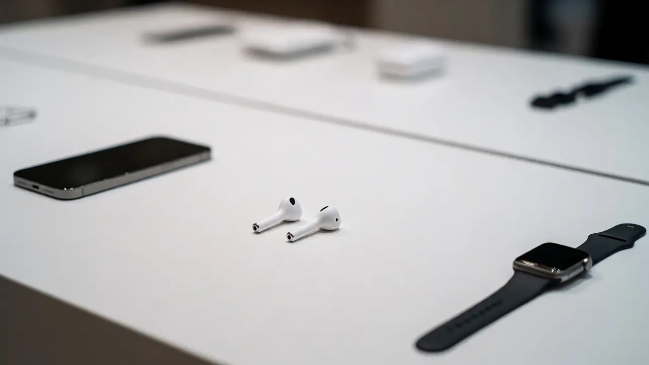
Notice what’s missing from the shelves. There are no cluttered displays of accessories tangled in plastic packaging. No stacks of discounted cables gathering dust. Accessories are minimal, high-margin, and placed strategically near related devices. A pair of AirPods sits next to the iPhone display. An Apple Watch strap lies near the watch table. This curation guides your eye and simplifies decision-making. It’s a concept known as "choice architecture." By limiting options visually, Apple reduces cognitive load. You aren’t overwhelmed by fifty types of USB-C cables. You see the two best ones. This clarity speeds up the process and increases the likelihood of adding an accessory to your cart.
| Feature | Traditional Electronics Store | Apple Store |
|---|---|---|
| Primary Goal | Immediate Sale | User Competence & Trust |
| Staff Role | Salesperson / Closer | Educator / Consultant |
| Product Access | Behind Glass / Locked Cases | Open Tables / Hands-On |
| Checkout Process | Fixed Counter / Queue | Mobile Payment / Anywhere |
| Post-Purchase Focus | Warranty Upsell | Workshops & Support |
Designing for Flow and Frictionless Movement
The flow of traffic in an Apple Store is carefully choreographed. Customers enter, gravitate toward the newest products (usually front and center), then drift toward older models or accessories. The wide aisles prevent bottlenecks, allowing people to move at their own pace. There’s no pressure to keep moving forward in a queue. You can step back, look again, and re-approach. This freedom respects the customer’s autonomy. It treats shopping as a leisure activity rather than a chore.
Lighting plays a crucial role here too. Natural light floods in through massive glass fronts, supplemented by soft, diffused artificial lighting. This eliminates harsh shadows and makes screens look vibrant without glare. The color palette-white walls, light wood, gray stone-creates a neutral canvas. Products pop against this background. Your eyes rest easily. This sensory comfort encourages longer visits. And in retail, time spent is directly correlated with spend potential. Not because you’re trapped, but because you’re engaged.
Why This Strategy Works in 2026
In an era of e-commerce dominance, why does physical retail still matter? Because digital interfaces lack texture. You can read reviews online, but you can’t feel the weight of a titanium MacBook. You can watch videos, but you can’t experience the haptic feedback of the Taptic Engine. Apple leverages the physical store to provide what the web cannot: sensory validation.
Moreover, the educational component addresses a growing market need. As technology becomes more integrated into daily life-from health tracking to smart home controls-users crave guidance. They don’t just want gadgets; they want solutions. Apple positions itself as the teacher that helps you solve problems. This relationship-based model fosters loyalty that price cuts alone can’t break. Even when competitors offer similar specs at lower prices, the familiarity and confidence gained in the store environment keep users returning.
Key Takeaways for Retailers and Designers
- Prioritize Education: Train staff to demonstrate features in context, not just list specifications.
- Remove Physical Barriers: Let customers touch and interact with products freely to build ownership feelings.
- Curate Choices: Reduce visual clutter to lower cognitive load and guide decisions subtly.
- Design for Comfort: Use open layouts and calming aesthetics to encourage longer dwell times.
- Integrate Services: Make support and learning accessible parts of the shopping journey, not afterthoughts.
Why doesn't Apple have traditional cash registers?
Apple uses mobile point-of-sale systems carried by staff members. This allows checkout to happen anywhere in the store, reducing wait times and maintaining the conversational, non-transactional vibe of the space. It removes the psychological barrier of approaching a fixed counter to "pay up."
What is the purpose of "Today at Apple" sessions?
These free workshops educate customers on how to use Apple products creatively and efficiently. Topics include photography, music production, coding, and app development. They serve to deepen user engagement, reduce frustration with complex features, and build community around the brand.
How does product placement influence buying behavior?
By placing accessories near relevant devices and keeping displays uncluttered, Apple simplifies the decision-making process. This technique, known as choice architecture, reduces cognitive overload and subtly encourages add-on purchases by showing natural pairings.
Do Apple Store employees earn commissions?
Generally, no. Apple Store specialists and Geniuses typically receive hourly wages and bonuses based on overall store performance and customer satisfaction scores, not individual sales commissions. This structure aligns their incentives with helping the customer find the right solution rather than pushing the most expensive item.
How does the store design affect customer anxiety?
The open layout, ample spacing, and bright, natural lighting create a calm environment. This reduces the stress often associated with high-pressure retail environments. Customers feel more in control and less rushed, which leads to more thoughtful purchasing decisions and higher satisfaction.

Categories
Popular Articles