
Have you ever opened a new app and felt instantly confused? Like your brain hit a wall before you even tapped anything? That’s cognitive load - the mental effort it takes to make sense of something. Too much of it, and you quit. Apple doesn’t just avoid this - they built their entire design philosophy around reducing it.
What Is Cognitive Load, Really?
Cognitive load isn’t some abstract theory. It’s the number of things your brain has to hold onto at once. Psychologist George Miller found in the 1950s that people can juggle about seven pieces of information at a time - give or take two. That’s why phone numbers are seven digits. That’s why menus with 12 options feel overwhelming. When Apple designs a product, they don’t ask, “What can we add?” They ask, “What can we remove?”
It’s not about making things simple. It’s about making them effortless. A button that does one thing. A screen that shows only what’s needed right now. No hidden menus. No extra steps. No guessing.
Apple’s Three Core Rules for Decision Simplicity
Apple doesn’t publish a manual called “How to Reduce Cognitive Load.” But if you look at every iPhone, iPad, and Mac they’ve released over the last 15 years, three patterns keep showing up.
1. Show Less, Do More
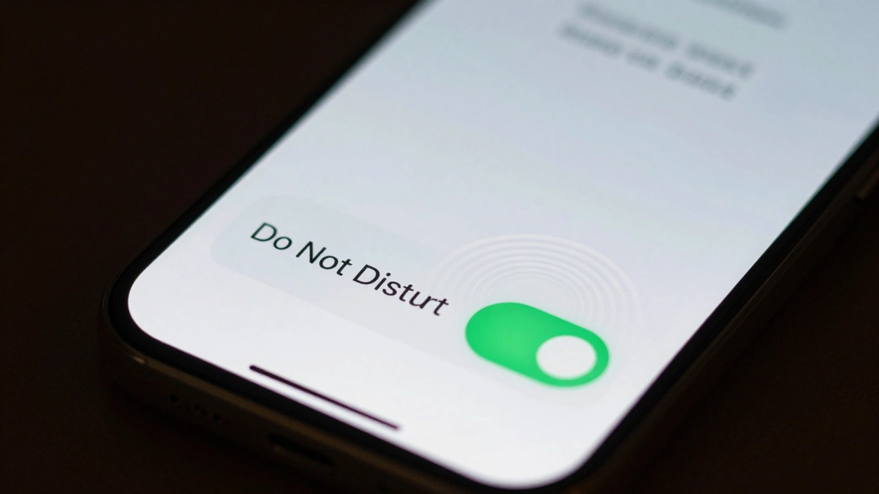
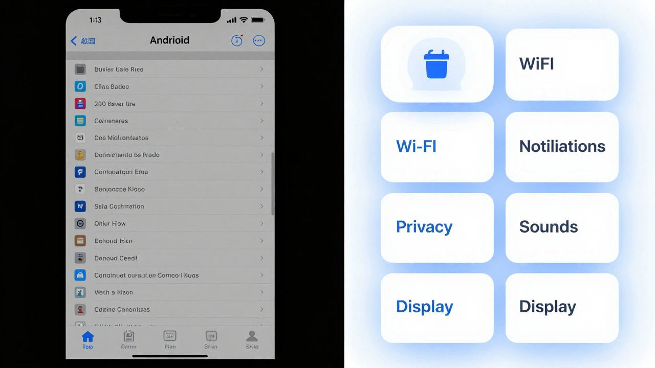
Think about the iPhone home screen. No folders. No clutter. Just icons - and only the ones you use daily. Even the Settings app doesn’t dump everything on one page. It groups related settings under clear headings: “Battery,” “Wi-Fi,” “Notifications.” Each tap leads to one clear choice. No scrolling through 50 options to find “Do Not Disturb.”
Compare that to many Android phones at launch. You’d open Settings and see 200 items. Apple’s version? About 40. And they’re grouped so logically, you rarely need to search.
2. Let the System Guess - But Let You Fix It
Apple doesn’t ask you to configure everything. They assume you want the most common option. Your iPhone knows you’re likely to text your partner at 7 p.m. So it suggests that contact in the lock screen notification. Your Mac knows you use your printer every Monday. It remembers the last one you used - no setup needed.
But here’s the trick: if you want something different, it’s still easy to change. No buried menus. No passwords. Just tap the suggestion, and you’re there. This is called progressive disclosure - showing only what’s needed now, and revealing more only if you ask for it.
3. One Way to Do It
Apple rarely gives you five ways to accomplish the same thing. There’s one primary method. And it’s the best one. On iPhone, sharing a photo? You tap the share icon. No dropdowns. No “Choose Your Sharing Method” screen. Just a clean list of people and apps you use often.
Why? Because choice isn’t freedom - it’s friction. Every extra option adds mental weight. Apple removes that weight by making decisions for you - smartly, consistently, and only when it matters.
How Apple Handles Information Overload
Information overload isn’t just about too many buttons. It’s about too many colors, too many fonts, too many animations. Apple’s design language is famously minimal. But it’s not empty. It’s intentional.
They use white space like a tool. Not because it looks “clean,” but because it gives your eyes a place to rest. A button with padding around it is easier to tap. A line of text that’s 55 characters long is easier to read than one that’s 120. Apple measures this stuff. They test layouts with real users. If people hesitate, they redesign.
Even their typography follows cognitive science. San Francisco, Apple’s system font, is designed for clarity at small sizes. Letters are spaced just right. The curves are optimized for quick recognition. You don’t notice it - but your brain does. It’s reading faster because it’s working less.
What Apple Doesn’t Do
Apple avoids several common design traps that increase cognitive load:
- No pop-up tutorials on first launch - users figure it out by doing.
- No “tips of the day” - they assume you’ll learn through use.
- No customizable home screens with widgets everywhere - they limit widgets to one screen, and only let you add what’s useful.
- No “smart” features that override your settings without asking - they respect your control.
They don’t assume you’re a beginner. They assume you’re busy. And they design for someone who wants to get things done - not learn how to use an app.
The Hidden Cost of “More Features”
Many companies think adding features makes their product better. Apple thinks it makes it worse.
Remember when Apple removed the headphone jack? Critics screamed. But internally, Apple saw it as a chance to simplify. No more jacks meant no more ports. No more adapters. No more confusion about which cable to use. The result? A cleaner, thinner phone. And fewer decisions for you.
Same with the removal of the home button. It wasn’t about style. It was about removing a physical button that required a specific motion - and replacing it with a gesture that felt natural after one try. No menu. No settings. Just swipe up.
Apple doesn’t add features to impress developers. They remove distractions to serve users.

Why This Works - And Why It’s Hard to Copy
You can’t fake Apple’s approach. It’s not a design trend. It’s a cultural habit. Every product team at Apple starts with one question: “What’s the simplest way this could work?”
They don’t start with tech. They start with behavior. What do people actually do? What do they hate? What do they forget?
And they test relentlessly. If a user takes more than two taps to do something basic - like turning on Wi-Fi - they go back to the drawing board. Not because it’s “hard.” But because it’s effortful.
Other companies try to copy Apple’s look - the white space, the clean lines. But they miss the real secret: it’s not about aesthetics. It’s about reducing friction at every step. And that takes discipline. It takes saying no. A lot.
What You Can Learn From Apple
You don’t need to work at Apple to apply these principles. Here’s how to start:
- Count the number of choices on your screen. If it’s more than five, cut half.
- Ask: “What’s the one thing the user needs right now?” Remove everything else.
- Use defaults wisely. If 80% of users choose the same setting, make it the default.
- Test with someone who’s never used your product. Watch where they pause. That’s your cognitive load.
- Don’t add a feature unless it removes another.
Apple’s genius isn’t in their technology. It’s in their refusal to let complexity creep in. They know that the best design isn’t the one with the most options - it’s the one that disappears. When you don’t think about how to use something, you’re free to use it.
Does Apple really reduce cognitive load better than other companies?
Yes - and the evidence is in how people use their products. Studies show iPhone users complete common tasks like sending messages or adjusting settings 20-30% faster than users of phones with more complex interfaces. Apple’s design reduces the number of decisions needed, not just the number of buttons. That’s why people say Apple products “just work.” It’s not magic. It’s intentional cognitive load reduction.
Can reducing cognitive load make a product feel too limiting?
It can - if done poorly. But Apple avoids this by keeping customization possible, just hidden. For example, you can still add widgets to your iPhone home screen - but only one screen of them, and only the ones you choose. This prevents overload while still offering control. The key is: don’t force users to make decisions they don’t care about. Give them freedom where it matters, and remove noise everywhere else.
Is Apple’s design approach only for consumer products?
No. Apple’s principles work for any interface - from medical devices to enterprise software. Hospitals using Apple-designed tablets for patient check-ins report 40% fewer errors because staff don’t have to think about how to use the tool. The same logic applies: fewer choices, clearer paths, less mental effort. Designing for simplicity isn’t about style - it’s about safety and efficiency.
Why doesn’t Apple let users customize everything?
Because customization creates cognitive load for everyone. Every setting you can change adds complexity. Apple assumes most people don’t want to tweak settings - they just want things to work. So they lock down the defaults to the most common, effective options. Power users can still access deeper settings - but only after tapping through a few layers. That way, the majority aren’t drowned in options, and experts aren’t blocked.
How does Apple decide what to remove?
They use data, observation, and internal debate. Teams run usability tests with hundreds of users. If more than 10% of users hesitate at a step, they redesign. They also track feature usage. If a button is rarely tapped after two years, it gets removed. Apple doesn’t design for hype. They design for behavior. What people actually do - not what they say they want.