
Have you ever tried to tap a tiny "close" icon on your iPhone while walking down the street? You aim carefully, but your finger lands on the ad next to it. It’s frustrating. It makes you feel clumsy. But here is the truth: it wasn’t your fault. The button was designed poorly.
On Apple devices, making things easy to tap isn’t just about aesthetics. It is about physics, biology, and empathy. If you are designing for iOS or iPadOS, you need to understand that a touch target is not the visual icon-it is the invisible area around it that registers a tap. Getting this right means the difference between a smooth experience and a user who quits your app in anger.
What is the minimum touch target size for Apple devices?
Apple's Human Interface Guidelines recommend a minimum hit area of 44x44 points for all interactive controls on iOS and iPadOS.
The Magic Number: Why 44 Points Matters
Since the first iPhone launched in 2008, Apple has stuck to one core rule: make tappable areas at least 44x44 points. This number comes from Apple’s Human Interface Guidelines (HIG). It hasn’t changed because it works. A point in iOS is a logical unit of measurement that stays consistent across different screen densities. Whether you are holding an older iPhone with a standard Retina display or a newer model with Super Retina XDR, a 44-point square looks and feels roughly the same physical size.
But why 44? Let’s look at the human body. Research from the MIT Touch Lab shows that the average adult index finger pad is between 16 and 20 millimeters wide. That is huge compared to early mobile buttons. Nielsen Norman Group (NN/g), a leading UX research firm, recommends a physical size of at least 1 cm x 1 cm (about 10mm) for quick and accurate selection. On a typical high-density iPhone screen, 44 points translates to roughly 6.8 millimeters. While this is smaller than the ideal 10mm, it is significantly larger than the mouse-click targets we used in the desktop era. It is the bare minimum to prevent constant mistakes.
Think of the 44-point rule as the speed limit. You can drive faster if conditions allow, but going slower gets you fined. In design, going below 44 points guarantees frustration. For many users, especially those with motor impairments or larger hands, 44 points is still tight. Treating it as a floor, not a ceiling, is the key to inclusive design.
Beyond Pixels: The Reality of Finger Size
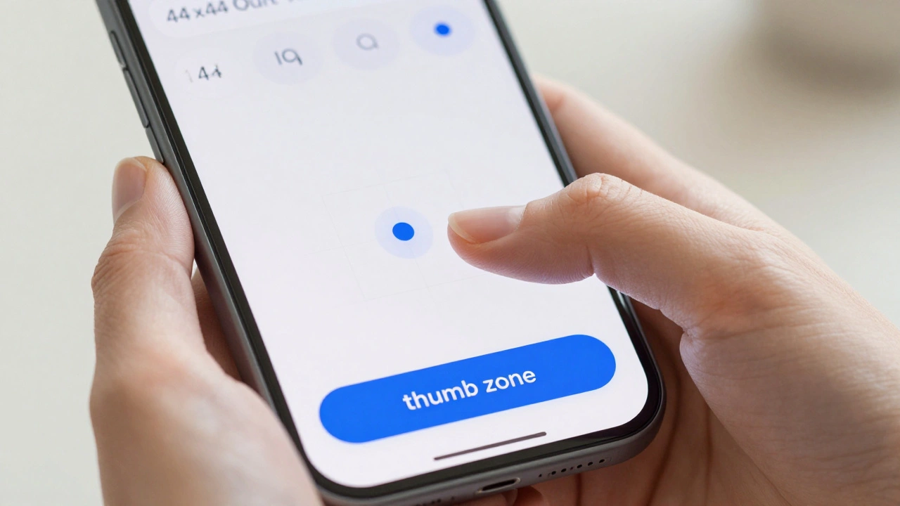
We often design on large monitors using a precise mouse cursor. We forget that our users interact with their thumbs, often while standing up, holding coffee, or swaying on a bus. Steven Hoober’s widely cited study on mobile device usage revealed that about 75% of interactions involve the thumb, not the index finger. Thumbs are thicker and less dexterous than index fingers.
This biological reality dictates where you place your buttons. Hoober’s data suggests keeping primary actions within the "thumb zone." This means placing navigation bars and main call-to-action buttons at the bottom of the screen. Apple recognized this years ago by shifting from top-heavy menus to bottom tab bars in iOS. They also introduced Reachability in iOS 8, allowing users to slide the interface down with a gentle swipe. These features exist because designers initially ignored how people actually hold phones.
If you put a critical "Buy Now" button at the very top right corner, you are forcing the user to contort their hand or use two hands. That adds friction. Friction kills conversions. By respecting thumb reach, you make the app feel lighter and easier to use.
Spacing Is Just As Important As Size
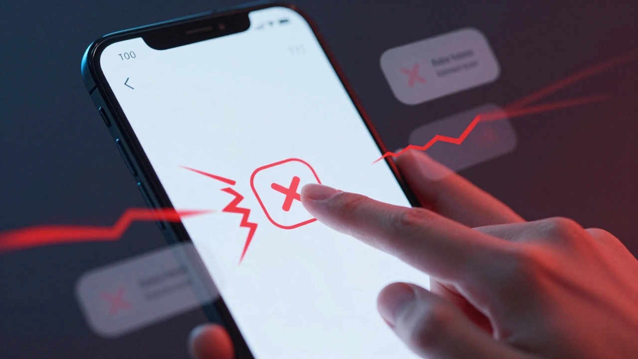
You can have a perfect 44x44 point button, but if it sits directly against another 44x44 point button, you have created a trap. Accidental taps happen when targets are too close together. Industry experts, including teams at Siteimprove and OpenReplay, recommend maintaining at least 8 to 10 pixels of spacing between interactive elements.
Imagine a row of icons: Home, Search, Profile. If these are packed tightly, a slight tremor in the user’s hand or a shift in grip causes them to tap the wrong one. This leads to "rage taps"-rapid, repeated taps on the same spot because the user thinks the app is broken. Analytics tools can detect these rage taps. If you see spikes in rage taps on specific screens, check your spacing. Increasing the gap between buttons by just a few pixels often resolves the issue instantly.
For text links, which are naturally harder to tap due to their irregular shapes, ensure the clickable area extends well beyond the visible text. A good rule of thumb is to add padding so the entire line height becomes the touch target. This turns a fragile link into a robust button.
Inclusive Design: Designing for Every Hand
Inclusive design means creating products that work for everyone, regardless of ability. When it comes to touch targets, this is crucial for older adults and people with motor disabilities. A study published in core.ac.uk found that for older adults, accuracy drops significantly when button sizes fall below 14 millimeters. Interestingly, the study noted no significant accuracy gains above 14 mm, suggesting a practical upper bound where bigger doesn't necessarily mean better, but definitely means safer.
WCAG (Web Content Accessibility Guidelines) standards reflect this. WCAG 2.2 introduced Success Criterion 2.5.8, which sets a minimum target size of 24x24 CSS pixels for Level AA compliance. However, WCAG 2.1’s enhanced criterion (Level AAA) asks for 44x44 pixels. For Apple developers aiming for true inclusivity, aiming for the higher standard is wise. If your app serves seniors, healthcare patients, or users with arthritis, consider increasing your primary targets to 48x48 points or even larger. It costs nothing in terms of development time but pays off massively in user trust and accessibility.
Implementation: From Figma to SwiftUI
Knowing the rules is half the battle. Applying them consistently is the other half. Here is how you enforce comfortable taps in your workflow.
In Design Tools: Don’t rely on manual resizing. Create components in Figma or Adobe XD that bake in the 44x44 minimum dimension. Use auto-layout properties to ensure that if text grows, the button expands, but never shrinks below the threshold. Set a global style for buttons that includes the necessary padding.
In Code (SwiftUI): SwiftUI makes this straightforward. Use modifiers like `.frame(minWidth: 44, minHeight: 44)` to enforce size. For icons that must remain visually small (like a 24-point close 'X'), use `.contentShape(Rectangle())` combined with padding to expand the hit area without changing the visual appearance. This trick lets you keep a sleek, minimal look while providing a generous tapping surface.
In UIKit: Use `contentEdgeInsets` on buttons to expand the touch area. Ensure your Auto Layout constraints set a minimum height constraint of 44 points for all interactive views. Never let a developer override this without a compelling reason.
| Control Type | Minimum Size (Points) | Ideal Size (Points) | Spacing Recommendation |
|---|---|---|---|
| Primary Buttons | 44x44 | 48x48 | 8px between buttons |
| Icons (e.g., Close, Menu) | 44x44 hit area | 48x48 hit area | 8-10px from adjacent elements |
| Text Links | 44pt height | 48pt height with padding | Ensure line height covers text |
| Form Inputs | 44pt height | 48+ pt height | Full width preferred |

Testing for Real-World Usage
Simulators lie. When you test an app on a Mac simulator, you use a mouse. You have pixel-perfect precision. This hides all your touch target errors. To truly validate your design, you must test on real devices. Walk around your office. Hold the phone in one hand. Try to tap the smallest buttons while moving. Notice how hard it is to hit the top corners. Notice how easy it is to hit the bottom center.
Use analytics to back up your intuition. Tools like OpenReplay can track "rage taps"-instances where a user taps the same spot three or more times within 300-500 milliseconds. This is a clear signal that a target is either too small, unresponsive, or obscured. If you see rage taps on a specific button, increase its size or spacing immediately. A/B testing can confirm improvements; many teams report higher conversion rates simply by enlarging checkout buttons from 32px to 44px.
Looking Ahead: New Form Factors
As Apple introduces new platforms like visionOS for the Vision Pro, the concept of a "touch target" evolves. In spatial computing, you don’t tap with your finger; you select with your gaze and pinch. However, the principles remain identical. Targets need sufficient size and spacing to be selected accurately by hand gestures, which are less precise than direct touch. The 44-point convention provides a baseline for calibrating these new interaction distances. Even as technology changes, human anatomy does not. Our fingers and hands stay the same size. Designing for comfort is timeless.
How does Apple's touch target size compare to Android?
Google's Material Design recommends a minimum of 48x48 density-independent pixels (dp), which is slightly larger than Apple's 44x44 points. Both standards aim for a similar physical size of roughly 9-10mm on most devices.
What is a "rage tap" and why should I care?
A rage tap occurs when a user rapidly taps the same area multiple times because the app didn't respond or they missed the target. It indicates poor touch target design and correlates with lower user satisfaction and conversion rates.
Do I need to follow WCAG guidelines for native iOS apps?
While WCAG primarily applies to web content, following its touch target recommendations (especially SC 2.5.8 and 2.5.5) improves accessibility for all users and aligns closely with Apple's own Human Interface Guidelines.
Is bigger always better for touch targets?
No. Research suggests a plateau in accuracy around 14mm. Beyond that, larger targets can clutter the interface and potentially increase completion time by reducing the amount of information visible on screen. Balance size with layout efficiency.
Where should I place primary actions for one-handed use?
Place primary actions in the bottom third of the screen, ideally centered or slightly towards the edges for easy thumb reach. Avoid placing critical tasks in the top corners, which require awkward hand stretching.
Categories
Popular Articles