
Remember the days when designing an app icon meant exporting a dozen different PNG sizes? That era is officially over. With the rollout of Liquid Glass, introduced at WWDC25 as the new visual standard for Apple devices, icons are no longer static images. They are dynamic, translucent materials that react to your wallpaper, lighting conditions, and system modes in real-time.
If you are building apps for iPhone, iPad, or Mac in 2026, sticking to flat, single-layer designs makes your product look dated. The new system uses real-time rendering to create depth, specular highlights, and chromatic shadows automatically. But here is the catch: you cannot just draw a pretty picture and upload it. You have to build a structured, multi-layer asset using Apple’s new toolchain. If you get the layers wrong, your icon will look muddy or illegible when users switch to Dark Mode or apply a tint.
Understanding the Liquid Glass Material Model
To design effectively, you first need to understand what Liquid Glass actually is. It isn't just a style; it is a rendering engine. Think of it like actual glass sitting on top of your content. It takes light from the environment (the user's wallpaper) and reflects it. It creates refractions and blurs based on the distance between layers.
Unlike previous design languages where you baked gradients and drop shadows into the image file, Liquid Glass requires you to provide raw, flat shapes. The system handles the "fancy" stuff. This means your role shifts from pixel-pushing artist to structural designer. You define the geometry and the hierarchy; the OS defines the lighting and material properties.
| Feature | Legacy Static Icons | Liquid Glass Multi-Layer |
|---|---|---|
| File Format | PNG (Raster) | SVG/PNG Layers + .icon Asset |
| Lighting | Baked into artwork | Real-time specular highlights |
| Adaptability | Static appearance | Adapts to Light/Dark/Tinted modes |
| Depth | Flat or simulated via gradients | Parallax effects via layer separation |
| Tooling | Figma/Sketch only | Figma/Sketch + Icon Composer |
The Core Workflow: From Canvas to Device
The process starts with a strict setup. You need Xcode 26 (or later), which includes the Icon Composer developer tool. You also need updated icon grids from Apple Design Resources to ensure your vectors align correctly with the system masks.
- Create the Master Canvas: Open your vector tool of choice-Figma, Sketch, or Adobe Illustrator. Set up a square canvas exactly 1024 × 1024 pixels. Do not use transparency in the background; make it fully opaque. This is your reference view.
- Design Flat Shapes: Draw your icon using simple, bold vectors. Avoid intricate details. Remember, this icon needs to be recognizable at tiny sizes on an Apple Watch screen. Convert any text to outlines immediately-fonts do not survive SVG export reliably.
- Separate Layers by Role: This is the most critical step. Break your design into distinct logical groups. A typical structure includes:
- Background Layer: The base shape or color field.
- Mid-ground Layers: Secondary elements that add context but aren't the main symbol.
- Foreground Layer: The primary symbol that identifies the app.
- Accents: Small details like highlights or badges.
- Export Assets: Export each layer individually. Use SVG for clean vector shapes and PNG only if you have complex textures that vectors can't handle. Name them clearly (e.g., "01-Background.svg", "02-Foreground.svg") so they stack in the correct order later.
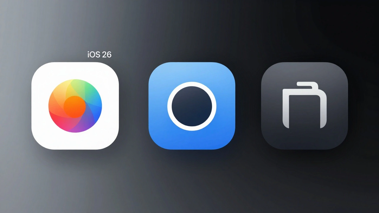
Assembling Icons in Icon Composer
Once your assets are ready, launch Icon Composer via Xcode’s "Open Developer Tool" menu. Drag your exported files into the workspace. The tool will auto-stack them, but verify the order: Background at the bottom, Foreground at the top.
Now you apply the Liquid Glass magic. For each layer, open the inspector panel. Here you control how the material behaves:
- Specular Highlights: Keep this enabled for most layers to get that bright, glass-like reflection. It gives the icon its premium feel.
- Blur: Apply this primarily to the background layer. A slight blur creates a frosted glass effect, pushing the foreground symbol forward visually. Do not overdo it, or your icon will lose definition.
- Translucency: Use this sparingly. It allows the wallpaper color to bleed through. Great for backgrounds, dangerous for foreground symbols where legibility is key.
Use the lighting dial in the toolbar to rotate the virtual light source. Watch how the shadows and highlights shift across your layers. If the icon looks flat or confusing under certain angles, go back to your vector editor and simplify the shapes.
Cross-Platform Consistency and Testing
One of the biggest advantages of this system is unification. One multi-layer icon file targets iPhone, iPad, Mac, and Apple Watch. However, the rendering context changes per platform.
On iOS, icons sit against user-chosen wallpapers and tints. On macOS, they often appear in the Dock, which has its own vibrancy and blur effects. In Icon Composer, toggle between the Default, Clear, and Tinted appearance previews. Check your icon in Dark Mode specifically. A common pitfall is a dark foreground symbol disappearing against a dark, translucent background in Dark Mode. Ensure your contrast ratios hold up across all these states.
Test on physical hardware whenever possible. Simulators are helpful, but they don't always capture the subtle chromatic aberrations or the way ambient light affects the perceived depth on OLED screens. Run your build on an iPhone running iOS 26. Long-press the home screen, enter jiggle mode, and customize the icon appearance. Try the "Clear" mode, which removes labels and expands icons. Does your symbol still read clearly without text?
Common Pitfalls to Avoid
Even experienced designers stumble here because the workflow feels counter-intuitive at first. Here are the mistakes that ruin Liquid Glass icons:
- Baking in Effects: Never add drop shadows, inner glows, or linear gradients in Figma. The system adds these dynamically. Baked effects clash with the real-time lighting, creating double-shadows and visual noise.
- Ignoring Bleed: Because icons can parallax slightly, elements touching the edge might reveal gaps. Extend your background shapes slightly beyond the 1024px boundary to ensure smooth masking.
- Overcomplicating Layers: Aim for 3-4 layers maximum. More than that increases file complexity and can lead to performance hiccups on older devices. If you find yourself needing ten layers, your design is too busy.
- Skipping Tint Tests: Users love customizing their home screens. If your icon relies on a specific red hue to be recognized, it will fail when a user applies a blue tint. Rely on shape and silhouette, not color alone.
Why This Matters for Your App’s Success
This isn't just about aesthetics. MobileAction data suggests that icons ignoring Liquid Glass standards feel outdated in the iOS 26 ecosystem. Users associate the new material language with modernity and polish. Furthermore, the ability to A/B test multiple icon variants using Apple’s Product Page Optimization tools becomes more powerful when you can tweak material parameters rather than redesigning entire graphics.
By mastering Icon Composer, you reduce the manual labor of resizing assets while increasing visual fidelity. It is a win-win for development speed and brand perception. The learning curve is steep for a few hours, but the payoff is a unified, stunning presence across every Apple device.
What software do I need to create Liquid Glass icons?
You need a vector design tool like Figma, Sketch, or Adobe Illustrator to create the flat layers, and Xcode 26 (or later) to access Icon Composer, Apple’s dedicated tool for assembling and configuring the multi-layer assets.
Can I use my existing flat PNG icons with Liquid Glass?
Technically yes, legacy flat icons are supported for backward compatibility. However, they will not benefit from the real-time lighting, translucency, or adaptive tinting features. To take full advantage of the iOS 26 aesthetic, you must rebuild them as multi-layer vector assets.
Should I include shadows or highlights in my vector design?
No. You should keep your vector artwork completely flat. The Liquid Glass rendering engine automatically applies specular highlights, chromatic shadows, and bevels based on the system lighting model. Baking these effects into the source art causes visual conflicts.
How many layers should a Liquid Glass icon have?
Aim for 3 to 4 layers: a background, optional mid-ground elements, a primary foreground symbol, and accents. This provides enough depth for parallax effects without complicating the file or reducing legibility on small screens.
Does Liquid Glass work on Apple Watch?
Yes. Icon Composer allows you to target iPhone, iPad, Mac, and Apple Watch from a single layered definition. However, you must ensure your core symbol is simple enough to remain recognizable at the very small scale used on watchOS interfaces.
What happens if a user changes their Home Screen tint?
The icon adapts dynamically. The translucent layers will reflect the chosen tint color. This is why it is crucial to rely on strong silhouettes and high contrast in your foreground layers, as color cues may change based on user preferences.