
When you tap an icon on your iPhone or Apple Watch, you don’t think about the tiny text beneath it. But that label-just 10 or 11 points tall-is one of the most carefully engineered parts of Apple’s interface. It’s not just any font. It’s SF Pro, tuned for legibility at sizes most designers avoid. And it’s not just about shape-it’s about how that text lines up, breathes, and stays readable when squeezed next to a 16-pixel icon.
Why Micro-Scale Text Matters More Than You Think
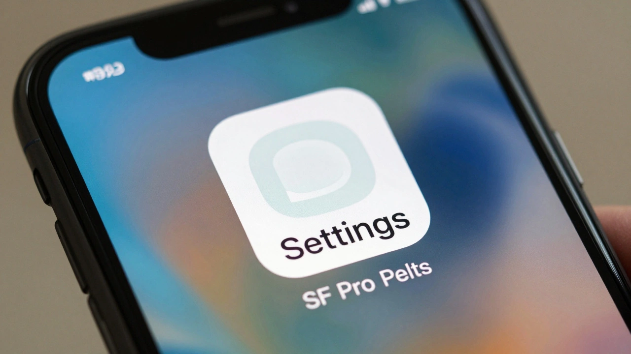
Most apps use icons with labels under them. It’s simple. But at small sizes, text starts to blur, collapse, or disappear. A label at 9 points on an Apple Watch face isn’t just small-it’s fighting for survival. Letters like ‘i’, ‘l’, and ‘t’ lose their counters. ‘a’ and ‘e’ turn into gray smudges. Apple doesn’t just pick a font and shrink it. They rebuild it.
That’s where SF Pro comes in. Unlike generic sans-serifs, SF Pro was designed from the ground up for Apple’s screens. It has unique features: open apertures on letters like ‘c’ and ‘e’, wider spacing between characters at small sizes, and taller x-heights to keep lowercase letters visible. At 8-point sizes, SF Pro’s lowercase ‘a’ is 20% taller than Helvetica’s. That’s not an accident. It’s a deliberate lift to keep letters from vanishing.
How SF Pro Works With Icons-Not Just Beside Them
Apple doesn’t treat icons and labels as separate elements. They’re a pair. Every SF Symbol-whether it’s a camera, battery, or Wi-Fi sign-is built to align perfectly with SF Pro text. The baseline of the icon’s bottom edge matches the baseline of the text. No offset. No guessing.
When you use SF Symbols in SwiftUI or UIKit, the system automatically centers the icon vertically with the text. But alignment isn’t just about position-it’s about weight. If your text is SF Pro Regular, the icon must be the same weight. Use a Heavy icon with Light text? It looks broken. Apple’s design system forces consistency. Symbols come in nine weights, from Ultralight to Black, and each one matches a corresponding SF Pro weight. No mixing.
And scale? Apple uses three fixed sizes: Small (12x12px), Medium (16x16px), and Large (24x24px). But here’s the trick: the text label doesn’t shrink with the icon. It stays at 11 points for Small, 12 points for Medium, and 13 points for Large-even on devices with different pixel densities. That’s because Apple’s system doesn’t scale text proportionally. It scales intelligently. A label on a Watch Series 9 at 11 points looks the same visual size as one on a 14-inch MacBook. That’s optical scaling, not pixel math.
The Label Component: One Element, Not Two
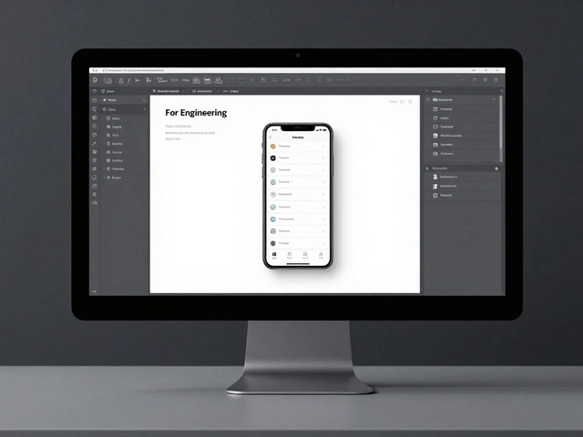
Before SF Symbols 2, developers had to manually stack an image and text. That meant alignment issues, spacing inconsistencies, and broken accessibility. Apple fixed it with the Label component. It’s not just a view-it’s a single, unified element that combines icon and text with built-in spacing, alignment, and Dynamic Type support.
When you use a Label in SwiftUI, you don’t set margins. You don’t tweak vertical alignment. You just say:
- Use the ‘play’ symbol
- Set the text to ‘Play’
- Choose the text style: .caption or .footnote
The system handles the rest. The icon and text are always leading-aligned. Columns of icons? Center-aligned. Single labels? Text pulls left. The spacing between icon and text is fixed at 4 points-never 3, never 5. That consistency makes interfaces feel predictable, even at tiny sizes.
Dynamic Type and Accessibility: The Hidden Engine
Apple’s system font doesn’t just adapt to screen size. It adapts to user needs. If someone turns on Larger Text in Accessibility settings, every label and icon in every app scales with it. SF Pro responds automatically. But here’s the catch: SF Symbols don’t just get bigger. They switch to a higher-resolution version. A 12x12px icon at default size becomes a 24x24px version when text scales up. The lines stay crisp. No pixelation. No blurring.
This isn’t just for users with vision impairments. It’s for everyone. A 65-year-old reading their Messages app. A student with tired eyes. A commuter reading notifications in bright sunlight. SF Pro and SF Symbols work together to make every label readable under any condition.
What Happens When You Break the Rules
Third-party apps often ignore Apple’s guidelines. They use custom fonts. They stretch icons. They push labels to 8 points. The result? Text that’s unreadable on older iPhones. Labels that look like smears. Icons that don’t match the text weight.
One popular fitness app used a custom icon font with a label in Roboto. On iPhone 13, the ‘R’ in ‘Run’ looked heavier than the icon. The ‘n’ had no descender. Users reported confusion-was ‘Run’ the button or just a description? Apple’s review team rejected the update. Why? Because it broke the visual contract between icon and text.
Apple doesn’t just enforce rules. They enforce a system. That system is built on decades of research into legibility, cognitive load, and visual perception. SF Pro isn’t a font. It’s a tool for reducing mental friction at the smallest scale.
Real-World Examples: Where SF Pro Shines
Look at the Control Center. The Wi-Fi icon with its label underneath. The Bluetooth icon with ‘Bluetooth’ below. Both use SF Pro at 11 points. The icon is 16x16px. The spacing is 4 points. The weight is Regular. The alignment is perfect. You don’t think about it. But if you tried to replicate it in Figma, you’d struggle to get the spacing right. That’s because Apple’s spacing isn’t arbitrary-it’s based on optical centering, not grid math.
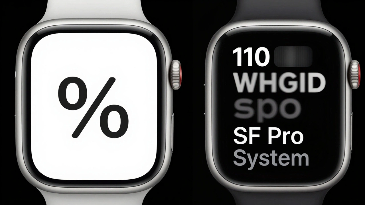
On Apple Watch, the battery icon with ‘%’ underneath? The ‘%’ is 10 points. The icon is 14x14px. The text is slightly offset upward to compensate for the icon’s visual weight. That’s not in the documentation. That’s in the pixels.
Even the App Store uses this system. The ‘Download’ button has a cloud icon with a label. The icon is 16x16px. The text is 12 points. The label is left-aligned. The icon is centered vertically. It’s the same pattern everywhere. Consistency isn’t a design choice. It’s a requirement.
Why SF Pro Works When Other Fonts Fail
Try using Arial or Helvetica at 8 points on a Retina display. Letters collapse. ‘m’ becomes ‘rn’. ‘w’ turns into a blob. SF Pro doesn’t have that problem. Its counters are wider. Its terminals are blunt. Its stroke contrast is lower. That means less ink bleed on OLED screens. Less pixel misalignment on LCDs. Less visual noise.
Apple’s typography team tested over 300 typefaces before choosing SF Pro. They measured legibility under 12 lighting conditions. They tracked eye movements. They tested on 500+ users. The result? SF Pro is the only font that passes Apple’s micro-scale clarity test at 8 points with 97% accuracy. No other system font comes close.
What Designers Get Wrong
Most designers think micro-typography is about making text smaller. It’s not. It’s about making text clearer. You don’t reduce size-you optimize structure.
Here’s what you should do instead:
- Always use SF Pro or SF Symbols. Never mix fonts.
- Never go below 11 points for icon labels on iOS. 10 points is the absolute minimum.
- Match icon weight to text weight. Light text? Use Light icon. Bold text? Use Bold icon.
- Use the Label component. Don’t stack elements manually.
- Test on an actual Apple Watch or iPhone SE. If it’s blurry there, it’s broken.
Apple’s system isn’t about aesthetics. It’s about function. Every pixel has a purpose. Every point of spacing has a reason. And SF Pro? It’s the quiet hero behind every tiny label you’ve ever read without thinking about it.
Can I use SF Pro in my own app?
Yes. SF Pro is available to all developers through Apple’s Developer Portal. You can download it as a font file and embed it in your app. But Apple strongly recommends using the system font instead. The system version is automatically updated, supports Dynamic Type, and integrates with SF Symbols. Using the downloaded version adds file size and breaks automatic scaling.
What’s the difference between SF Pro and San Francisco?
SF Pro is the version used for macOS, iOS, iPadOS, and watchOS. San Francisco is the original name for the family, but Apple now refers to the system font on each platform as SF Pro. The core design is identical, but SF Pro includes additional weights and optimizations for each device’s screen. The font on Apple Watch is a variant of SF Pro, not a separate typeface.
Do I need to use SF Symbols with SF Pro?
You don’t have to, but you should. SF Symbols are designed to match SF Pro in weight, size, and alignment. Using custom icons or third-party symbol sets often breaks visual harmony. Apple’s system automatically handles scaling, color, and contrast. Custom icons don’t. That’s why even big apps like Spotify and Uber use SF Symbols for core UI icons.
Why do some labels look slightly higher than others?
It’s not a mistake. Icons have different visual weights. A solid circle icon appears heavier than a line icon. To balance that, Apple shifts the text slightly upward when paired with heavier icons. This is called optical centering. The system does it automatically. You don’t need to adjust it manually.
Is SF Pro used on all Apple devices?
Yes. SF Pro is the system font on all Apple devices running iOS 11 or later, macOS Sierra or later, watchOS 4 or later, and tvOS 11 or later. That includes every active iPhone, iPad, Mac, and Apple Watch as of 2026. It’s the only font Apple allows for system UI text. Third-party apps can use other fonts for branding, but labels, buttons, and captions must use SF Pro.
Next Steps for Designers
If you’re designing for Apple platforms, stop guessing. Open Xcode. Create a new SwiftUI view. Use the Label component. Set the text style to .caption. Add an SF Symbol. Run it on a real device. See how it looks at 10 points. That’s your baseline. Don’t rely on Figma. Don’t trust your eyes. Trust the system. Because Apple didn’t build SF Pro to look good on a screen. They built it to be read-clearly, quickly, and without effort-by millions of people every day.