
When you open an app on your iPhone, iPad, Mac, or Apple Watch, the icons you see aren’t just randomly chosen graphics. They’re carefully designed to match the system’s rhythm - the same spacing, the same weight, the same alignment with text. That consistency isn’t accidental. It’s built on SF Symbols, Apple’s unified icon system that works across every Apple platform. If you’re designing or developing for iOS, macOS, watchOS, or tvOS, ignoring SF Symbols means you’re fighting against Apple’s own design language instead of working with it.
What SF Symbols Actually Is
SF Symbols isn’t a collection of pretty pictures. It’s a living, breathing library of over 6,900 vector-based symbols, updated and expanded with every major iOS and macOS release. The latest version, SF Symbols 7, launched in 2025, adds hundreds of new icons, support for gradients, and dynamic animations like Draw - where symbols animate into place with natural motion. Every symbol is built as a scalable vector path, not a pixel-based image. That means it scales perfectly from a tiny watch face to a giant Mac menu bar without ever getting blurry.
What makes SF Symbols powerful isn’t just the number of icons. It’s how they behave. Each symbol comes in nine weights - from Thin to Black - and three sizes - Small, Medium, and Large. You don’t need to find separate files for each variation. The system generates them automatically based on context. Need a medium-weight, bold checkmark next to a heading? The system pulls the right version. No manual resizing. No pixel-perfect hunting.
How SF Symbols Stay Consistent Across Platforms
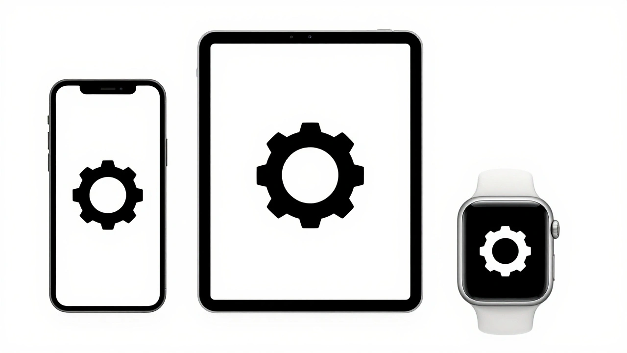
Think about this: a user switches from their iPhone to their Mac to their Apple Watch. The icons they interact with should feel like the same language - not three different dialects. SF Symbols makes that possible. The same symbol - say, a gear for settings - looks identical in shape, weight, and spacing whether it’s on a 4-inch screen or a 27-inch display. Why? Because Apple ties the symbols directly to the San Francisco system font.
When you place a symbol next to text, it aligns perfectly. The baseline, the x-height, the optical center - everything matches. That’s not something you can fake by copying a PNG and resizing it. SF Symbols uses the same mathematical rules that govern text rendering. So if a user enables Bold Text in Accessibility settings, the symbol automatically thickens to match. If they switch to Dark Mode, the symbol’s fill and stroke adjust to the system’s color palette. It’s not a workaround. It’s native behavior.
Rendering Modes: Color That Adapts
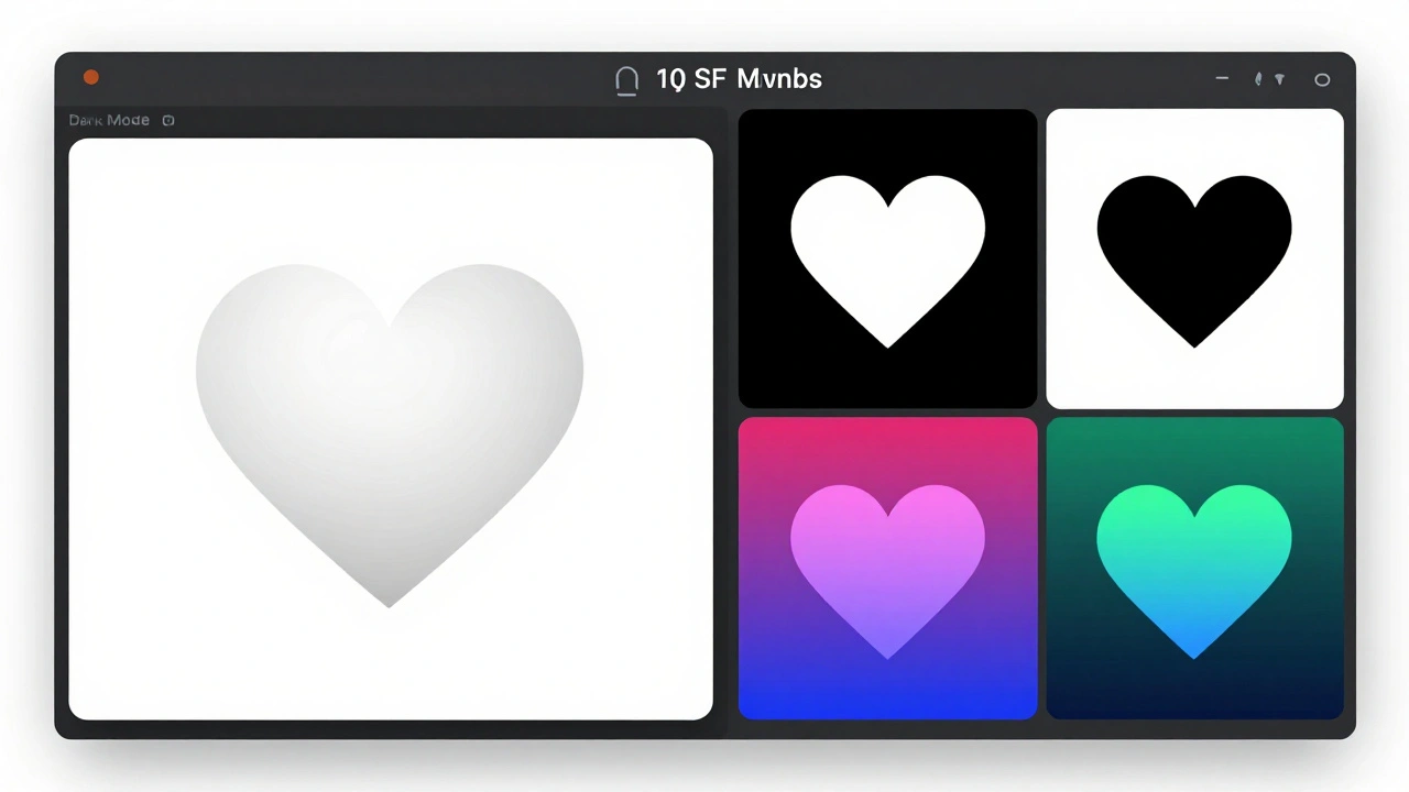
One of the biggest wins with SF Symbols is how they handle color. Instead of forcing you to pick one fixed color, Apple gives you four rendering modes:
- Monochrome - Uses a single color, usually inherited from the text or button tint.
- Hierarchical - Applies different weights to parts of the symbol (like a filled center and lighter outline) to create visual hierarchy.
- Palette - Lets you assign up to three custom colors to different parts of the symbol, perfect for branded icons.
- Multicolor - Preserves the original color design of the symbol, used sparingly for icons like flags or weather symbols.
These aren’t just filters. They’re intelligent systems. A hierarchical symbol in a button will darken when pressed. A palette symbol in a dark app will lighten its background tones automatically. You don’t have to write code for every state. The system handles it.
Custom Symbols: Extend the System
What if you need an icon that doesn’t exist? SF Symbols lets you build your own - and still make them behave like native ones. You start with a template exported from the SF Symbols app. That template includes guides for optical centering, stroke weights, and path compatibility rules. You design your symbol in a vector tool like Illustrator or Figma, then import it back.
Here’s the trick: your custom symbol must follow Apple’s path structure. If your symbol has a circle and a line, those paths must match the number of points and their order in all weight variants. SF Symbols 3+ can auto-generate the other weights if you provide just three - Thin, Medium, and Black - as long as the paths are compatible. That means you design once, and the system builds the rest. No more exporting 27 versions of the same icon.
And here’s the kicker: custom symbols live in a completely separate namespace from Apple’s system symbols. You won’t accidentally override a system icon. Your custom icon won’t break if Apple updates its library. They’re isolated, safe, and fully integrated.
Integration: From Design to Code
Getting SF Symbols into your app is simple. In Xcode, you can drag and drop symbols directly from the SF Symbols app into your storyboard or SwiftUI code. In SwiftUI, you just write Image(systemName: "checkmark.circle"). No asset catalogs needed. No manual sizing. The system handles everything.
For UIKit, you use UIImage(systemName:) or SF Symbols in Interface Builder. You can even configure the weight and scale on the fly: symbolConfiguration: .init(weight: .bold, scale: .medium). If you’re using custom fonts, SF Symbols adapts to them automatically using the SymbolConfiguration(font:) method.
And if you’re using SwiftUI? The integration is even smoother. Symbols scale with Dynamic Type. If the user increases their text size, your icons scale with them - no extra code. That’s accessibility baked in, not bolted on.
Why This Matters for Designers and Developers
Before SF Symbols, teams spent weeks creating icon sets. One designer made icons for iOS. Another made them for macOS. A third handled watchOS. They all looked slightly different. Updates meant redoing everything. Now, one person can design a single symbol in SF Symbols, and it works everywhere.
For developers, it cuts down on file bloat. No more 50 PNGs for one icon. No more SVGs that don’t render right on retina screens. SF Symbols are lightweight, vector-based, and system-managed. Your app loads faster. Your UI stays crisp.
For designers, it means less guesswork. You don’t have to wonder if your 16px icon will look right next to 17pt text. The system does it for you. You can focus on layout, spacing, and hierarchy - not pixel alignment.
What Happens If You Don’t Use SF Symbols?
You can still use custom icons. But you’ll pay the price. Your app will look out of sync. Buttons won’t match the system’s tap targets. Icons won’t scale with Dynamic Type. Your app won’t adapt to Dark Mode or Bold Text without extra work. And when Apple updates its design language - like they did with the new rounded corners in iOS 16 - your icons will look outdated.
Apple’s system icons are updated automatically. If you use SF Symbols, your app gets those updates without a single line of code. If you use your own icons? You’re stuck with what you shipped.
Real-World Example: A Simple App
Imagine a task manager app. You need icons for: add, delete, checkmark, folder, tag, clock, and settings. With SF Symbols, you use:
plus.circletrashcheckmark.circle.fillfoldertagclockgear
Each one is pre-aligned, pre-weighted, and ready to use. You set them to Hierarchical mode so the filled parts stand out. You let them scale with Dynamic Type. You don’t touch color - the system handles it. You ship. And when Apple adds a new folder.badge symbol in iOS 18? Your app gets it automatically.
Where to Start
Download the SF Symbols app from Apple’s developer website. Open it. Search for any symbol - say, "heart". See how it changes across weights and scales. Click on one, copy it with Command-C, and paste it into Figma or Xcode. Try using it next to text. Watch how it snaps into place.
Then, in your next project, replace every custom icon with an SF Symbol. Even if it’s not a perfect match. Use the closest one. You’ll be surprised how often Apple already has what you need.
Start small. One screen. One icon. Then build from there. The system is there to help. Use it.
Do I need to download anything to use SF Symbols?
Yes - but only once. Download the SF Symbols app from Apple’s developer website. It’s free. It lets you browse, copy, and export symbols. You don’t need to install it on every device. Just use it to find and copy symbols into your design tools or Xcode. Once you’ve added symbols to your project, you don’t need the app anymore.
Can I use SF Symbols in older iOS versions?
Yes, but with limits. SF Symbols 1.0 works on iOS 13+, SF Symbols 2.0 on iOS 14+, and SF Symbols 3.0+ on iOS 15+. If your app supports iOS 14 or earlier, you must export symbols in both 2.0 and 3.0 formats and load them conditionally. If you only target iOS 15 or later, you only need the 3.0 templates. Apple’s APIs handle the rest.
Are SF Symbols accessible?
Yes, by design. SF Symbols are built with VoiceOver in mind. Each symbol has a default accessibility label (like "Add" for the plus icon). You can override it if needed, but most of the time, the system label works perfectly. Symbols also adapt to Bold Text, Dynamic Type, and Dark Mode without extra work. Accessibility isn’t an add-on - it’s baked into every symbol.
Can I edit SF Symbols in Figma or Adobe Illustrator?
Yes. The SF Symbols app lets you export symbols as SVG files. You can open them in Figma, Illustrator, or any vector tool. But don’t just edit the shape. Use the template provided - it includes guides for optical centering, stroke weight, and path structure. If you break those rules, your symbol won’t render correctly in iOS or macOS. Stick to the template.
Do SF Symbols work with third-party fonts?
Yes, but you need to configure them properly. Use the SymbolConfiguration(font:) method to tell the system which font to match. If you’re using a custom font like Inter or Lato, SF Symbols will adjust its spacing and alignment to fit. Without this, symbols may look misaligned or too large next to your text.
What if I can’t find the symbol I need?
Search the SF Symbols app thoroughly - it has over 6,900 icons. If you still can’t find it, create a custom symbol. Use the template provided by Apple, follow the path rules, and export it as a 3.0 template. Then add it to your Xcode project. Your custom symbol will behave just like a system icon: it scales, adapts to modes, and works with Dynamic Type.
Will SF Symbols work on non-Apple platforms?
No. SF Symbols are exclusive to Apple platforms. You can’t use them in Android, Windows, or web apps. If you’re building cross-platform apps, you’ll need to use a different icon system like Material Icons or Fluent UI. But if you’re building for Apple only, SF Symbols is the only icon system you need.
Categories
Popular Articles