Wolf and Hare

Tag: iOS icons

SF Symbols in App Design: Consistent Iconography Across Apple Platforms

SF Symbols in App Design: Consistent Iconography Across Apple Platforms
  • Elias Voss
  • Elias Voss

18/03
0

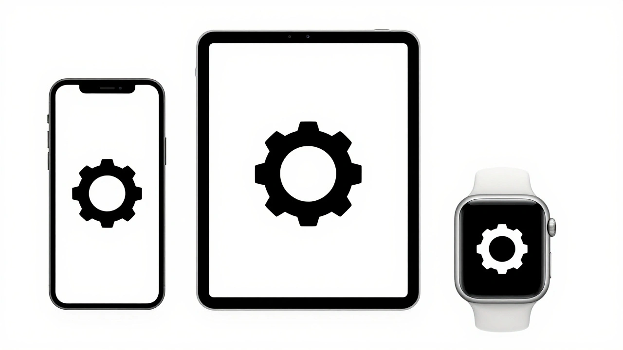
SF Symbols is Apple’s unified icon library that ensures consistent, scalable, and accessible icons across iOS, macOS, watchOS, and tvOS. Learn how to use it to build better apps with less work.

Read More...

Categories

  • Design & Technology (184)
  • Retail Design (8)
  • Design Tools (6)
  • Design & Development (6)
  • Technology (3)

Popular Articles

Square vs. Round Watch Displays: Why Apple Chose Rectangular for Better Readability

Jan 8 2026

How Liquid Glass Scales: From Apple Watch Controls to Mac Sidebars

Jan 27 2026

Simplicity as ROI at Apple: How Clear UX Lowers Support Costs

Jan 30 2026

Designing Accessible Typography on Apple: Legible at a Glance and Up Close

Jan 14 2026

Globalization by Design: How Apple Balances Consistency with Local Relevance

May 8 2026

Tags

  • Liquid Glass
  • Apple design
  • Apple typography
  • Apple ecosystem
  • inclusive design
  • Apple Human Interface Guidelines
  • Apple Intelligence
  • user experience
  • Apple design philosophy
  • unboxing experience
  • Apple packaging
  • iOS 26
  • San Francisco font
  • Apple accessibility
  • Apple industrial design
  • Jony Ive
  • industrial design
  • Apple retail design
  • Dynamic Type
  • Apple interface design
Wolf and Hare

© 2026. All rights reserved.