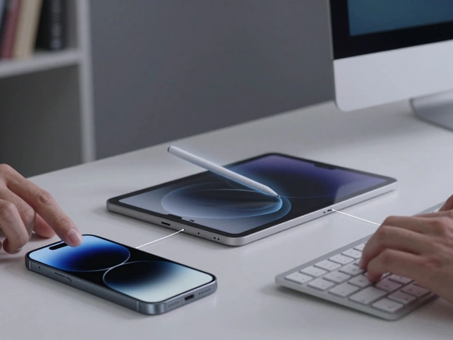

Imagine you’re typing a quick email to a client. You hit send, but wait-did that AI assistant just change "sincerely" to "regards" without asking? Or maybe it auto-corrected a name you spelled intentionally differently. In the past, fixing these small errors meant digging through settings or manually retyping lines. That’s AI friction. It’s the tiny, annoying moments where artificial intelligence feels more like a micromanager than a helper.
Apple has been quietly tackling this problem across its ecosystem. By embedding one-tap corrections and robust undo functions directly into user interfaces, they are shifting the paradigm from "trust the machine blindly" to "collaborate with the machine easily." This isn’t just about convenience; it’s about restoring user agency. When you can fix an AI mistake in less than two seconds, the technology stops being a barrier and starts becoming a seamless extension of your intent.
The Problem with Current AI Integration
Most AI features in software today operate on a binary logic: either you accept the suggestion, or you reject it entirely. There is rarely a middle ground. If an AI writes a sentence for you, you usually have to delete the whole thing if one word is wrong. If it suggests a photo edit, you often have to start over if the lighting looks off. This creates cognitive load. You spend more mental energy monitoring the AI than actually doing your work.
This friction leads to what designers call "feature fatigue." Users turn off AI features because they don’t trust them enough to rely on them daily. The solution isn’t necessarily smarter AI, though that helps. The solution is better interface design that acknowledges humans make mistakes and AI makes mistakes too. It requires an interface that allows for rapid iteration without penalty.
One-Tap Corrections: The Power of Micro-Interactions
One-tap corrections are micro-interactions designed to fix specific errors without disrupting the workflow. Instead of selecting all text and deleting it, you tap a highlighted word or icon, and a menu appears with alternatives. This pattern is already visible in Apple’s keyboard predictions and Siri interactions, but it’s expanding into deeper workflows.
- Contextual Menus: When an AI generates a paragraph, tapping any word should offer synonyms or rephrasings immediately.
- Visual Adjustments: In photo editing, tapping a shadow adjustment should allow a slider to appear instantly for fine-tuning.
- Voice Notes: After transcribing audio, tapping a misheard phrase should let you correct it and update the transcript globally.
The key here is speed. If the correction takes more than three taps, it fails. The goal is to make the correction feel as fast as the error itself. This reduces the psychological cost of using AI. You stop fearing the mistake because the fix is trivial.
The Role of Undo in Building Trust
If one-tap corrections handle small errors, the undo function handles big ones. A powerful, persistent undo stack is the safety net that encourages experimentation. In traditional software, undo was a standard feature. In AI-driven interfaces, it needs to be smarter.
Standard undo reverts the last action. Smart undo reverts the last intent. For example, if an AI applied a filter, changed the brightness, and cropped the image, pressing undo once should revert all three actions as a single logical step. This is known as grouping operations. Apple’s implementation in apps like Photos and Keynote has historically been good at this, but as AI becomes more autonomous, the complexity grows.
Consider a scenario where an AI assistant drafts a report. It changes the tone, fixes grammar, and updates dates. If you only liked the grammar fixes but hated the tone change, a simple undo would ruin the grammar fixes too. Advanced undo systems need to allow selective reverting. This might look like a timeline view where you can toggle specific AI actions on and off. This level of control transforms the AI from a black box into a transparent tool.

Case Study: Email and Document Editing
Let’s look at how this plays out in a common task: writing a professional email. You use an AI to draft a response. It sounds polite but slightly too formal. You want to keep the structure but make it friendlier.
- Draft Generation: The AI writes the email. You read it and notice the opening is stiff.
- One-Tap Correction: You tap the word "Dear" and select "Hi" from the contextual menu. The rest of the email remains untouched.
- Tone Adjustment: You realize the closing is still too formal. You tap the signature line and choose a casual sign-off.
- Undo Safety Net: You accidentally deleted a comma while editing. You press the undo button on the toolbar. Only the comma is restored; your previous edits remain.
In this flow, the AI acted as a co-pilot, not an autopilot. The interface allowed you to steer the ship at every turn. Without one-tap corrections, you’d have to rewrite sentences. Without smart undo, you’d risk losing your manual tweaks when trying to fix a typo. Together, these features create a smooth loop of creation and refinement.
Design Principles for Low-Friction AI
So, how do we build interfaces that reduce AI friction consistently? There are three core principles developers and designers should follow.
1. Transparency Over Autonomy
Users don’t mind AI making decisions if they know exactly what those decisions were. Show the changes. Highlight the words the AI touched. Make the AI’s footprint visible. Hidden magic is scary; visible magic is useful.
2. Reversibility Is Non-Negotiable
Every AI action must be reversible. Not just the last one, but the last ten, twenty, fifty. Provide a history log. Let users see a timeline of AI interventions. If a user can’t go back, they will hesitate to try new features.
3. Granular Control
Avoid all-or-nothing choices. Break down complex AI tasks into smaller, manageable chunks. Allow users to approve parts of a generation while rejecting others. This granular control respects the user’s expertise and preference.

Comparing Traditional vs. Low-Friction AI Interfaces
To understand the impact, let’s compare a traditional AI interface with a low-friction one.
| Feature | Traditional AI Interface | Low-Friction AI Interface |
|---|---|---|
| Error Correction | Manual retyping or full regeneration | One-tap contextual menus with alternatives |
| Undo Capability | Reverts last single action only | Groups related AI actions; supports selective revert |
| User Control | All-or-nothing acceptance | Granular approval of specific segments |
| Transparency | Changes appear silently | Highlighted changes with visual indicators |
| Cognitive Load | High (monitoring required) | Low (focus on content, not mechanics) |
The difference is stark. The traditional approach forces users to become quality control managers for the AI. The low-friction approach lets users stay focused on their actual goals, whether that’s writing, designing, or organizing data.
Future Implications for User Experience
As AI models become more capable, the interface becomes even more critical. A smarter model can still make subtle errors that only a human can catch. The gap between raw AI capability and user satisfaction is bridged by interface design. We are moving toward a future where AI is invisible until you need it, and when you do need it, it responds to your touch with precision.
This shift benefits not just individual users but entire industries. In healthcare, doctors need to quickly correct AI-drafted patient notes. In law, attorneys need to tweak AI-generated contract clauses. In education, teachers need to adjust AI-created lesson plans. In all these cases, speed and control are paramount. Reducing AI friction isn’t a luxury; it’s a requirement for widespread adoption.
Apple’s focus on this area signals a broader industry trend. Other platforms will likely follow suit, recognizing that the battle for AI dominance isn’t just about who has the best model, but who has the best way to interact with it. The winner will be the platform that makes the user feel in charge, not the other way around.
Frequently Asked Questions
What is AI friction in user interfaces?
AI friction refers to the obstacles or annoyances users face when interacting with AI features. This includes difficult error correction, lack of control over AI outputs, and confusing feedback loops that slow down productivity.
How do one-tap corrections improve user experience?
One-tap corrections allow users to fix specific AI errors instantly without restarting the process. This reduces cognitive load and builds trust by showing that mistakes are easy to fix, encouraging more frequent use of AI tools.
Why is a smart undo function important for AI integration?
A smart undo function groups related AI actions, allowing users to revert complex changes as a single step. This prevents the loss of manual edits when correcting AI mistakes, providing a safety net that promotes experimentation.
Does reducing AI friction require more advanced AI models?
Not necessarily. While better models help, interface design plays a crucial role. Even imperfect AI can be highly usable if the interface allows for quick, granular corrections and reliable undo options. Good design compensates for model limitations.
Which Apple products currently demonstrate low-friction AI design?
Apple’s keyboard predictions, Siri interactions, and photo editing tools in iOS and macOS show early examples. These features use contextual menus and grouped undo actions to minimize disruption during user tasks.