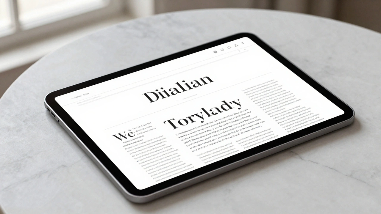

The Secret Sauce: Variable Optical Sizing
Most fonts are static. If you take a font designed for a billboard and shrink it down to a footnotes size, the thin lines disappear and the letters feel cramped. Optical Sizing is a technical feature that allows a typeface to change its actual shape based on the point size. When you use New York at small scales, the system automatically switches to a "reading face." This version features a larger x-height (the height of lowercase letters) and more open letterforms, preventing the text from blurring into a grey smudge on a Retina display. As you scale up for a headline, the typeface morphs into a "graphic display face." The contrast between thick and thin strokes becomes more pronounced, and the details become sharper, giving the text that crisp, high-end editorial look you see in luxury magazines.| Scale | Functional Role | Key Visual Attributes | Primary Use Case |
|---|---|---|---|
| Small (Text) | Reading Face | Increased x-height, open counters | Body copy, long-form articles |
| Large (Display) | Graphic Face | Higher contrast, refined serifs | Headlines, Hero sections |
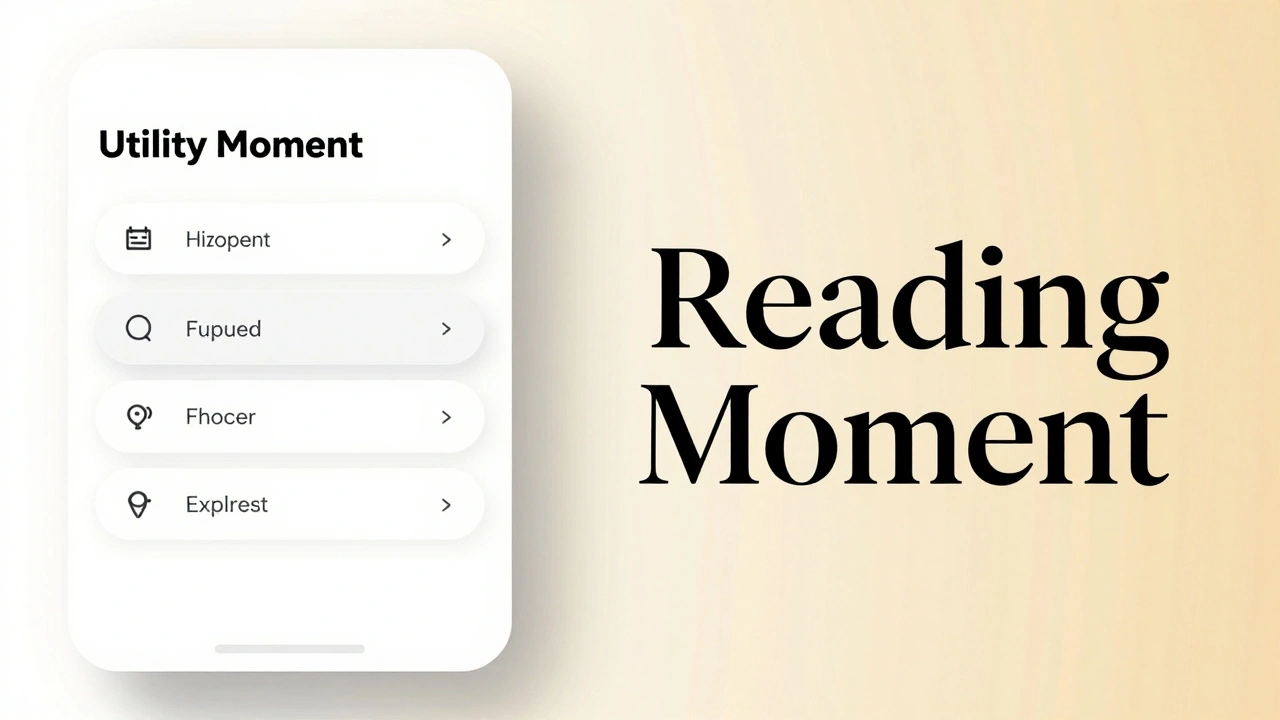
Pairing New York with San Francisco
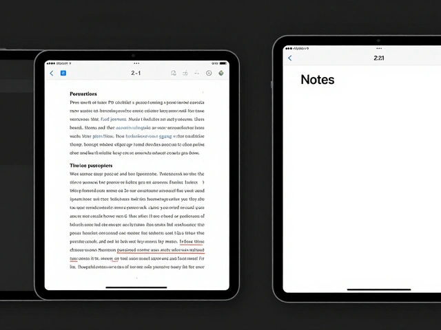
Apple doesn't intend for New York to replace San Francisco; they want them to dance together. The goal is a unified typographic system where each font handles a specific job. San Francisco is the workhorse-it handles the navigation, buttons, and utility labels because it's built for speed and clarity. New York is the specialist. It is reserved for moments that require a "premium" feel. When you pair the two, you create a natural visual hierarchy. A common winning formula is using New York for the H1 and H2 headings to establish a a sophisticated tone, then switching to San Francisco for the UI elements to keep the experience feeling modern and efficient. This prevents the interface from feeling like a dusty old book while still retaining the prestige of traditional publishing.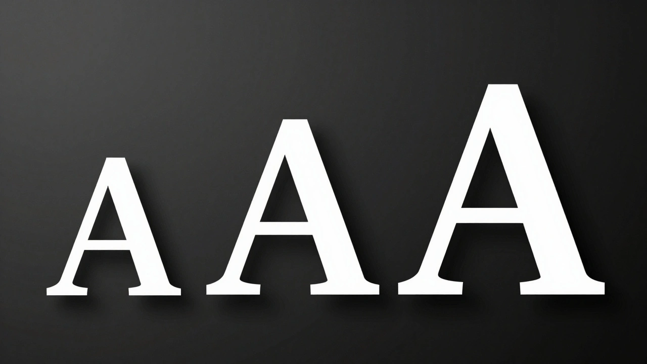
Technical Specs for Precision Typesetting
For those who care about the nitty-gritty of typesetting, New York is far more than just a pretty face. It's a comprehensive toolset. The family comes in six weights, with a total of nine when you include italics. But the real power lies in the OpenType features. If you're building a technical or academic interface, you have access to:- Small Caps: Perfect for maintaining a clean look in all-caps subheadings without the visual "shouting" of full caps.
- Superior and Inferior Numerals: Essential for footnotes and mathematical notations.
- Fractions: Ensuring a 1/2 looks like a professional fraction rather than a slash between two numbers.
- Indices: Special shrunk characters for complex editorial layouts.
Real-World Implementation: Where to Use It
Knowing *how* to use a font is important, but knowing *where* is critical. Using a serif everywhere can make an app feel sluggish or dated. Apple uses New York sparingly and intentionally. Look at Safari Reader mode or the Apple Books app. In these contexts, the user's primary goal is consumption and immersion. A serif font reduces eye strain during long-term reading and signals to the brain that it's time to slow down and focus. If you are designing your own interface, ask yourself: "Is this a utility moment or a reading moment?"- Utility Moment: Searching for a flight, adjusting a setting, checking a notification. Use San Francisco.
- Reading Moment: Reading a biography, browsing a curated fashion editorial, diving into a deep-dive essay. Use New York.
Common Pitfalls to Avoid
One of the biggest mistakes designers make is trying to force New York into a high-density UI. Serifs, by definition, have small strokes that can disappear or look "jittery" if they are too small or if the line height is too tight. Avoid these common traps:- Tight Leading: Give New York room to breathe. Serifs need more vertical space between lines to maintain legibility. If your lines are too close, the ascenders and descenders will clash, making the text hard to scan.
- Low Contrast Backgrounds: While San Francisco can survive a low-contrast grey-on-grey look, New York needs a clear distinction between the text and the background. The thin strokes of a serif can vanish if the contrast is too low.
- Overusing Bold: Because New York has such a strong personality, using the heaviest weights everywhere can make the page feel cluttered. Use bold weights for emphasis, not as a default for all headers.
Is New York a revival of the original 1983 Macintosh font?
Not exactly. While Apple acknowledges it as a contemporary "re-rub" of the New York font introduced by Susan Kare in 1983, the current version is an entirely new design. It was built from the ground up to handle the technical requirements of modern high-density screens, rather than simply updating an old file.
Can I use New York for my non-Apple app?
Yes, provided you are developing for the Apple ecosystem. Apple makes New York available for free to developers through the Apple Developer website to ensure a consistent look and feel across the OS.
What is the main difference between SF Pro and New York?
SF Pro is a sans-serif designed for neutrality, clarity, and high-speed scanning of information. New York is a serif designed for elegance, storytelling, and long-form reading. One is for the "interface," the other is for the "content."
How does optical sizing actually work in the code?
It's handled via OpenType features. The system detects the font size being rendered and automatically selects the appropriate glyph shape (either the Text or Display variant) so the designer doesn't have to manually switch fonts when changing a size from 12pt to 48pt.
Does New York support non-English languages?
Yes, the typeface family includes comprehensive support for Latin, Greek, and Cyrillic scripts, making it viable for global editorial interfaces.
Next Steps for Implementation
If you're ready to integrate New York into your project, start by auditing your content. Identify the "reading zones" where the user is expected to spend more than 30 seconds on a single page. Map these zones to New York and leave the navigation and controls to San Francisco. If you notice that the text feels too light at small sizes, check your rendering settings-ensure you aren't overriding the system's automatic optical sizing. For a truly premium feel, try experimenting with a combination of New York Regular for body text and New York Medium for sub-headers, ensuring your line height is at least 1.4x the font size. This gives the serif enough air to perform its magic.
Categories
Popular Articles