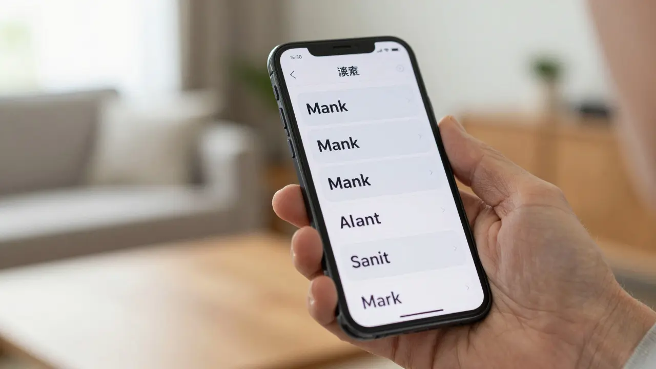

Imagine a user with low vision trying to read your app. They turn on the largest text size setting. Suddenly, your carefully crafted interface looks like a broken collage. Buttons overlap, labels get cut off, and the hierarchy vanishes. This is the nightmare scenario for many designers who treat Dynamic Type as an afterthought rather than a core design constraint.
Dynamic Type is Apple's system-level feature that allows users to adjust the size of text across their devices independently from the screen resolution. It’s not just about making things bigger; it’s about maintaining readability and usability for everyone, from the young child with developing eyesight to the elderly user with macular degeneration. If you’re building for iOS, iPadOS, or macOS, ignoring this feature means excluding a significant portion of your potential audience.
Why Dynamic Type Is More Than Just Bigger Fonts
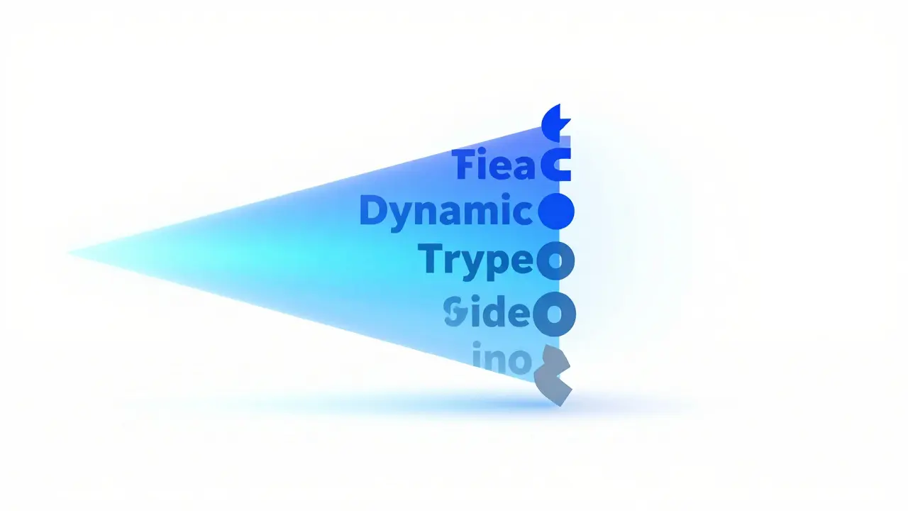
Most developers think of font size as a single variable. In reality, Typography Scale in Apple’s ecosystem consists of multiple semantic styles. Each style serves a specific purpose: body text, captions, footnotes, titles, and subheadings. When you use these semantic styles instead of fixed point sizes, the system automatically adjusts each element proportionally based on the user’s preference.
The key here is understanding that "scaling" doesn't mean uniform zooming. A caption shouldn't grow at the exact same rate as a headline. If they did, the visual hierarchy would collapse. Instead, the system uses a calculated ratio where larger text styles scale more aggressively than smaller ones. This ensures that even at the maximum size, you can still tell which part of the UI is the main message and which is supplementary information.
Think of it like a newspaper. The masthead is huge, the headlines are large, and the body copy is readable but compact. If you scaled everything by the same factor, the masthead would take up half the page, and the body text would become illegible. Dynamic Type handles this complexity for you, provided you set it up correctly.
The Core Mechanics: Text Styles and Content Categories
To implement this properly, you need to stop thinking in points (pt) and start thinking in categories. Apple defines nine standard text styles, ranging from .largeTitle down to .caption2. Each of these has a default size, but more importantly, they have a defined relationship to one another.
- Large Title: Used for the most prominent headings, often at the top of a view controller.
- Title1, Title2, Title3: Secondary headings within sections or cards.
- Body: The primary reading text for paragraphs and descriptions.
- Callout: Slightly larger than body, used for emphasized text or buttons.
- Subheadline: Smaller than body, used for secondary information.
- Footnote, Caption1, Caption2: The smallest texts, used for metadata, timestamps, and fine print.
When a user increases the text size, the system applies a multiplier to each category. For example, if the user selects "Accessibility Large," the .body style might jump from 17pt to 28pt, while .caption1 jumps from 12pt to 16pt. The gap between them widens slightly, preserving the distinction. This is why hard-coding font sizes is dangerous; you lose the automatic proportional adjustment that keeps your layout coherent.
Common Pitfalls That Break Your Layout
Even when using semantic styles, layouts can break. Here are the three most common culprits I see in code reviews:
- Fixed Height Constraints: If you constrain a label to a height of 20 points, it will clip when the text scales to 24 points. Always allow text views to determine their own intrinsic content size unless absolutely necessary.
- Hard-Coded Padding: Adding 10 points of padding around a button works at small sizes. At large sizes, that padding feels cramped. Use relative spacing or ensure your containers expand to fit the content.
- Ignoring Line Height: As text gets larger, the line height needs to increase to maintain readability. If you don’t adjust line spacing, lines of text will touch each other, creating a wall of characters that is difficult to parse.
A classic mistake is using Auto Layout constraints that pin both the top and bottom of a multi-line label to fixed points. Instead, let the label expand vertically. If space is tight, consider truncating the text or collapsing the section rather than clipping the letters.
Practical Strategies for Robust Implementation
How do you build a layout that survives the largest text settings? Start by auditing your existing UI. Open your simulator, go to Settings > Accessibility > Display & Text Size, and drag the slider to the far right. Now look at your app. What breaks?
Here is a practical checklist to fix those issues:
- Use Intrinsic Sizes: Let UILabels and Buttons calculate their own height. Avoid explicit height constraints on text elements.
- Adjust Spacing Dynamically: In SwiftUI, you can use environment values to detect the current type size and adjust padding accordingly. In UIKit, observe changes to the preferred font size trait collection.
- Test Multi-Line Scenarios: Ensure that long paragraphs wrap correctly without overflowing their containers. Check that justified text doesn’t create awkward gaps.
- Verify Icon-Text Alignment: When text grows, icons next to it should remain centered. Misaligned icons make the UI look amateurish.
In SwiftUI, this is easier thanks to the declarative nature of the framework. You can simply apply .font(.body) and trust the system. However, if you need custom logic, you can access the dynamicTypeSize environment value to tweak your layout parameters conditionally.
| Feature | Fixed Font Sizes | Dynamic Type Styles |
|---|---|---|
| User Control | None | Full range of 5 standard + 5 accessibility sizes |
| Layout Stability | High (but inaccessible) | Variable (requires careful constraint management) |
| Maintenance Effort | Low initially, high for accessibility fixes | Medium initially, low for ongoing support |
| Visual Hierarchy | Static | Proportional and adaptive |
Handling Edge Cases: Images, Icons, and Custom Views
Text isn't the only thing that needs to scale. Icons and images often accompany text. If your icon is 16x16 pixels and your text becomes 30 points, the icon will look tiny and insignificant. Ideally, vector assets should scale with the text. In iOS, you can mark certain image assets as "Preserve Vector Data" to allow them to scale sharply at any size.
For custom-drawn views, such as charts or complex diagrams, you may need to redraw elements based on the current font size. Listen for changes in the trait collection and trigger a refresh of your custom drawing code. This ensures that grid lines, labels, and data points all remain legible and aligned.
Don't forget about input fields. Text fields need enough vertical space to accommodate the larger text. If you keep the field height fixed, the cursor might sit at the very top or bottom edge, making it hard to click accurately. Increase the minimum height of text inputs when the user selects larger text sizes.

Testing Beyond the Simulator
The simulator is a good start, but real devices behave differently due to varying screen densities and hardware limitations. Test on physical devices whenever possible. Pay attention to how text renders on older iPhones versus newer iPads. Sometimes, sub-pixel rendering differences can cause slight misalignments that aren't visible in the simulator.
Also, test with VoiceOver enabled. While VoiceOver reads out the text, it also helps verify that the logical order of your elements makes sense. If a user taps a button, does VoiceOver announce the correct label? If the layout is broken, the tap target might be too small or obscured, leading to frustration for assistive technology users.
Frequently Asked Questions
Does Dynamic Type work on macOS?
Yes, macOS supports Dynamic Type starting from macOS Big Sur. However, the implementation is slightly different because macOS windows are resizable. You need to ensure that your text scales appropriately within resizable windows, not just in fixed-size panels.
Can I disable Dynamic Type for specific elements?
You can prevent specific labels from scaling by setting their font explicitly without using a dynamic type style. However, this is generally discouraged as it creates inconsistency. If you must do so, document the reason clearly in your code comments.
What is the difference between Body and Callout styles?
Body is the standard size for paragraphs and main content. Callout is slightly larger and is typically used for text that stands out from the body, such as button labels or emphasized phrases. The difference is subtle but important for visual hierarchy.
How do I handle line spacing with Dynamic Type?
Line spacing should increase as font size increases. In UIKit, you can use NSParagraphStyle to adjust line spacing dynamically. In SwiftUI, the default behavior usually handles this well, but you can customize it using the .lineSpacing modifier if needed.
Is Dynamic Type required for App Store approval?
While not strictly required for every single app, it is highly recommended and often expected for apps targeting general audiences. Apps that fail to support reasonable text scaling may face rejection during review if they are deemed inaccessible, especially in educational or medical categories.

Categories
Popular Articles