

Most iPhone users tap the bottom of their screen hundreds of times a day without thinking. That muscle memory is built on Tab Bars a horizontal strip of icons at the bottom of the screen that serves as the primary navigation mechanism for multi-view applications. But when your app grows complex, or you switch to iPadOS, those same tabs can feel cramped and inefficient. Understanding how to balance Tab Bars, Sidebars, and Context-Aware Controls is the difference between an app that feels native and one that feels like a web page squeezed into a phone.
Key Takeaways
- Tab Bars are best for 3-5 top-level destinations; more than five creates cognitive overload.
- Sidebars work well on iPad and large iPhones (like Pro Max models) but require careful handling on smaller devices.
- Context-Aware Controls (like contextual menus and inline actions) reduce friction by appearing only when relevant.
- Mixing these patterns requires strict hierarchy rules to avoid confusing users.
- Always test with real users on the smallest supported device first.
The Role of Tab Bars in Mobile Hierarchy
A Tab Bar is a standard iOS component that displays a set of tabs, each representing a distinct section of the app sits at the foundation of most mobile interfaces. It’s persistent, always visible, and immediately tells the user where they are. Think of it as the main menu of your app. If you’re building a social media platform, your tabs might be Home, Search, Post, Notifications, and Profile. Each tab leads to a completely different view, but switching between them is instant and non-destructive-your state is preserved.
The golden rule here is restraint. Apple’s Human Interface Guidelines recommend limiting tabs to five maximum. Why? Because beyond five, users start scanning rather than recognizing. A study by Nielsen Norman Group found that users take up to 40% longer to locate a specific tab when there are six or more options. So if you’re tempted to add a “Settings” tab, ask yourself: does this really belong at the top level, or should it live inside a profile menu?
Also, keep icon labels short. One or two words max. “Messages” is fine. “Direct Messages Inbox” is not. The tab bar isn’t a place for explanations-it’s a wayfinding tool.
When to Switch to a Sidebar Layout
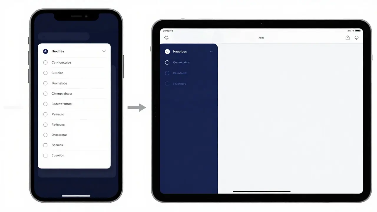
Now, what happens when your app gets bigger? Maybe you’re building a productivity suite with dozens of folders, projects, or channels. At that point, a Sidebar a vertical list of navigation links typically displayed on the left side of the screen, often collapsible on mobile devices makes more sense. On iPad, sidebars are standard-they mirror desktop apps and give users room to see both content and navigation simultaneously. On iPhone, it’s trickier.
On smaller iPhones (like the SE or base models), a full sidebar eats up too much screen real estate. Instead, use a slide-out drawer or a modal sheet that appears from the edge. This keeps the main content area uncluttered until the user explicitly asks for navigation. Think of how Apple’s Files app works: on iPhone, you tap a folder name and it opens in a new view; on iPad, you get a split view with the sidebar always visible.
If you must include a sidebar on iPhone, make sure it’s dismissible with a swipe gesture. Users expect to be able to hide it quickly. Also, consider using a hamburger menu icon in the top-left corner as a trigger, but don’t rely on it alone-gesture support is critical for fluidity.
Context-Aware Controls: Reducing Clutter, Increasing Speed
Here’s where modern iOS design shines: Context-Aware Controls UI elements that appear dynamically based on user interaction or current state, such as long-press menus, swipe actions, or floating action buttons. These aren’t permanent fixtures like tabs or sidebars. They pop up only when needed, keeping the interface clean until the moment of action.
Take email apps, for example. You don’t need “Delete,” “Archive,” or “Mark as Read” buttons constantly visible. Instead, swipe left on an email to reveal those actions. Or long-press a contact to bring up a quick share sheet. This reduces visual noise and speeds up common tasks. According to a 2025 usability report by Baymard Institute, apps that use contextual gestures reduced task completion time by 22% compared to static button layouts.
But beware: context-dependent features must be discoverable. If users don’t know they can swipe, they won’t use it. That’s why subtle animations, haptic feedback, and occasional tooltips help. Don’t hide your most important actions behind obscure gestures-reserve those for secondary functions.
Combining Patterns Without Confusing Users
You might want to combine all three: a tab bar for main sections, a sidebar within one tab for sub-navigation, and contextual controls for quick actions. That’s totally valid-but only if the hierarchy is clear. Here’s a simple decision tree:
- Top-Level Destinations (3-5): Use a Tab Bar.
- Sub-Navigation Within a Tab (Many Items): Use a Sidebar or List View.
- Quick Actions on Specific Items: Use Contextual Menus or Swipe Gestures.
For instance, in a music app, your tabs could be Library, Browse, Radio, and Now Playing. Inside “Library,” you might have a sidebar listing Playlists, Artists, and Albums. Then, when you tap a song, a contextual menu appears with options like “Add to Playlist” or “Share.” Each layer serves a different purpose, and users understand which level they’re at because the UI changes subtly-maybe the background darkens slightly when a sidebar is open, or a close button appears.
Device-Specific Considerations
Not all iPhones are created equal. An iPhone SE has a 4.7-inch screen; an iPhone 16 Pro Max has a 6.9-inch display. Your navigation strategy must adapt. On larger screens, you can afford more visible elements. On smaller ones, prioritize simplicity.
Test your layout on the smallest device you support. If it works there, it’ll likely work everywhere else. But if it feels cramped on the SE, it might feel sparse on the Pro Max. Aim for consistency, not identical layouts.
Common Pitfalls to Avoid
- Overloading the Tab Bar: Adding a sixth tab just because you can. Resist it.
- Inconsistent Gestures: If swiping left deletes an item in one screen but opens a menu in another, users will get confused. Standardize your gestures across similar contexts.
- Hiding Critical Features: Don’t bury “Search” or “Settings” behind multiple taps. These should be easily accessible.
- Ignoring Accessibility: Ensure all contextual controls have VoiceOver labels and sufficient touch targets (minimum 44x44 points).
Testing and Iteration
Don’t guess what works-test it. Run usability sessions with 5-7 participants. Watch where they hesitate, mis-tap, or complain about clutter. Tools like Maze or UserTesting let you do this remotely and quickly. Pay attention to task completion rates and error frequencies. If 30% of users miss the sidebar toggle, maybe move it or add a hint.
Also, monitor analytics. Track how often users switch tabs, open the sidebar, or trigger contextual menus. If a feature is rarely used, reconsider its placement. Data doesn’t lie, but it needs interpretation. Combine quantitative metrics with qualitative feedback for the best insights.
How many tabs should an iPhone app have?
Aim for 3 to 5 tabs. More than five increases cognitive load and slows down navigation. If you need more, group related items under a single tab or use a sidebar within that tab.
Should I use a sidebar on iPhone?
Only if you have many sub-items. On small iPhones, use a slide-out drawer triggered by a menu icon or edge swipe. On larger iPhones, a persistent sidebar is acceptable if it doesn’t crowd the content area.
What are context-aware controls?
These are UI elements that appear based on user action or context, like swipe-to-delete, long-press menus, or floating action buttons. They reduce clutter by showing options only when relevant.
How do I ensure my navigation is accessible?
Use clear labels for VoiceOver, maintain minimum touch target sizes (44x44 points), provide alternative ways to access hidden features (not just gestures), and test with assistive technologies.
Can I mix tab bars and sidebars in the same app?
Yes, as long as the hierarchy is clear. Use tabs for top-level sections and sidebars for sub-navigation within a tab. Make sure visual cues indicate which level the user is currently on.