
You spent weeks polishing your SwiftUI interface. The animations are buttery smooth. The dark mode looks perfect. You hit "Submit for Review" and wait. Two days later, you get the email that every developer dreads: "We noticed issues with your user interface...".
It’s frustrating, right? But here’s the thing: Apple doesn’t reject apps because they hate creativity. They reject them because of predictability. Their reviewers follow a strict set of rules outlined in the Human Interface Guidelines (HIG)Apple's official design documentation. If you ignore these, you’re gambling with your launch date.
I’ve seen countless teams lose momentum over avoidable UI mistakes. This guide breaks down exactly what triggers those rejections and how to fix them before you even upload your build. No fluff, just the specific design checks that keep your app in the good graces of the review team.
The Core Problem: Why Apple Cares About Your Buttons
Think about the last time you used an unfamiliar app. Did you hesitate when tapping a button? Did you accidentally close a modal because it looked like a background element? That hesitation is what Apple wants to eliminate.
The primary reason for UI-related rejections under Guideline 4.0Apple's minimum functionality and quality standards is inconsistency. If your app looks like three different developers worked on it without talking, Apple sees it as unfinished. It signals poor engineering discipline, which often correlates with bugs.
Reviewers aren't designers. They are generalists checking for compliance. They look for obvious violations of platform conventions. If a back button appears in the top-right corner instead of the left, or if a tab bar disappears unexpectedly, they flag it. It’s not subjective taste; it’s objective deviation from the standard.
Navigation Patterns That Trigger Instant Flags
Navigation is the skeleton of your app. If it breaks, everything else collapses. Apple has very specific expectations for how users move through content on iOS.
First, respect the safe areas. With the notch and dynamic island on modern iPhones, placing interactive elements too close to the edges is a common mistake. If a user can’t tap a "Save" button without their thumb hitting the home indicator, you risk a rejection for usability issues. Always use the built-in layout guides in Xcode or SwiftUI modifiers like .safeAreaInset().
Second, don’t reinvent the wheel for navigation bars. A common trap is hiding the navigation bar entirely to save vertical space. While this might look sleek, it disorients users who rely on the back arrow for context. If you must hide it, ensure there’s another clear way to go back, like a swipe gesture from the left edge. But honestly? Keep the nav bar visible unless you have a compelling reason not to.
- Tab Bars: Must remain persistent across main sections. Don’t swap between a tab bar and a hamburger menu arbitrarily.
- Modals: Should have a clear dismiss mechanism. An "X" button or a swipe-down gesture is mandatory. Users shouldn’t have to guess how to exit.
- Back Gestures: Ensure swipe-to-go-back works everywhere. Custom navigation controllers sometimes break this default behavior, leading to frustration.
Accessibility Is Not Optional-It’s a Requirement
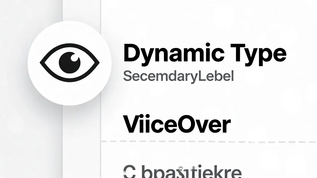
Many developers treat accessibility as a nice-to-have feature for version 2.0. Apple treats it as a baseline requirement for version 1.0. Under VoiceOverApple's screen reader technology for iOS compatibility checks, if your buttons aren’t labeled properly, you will get rejected.
This isn’t just about blind users. It’s about semantic structure. Every image acting as a button needs an accessibility label. Every decorative image should be hidden from VoiceOver. If you skip this, your app fails the basic utility test.
Color contrast is another major hurdle. Text on a light gray background might look elegant to you, but if it doesn’t meet WCAG AA standards, it’s a fail. Use tools like Stark or built-in Xcode accessibility inspectors to check contrast ratios. Aim for at least 4.5:1 for normal text. If your brand colors are too pale, adjust the opacity or choose a darker shade for text overlays.
Dynamic Type support is equally critical. iOS allows users to scale text sizes system-wide. If your layout breaks or text gets cut off when a user increases font size, Apple views this as a broken experience. Test your screens with the largest font setting enabled. If labels overlap or truncate unexpectedly, redesign those components using flexible layouts rather than fixed heights.
Visual Consistency and Asset Management
Inconsistency screams "beta." If one screen uses rounded corners with a 12-point radius and another uses 8 points, it feels sloppy. Define a design system early. Pick a color palette, typography scale, and spacing grid, then stick to it religiously.
Iconography is a frequent pain point. Mixing flat icons with skeuomorphic ones confuses the visual language. Stick to one style throughout the app. SF Symbols is a great resource here because they integrate seamlessly with Dynamic Type and weight adjustments. If you use custom icons, ensure they match the stroke width and optical alignment of standard iOS icons.
Here’s a quick checklist for asset hygiene:
| Element | Common Mistake | Solution |
|---|---|---|
| App Icon | Transparent background or wrong dimensions | Use solid background; export at all required sizes (e.g., 1024x1024) |
| Buttons | Inconsistent height or padding | Standardize touch targets to min 44x44 points |
| Images | Pixelated on Retina displays | Provide @2x and @3x assets; use vector PDFs where possible |
| Fonts | Custom fonts causing layout shifts | Fallback to San Francisco; test line heights carefully |
Dark Mode and Adaptive Colors
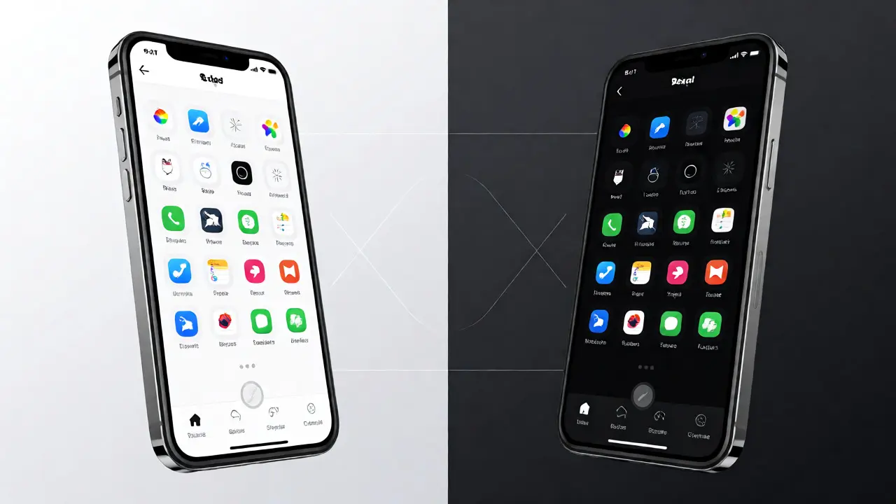
Since iOS 13, supporting Dark Mode is expected. If your app looks broken in Dark Mode-white backgrounds staying white while text turns white-you’ll face immediate pushback. Apple requires apps to adapt to system appearance settings automatically.
Don’t hardcode hex codes for colors. Use semantic colors provided by UIKit or SwiftUI, such as systemBackground, secondaryLabel, and separator. These automatically adjust based on the current appearance. If you need custom branding colors, define them in an Asset Catalog with Any/Dark/Light variants.
Test your app in both modes before submission. Check screenshots in the App Store Connect preview, too. Apple reviews the metadata images alongside the binary. If your screenshots show Light Mode only but the app supports Dark Mode, it’s fine, but ensure the transition within the app is seamless. No flashing or delayed updates when switching modes.
Pre-Submission Checklist for Designers
Before you hand off the build to QA, run through this final sweep. These steps catch 90% of UI-related rejections.
- Run Accessibility Audit: In Xcode, open the Accessibility Inspector. Click on every interactive element. Does it read correctly? Are labels descriptive?
- Check Safe Areas: Rotate the simulator to landscape mode. Do controls stay within bounds? Does the keyboard obscure important fields?
- Verify Touch Targets: Tap small buttons with your finger, not the mouse cursor. If you miss frequently, enlarge the target area, even if the visual icon stays small.
- Test Empty States: What does the app look like with zero data? Don’t leave blank white screens. Provide helpful illustrations or calls to action.
- Review Loading Indicators: Never let a spinner hang forever. Add timeouts or error messages if network requests fail.
One subtle tip: Pay attention to haptic feedback. While not strictly required for approval, missing haptics on key actions (like pulling to refresh) can make the app feel cheap. Adding UIImpactFeedbackGenerator takes minutes but elevates the perceived quality.
Does Apple reject apps for having custom UI designs?
No, Apple encourages unique aesthetics. However, custom designs must still adhere to functional standards. If your custom buttons are hard to identify or navigate, they may be rejected for usability issues under Guideline 4.2. The key is clarity, not conformity to stock components.
How long does Apple take to review UI changes?
Typically, 24 to 48 hours for most submissions. However, during peak periods or if significant UI overhauls are detected, it can extend to a week. Minor UI tweaks usually result in faster approvals compared to major structural changes.
What is the most common UI rejection reason?
Lack of accessibility support is increasingly common, followed closely by inconsistent navigation patterns. Many developers overlook VoiceOver labels or fail to implement proper Dynamic Type scaling, leading to automated or manual flags during review.
Can I appeal a UI-based rejection?
Yes, you can request a resolution center conversation. Explain your design choices clearly and reference specific HIG sections. Often, providing a short video demo showing how the UI functions resolves misunderstandings quickly without needing code changes.
Do screenshots affect App Store review?
Yes, Apple reviews metadata including screenshots. If your screenshots show outdated UI or misleading features not present in the binary, you may receive a rejection under Guideline 2.3. Ensure your marketing materials accurately reflect the submitted build.