
Walking into an Apple Store is often described as a sensory experience. The glass facades, the open floor plans, and the minimalist aesthetic create a specific atmosphere that many people find calming. However, for millions of customers with visual, auditory, or motor impairments, that same minimalism can sometimes feel like a barrier. How does a brand known for seamless digital experiences handle the physical world? The answer lies in a deliberate strategy of Inclusive Design that goes beyond basic compliance to actively remove friction.
This article breaks down how Apple Retail structures its spaces to ensure that Accessibility is not an afterthought but a core feature. We will look at the specific architectural choices, the technology embedded in the environment, and the human interactions that make these stores work for everyone.
The Architecture of Openness
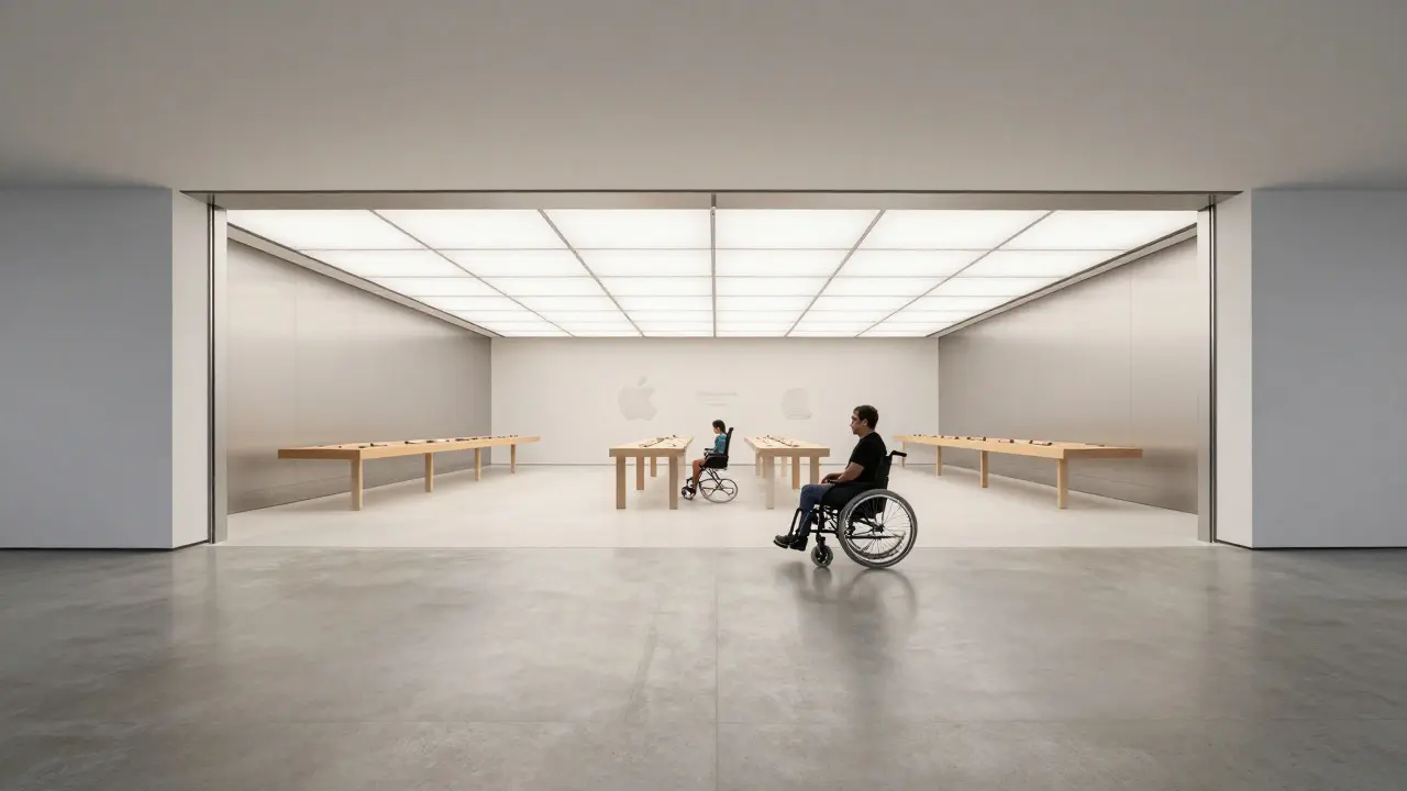
The foundation of accessibility in physical retail is spatial clarity. Apple Stores are designed with wide aisles and uncluttered sightlines. This isn't just for aesthetics; it is a functional requirement for wheelchair users and those using mobility aids. The standard aisle width in most high-traffic retail environments is often around 36 to 48 inches. In Apple locations, you frequently see pathways exceeding 5 feet, allowing two wheelchairs to pass each other comfortably without squeezing past merchandise.
Flooring plays a critical role here. Smooth, low-pile carpet or polished concrete reduces the resistance required to move wheels. This choice also benefits individuals with balance issues or those who use canes, as uneven surfaces or thick rugs can be tripping hazards. The lighting is another subtle but powerful tool. High Color Rendering Index (CRI) lights help people with color vision deficiencies distinguish product packaging more easily, while consistent brightness levels reduce glare for those with photosensitivity.
- Wide Aisles: Minimum 60-inch clearance in main thoroughfares to facilitate bidirectional movement of mobility devices.
- Level Transitions: No steps at entrances; ramps are integrated seamlessly into the landscape rather than added as an afterthought.
- Visual Cues: High-contrast signage ensures legibility from a distance, aiding customers with low vision.
Tactile and Visual Wayfinding
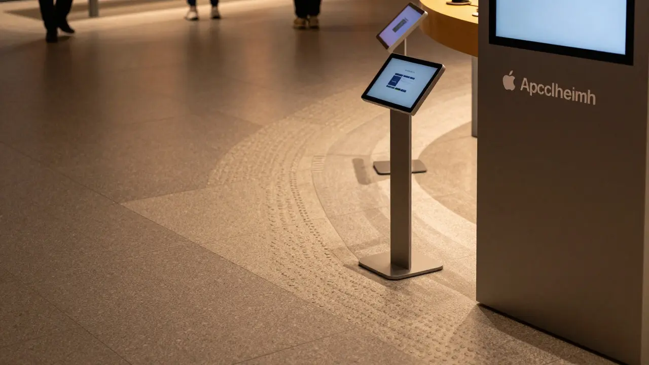
Navigating a large store can be overwhelming for anyone, but it is particularly challenging for blind or low-vision shoppers. Apple addresses this through a multi-sensory wayfinding system. You will notice distinct material changes on the floor that act as tactile guides. For example, moving from the entrance to the first display table involves a change in texture that signals a new zone without requiring visual confirmation.
Signage is designed with universal readability in mind. Fonts are sans-serif, large, and placed at eye level for both standing and seated users. The contrast between the text and the background is optimized to meet WCAG AAA standards, which is significantly stricter than typical retail requirements. Furthermore, interactive displays are positioned at varying heights. Some screens are mounted lower, within reach of a wheelchair user, while others are higher to prevent obstruction by standing crowds. This vertical layering ensures that no single height dominates the interface, making the space truly democratic.
| Feature | Standard Retail | Apple Retail Approach |
|---|---|---|
| Aisle Width | 36-48 inches | 60+ inches in key areas |
| Screen Height | Fixed at 48-54 inches | Variable heights (30-60 inches) |
| Lighting | Decorative/Ambient focus | High CRI, uniform distribution |
| Wayfinding | Visual only | Visual + Tactile + Auditory cues |
Interaction Design in Physical Space
Once inside, the interaction with products becomes the primary test of accessibility. Apple’s self-service kiosks and demo units are engineered with Universal Design principles. Touchscreens are calibrated to respond to light pressure, which helps users with limited hand dexterity. The software running on these devices mirrors the robust VoiceOver and Switch Control features found on personal iPhones and iPads. This consistency means that a customer who relies on assistive technology at home faces no learning curve in the store.
Audio feedback is another layer of interaction. Many displays provide optional audio descriptions when a product is selected. This is not just a gimmick; it allows blind customers to hear the exact specifications, price, and stock availability without needing to ask for help. The volume is adjustable, and the sound is localized to the device, preventing confusion in busy areas. For hearing-impaired customers, visual indicators such as flashing lights or clear on-screen captions accompany any audio prompts, ensuring that information is never locked behind one sense alone.
The Role of Human Assistance
Technology and architecture set the stage, but people close the loop. Apple Sales Specialists receive training that goes beyond product knowledge. They are taught how to approach customers with disabilities respectfully. Instead of asking "What is wrong?" or assuming a need for help, they offer assistance neutrally: "Would you like me to show you where the accessories are?" This phrasing preserves autonomy.
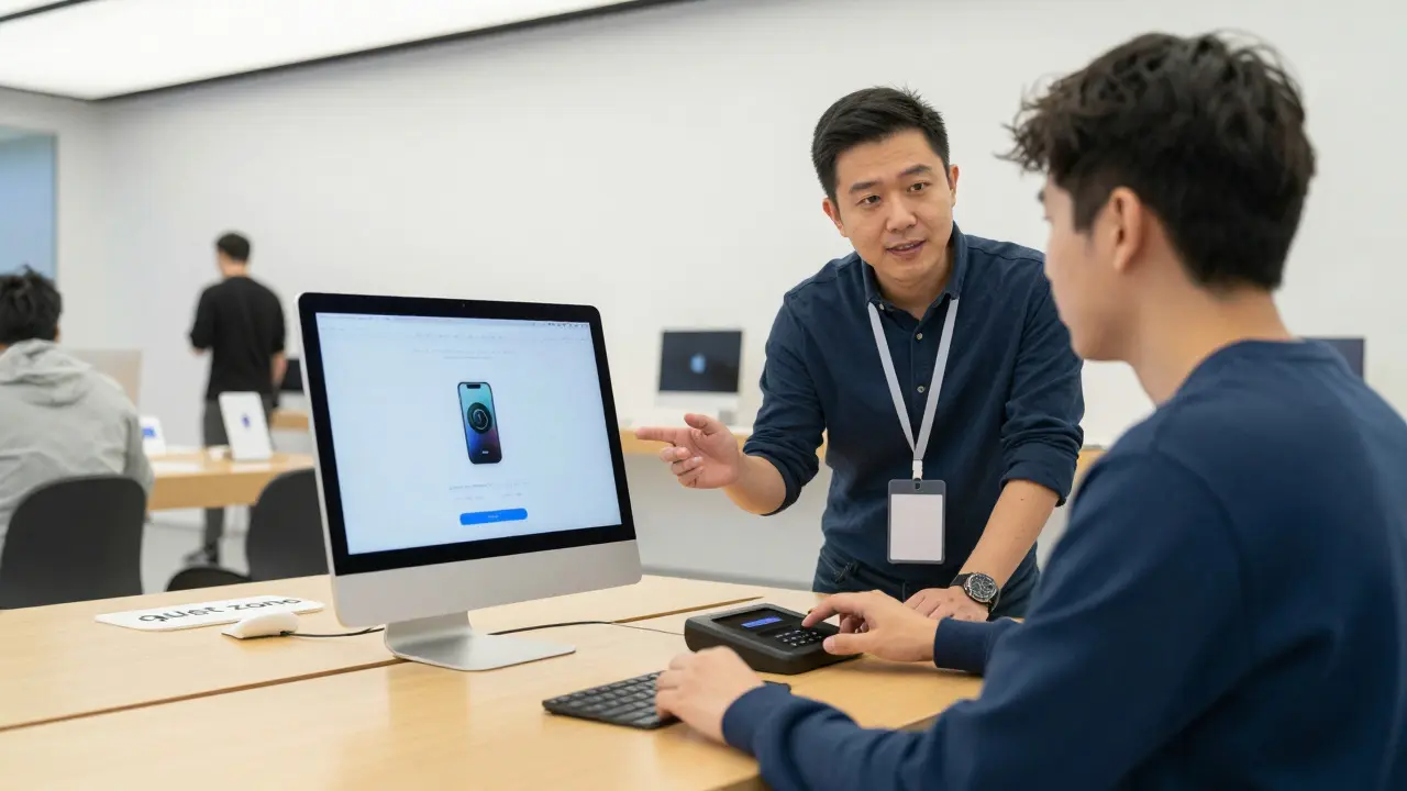
Store layouts include designated "quiet zones" or smaller consultation tables away from the main traffic flow. These areas are crucial for neurodivergent customers who may find the sensory load of a busy flagship store overwhelming. Having a predictable, low-stimulation space to discuss complex technical questions reduces anxiety and makes the shopping experience manageable. The staff are trained to recognize signs of sensory overload and proactively suggest these quieter areas.
Technology Integration and Assistive Tech
Apple’s ecosystem advantage is fully leveraged in retail. Customers can connect their own devices to in-store displays via AirPlay or direct cable connections. This allows them to see their own data, apps, and settings on the large screen, bridging the gap between personal usage and store demonstration. For those using Braille Displays, certain kiosks support Bluetooth connectivity, enabling real-time text translation directly from the screen to the braille device. This integration turns a static display into a dynamic, personalized tool.
Furthermore, the store’s Wi-Fi network is optimized for low latency, ensuring that cloud-based services like iCloud sync quickly during demonstrations. This reliability is vital because technical glitches can frustrate users, especially those who rely heavily on the stability of their assistive setups. By prioritizing network performance, Apple ensures that the digital experience remains as smooth as the physical one.
Common Pitfalls and Best Practices
Even well-intentioned designs can fail if they miss the mark. One common error is placing essential controls out of reach. If the power button or the main menu selector is too high or too low, the device becomes unusable for some segments of the population. Another pitfall is inconsistent labeling. If one screen uses icons and another uses text, cognitive load increases unnecessarily. Consistency is key to reducing mental effort.
- Test with Real Users: Prototypes should be tested with people who actually use wheelchairs, screen readers, and hearing aids, not just simulated models.
- Provide Multiple Input Methods: Always allow touch, voice, and switch input options.
- Maintain Clear Sights: Ensure that no decorative element blocks the view of primary interfaces.
- Train Staff on Empathy: Technical skills matter, but social comfort determines whether a customer feels welcome.
By treating accessibility as a continuous process rather than a one-time checklist, retailers can create environments that serve all customers better. When you remove barriers for one group, you often improve the experience for everyone else. Wider aisles help parents with strollers. Clear signage helps tourists. Quiet zones help anyone feeling stressed. Inclusive design is not a niche feature; it is the baseline for modern retail excellence.