
Your screen is lying to you. Or at least, it’s showing you a version of reality that might not match what your client sees on their monitor or what prints out in the studio. For designers working on iPad is a mobile computing device known for its high-fidelity displays and touch-first interface, widely used for digital art and design., this discrepancy can be a dealbreaker. You’re painting with vibrant purples that look muddy on an sRGB laptop, or adjusting skin tones that shift hue when you switch devices. The good news? Apple has built powerful tools into the hardware and software stack to fix this, but only if you know how to use them.
Understanding the Display Hardware
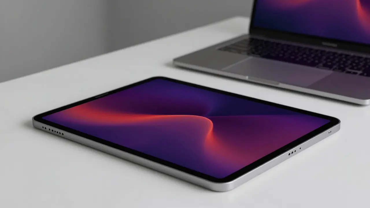
To manage color, you first need to understand what you’re looking at. Most modern iPads, particularly the Pro models, feature Liquid Retina XDR is a mini-LED display technology offering higher contrast ratios and brightness than standard LCD screens.. This isn't just about being brighter; it's about range. These panels cover the Display P3 is a wide color gamut standard developed by Apple, covering approximately 25% more colors than the traditional sRGB standard. color space. If you’ve been working in sRGB (the web standard), you’re leaving a lot of color on the table. P3 allows for deeper reds, greener greens, and more nuanced blues that simply don’t exist in older standards.
However, having a wide-gamut panel doesn’t automatically mean accurate color. That’s where calibration comes in. While you can’t easily plug a hardware calibrator into an iPad like you can a desktop monitor, the operating system handles much of the heavy lifting through ColorSync is Apple’s color management engine that ensures consistent color reproduction across different devices and applications.. When you open a file in a supported app, the OS reads the embedded color profile and adjusts the pixels so they look correct on your specific hardware. If you ignore this, your "vibrant" orange might actually be a distorted yellow because the app is stretching the sRGB data across the P3 spectrum without proper mapping.
The Role of True Tone
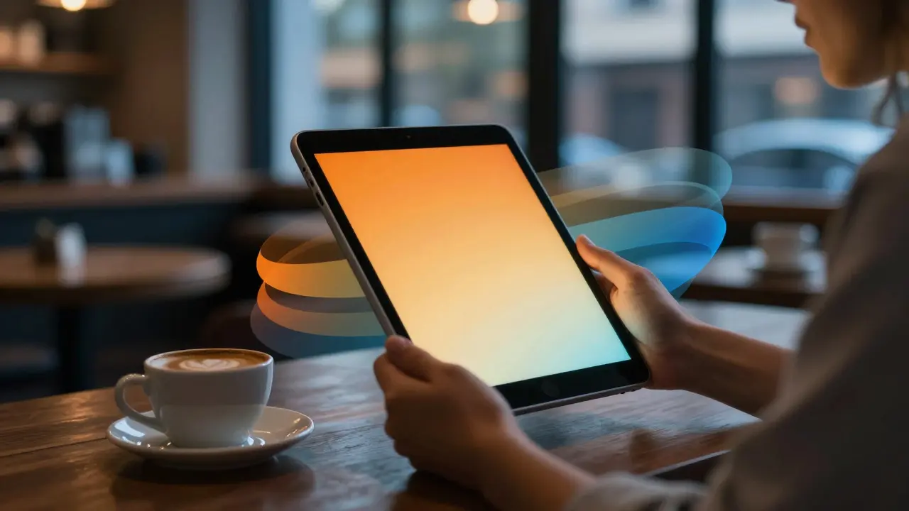
This is where things get controversial among designers. True Tone is an adaptive display feature that adjusts white balance based on ambient light conditions to make the screen appear more natural. uses sensors to measure the color temperature of the room and shifts the screen’s white point accordingly. In a dimly lit coffee shop, it warms up the screen to reduce eye strain. In bright daylight, it cools it down. For casual browsing, it’s fantastic. For professional color grading? It’s a potential pitfall.
If you are doing final color checks, especially for print or broadcast, True Tone can introduce subtle shifts that make your work inconsistent. A shadow tone you balanced in a cool office might look too warm when reviewed in a sunny studio. The best practice? Turn it off for critical evaluation. Go to Settings > Display & Brightness and toggle it off before you do your final passes. Use it for sketching, wireframing, or general layout work where absolute color accuracy is less critical than comfort. Think of True Tone as a comfort feature, not a precision tool. It helps your eyes relax, but it shouldn’t dictate your color decisions.
Choosing the Right Apps for Accuracy
Not all apps respect color profiles equally. Some render everything in sRGB regardless of your display capabilities, while others fully support P3 and even Rec. 709 for video. Here is how to navigate the landscape:
- Procreate: Fully supports P3. When you start a new canvas, check the color profile settings. If you’re exporting for the web, convert to sRGB. If you’re printing, keep it in P3 or CMYK depending on your printer’s requirements.
- Adobe Fresco / Photoshop: These apps integrate deeply with Adobe’s color pipeline. Ensure your workspace settings are set to "Proof Colors" if you want to simulate other output devices. They handle ICC profiles natively, which is crucial for cross-platform consistency.
- Affinity Photo: Known for its robust color management. It allows you to assign soft-proofing profiles, letting you see exactly how your image will look on an sRGB monitor or in CMYK print before you export.
- Lightroom Mobile: Excellent for photo editing. It respects the source profile of your photos. If you shoot in RAW, you have full control over the color space during development. Export carefully-choosing "Original" preserves your P3 data, while "JPEG" often defaults to sRGB unless specified otherwise.
The key takeaway: always check the export settings. An artist might spend hours perfecting a P3 image, only to flatten it to sRGB upon export, losing vibrancy and potentially causing banding in gradients. Conversely, sending a P3 file to a client who only works in sRGB can result in oversaturated, unnatural colors on their end. Communication is part of color management.
Workflow Tips for Consistency
Managing color isn’t just about the screen; it’s about the entire pipeline. Here are some practical steps to tighten up your workflow:
- Calibrate Your Environment: Light affects perception. Try to work under consistent lighting. If possible, use neutral white light (around 5000K-6500K). Avoid strong colored lights from windows or lamps, as they cast shadows that trick your brain into perceiving different colors on the screen.
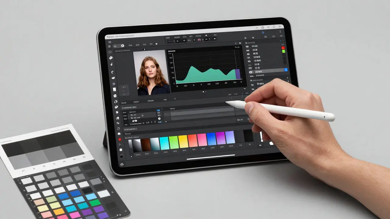
- Use Reference Images: Keep a set of reference images with known color values (like a grayscale ramp or a color checker chart) in your project folder. Open them side-by-side with your work. If the grays look tinted, your white balance is off. If the colors look washed out, your gamma might be incorrect.
- Export in Multiple Formats: Don’t rely on a single export. Create an sRGB version for web clients and a P3 or TIFF version for archival or print. Label them clearly. This prevents confusion later when someone asks why the website looks dull compared to the mockup.
- Review on Different Devices: Even with perfect management, human perception varies. Send your work to a friend or colleague on a different device type (Android, Windows, another Mac). Ask them to check for obvious shifts. This catches issues that software profiles sometimes miss due to hardware limitations.
Common Pitfalls and How to Avoid Them
Even experienced designers fall into these traps. Recognizing them early saves time and rework.
- The "Vivid" Trap: Liking the way colors look on your P3 screen doesn’t mean they’re correct. It means your screen is capable of showing them. Always ask: "Is this color intended for this specific output?" If yes, great. If no, adjust.
- Ignoring Metadata: Some apps strip metadata, including color profiles, when saving. Check your save settings. If you’re working in a collaborative environment, agree on a master format (like PSD or TIFF) that retains profile information.
- Mixing Color Spaces in One Project: Trying to combine assets created in sRGB with those in P3 without conversion leads to mismatched edges and inconsistent tones. Convert all imported assets to your working color space at the start of the project.
| Standard | Typical Use Case | Color Range | Best For |
|---|---|---|---|
| sRGB | Web, Social Media | Baseline | Universal compatibility |
| Display P3 | Digital Art, Video Editing | ~25% wider than sRGB | High-end displays, immersive content |
| Rec. 709 | HDTV, Broadcast | Similar to sRGB | Video production, TV delivery |
| CMYK | Varies by paper/ink | Physical media, packaging |
Frequently Asked Questions
Should I always turn off True Tone when designing?
Not always. For sketching, layout, and long sessions where eye strain is a concern, True Tone is helpful. However, for final color grading, proofing, or any task requiring precise color matching, turn it off to ensure consistent white balance regardless of ambient light.
What is the difference between P3 and sRGB?
sRGB is the standard color space for the web, covering a limited range of colors. Display P3 is a wider gamut that includes more saturated reds and greens. P3 offers richer, more vivid colors but requires proper management to avoid inconsistencies across devices.
Can I calibrate my iPad like a desktop monitor?
You cannot attach a hardware calibrator directly to an iPad. However, the iPad’s display is factory-calibrated to high standards. You can use software-based checks and reference images to verify consistency. For critical work, consider using a companion calibrated monitor for final reviews.
Which color space should I use for digital art portfolios?
For online portfolios viewed primarily on web browsers, sRGB is the safest choice to ensure consistent viewing. If you are showcasing work specifically for high-end digital displays or video, you may use P3, but provide a note to viewers that the colors may vary on non-P3 devices.
Does brightness affect color accuracy?
Yes. At very high brightness levels, colors can appear washed out or lose contrast. For accurate color judgment, aim for a moderate brightness level that matches your ambient lighting. Avoid working in extreme dark or bright conditions without adjusting your screen accordingly.