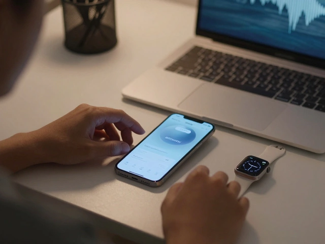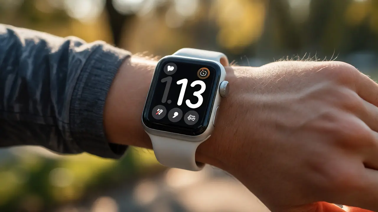

You have exactly six seconds. That’s the average time a user spends looking at their Apple Watch. If your app can’t communicate its core value in that window, it fails. This isn’t just about small screens; it’s about cognitive load on a moving body. When you’re jogging, cooking, or holding a baby, you don’t want to read paragraphs. You want data. You want action. And you want it now.
Glanceability is the art of designing interfaces that can be understood at a single glance. It’s the primary metric for success in watchOS development. But how do you pack enough utility into a 1.7-inch display without creating visual noise? The answer lies in mastering information density-the balance between content volume and white space. Let’s break down how top-tier apps achieve this, using real-world examples from fitness trackers, smart home controls, and messaging platforms.
The Six-Second Rule and Cognitive Load
Think about the last time you checked your watch while walking. Did you stop? Did you squint? Probably not. You likely performed a quick scan. This behavior dictates every pixel you place on the screen. Human Interface Guidelines (HIG) from Apple explicitly state that interactions should be short and direct. Why? Because users are often in motion. Their hands might be occupied. Their attention is fragmented.
If an app requires scrolling through three screens to find a heart rate reading, it violates the principle of glanceability. Users won’t scroll. They’ll close the app. Instead, successful designs use complications-small widgets on the watch face-to deliver critical data before the user even opens the app. This shifts the burden from deep navigation to immediate visibility. For example, a weather app doesn’t show a forecast list by default; it shows the current temperature and condition icon. One tap reveals more. Two taps reveal the hourly breakdown. This hierarchy respects the user’s time.
Information Density vs. Visual Clutter
Density isn’t about cramming. It’s about efficiency. A dense interface feels heavy if it lacks structure. A sparse interface feels empty if it lacks context. The sweet spot depends on the task complexity. For simple tasks like checking notifications, low density works best. Large fonts, high contrast, minimal text. For complex tasks like controlling a smart home hub, higher density is acceptable because the user expects to interact with multiple variables.
Consider the difference between a notification view and a workout summary. The notification uses large typefaces and truncates long messages. The workout summary uses charts, smaller labels, and grouped metrics. Both are dense relative to their purpose. To achieve this, designers rely on SF Pro Display, Apple’s system font optimized for legibility at small sizes. Using custom fonts often hurts readability unless carefully tested. Stick to system fonts for body text. Reserve custom typography for branding headers where size is larger.
| Use Case | Density Level | Primary Element | Interaction Model |
|---|---|---|---|
| Notifications | Low | Large Icon + Title | Swipe to dismiss |
| Fitness Metrics | Medium | Data Visualization | Crown rotation |
| Smart Home Control | High | Toggle Switches | Tap + Drag |
| Messaging Reply | Low | Voice Input Button | Dictation |
Leveraging Spatial Awareness and Haptics
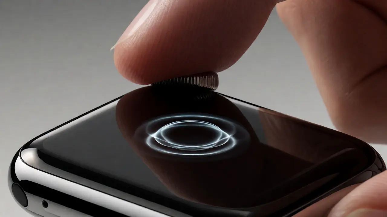
On a phone, you have vertical space. On a watch, you have depth and time. Digital Crown input allows for precise control without obscuring the screen with fingers. This is crucial for maintaining glanceability. When users rotate the crown to adjust volume or zoom into a map, they don’t need to look at their finger position. The feedback comes via haptics and visual changes.
Haptic feedback serves as a secondary channel for confirmation. When you tap a button, a subtle tick confirms the action. This reduces the need for visual loading spinners. If the app responds instantly with haptics, the user trusts the interface. If it lags, even by 200 milliseconds, the illusion of immediacy breaks. Developers must optimize backend calls to ensure sub-second response times. Caching recent data locally on the device helps here. Fetching live data from a server every time kills the experience.
Designing for Peripheral Vision
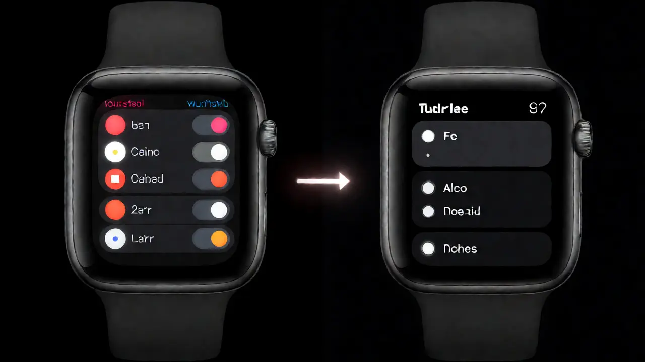
Most watch usage happens in peripheral vision. You’re driving, talking, or working. Your eyes aren’t focused directly on the wrist. Therefore, color coding becomes a powerful tool. Red means alert. Green means all clear. Blue means neutral info. This semantic color mapping allows users to interpret status without reading text. Apps like Strava or Spotify use distinct colors for different states (playing vs. paused, active vs. resting) so you know what’s happening with a quick flicker of the eye.
Contrast is equally vital. The Always-On Display dims significantly when inactive. Ensure your dark mode designs remain legible at 10% brightness. Test your prototypes in bright sunlight and dim rooms. A common mistake is using light gray text on a black background. It looks sleek in a design tool but vanishes outdoors. Use pure white or high-saturation accents for critical data points.
Micro-Interactions and Animation
Animation isn’t just decoration; it’s communication. Smooth transitions guide the eye. If a new message slides in from the right, the user knows where it came from. If a button expands into a menu, the spatial relationship is preserved. However, excessive animation slows down perceived performance. Keep animations under 300 milliseconds. Fast, snappy movements feel responsive. Slow, floaty movements feel sluggish.
Use Spring Animations instead of linear easing. Springs mimic physical objects, making digital elements feel tangible. When a toggle switch flips, it should bounce slightly. This micro-interaction provides satisfaction and confirms completion. Avoid parallax effects that require head movement to perceive. On a wrist, those effects are often lost or cause motion sickness.
Testing Glanceability: The Squint Test
How do you know if your design works? Perform the squint test. Hold your prototype at arm’s length. Squint until details blur. What remains visible? If you can still identify the primary call-to-action and key data points, you’ve achieved good glanceability. If everything blurs into a gray blob, increase contrast or reduce element count.
Another method is the stopwatch challenge. Ask five friends to complete a specific task (e.g., "Start a 5-minute timer") while wearing the watch. Time them. If anyone takes longer than eight seconds, simplify the flow. Remove optional steps. Pre-fill default values. Make the most common action the largest target.
Common Pitfalls in Watch App Design
Many developers try to port iOS patterns directly to watchOS. This fails. Tab bars take up too much vertical space. Modal sheets obscure context. Long forms are painful to fill. Instead, use hierarchical navigation. Start with a summary screen. Drill down only when necessary. Return to the top level quickly.
Also, avoid relying solely on text. Icons convey meaning faster. A bell icon means notification. A gear icon means settings. Universal symbols reduce cognitive load. But ensure icons are recognizable. Don’t invent new metaphors. Stick to standard SF Symbols library. These icons are designed specifically for small sizes and align perfectly with text baselines.
What is the ideal number of interactive elements per screen?
Aim for one primary action and two secondary actions maximum. Too many choices cause decision paralysis. If you have more options, group them into a menu accessible via a single tap.
Does Dark Mode improve battery life on Apple Watch?
Yes, especially on OLED models like Series 6 and later. Black pixels are off, consuming zero power. However, battery impact varies based on usage patterns. Always-on displays mitigate some savings since the screen never fully turns off.
How does the Digital Crown enhance usability?
It allows precise input without covering the screen. Users can scroll lists, adjust sliders, or zoom maps while keeping their gaze on the display. This maintains glanceability during interaction.
Can I use custom fonts in watchOS apps?
You can, but it's risky. Custom fonts may lack hinting for small sizes, reducing readability. SF Pro is optimized for legibility. Use custom fonts sparingly, only for large headings or brand identity, and always test in various lighting conditions.
What is the role of complications in glanceability?
Complications provide instant access to key data without opening the app. They act as persistent previews. Well-designed complications allow users to get value from the watch face alone, reinforcing the habit of frequent glances.