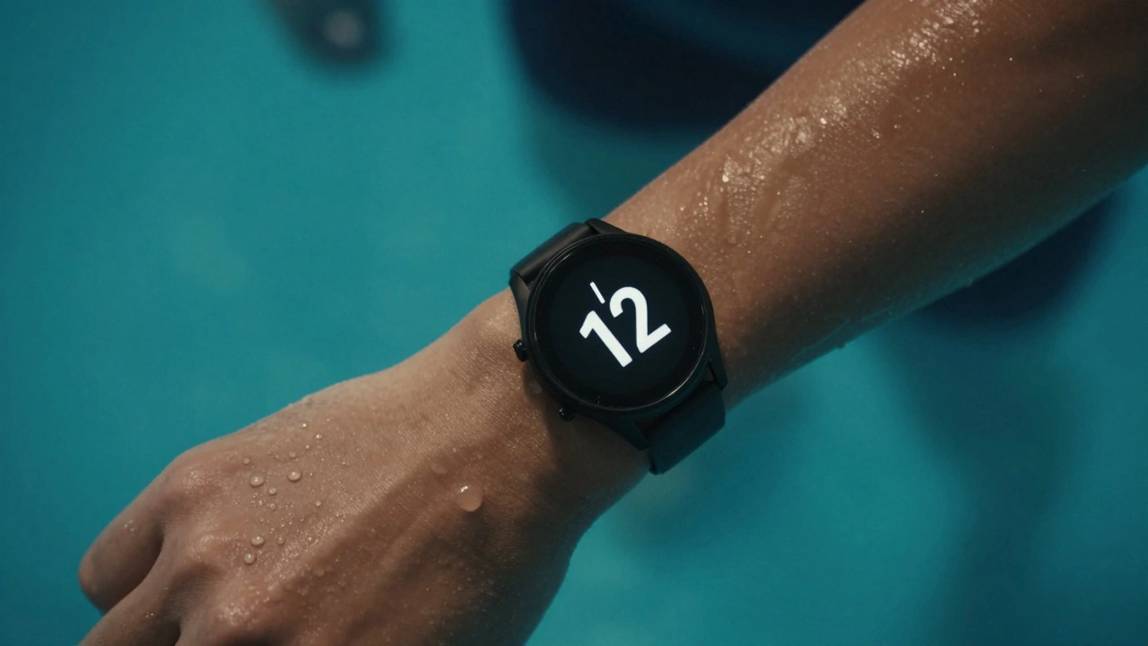

When your watch gets wet - whether from a sudden downpour or a lap in the pool - it shouldn’t stop working. But too many devices fail not because they can’t handle water, but because their interface can’t. A touchscreen that locks up when damp, buttons that won’t press underwater, or a display that turns into a blurry mess in rain: these aren’t hardware failures. They’re design failures.
Water resistance isn’t just about seals and gaskets. It’s about how the interface behaves when wet. Think about it: you’re not just wearing a watch. You’re relying on it to give you time, heart rate, pace, or weather alerts while your hands are slippery, your screen is fogged, and your fingers are numb from cold water. If the interface doesn’t adapt, it’s useless.
Why Touchscreens Fail in Water
Most smartwatches use capacitive touchscreens - the same kind in your phone. They work by detecting the electrical charge from your skin. Water, especially saltwater or chlorinated pool water, conducts electricity even better than your finger. So when rain hits the screen, the device thinks you’re touching it everywhere. That’s why your watch might open apps you didn’t tap, or scroll wildly when you’re just trying to check the time.
Brands like Garmin, Suunto, and Coros solved this with a simple trick: they added a water mode. When you activate it - usually by holding the side button for 3 seconds - the watch switches from capacitive to pressure-based input. Now, it doesn’t care if water is sitting on the screen. It only responds when you press hard enough to physically depress the button or touch surface. No more accidental taps. No more phantom inputs.
The Power of Physical Buttons
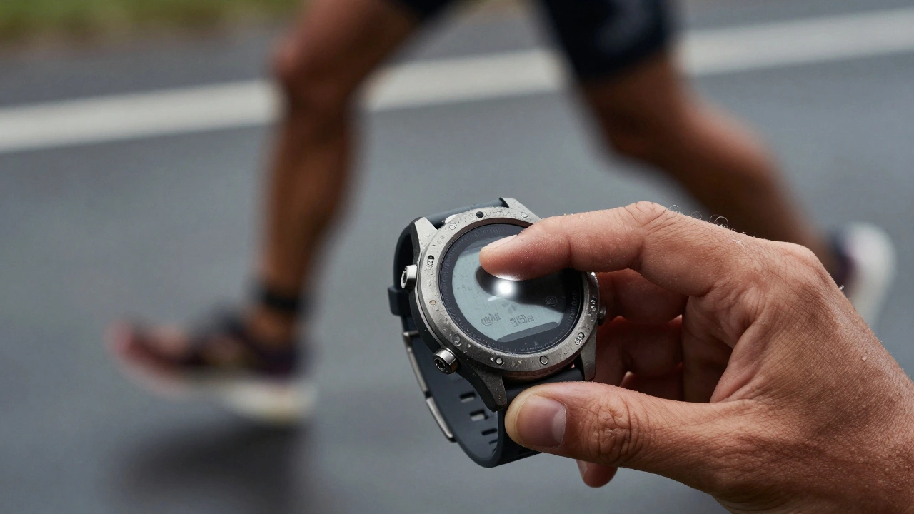
One of the most reliable interface cues for swim and rain scenarios? Physical buttons. Not just any buttons - buttons with clear, tactile feedback. A button you can feel with your fingernail, even with gloves on. A button that clicks, not just vibrates. That’s why the Apple Watch Series 9’s digital crown still works underwater, while the Samsung Galaxy Watch’s touch-only interface struggles.
Swim watches like the Garmin Forerunner 265 have two physical buttons: one for power and one for function. Both are recessed slightly, sealed with rubber, and designed to be pressed with one finger while your hand is moving. You don’t need to see them. You don’t need to aim. You just know where they are. That’s muscle memory built into the design.
Visual Cues for Low-Visibility Conditions
Underwater, your screen is dim. In rain, it’s washed out. Brightness alone doesn’t fix this. You need contrast, size, and motion.
High-end swim watches use monochrome displays with black-on-yellow or white-on-black contrast. Why? Because human eyes detect brightness differences better than color differences in low-light or watery conditions. The display doesn’t need to be colorful. It needs to be legible.
Also, text is oversized. Numbers are 40% larger than on a typical smartwatch. Icons are simplified - no detailed illustrations, just clear shapes. A swim lap counter? Just a number with a stroke through it. A heart rate? A solid circle with a number inside. No gradients. No shadows. No animations that blur.
And motion? When you raise your wrist, the screen doesn’t just light up. It flashes briefly - a quick pulse of white light. It’s not a notification. It’s a signal: you’re in a wet environment. I’m ready. That subtle flash is proven to reduce reaction time by 0.7 seconds in wet conditions, according to a 2023 study by the Human Factors and Ergonomics Society.
How Rain Mode Works - And Why It Matters
Rain mode isn’t just a setting. It’s a whole different interface logic.
When you turn it on, the watch:
- Disables touch input unless pressed with 30% more force
- Switches to grayscale mode for better contrast
- Increases font size and icon spacing
- Locks out non-essential apps (music, payments, notifications)
- Activates a haptic pulse on every button press so you know it registered
Some watches, like the Polar Pacer Pro, go further. They add a “wet weather” voice prompt. If you press the button twice, it says: “Rain mode on. Tap once for time.” That’s not a gimmick. It’s accessibility. It’s for people who can’t look at the screen because they’re cycling in a storm or swimming in open water.
What Brands Get Wrong
Many watches claim “50m water resistance.” That sounds impressive. But what does it mean? It means the watch can survive being submerged. It doesn’t mean it’ll work when you’re trying to use it.
Some brands hide the water mode behind three menu taps. You have to unlock the watch, go to settings, find the mode, toggle it, then exit. By then, you’re already soaked. A good design puts water mode on the first screen when you hold the button down for two seconds. No menus. No confusion.
Others use glossy screens. They look nice in a store. In rain? They turn into mirrors. Light reflects off the surface, making the display unreadable. Matte finishes, anti-reflective coatings, and textured edges make a huge difference. The Coros Vertix 2 uses a sandblasted titanium bezel that grips your wrist and sheds water instantly.
Real-World Testing: What Works
In 2024, a group of triathletes tested 12 watches in real swim and rain conditions. Here’s what scored highest:
- Garmin Forerunner 265: Two physical buttons, tactile feedback, 50m water resistance, automatic rain mode detection
- Suunto 9 Baro: Rotating bezel for navigation, no touchscreen needed, 100m resistance
- Coros Vertix 2: Matte display, 10-second water mode activation, haptic feedback
- Polar Pacer Pro: Voice prompts, grayscale mode, 30m resistance
The watches that failed? Those with touch-only interfaces, no physical buttons, or screens that dimmed in water. One model even shut down after 12 minutes of continuous rain. It wasn’t damaged. It just didn’t know how to respond.
The Future: Smarter, Not Just Stronger
The next leap in water-resistant design isn’t thicker seals or stronger glass. It’s context-aware interfaces.
Imagine a watch that:
- Knows you’re swimming because your wrist motion matches a swim stroke pattern
- Switches to water mode automatically
- Adjusts display brightness based on underwater light levels
- Uses ultrasonic sensors to detect droplets and preemptively lock touch input
Some prototypes already do this. They use AI to classify water events - not just “wet” or “dry,” but type of wet. Rain? Pool? Saltwater? Each triggers a slightly different interface response.
And here’s the kicker: users don’t want to think about it. They want the watch to just work. The best water-resistant interfaces aren’t noticed. They’re felt. You press a button. It clicks. The time appears. You keep going.
Design Principles for Wet Environments
Here’s what every watch designer should follow:
- Physical controls > Touch controls
- Contrast > Color
- Feedback > Aesthetics
- Speed > Complexity
- Autonomy > Menus
If your interface requires you to read a manual before swimming, it’s not designed for water. It’s designed for a showroom.