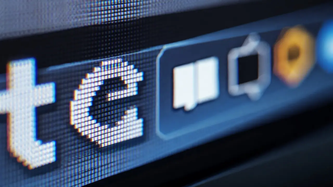

You know that feeling when you look at a website on an old monitor and the text looks fuzzy? Like it was printed with a smudged inkjet printer? That wasn't just bad luck or cheap screens. It was a fundamental mismatch between how software was built and how human eyes actually work. Then Apple dropped the Retina display on the MacBook Pro in 2012, and everything changed. Not just for Mac users, but for how we think about digital interfaces today.
This wasn't just a spec bump. It forced developers to rethink every icon, button, and font they had ever made. If you're a designer or developer working today, understanding why this shift happened helps you make better choices now. Let's break down what actually happened, why it mattered, and how it still shapes your screen time.
The Pre-Retina World: Why Pixels Were Lying to You
Before 2010, most computer monitors hovered around 96 to 110 pixels per inch (PPI). At that density, if you sat at a normal desk distance-about two feet away-you could see individual pixels if you looked closely. Text edges weren't smooth; they were stair-stepped. This is called aliasing, and it makes reading tiring over long periods.
Software developers worked within these constraints. They designed interfaces assuming one CSS pixel equals one physical screen pixel. When you clicked a button, the system drew a square exactly as wide as its code said. Simple. Predictable. But limited.
Steve Jobs introduced the term "Retina" with the iPhone 4 in 2010, claiming that above 300 PPI, the human eye can't distinguish individual pixels at a typical viewing distance. He didn't invent high-resolution screens-Nokia and others had them-but he packaged the concept into a marketing narrative that stuck. The key insight wasn't just more pixels. It was about matching screen density to natural visual acuity.
How Retina Displays Actually Work: The Math Behind the Magic
When Apple launched the first Retina MacBook Pro in June 2012, it featured a 15.4-inch IPS LCD panel with a resolution of 2880 x 1800 pixels. That's roughly 220 PPI. For comparison, the previous generation topped out at 1440 x 900, or about 110 PPI. Same physical size, double the linear resolution, four times the total pixels.
Here's where it gets clever. Apple didn't ask developers to redesign everything overnight. Instead, they introduced HiDPI rendering. In simple terms, macOS would take a standard 1440 x 900 logical workspace and render it using twice the horizontal and vertical pixels. Each logical point became a 2x2 grid of physical pixels. The result? Crisp text and sharp graphics without breaking existing apps.
| Feature | Pre-Retina (2011) | First Retina (2012) | Current M3 Pro (2023-2026) |
|---|---|---|---|
| Resolution | 1440 x 900 | 2880 x 1800 | 3024 x 1964 |
| Pixels Per Inch (PPI) | ~110 | ~220 | ~224 |
| Brightness | ~250 nits | ~300 nits | Up to 1600 nits (HDR) |
| Color Gamut | sRGB | sRGB | P3 Wide Color |
Notice the PPI didn't skyrocket after 2012. Why? Because Apple hit the point of diminishing returns for laptop viewing distances. Going from 220 to 400 PPI on a 14-inch screen offers marginal visual gains for most people but doubles the GPU workload and battery drain. The jump to 1600 nits and P3 color gamut in recent models matters more for professional creators than raw pixel count does for everyday users.
The Developer's Dilemma: Scaling Icons and Fonts
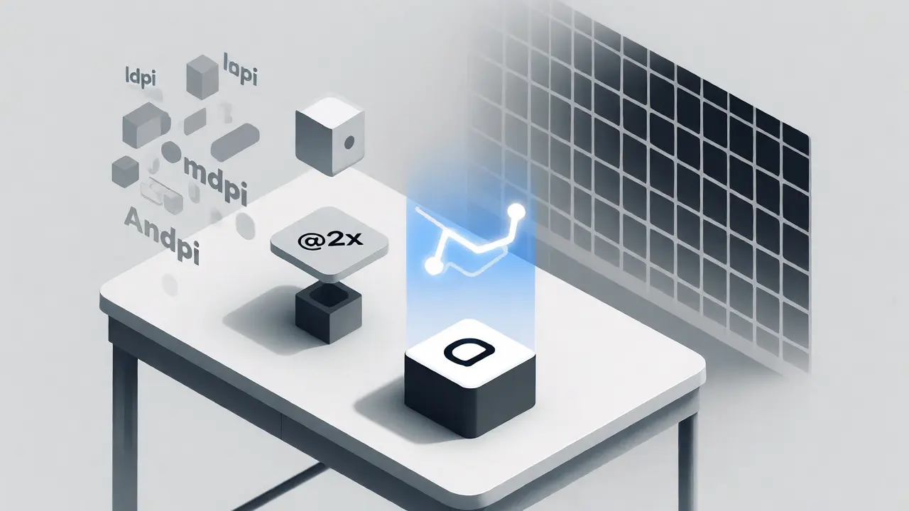
If you've ever opened an old Windows app on a modern high-DPI screen and seen blurry icons, you've experienced scaling issues. Apple solved this early by forcing developers to provide @2x assets. If you had a 32x32 pixel icon, you also needed a 64x64 version. The system automatically picked the right one based on the display density.
This created extra work. Designers had to maintain multiple asset sets. Developers had to update build pipelines. But the payoff was massive consistency. Unlike Android, which struggled with fragmentation across hundreds of screen densities for years, macOS offered a unified target. Most Macs ran at 2x scale. Web developers followed suit, adopting CSS media queries like `@media (-webkit-min-device-pixel-ratio: 2)` to serve sharper images.
SVG (Scalable Vector Graphics) became the hero here. Since vectors are defined by mathematical paths rather than fixed pixels, they render perfectly at any density. By 2015, major design tools like Sketch and later Figma pushed vector-first workflows, partly because Retina displays made raster assets feel outdated.
Impact on Typography and Readability
Text quality improved dramatically. Subpixel anti-aliasing, which relies on the RGB stripe pattern of LCD panels to smooth edges, works best at lower densities. On Retina screens, each character has enough pixels to define curves naturally without heavy smoothing tricks. Fonts look closer to print quality.
This changed how designers approach hierarchy. Before Retina, small text (under 12px) was often unreadable on standard screens. Designers avoided it. With Retina, 11px labels became viable for dense data tables. UI elements could be smaller without sacrificing legibility, allowing for cleaner, less cluttered interfaces.
However, there's a catch. Browsers handle zoom differently on Retina vs. non-Retina displays. If you use browser zoom (Cmd+Plus), you're not just magnifying pixels-you're recalculating layout units. This can cause unexpected reflows in responsive designs. Testing on actual Retina hardware remains essential for web developers targeting Mac users.
Why Other Manufacturers Lagged (And Caught Up)
Apple controlled both hardware and software, making the transition seamless. PC manufacturers faced chaos. Windows supported high DPI, but many legacy apps ignored it. A user buying a Dell XPS 15 with a 4K screen in 2014 might find their mouse cursor tiny while their Word document stayed huge. It took Microsoft until Windows 10 Creators Update (2017) to stabilize per-monitor DPI scaling.
Meanwhile, Android fragmented further. Screen sizes ranged from 5 inches to 7 inches, resolutions from 720p to QHD+. Developers had to support ldpi, mdpi, hdpi, xhdpi, xxhdpi, xxxhdpi buckets. It was a nightmare. iOS remained simpler: mostly @1x and @2x, then @3x for larger iPhones. This simplicity drove higher adoption rates of crisp UIs among mobile users.
The Modern Context: OLED, ProMotion, and Beyond
Today, pixel density isn't the main selling point. Apple's current MacBook Pros use Liquid Retina XDR mini-LED displays. The focus shifted to contrast ratio, peak brightness, and refresh rate. ProMotion technology, introduced in iPad Pro and brought to MacBook Pro in 2021, allows variable refresh rates up to 120Hz. This makes scrolling smoother, reducing perceived latency.
For designers, this means animation matters more than static sharpness. A 60Hz interface feels sluggish next to 120Hz. Micro-interactions-button presses, hover effects, transitions-need to be tuned for high frame rates. Tools like After Effects and Principle help simulate these behaviors before coding.
Also, HDR content demands new color management workflows. Standard sRGB designs don't translate directly to P3 wide-gamut displays. You need to specify color profiles explicitly in CSS (`color-space: display-p3`) or export assets with embedded ICC profiles. Ignoring this leads to washed-out colors on newer MacBooks.
Practical Tips for Designing for High-Density Screens
- Use vector assets whenever possible. SVGs scale infinitely without file bloat. Reserve PNGs for complex textures or photos.
- Test at 2x scale. Don't just check your design in a single view. Zoom to 200% to ensure alignment and spacing hold up.
- Optimize for touch targets. Even on desktop, accessibility guidelines suggest minimum 44x44pt interactive areas. Retina clarity doesn't excuse tiny buttons.
- Watch performance costs. Rendering large high-res images on older MacBooks can stutter. Use lazy loading and compression formats like WebP or AVIF.
- Consider dark mode contrast. High-density screens reveal subtle gradients and noise. Ensure your dark theme maintains WCAG AA contrast ratios (4.5:1 for normal text).
Frequently Asked Questions
Is a Retina display really necessary for programming?
Yes, strongly recommended. Coding involves reading small fonts for hours. Retina reduces eye strain significantly. Many developers report fatigue headaches disappearing after switching to high-DPI monitors. The crispness helps distinguish similar characters like 'l', 'I', and '1' more easily.
Do all websites look better on Retina displays?
Not necessarily. If a site uses low-resolution raster images without @2x variants, they will appear blurry on Retina screens. However, well-coded sites using SVGs, web fonts, and proper image srcsets will look noticeably sharper and more professional.
Can I use external monitors with Retina-like quality?
Yes, but you need a 4K monitor (3840x2160) at 27 inches or smaller to achieve ~163 PPI, which approaches Retina clarity at desk distance. Apple's own Studio Display offers 5K resolution (~218 PPI) for true native HiDPI scaling without interpolation artifacts common in cheaper 4K panels.
Does higher resolution drain battery faster?
Historically, yes. More pixels require more GPU power to render. However, modern Apple Silicon chips (M1, M2, M3 series) have dedicated media engines and efficient integrated GPUs that mitigate this impact. Battery life differences between base and Pro models are minimal unless you're running heavy graphical tasks continuously.
What is the difference between Retina and OLED?
Retina refers to pixel density (sharpness). OLED refers to panel technology (contrast and color). An OLED screen can be Retina or not. Currently, MacBook Pros use mini-LED LCDs, not OLED. iPads and iPhones use OLED. OLED offers perfect blacks and infinite contrast, while mini-LED offers higher sustained brightness for HDR video editing.