
You know that feeling when you try to make a secondary label stand out by slapping an italic style on it? It often looks like a mistake. Or worse, it looks like the user accidentally held down the shift key while typing. In the world of Apple User Interface (UI) design systems and visual language standards established by Apple Inc., italics are rarely used for emphasis in the way web designers might expect. They’re reserved for specific semantic states, not just decorative flair.
If you’re designing for iOS or macOS, understanding why Apple avoids standard italics-and what they use instead-is crucial for maintaining that crisp, native feel. Let’s break down exactly where italics fit, where they don’t, and how to achieve true hierarchy without breaking the system.
The Problem with Standard Italics in SF Pro
Most people assume SF Pro the custom sans-serif typeface family designed by Apple for iOS, iPadOS, macOS, tvOS, and watchOS has a dedicated italic variant for every weight. It doesn’t. At least, not in the way traditional serif fonts do. When you apply italics to SF Pro Text or SF Pro Display, the system often applies a "synthetic" oblique transformation. This means it simply shears the characters rather than using a carefully drawn italic glyph set.
Why does this matter? Because synthetic italics look messy at small sizes. On high-resolution Retina displays, those sheared edges can appear jagged or uneven compared to the clean vertical strokes of the regular font. Apple’s Human Interface Guidelines (HIG) explicitly discourage relying on italics for primary emphasis because the visual noise outweighs the benefit. You end up with text that feels unstable rather than emphasized.
When to Actually Use Italics
So, if italics are so problematic, why do we see them in apps like Books or News? Because there are specific contexts where italics carry semantic meaning that bolding cannot replicate. Here is the narrow list of acceptable uses:
- Titles of Works: Just like in print journalism, book titles, movie names, and song titles within body text should be italicized. This follows standard editorial conventions that users recognize instantly.
- Placeholder Text: While Apple prefers grayed-out regular text for placeholders now, some legacy patterns or specific input fields still use italics to indicate "this is not real content yet." However, check your specific component library first; modern SwiftUI TextField defaults often avoid this.
- Scientific Names: If you’re building a biology app, Latin binomial nomenclature (like Homo sapiens) requires italics. This isn’t about UI hierarchy; it’s about scientific accuracy.
- Quotations: Long block quotes sometimes use italics to distinguish voice from narration, though indentation and color changes are often preferred for better readability.
Notice what’s missing? "Emphasis," "Warning," or "Secondary Label." Those are the traps most new designers fall into.
Achieving Hierarchy Without Italicizing
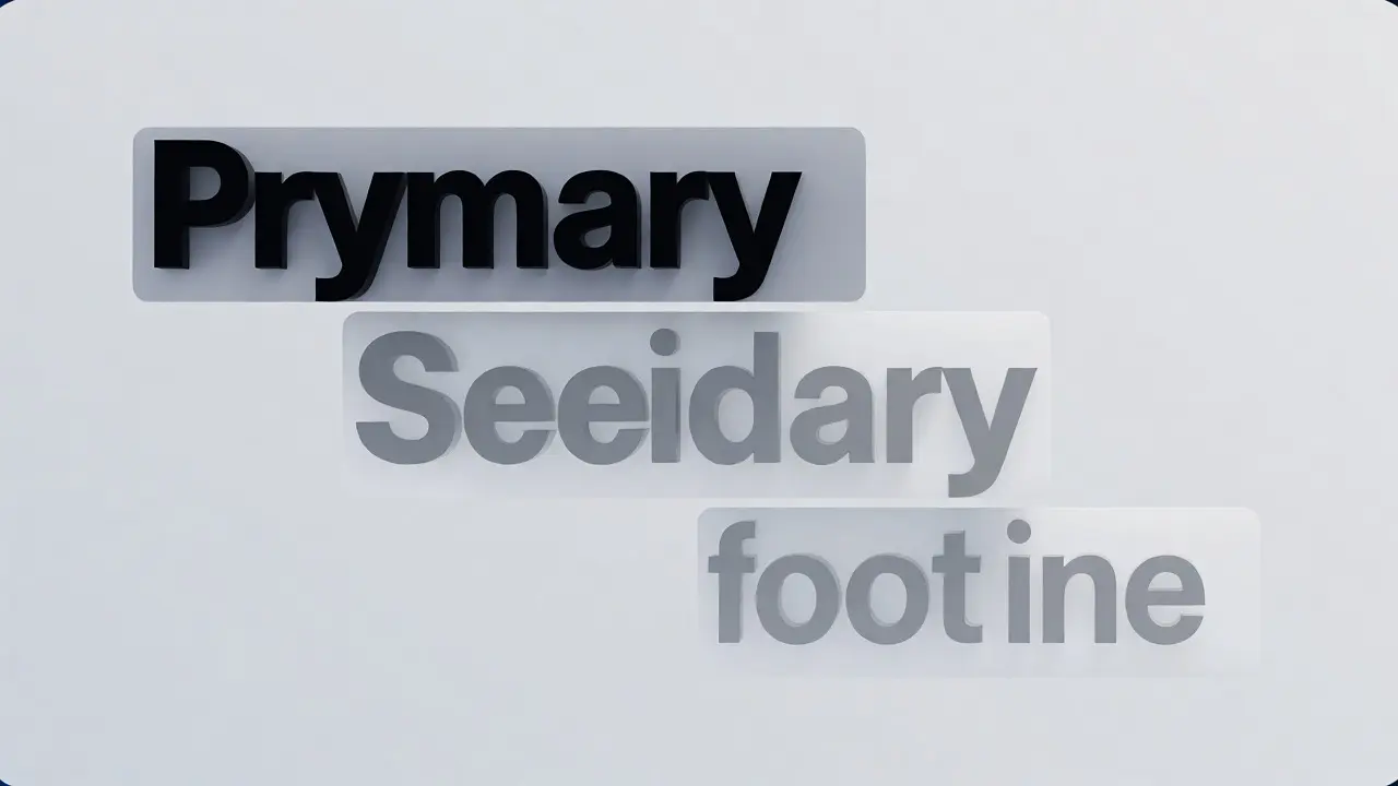
If you can’t use italics to make something secondary, what do you use? The answer lies in the trifecta of Text Weight the thickness of the stroke of a character in a typeface, Color Opacity the transparency level applied to text elements to denote importance, and Font Size the relative magnitude of the typeface.
Apple’s system provides predefined text styles that handle these combinations for you. Instead of manually setting an italic font, you switch from `.body` to `.subheadline` or `.footnote`. These styles automatically adjust size and line height to create visual separation. For emphasis within a paragraph, use `Bold` or `Semibold` weights. They provide stronger contrast against the regular weight than italics ever could.
| Method | Visual Impact | Readability at Small Sizes | Recommended Use Case |
|---|---|---|---|
| Bold/Semibold | High | Excellent | Primary emphasis, key data points |
| Reduced Opacity | Medium | Good | Secondary labels, metadata, timestamps |
| Synthetic Italic | Low/Messy | Poor | Titles of works only |
| Color Change | Variable | Context-dependent | Actionable links, error states |
The "Subtle Emphasis" State
Let’s talk about that title phrase: "Subtlety for Secondary and Emphasis States." What does subtle emphasis actually look like in practice? Imagine a settings menu. The main label says "Wi-Fi." The status below it says "Connected to Portland_Guest." That second line isn’t italicized. It’s smaller, lighter in weight, and often uses a lower opacity color token (like `secondaryLabel` in UIKit or SwiftUI).
This approach reduces cognitive load. Users scan the bold, dark text for actionable items. The lighter, smaller text provides context without competing for attention. If you italicize that secondary line, you introduce a diagonal rhythm that clashes with the horizontal scanning pattern of reading. Your eye gets snagged on the slant, slowing down comprehension. Keep the baseline flat. Keep the hierarchy vertical through spacing and weight.
Accessibility Considerations
There’s a hidden cost to using italics: accessibility. For users with dyslexia or certain visual impairments, the irregular shapes of italicized letters can make reading significantly harder. Synthetic italics exacerbate this because the letterforms aren’t optimized for legibility at an angle.
Furthermore, screen readers don’t always announce italicization as a distinct state unless coded specifically with ARIA attributes or accessibility traits. If you rely on italics to convey meaning-like indicating a disabled field-a user with low vision might miss that cue entirely if the color contrast is also low. Always pair visual cues with structural ones. Don’t let italics do all the heavy lifting.
Practical Implementation Tips
Ready to clean up your designs? Here’s a quick checklist for reviewing your current UI components:
- Audit for Decorative Italics: Search your project files for `.italic()`. If it’s applied to button labels, navigation titles, or form inputs, remove it. Replace with `fontWeight(.semibold)` or `bold()`.
- Check Placeholder Styles: Ensure your text fields use the system default placeholder styling. Avoid forcing italics unless you have a very strong brand reason.
- Use Semantic Tokens: Instead of hardcoding colors and sizes, use Dynamic Type tokens. This ensures your hierarchy holds up when users increase their system font size.
- Test at Smallest Sizes: Zoom out to 50% or view on a SE-sized device. Do your "emphasized" italics look broken? Switch to bold.
Remember, good UI typography is invisible. It guides the eye without drawing attention to itself. Italics draw attention. Use them sparingly, only when the content demands it (like citing a book), and let weight and color do the work of organizing information.
Does SF Pro have a true italic font?
SF Pro includes true italic variants for certain weights and optical sizes, but many common UI weights rely on synthetic obliquing. Even when true italics exist, Apple's guidelines generally restrict their use to semantic contexts like titles of works rather than general UI emphasis due to readability concerns at small sizes.
How do I emphasize text in iOS without using italics?
The best ways to emphasize text in iOS are increasing font weight (using Bold or Semibold), increasing font size, or changing the color to a higher contrast value. For secondary text, reduce opacity and size rather than applying italics.
Can I use italics for button labels?
It is generally discouraged. Button labels should be clear and direct. Using italics can make buttons look inactive or secondary. Stick to regular or semibold weights for primary actions and use color or disabled states to indicate availability.
What is the difference between synthetic and true italics?
True italics are specially designed glyphs with curved strokes and adjusted proportions. Synthetic italics are created by software slanting the regular upright characters. Synthetic italics often lack the aesthetic balance and readability of true italics, especially at small pixel sizes.
Are italics accessible?
Italics can pose challenges for users with dyslexia or low vision. Screen readers may not consistently announce italic styling as a meaningful change. Therefore, italics should never be the sole indicator of important information; always combine them with other visual cues like weight or color.